A deep dive into... stream graphs
As a design enthusiast, stream graphs truly speak to my mind. With their elegant and captivating visual representation, stream graphs possess the power to transform complex data into a mesmerizing flow of information.
This type of chart is a beautiful variation of a stacked area chart and it provides a visually appealing way to depict how different categories contribute to a whole and how their proportions change over a given period. Stream graphs are primarily used to visualize trends and patterns over time rather than detailed information about each data point.
In this article, I will delve into the enchanting world of stream graphs, exploring their unique characteristics, practical applications, and the artistry behind their creation. Get ready to embark on a journey where data transforms into a harmonious stream of insights that captivates both the analytical and aesthetic senses.
Table of contents
1. The history of stream graphs 2. How does a stream graph work? 4. Chart automation with Datylon 5. Further reading & resources
|
The history of stream graphs
The concept of stream graphs was introduced by Lee Byron and Martin Wattenberg in 2008. The two designers, working at IBM's Visual Communication Lab, aimed to address some limitations of traditional stacked area graphs. Traditional stacked area graphs had a fixed baseline, which made it difficult to compare the relative sizes of the stacked layers accurately.
Byron and Wattenberg (1) proposed a new approach in which the baseline would dynamically change based on the underlying data, allowing for more intuitive visual comparisons. They developed a prototype visualization tool called "Streamgraph Generator" that implemented this idea and used it to create several visualizations, including one depicting the popularity of baby names over time.
The Streamgraph Generator gained attention when it was featured in The New York Times in 2008, and it quickly gained popularity as a novel and visually appealing way to represent time-based data. The technique gained further traction after being used in other prominent publications and websites.
Though, we shouldn’t forget to mention that also Robert Kosara and Caroline Ziemkiewicz contributed significantly to the advancement and popularization of the stream graph. They introduced the ThemeRiver technique, a similar concept to the stream graph, in their research paper titled "Do the Eyes Have It? A Comparison of Pictorial, Graphical, and Textual Presentations of Categorical Data," published in 2007. They developed the technique as a novel way to visualize categorical data over time. The terms "stream graph" and "Themeriver" are often used interchangeably to refer to the same visualization technique that represents categorical data over time using stacked areas that resemble flowing streams or rivers.
Since its introduction, stream graphs have been applied in various domains, including social media analysis, stock market analysis, website traffic visualization, and climate data representation. They effectively showcase trends, patterns, and fluctuations in multivariate time series data.
How does a stream graph work?
A stream graph typically comprises several components. The horizontal axis commonly represents time, with earlier times positioned on the left and more recent times on the right. It can employ various time units, including days, months, or years, depending on the specific context.
The vertical axis represents the magnitude of the measured value. It could be numerical values, percentages, or any other quantitative measure. It’s the vertical axis that distinguishes the stream graph from the stacked area chart. Where the stacked bar chart uses a conventional y-axis, in the stream graph the areas are wrapped around the x-axis resulting in a symmetrical way of representing the values.
Just like the stacked bar chart, the stream graph consists of layers that are stacked on top of each other, and each layer represents a category. Though, wherein the stacked bar chart the layers are rigidly stacked on top of each other, in the stream graph they flow in a smooth and wavy manner.
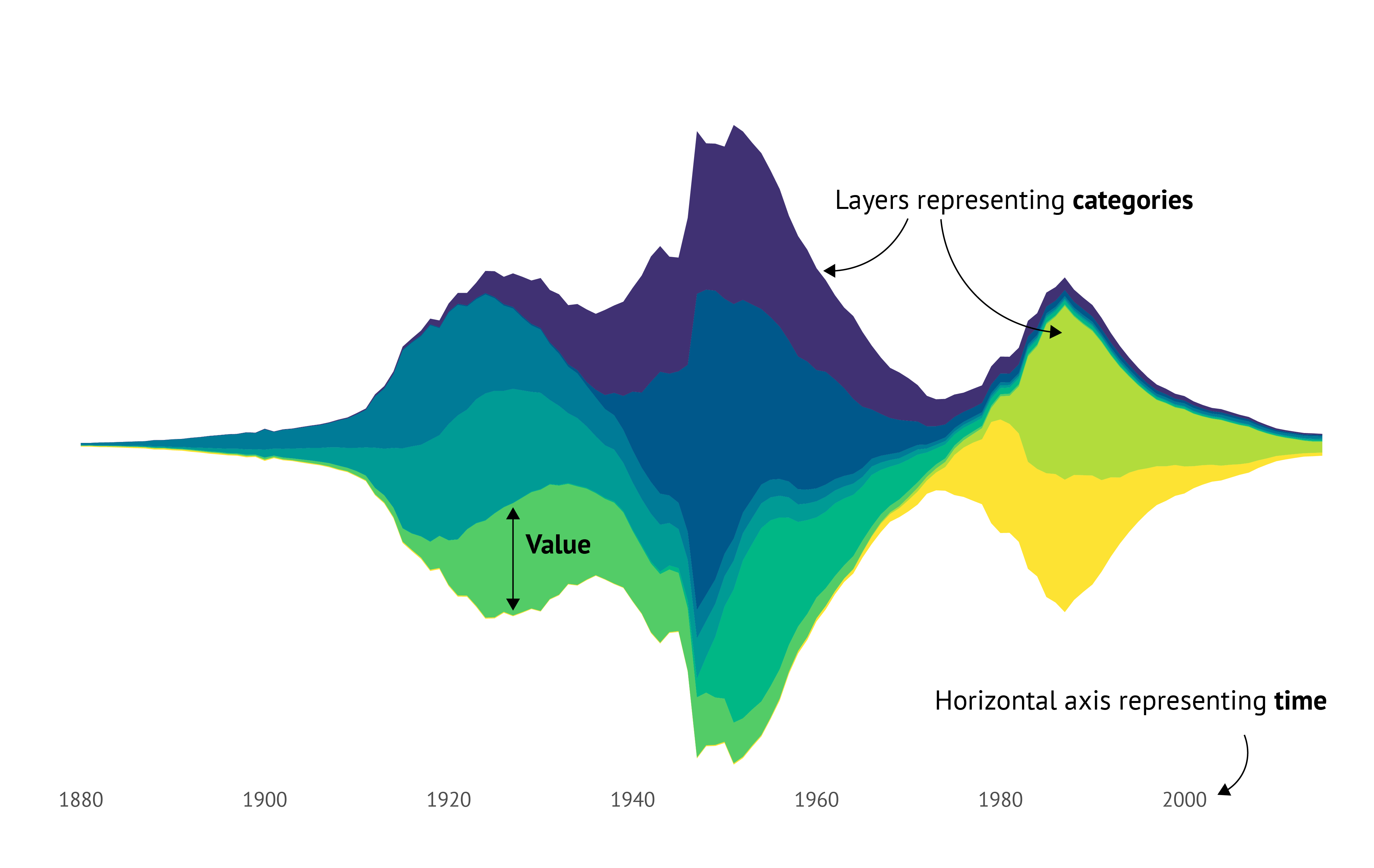
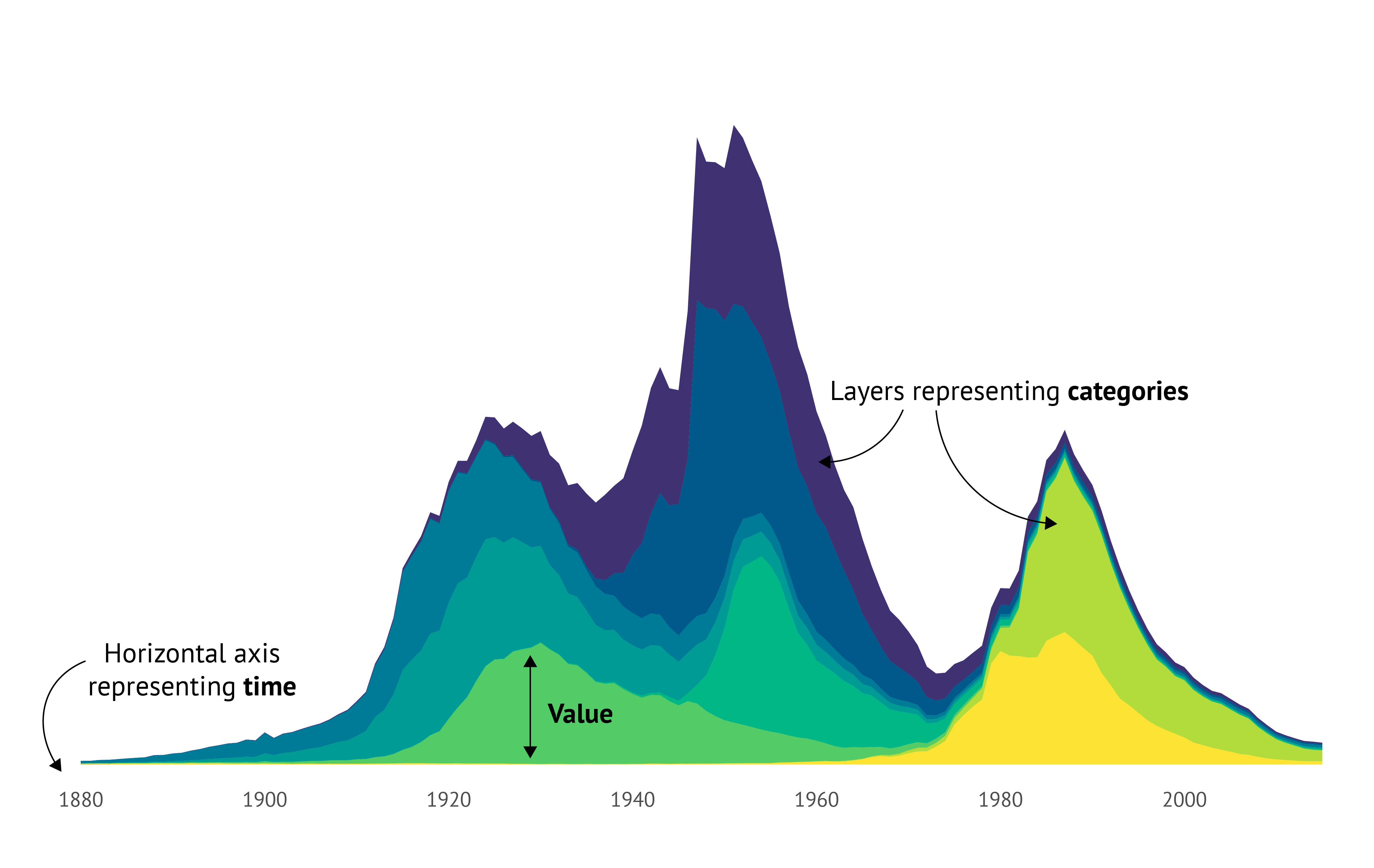 Figure 1: Elements of a stream graph vs. stacked bar chart.
Types of stream graphs
Interactive Stream Graph
As mentioned above, the stream graph was popularized in 2008 when it was featured in the New York Times. In this interactive stream graph shown as an image below, the ebb and flow of Movies at the Box Office between 1986 and 2008 were visualized.
Each layer within the chart corresponds to a movie, where the height of an area indicates its weekly box office revenue and the width represents the movie's duration. Additionally, the area size and color depict the movie's total domestic gross.
To augment the chart's usability, the designers incorporated various interactive elements. Firstly, users can navigate through different years using the horizontal scroll bar, enabling them to focus on specific time periods of interest. Secondly, a search bar allows users to locate a particular movie within the chart quickly.
Interactivity plays a vital role in enhancing the user experience and facilitating the exploration of the stream graph. In addition to scrolling and searching, interactivity can involve features such as tooltip information, which provides additional details upon hovering over specific areas. It can also include highlighting functionality to emphasize particular categories or time periods.
Zooming and panning options enable users to zoom in or out and explore different levels of detail. Additionally, interactivity can encompass filtering and selection capabilities to focus on specific subsets of data.
These interactive features collectively contribute to a more engaging and comprehensive exploration of the stream graph.
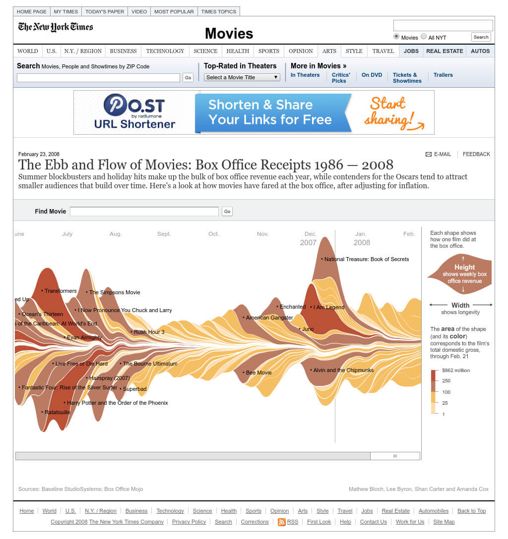
Figure 2: Stream graph featured in the New York Times in 2008.
Static Stream Graph
The New York Times also published a static version of the Ebb and Flow At the Box Office, as shown in the image below. In this static stream graph, you can explore movies of the year 2007.
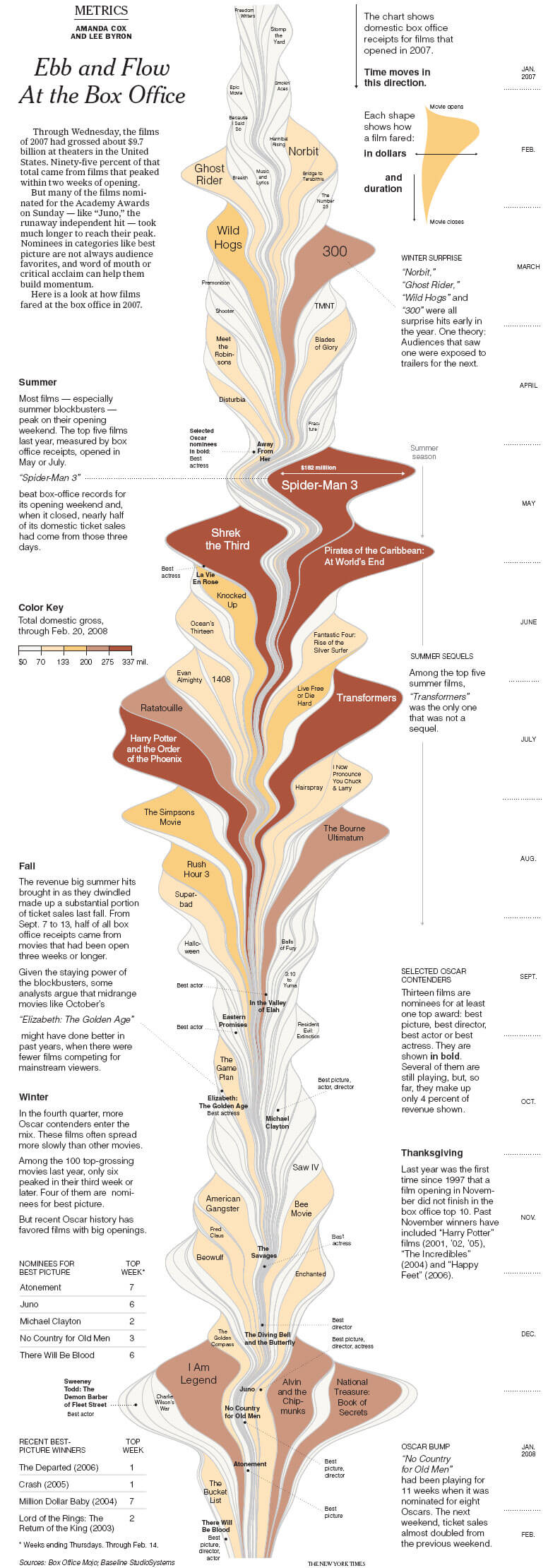
Figure 3: Static Stream Graph published in the New York Times in 2008.
In this chart, they managed to tackle some challenges that arise when designing a static stream graph for such many categories.
Compared to the interactive chart they labeled the categories in a different way.
The categories with the higher total domestic gross have bigger labels than the categories with a lower value.
What they did very well in both charts, is that they only put labels on the movies with the higher total domestic gross values. This makes the charts look uncluttered and readable.
Furthermore, the coloring employed in both of these charts is exceptionally well-executed.
A sequential color palette was utilized to represent the total domestic gross value.
As a result, higher values naturally stand out due to their darker hues, while lower values are rendered in lighter shades, making them less prominent.
Using a sequential color palette for this type of data and chart is the best choice. Applying
a categorical color palette to a chart like this with numerous categories would result in
a visually overwhelming display, making even a vibrant circus appear dull in comparison.
An alternative approach to the coloring used in this chart is to selectively highlight the most significant categories by applying color solely to those categories, regardless of their values being large or small. The remaining categories can be colored in a neutral shade.
This technique ensures that the most important categories stand out even more, capturing greater attention.
Since stream graphs are primarily used to visualize trends and patterns over time, data labels are often not included in the chart. Data labels focus on precise numerical values which may not be the primary objective of a stream graph. The labels can shift the focus away from the overall trends and detract from the intended purpose of the visualization.
Besides this, adding data labels to a stream graph could make the chart look very cluttered and there will be a high risk of overlapping labels.
To give more details or context to the data, using annotations in a static stream graph is
a good solution. In the static version of the Ebb and Flow At the Box Office, they added some annotations for the different seasons and some special days during the year.
At Datylon we have a specialized data visualization tool to create data-rich and beautiful static charts, dashboards, and reports, including appealing stream graphs like the above. With the ability to add annotations, your next data story can be created in a snap.
Sorted Stream Graph
As you already know by now, in a traditional stream graph, the areas are stacked on top of each other, creating a flowing river-like appearance. Though, there is also a type of stream graph that takes a different approach to the arrangement; the sorted stream graph. Instead of stacking the areas, they are sorted or ordered based on a specific criterion. This criterion could be the total value at a particular time, the maximum value across the entire time range, or any other relevant metric.
The sorting rearranges the areas horizontally, providing a different perspective on the relationships and comparisons between the categories. The sorting makes it easier to compare the categories and to identify the dominant categories.
A beautiful example of such a sorted stream graph is shown below. This chart by Valerio Pellegrini presents data on homicides by country from 2000 to 2012, specifically focusing on the top 20 countries with the highest rates of homicides. The areas are arranged by the rate of homicide with the country with the highest rate for a particular year on the top and the country with the lowest rate on the bottom.
Just like stream graphs, sorted stream graphs are primarily used to visualize trends and patterns over time rather than detailed information about each data point. Though, in this chart, a lot of data is missing which may lead to misinterpretation of the trends in the data.
It might seem that the total rate of homicides in the top 20 is increasing. However, this is mainly because homicides data for Nigeria was added in 2012, presumable because there is no data available for earlier years. Therefore, always be careful about misinterpretation and add annotations to the chart for clarification.
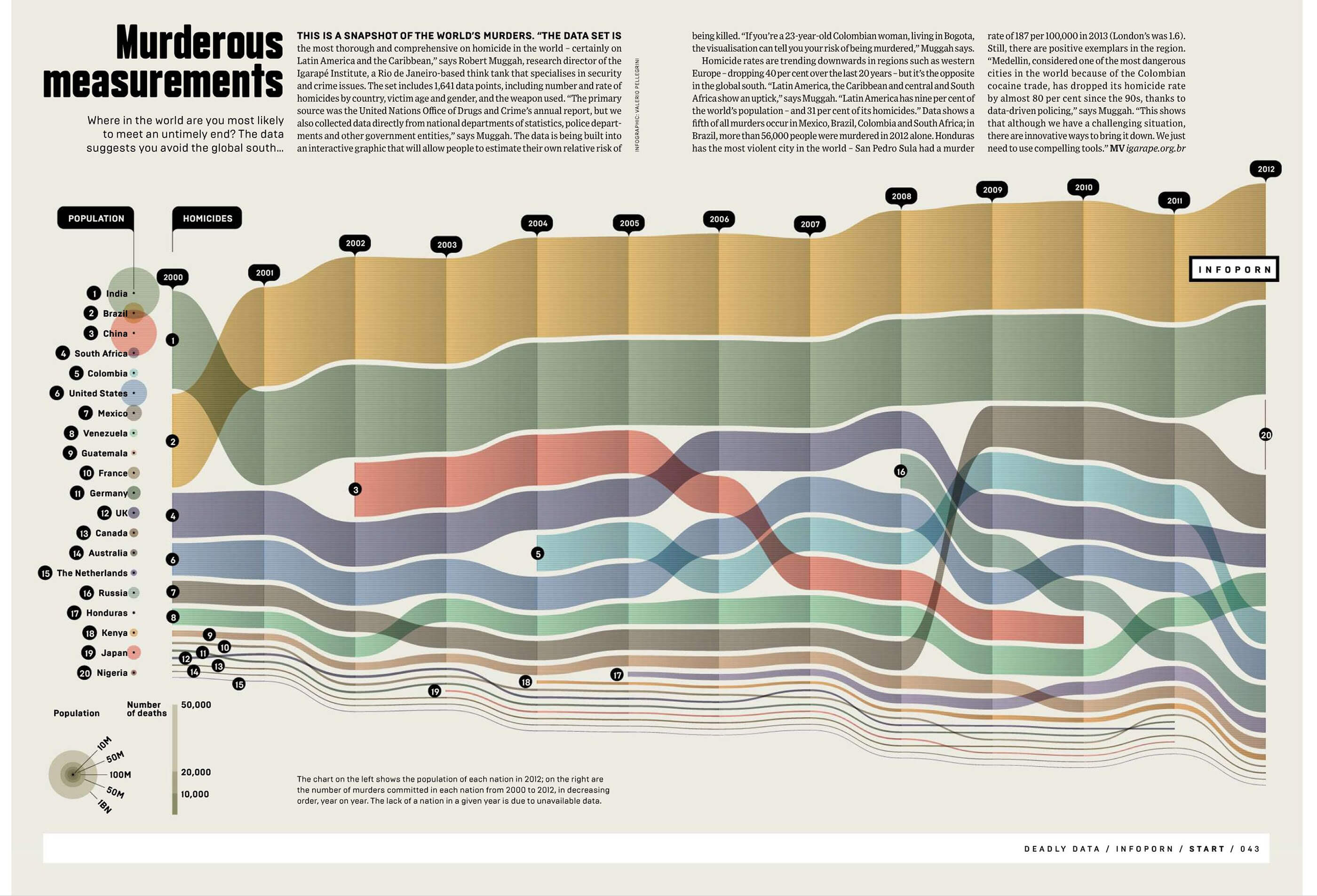 Figure 4: Sorted stream graph by Valerio Pellegrini.
A new type of stream graph?
In my research for this blog article, I bumped into the chart shown below which was categorized as a stream graph by datavizproject.com. At first glance, it looks like a stream graph: the areas are wrapped around the x-axis resulting in a sort of symmetrical way of representing the values. But after a second look, I discovered that it might not be a standard stream graph after all.
I believe the chart comprises two distinct stacked area charts—one representing New York and the other representing the world—each displaying its own dataset. These charts can exist independently of the other chart, which makes it in my opinion a double stacked area chart that is mirrored around the x-axis.
Before we conclude, I invite you to ponder this final question: How would you classify this visualization? Would you describe it as a stream graph, a double-stacked area chart, or would you categorize it as an entirely new graph type? Furthermore, if it were to be named differently, what name would you give it? I leave these intriguing thoughts for you to contemplate and welcome your insights.
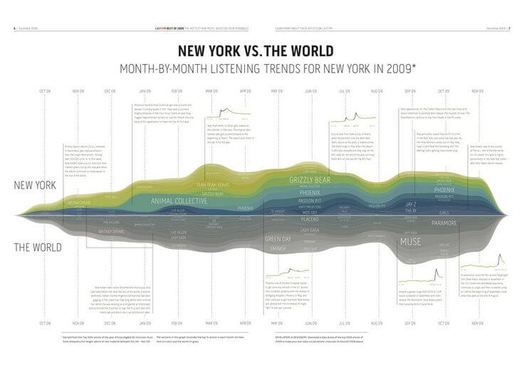
Figure 5: Is this chart a stream graph, a double, mirrored stacked area chart, or a new type of chart?
Chart automation with Datylon
Creating visually appealing streamgraphs often requires meticulous attention to detail, including specific styling and color palettes. This manual process can be time-consuming and inefficient, especially when creating multiple versions or reports.
Datylon offers a specialized data visualization tool that optimizes the creation of streamgraphs and other data visualizations or even total reports. With Datylon's automation capabilities, you can set up reports or charts to update automatically on-demand or according to a schedule. This eliminates the need for manual adjustments and ensures your charts and reports are always current and accurate.
Ready to automate your streamgraph or other charts for recurring reports? Schedule a demo today and one of our automation experts will guide you through the process. Or, explore our comprehensive blog article on automated reporting for in-depth information.
Further reading & resources
- L. Byron and M. Wattenberg, "Stacked Graphs – Geometry & Aesthetics," in IEEE Transactions on Visualization and Computer Graphics, vol. 14, no. 6, pp. 1245-1252, Nov.-Dec. 2008, doi: 10.1109/TVCG.2008.166.
- M. Wattenberg and F. B. Viégas, "The Word Tree, an Interactive Visual Concordance," in IEEE Transactions on Visualization and Computer Graphics, vol. 14, no. 6, pp. 1221-1228, Nov.-Dec. 2008, doi: 10.1109/TVCG.2008.172.
- A Peek Into Netflix Queues by The New York Times (2008).
- To click or not to click: static vs. interactive charts by Ivan Kilin (2023).

Dieuwertje van Dijk - Data Visualization Designer
Data, graphic design, illustration, food and mountains let her dopamine neurons spark on a daily basis. Most of the year she lives in Georgia where she spends her free time enjoying nature in a rooftop tent, eating khinkali and drinking wine.

