The best data visualization tools (2024)
What do you need data visualization tools for? Whether you’re a data scientist, data visualization designer, or marketing executive, you will often find yourself in need of software that can help you effectively visualize the insights you get after analyzing or interpreting data. An effective data visualization will help you give your data some context to make it easier to understand by others.
For a person who isn’t familiar or experienced with data visualization, looking for the right tool might be challenging. But even a seasoned dataviz expert will get a headache from all the overwhelming choices. There are just so many…
Whether you want to design a beautiful chart or compile an interesting presentation, you need to make sure to pick the right type of visualization for your audience. Also, keep in mind that visualizing data will make the process of decision-making and optimization much easier.
So how can you go about effectively explaining your data and conveying the right message? It’s good to start with choosing the right tool for your project. In this article, we have put together a list of some of the best data visualization tools that will really help you design your data stories. The list is divided into four categories: charts, interactive & animated charts, dashboard & reports, and presentation & infographic. Each of these categories lists a few tools and we highlighted some of them as more essential for your projects.
Table of contents
2. Animated & interactive charts |
1. Charts & graphs
Datylon for Illustrator
☆ Editor's choice
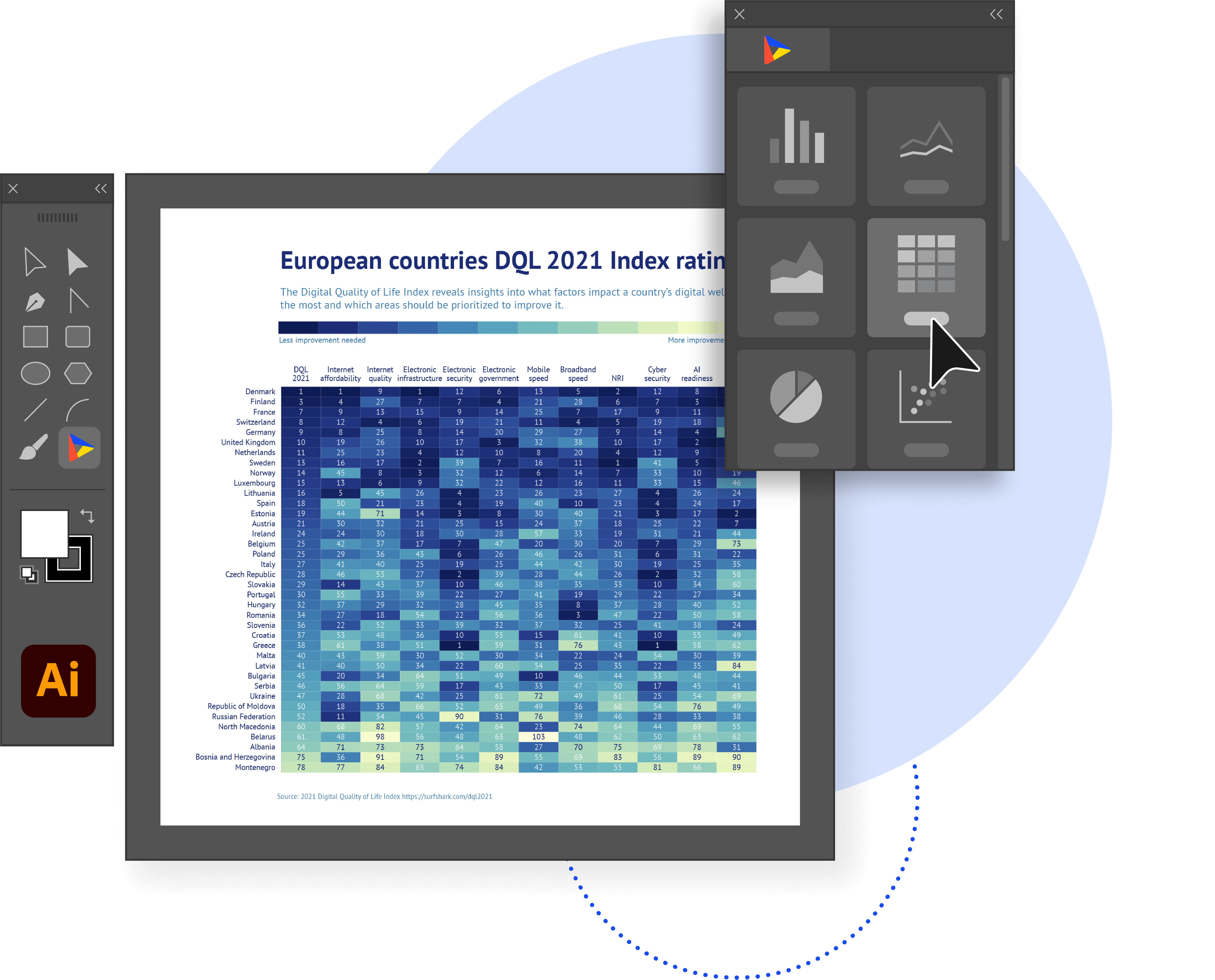
If you’re a data visualization designer or a graphic designer who creates charts and graphs repetitively within the Adobe environment, Datylon for Illustrator might be the best solution for you. Datylon for Illustrator is a powerful chart maker plug-in for Adobe Illustrator. Although mainly popular among designers, it can be used by anyone working with Illustrator.
Datylon for Illustrator is a no-coding tool. This intuitive plug-in allows you to create the most captivating on-brand data visualizations. It offers full freedom of design. Indeed, the tool is packed with so many styling properties that it allows you to fine-tune even the tiniest details of your design. And combined with Adobe Indesign, this is arguably the most effective tool to create extensive multi-page data stories.
One of the unique features of Datylon for Illustrator is the option to export your design to the Datylon web app. Think of being able to design the most beautiful and engaging report templates and exporting them online for the rest of the team to re-use. Thanks to this, non-Illustrator members of your team can collaborate and easily update data periodically with just a few clicks. After that, sharing it with your audience is really easy!
Combine that with a growing library of 130+ fully customizable chart templates to get you started, an advanced gallery of many inspiring examples to show you what Datylon can do for you, and an ever-growing Help Center with over a hundred articles to answer your questions. Did we mention a dedicated customer support team at your service whenever you need them?
Free version: yes - you can create a free account on Datylon that will allow you to access Datylon Online and templates exported from the plug-in (to Datylon Report Studio), or to create individual charts.
Pricing: you can see the pricing here. Free trial: yes - 14 days, no credit card.
Vizzlo
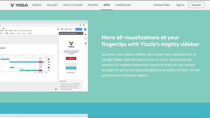
This small German startup developed quite an impressive chart maker tool for presentations and reports. It can be used as a seamless plug-in for Google Slides or PowerPoint, as an online cloud-based app, or even as an offline desktop app on your Windows or Mac laptop. Although it has somewhat limited design options, Vizzlo’s interface is very nice and smooth. The tool is packed with many charts and business graphics templates. What is important to note is that Vizzlo’s design editor does allow you to add titles and some annotations, but the styling possibilities here are rather limited.
It’s a really great collaboration tool for teams. Besides great compatibility between offline and online work, Vizzlo allows you to create, manage and share themes, layouts, and chart templates, making it easy to jointly work on the same project. The tool also offers a very nice cloud storage integration.
Finally, you can easily download your designs as PNG, PDF, or VZL (Vizzlo-native doc) files.
Free version: yes - you can use Vizzlo for free, although your design will contain a large watermark. Moreover, your documents will not be private.
Pricing: there are different pricing options starting at $11 per month.
Powerdrill AI
Powerdrill is an AI SaaS service centered around personal and enterprise datasets. Designed to unlock the full potential of your data, Powerdrill enables you to use natural language to effortlessly interact with your datasets for tasks ranging from simple Q&As to insightful BI analysis. Data visualization is a key competitive feature of Powerdrill AI.
You can chat with your data to get automatic visualizations. Simply drag and drop your files, then ask Powerdrill AI anything you want from your data. Powerdrill AI uncovers insights, patterns, and trends with intuitive, accurate, and precise visuals in real time. It also provides smart and accurate chart selection: Bar, Line, Pie, Doughnut, Heatmap, Boxplot, and more. Powerdrill AI instantly generates engaging, easy-to-understand charts during data analysis. With its intelligent detection, it selects and creates the most relevant visuals to enhance your data presentation. You can customize and save these charts to suit your needs, then add them to dashboards for better, data-driven decision-making. With Powerdrill AI, from data to actionable insights – you're just one step away.
Free version: You can use Powerdrill AI for free with limited data analysis jobs using basic models.
Pricing: There are different pricing options starting at $3.90 per month. The Plus plan is $9.90/month, and the Pro plan is $29.90/month.
2. Animated & interactive charts
Flourish Studio
☆ Editor's choice
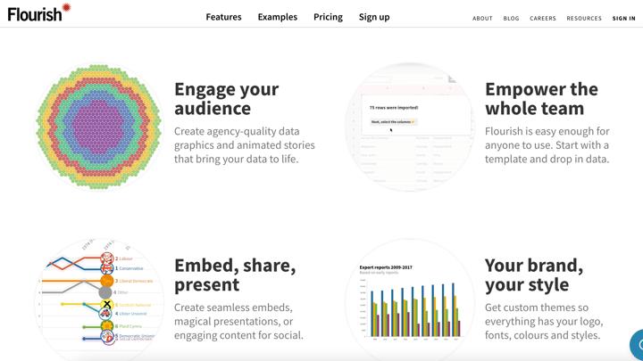
If you wish to add some spice to your project, Flourish Studio is a fantastic tool to create captivating interactive data visualizations. Similar to Datylon for Illustrator, it offers a wide range of charts and graphs, from basic to more complex types. But among Sankey, scatter plots, and customizable heatmaps, Flourish allows you to create maps (including 3D maps) or even animated bar charts. With an option to preview on all devices, this application will help you create stunning, fully interactive presentation slides or other types of data stories. Flourish Studio offers a pretty generous free version that gives you access to many templates and features. When you sign up, you get a quick tour of the platform. When creating a visualization, you can always see it in a preview on different types of devices. Recently, this London-based company joined forces with another design giant, becoming part of the Canva family.
Free version: yes - for individual users, offers most of the features for free; you can even create private stories.
Pricing: businesses and enterprises get a custom quote.
Datawrapper
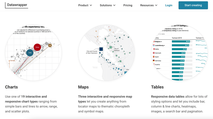
This chart maker legend from Germany was founded about a decade ago to revolutionize the data visualization industry, offering an easy-to-use tool to create charts, tables, and even maps. What makes Datawrapper stand out from the competition is the interactivity and responsiveness of the maps, making them so easy to create and share or embed. But most importantly, the tool is free and you don’t even have to sign up to use it. It also allows you to get started with dummy data if you only wish to try the tool. On the other hand, some features - such as the title’s fonts and colors - have limited customization options.
Whether you’re a data journalist or a blogger who needs an interactive dataviz on their website, this simple wizard concept tool will definitely help you engage your audience and help you tell your data story. Also Datawrapper’s River - an online gallery of works of other users - is worth looking at to get some inspiration.
Free version: yes, although it comes with attribution.
Pricing: the custom package is quite costly, starting at $599/month.
Everviz
No coding and no technical expertise are needed to use this tool. The Norwegian team behind Everviz spun off from Highcharts, a widely known JavaScript software library for charting. As a new subsidiary, Everviz offers an easy, if somewhat limited and pricy, chart maker tool for everyone to create and publish interactive and responsive visualizations. Some of the features include collaboration options, custom font upload, dummy data to work with, a lot of templates for charts, and even the possibility to update embedded charts with new data. One thing that stands out is that all projects created with Everviz include accessibility functionality to support viewers with vision, motor, or cognitive impairments. Something that is often overlooked yet so important for inclusive data visualization.
Free version: Yes, for up to 10 projects and with all standard features.
Pricing: Starting at $59/month makes it a bit expensive.
Tableau
☆ Editor's choice
Backed by Salesforce, smoothly integrable with Slack, and used by many businesses. Tableau is easily recognizable as a business intelligence software industry giant and leader with remarkable data visualization capabilities. It is particularly focused on data analytics.
Tableau offers a great range of different products, each with its own audience and use case in mind. Whether you’re an individual or a team within a large organization, anyone can use Tableau to visualize data with one of the best tools available. However, there is a really steep learning curve to keep in mind.
The tool is great for creating data-driven visualizations, such as interactive charts and graphs, using data from multiple sources, if needed. It can also work with really large datasets.
Tableau Public is a free version of the tool that allows you to create and publish data stories with others. There are several paid subscription plans available.
3. Dashboards & automated reporting
Datylon Report Server
☆ Editor's choice
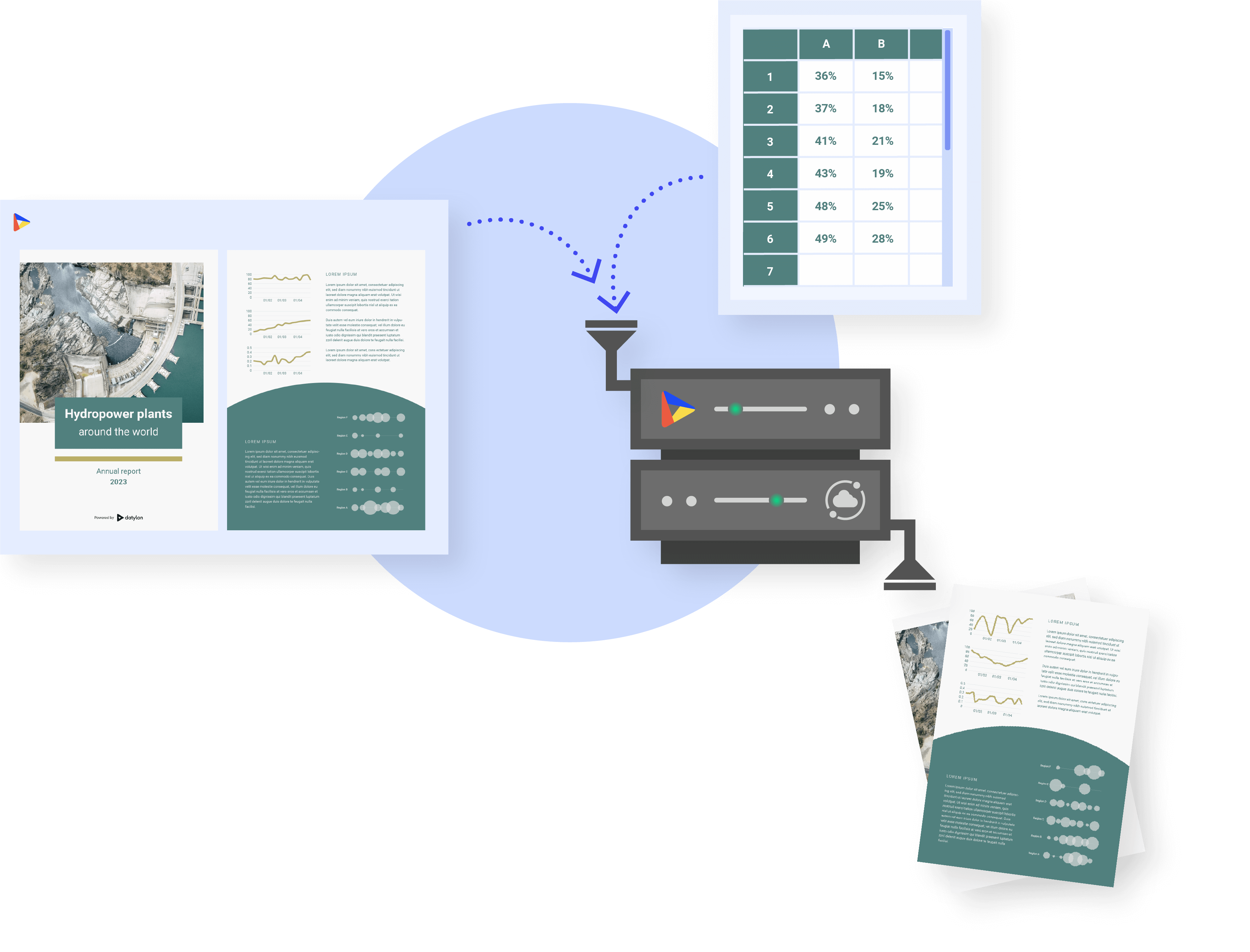
If you or your team create reports on a recurring basis, Datylon Report Server is a must-have. The manual process of turning data into beautiful visualizations can be expensive, time-consuming, and prone to mistakes. Suitable for many application areas and reporting objectives, Datylon Report Server helps you boost the creation and dissemination of reports, dashboards, survey results, data stories, infographics, or any other data-driven including multi-page data stories.
Create recurring or even personalized data-driven reports with Datylon Report Server, based on beautiful templates designed in Datylon for Illustrator. Save time and money by automating your chart and report production. Choose from on-demand or scheduled refresh intervals to fit your needs.
The cost-effective Datylon Report Server can either be implemented as a stand-alone report automation system or seamlessly embedded in your own application using the API. Check this story out if you’re curious about how effective Datylon Report Server can be. And if you’re not completely sure if it’s the right solution for your reporting needs, you can book a free demo with a dataviz and automation expert who can help you create a custom solution for you.
Pricing: it’s fully custom-tailored to your needs so it’s best to get a quote here.
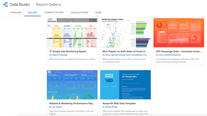
Google Data Studio
Among the wide selection of useful and free tools offered by Google, this one is quite powerful. Perhaps used mainly by marketing specialists, business owners, and agencies, Google Data Studio allows you to turn your data into fully customizable dashboards and reports. Obviously, with GDS you can easily visualize your KPIs with live data from Google Analytics or Google Ads. With some partner integrations, you can access your data from 800+ data sets from 600+ connectors.
There are many advantages of using Google Data Studio. Some of the best features include a wide range of tables, maps, and charts you can add to your report (be it a common line chart or even more advanced treemap or scatter plot), or advanced formulas such as calculated metrics and calculated fields. Besides that, you can create custom themes with your or your client’s company branding colors. The tool lets you set the whole layout (alignment, canvas size, and location of different elements). The data is always live and the visualization is easy to share with others.
Just like many other cloud-based tools from Google’s offer, Google Data Studio is completely free.
Funnel.io
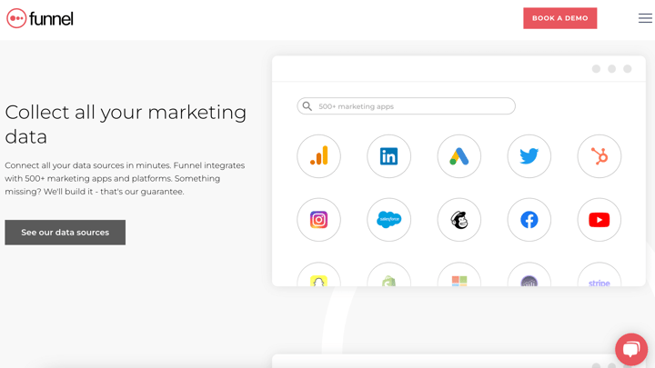
Just like Google Data Studio, Funnel is an automated cloud-based data collection and marketing report software that is aimed at marketers and business analysts. Being a marketing reporting tool that helps its users collect data from different platforms and social channels and combine them in one dashboard to meet their KPIs and goals, Funnel managed to become one of the most popular marketing analytics tools. Growing to a large, 200+ employees organization, it became a serious competitor to Google Data Studio and Supermetrics.
Pricing: being one of the most popular marketing tools it’s also quite pricy, starting at $399/month (yearly billing).
Whatagraph
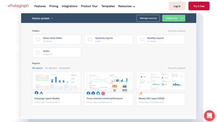
Although the name might suggest a graph maker, Whatagraph is a very handy reporting tool for all kinds of customers, from in-house marketing teams to small agencies. Think of Google Data Studio but much more sophisticated, and paid. Although Whatagraph functions similarly to Funnel.io, it is much more affordable. It works quite the same way as other marketing data visualization tools, pulling data from multiple channels (social media and website performance). It then allows you to build a really beautiful report with an easy-to-use drag-and-drop builder. The visual appeal of this very intuitive tool is actually really great.
The big advantage of Whatagraph is also the fact that the reports made with the tool are easily understood by broader audiences.
Whatagraph is nothing you haven’t seen before, though. Being a great tool that allows you even to automate the reports and business dashboards, it is missing one feature we believe is crucial in effective data visualization and data communication. And that is the ability to add annotations to your data. Currently, the reports still rely on viewers’ knowledge of the terms and graphs being used. Adding notes and comments would possibly make a difference in understanding the data.
Free version: no, but there is a free trial option.
Pricing: surprisingly affordable, it depends on the number of data sources. Prices start at $199/month (billed yearly). Interestingly, there is no monthly plan available.
Toucan Tuco
☆ Editor's choice
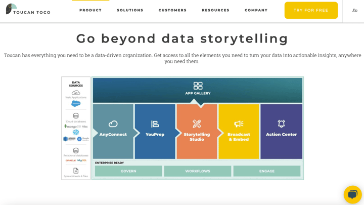
This French code-free software to build dashboard analytics applications is one-of-the-kind. Being a fully cloud-based platform, Toucan Tuco was developed with the ambitious goal of completely removing any friction between tools, data, and users. Saying it’s easy to use would be a complete understatement. Toucan Tuco has many features that make preparing data, connecting data, and building and deploying dashboards absolutely friction-free. It’s supposedly so easy that “no training is required for end-users”. A really hilarious line somewhere on the website even reads “So simple, even a CEO could do it”.
One of the things that deserve extra attention is the fact that the team behind Toucan Tuco says its offer is a Data Story builder tool. It shows their belief in the value of data storytelling and dedication to supporting the concept by adding allowing every chart to have definitions and annotations. This, in turn, helps users not only to understand the ‘what’, but also the ‘why’ of their data.
If you’re looking for a simple tool that doesn’t compromise quality and allows you to bridge the gap between data and people, look no further.
Free version: No, but you can try it for free for 15 days.
Pricing: no information about prices, you will need to request a custom quote.
4. Presentations & infographics
Canva
☆ Editor's choice
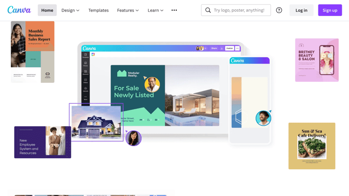
If you’ve ever had to design literally anything and you’re by no means a designer yourself, there is a big chance that you are familiar with Canva. The company revolutionized the software industry and shook it to the core by offering an excellent online graphic design tool that has so many features that you might retire before we finish listing them all. Canva can be used by literally anyone, independent of one’s skills and digital literacy. Being very intuitive and extremely easy to use, it offers anything from endless image and video stock libraries to some powerful photo editing features. With Canva, you can design logos, social media posts and banners, resumes, invoices, posters, reports, newsletters, menus, business cards, magazine and cd covers, flyers, diplomas, collages, letters and invitations, and so much more, that the list just keeps going.
Canva’s popularity and inevitable growth can be attributed to its very generous free plan.
With our focus on data visualization, we need to point out that Canva also allows you to create highly engaging infographics and presentations. This feature (like all others) comes with a great catalog of templates, fonts, files, and illustrations that can be added as you like. You can also upload your branded files, such as your own fonts, specify brand colors to be automatically applied, etc. The tool itself guides users throughout the design process, helping them to align or edit all elements. And all of this for a ridiculously low bargain price of $12.95 per month.
The presentations created with Canva can be adjusted to any size you want, they can include both images and videos, or even animations. They can be downloaded as different files or shared publicly with others via a link. Canva also offers support in printing your projects. The ever-growing library of photos, gifs, illustrations, and vector-based designs allows you to create the most captivating and on-brand infographics. The platform also offers a small selection of charts and graphs you can add to your asset, but those are pretty basic and their editing options are quite limited.
Google Slides
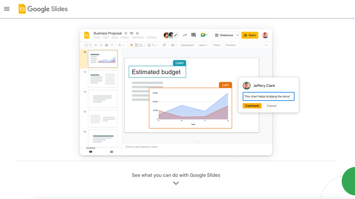
Hardly any introduction is needed for this free, web-based presentation platform offered by Google and included in its Google Docs office suite. PowerPoint’s absolute rival, Google Slides has been around for much shorter, but it grew exponentially and gained massive popularity among users from all sectors and industries. Developed with online use in mind, the tool requires minimal expertise and fully supports team collaboration. This is actually its biggest advantage, as Google Slides offers unparalleled collaboration features. Moreover, it’s definitely favorable for its affordability.
Google Slides has a sleek and recognizable interface. Besides that, it’s possible to include graphs or charts with data linked to a datasheet included in Google Sheets (another tool from the same suite). The presentation mode is really good and it offers the reader’s notes. Sharing and downloading your presentation is also very easy.
So to really summarize this presentation tool: nothing to download, nothing to install, nothing to pay, and very little to learn.
Storydoc
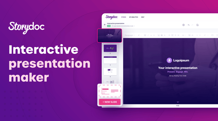
A challenger of static slides and PDFs, Storydoc is an interactive presentation maker perfect for sales teams, product marketers, and business owners. With tens of templates designed for every business use case and a user-friendly editor, you can easily create your presentations without any design skills.
Storydoc’s broad range of uses extends from simple presentations to sales decks, pitch decks, case studies, and proposals – a single online tool for all your sales and marketing collateral needs. What also brings a lot of value for B2B users is that Storydoc integrates with an array of tools, so you can capture leads or schedule calls directly from the decks you create.
There is a 14-day free trial and you can keep the presentations created forever. Paid plans start at $40 per seat/month, but with an annual subscription, you can save 25%.
Piktochart
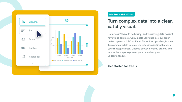
A very interesting alternative for Canva, as one can see lots of resemblance between the two. Piktochart came from Malaysia a decade ago and grew to become a go-to infographic maker catering to the same audience as Canva (marketers, business users, students, and users with no graphic design skills). In recent years, Piktochart broadened its offering and now the online tool can be used for the same purposes as its main competitor. This means not only infographics but also social media designs, email banners, presentations, etc.
The drag-and-drop tool is easy enough to use and offers a library of photos and graphics you can use in your project. Where the tool stands out is in providing the users with a video editor feature as well. One can simply upload a video (or record a screen) and edit it by adding an intro/outro, text, or images, but also add a transcript.
There is also one other thing in which Piktochart excels in comparison to Canva, and that is by giving its users an option to add better charts and graphs to their visualizations. Piktochart’s built-in charts selection is not only a little bit more impressive, but their editing options are more advanced. And if this isn’t enough, the charts are also interactive, meaning that the viewers can hover over them to get more information. Besides charts, the tool also offers pretty neat maps that can make your projects more engaging and add extra context.
There is forever free access (with some obvious limitations) and a paid subscription will cost you 29 per month. However, a yearly subscription saves you a jaw-dropping 52%.
Infogram
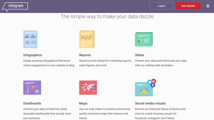
Infogram might be one of the most popular programs for building infographics. But there is more you can create with this online tool. Though, there are only a handful of types of visualizations you can create with Infogram, which is incomparably more limited than some of its competitors, such as Canva.
Drag and drop different elements in an online editor and simply add text, images, or even one of a big selection of charts. This easy-to-use user interface is accompanied by one of the smartest features out there - a dark mode of the editor, by default. Having to stare at a white screen for an extended period of time while making designs might be exhausting for the eye. Infogram by default offers a very dark background, which feels really good.
There is a built-in reusable template library which is surprisingly limited for an infographics maker. But besides that, Infogram is a really great tool to build interesting infographics, one-pagers, or even presentations. The free plan doesn’t support private projects and it is pretty limited, although still great to explore the power of the product. Paid plans start at $19/month if billed yearly or $25 if billed monthly. Fun fact: Infogram is part of Prezi, a long-standing presentation software company.
Visme
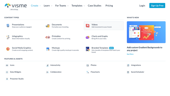
Visme is another online tool for visual content design that allows you to create anything from mockups and printables to broad data visualizations. The tool has a very nice and very easy-to-use drag-and-drop interface. If you plan to make an infographic or a presentation, you will be happy to know that Visme provides many templates and ready-to-use graphics. Changing colors and titles, adding charts and logos, you can do anything you want to engage your audience. A nice addition is a wireframe tool that might be particularly interesting to those who want to test their UX design skills.
Although there is a free (basic) plan to try the tool out, you can't even download your design and there are some template limitations. But interestingly, paid plans start at $12.25/month if you pay yearly - in which case you get 6 months for free. Now, that's a bargain!
Mind The Graph
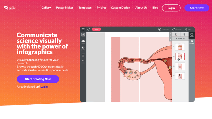
Unlike most other infographic makers catering to a broad audience, Mind the graph is a platform for students, teachers, and researchers. This is clear from the first moment you land on their website. Still, if you need a tool that will help you visualize your scientific data, look no further. Mind the graph is extremely affordable. There’s a quite limited free plan, but the paid subscription starts already at $7 per month. There are some charts and graphs you can add to your project, but the main feature is an incredible library of icons, or “scientifically accurate illustrations” for your infographic. Definitely a recommended tool for all academics who want to present their data to others.
👉If you're keen on crafting custom data visualizations, visit our Bespoke Data Visualization Solutions page.

Kosma Hess - Marketing Manager
Global citizen, world traveler, content creator, marketing specialist, can't sing to save his life. In his free time, he's mastering Datylon for Illustrator for no reason.

