(Multi-series) Bar or column chart
This is probably the most simple alternative to a dot plot. Bar charts represent values with bar length rather than relative position on a numerical axis. To replace multi-series dot plots, one can choose either a stacked or grouped bar chart, facilitating comparisons within and between categories.


Slope chart
A slope chart serves as an excellent substitute for a dumbbell chart when you want to highlight the evolution between two specific values. It's particularly effective at conveying the magnitude and direction of the difference between these two data points. Instead of relying on dots, it uses the angle of the slope itself to express this change.


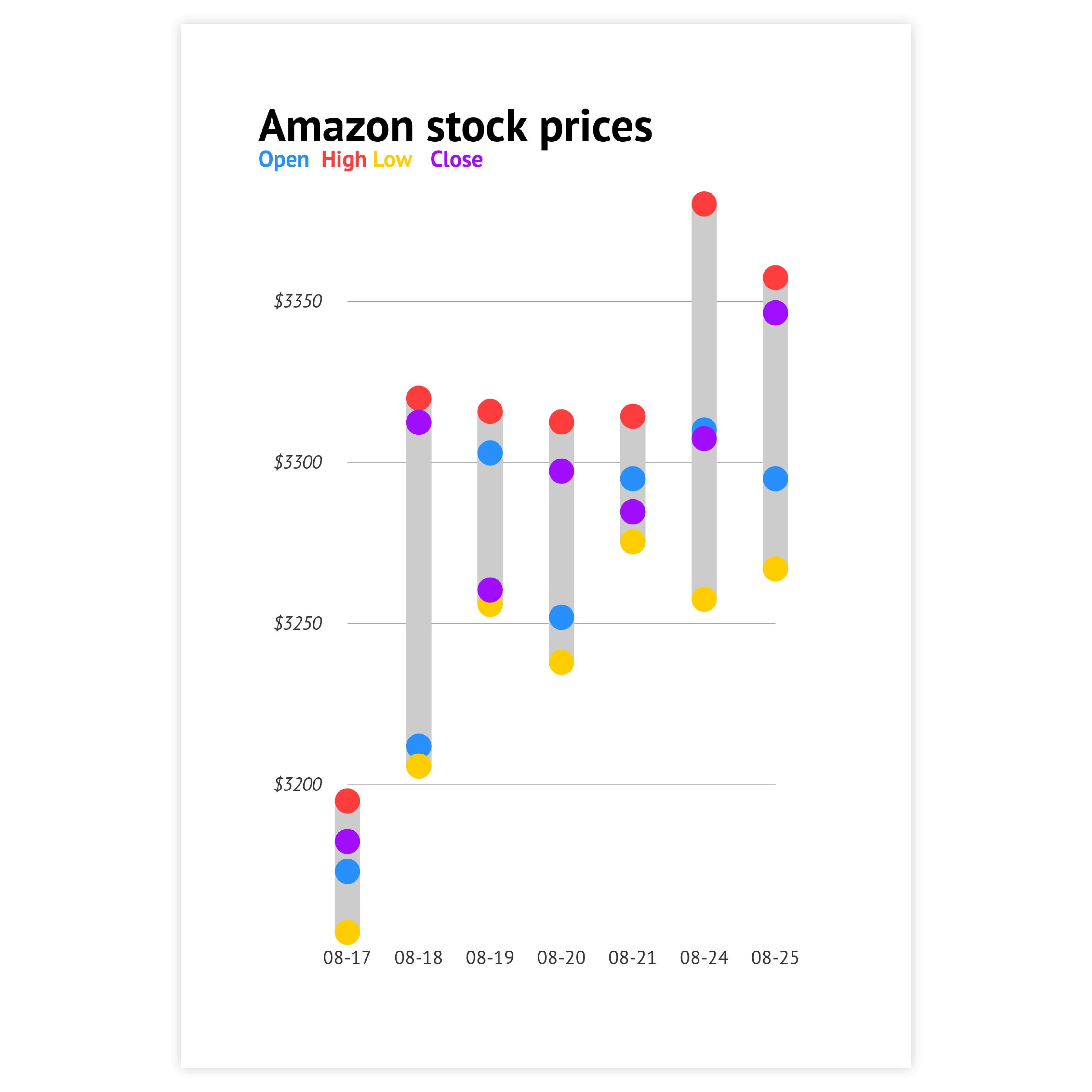
Range plot
A range chart can be used as an alternative to a two- or multi-series dot plot if it is more important to focus on the delta between two points or the range between the minimum and maximum value of multiple points. This type of chart is easy to understand and useful for presenting data to a wide audience due to its simplicity.

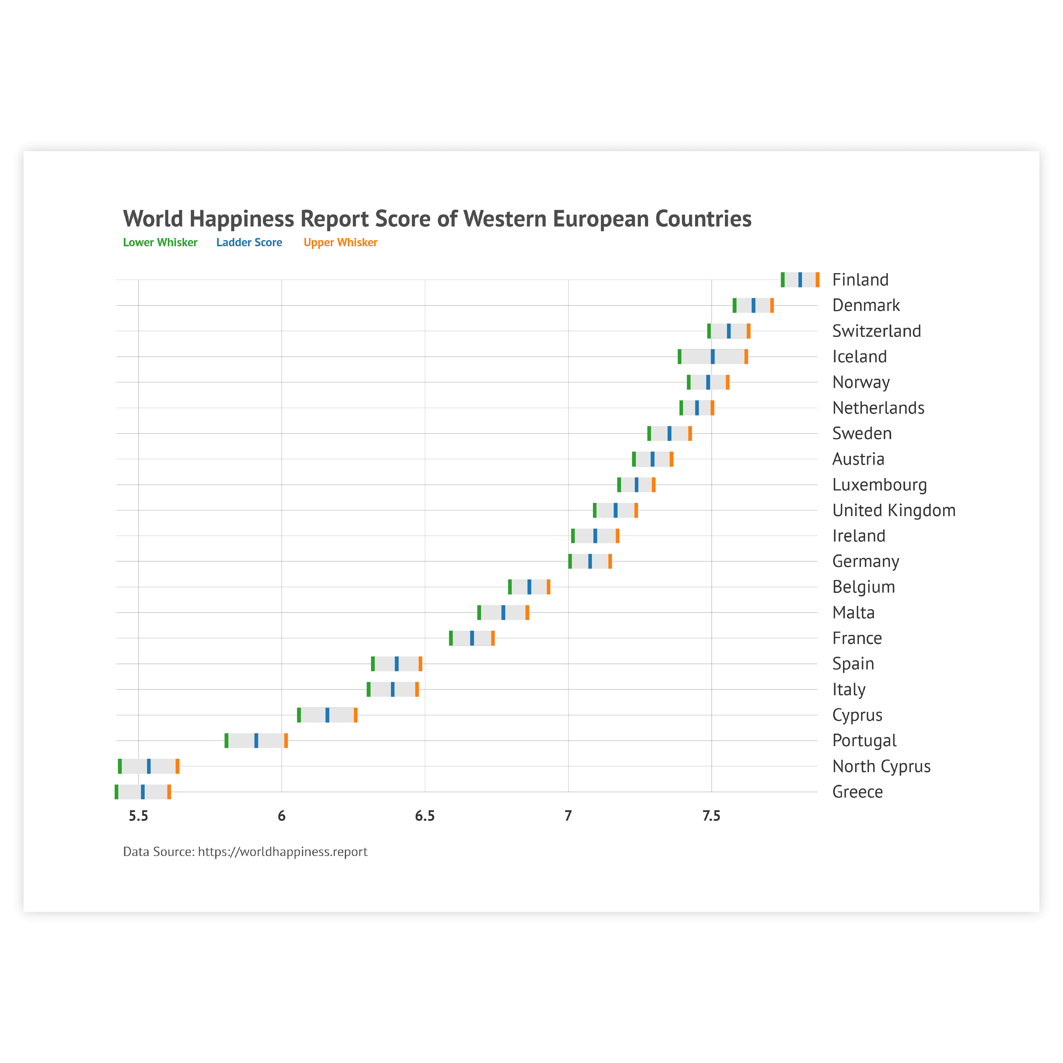
Add gridlines
Gridlines are what turns a set of barbells into an actual chart with a proper context.
Read more
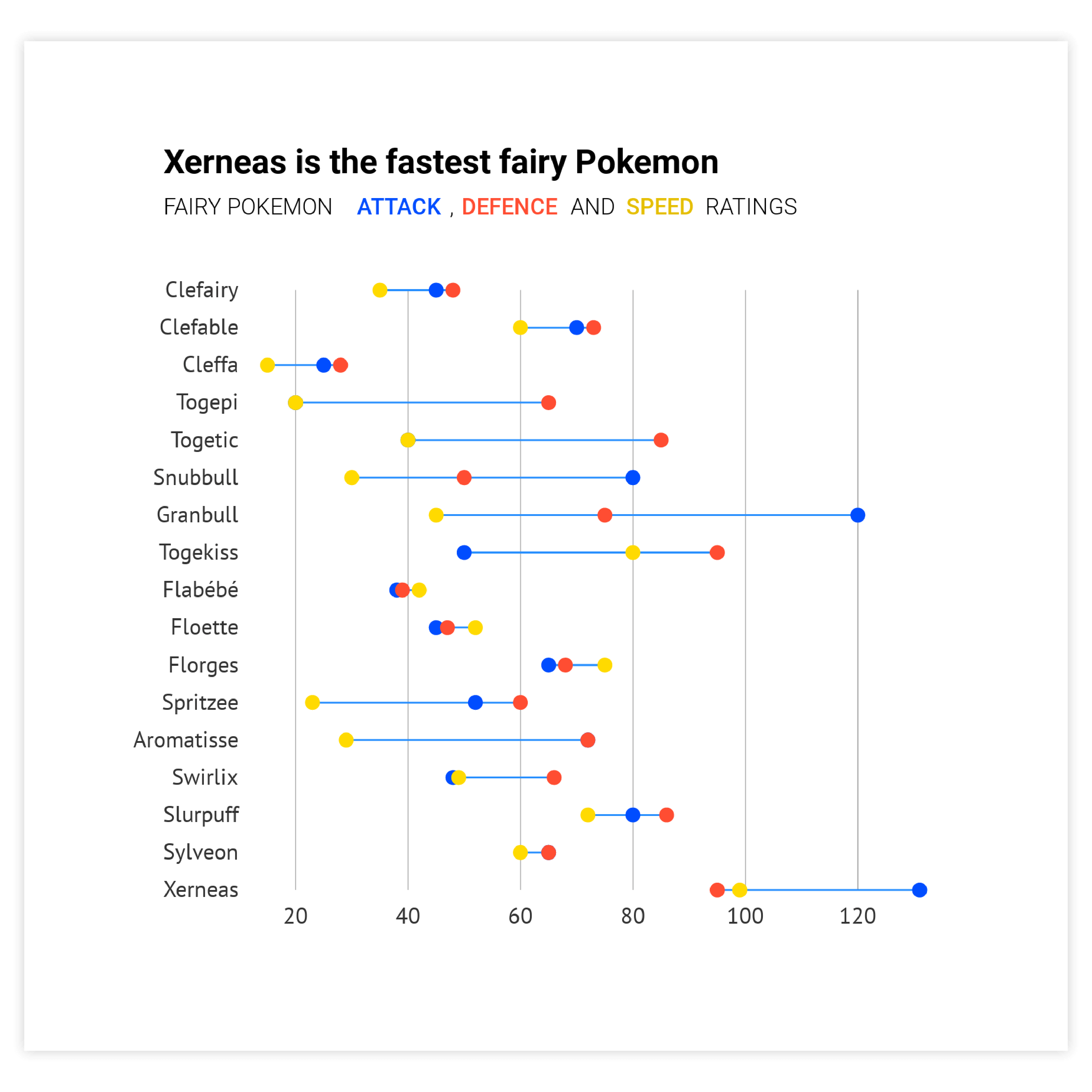
Coloring options
A dot plot can be a pretty simple chart. Its minimum pack is categorical and numerical dimensions and a fixed size mark. Color is the thing that adds the edge to this chart. It might be used to place simple accents, but it can also add a new dimension: numerical, categorical, or even time.
Read more
Sorting
Sort the categories in the data. Either based on the highest value, the lowest value, or the delta.
Read more
Combine with other charts
Combining a dot plot with another chart is a perfect choice for showing more context which may otherwise not be apparent.
Read more
Add labels
Using data labels instead of numerical axis makes the chart cleaner and gives full information about dot values.
Read more