10 dos and don’ts in report design
In my recent years working as a data visualization designer, I underwent a shift in perspective and became convinced that reports have the potential to be both informative and inspirational. By using the right design, reports can capture attention, inspire action, and facilitate the decision-making process.
In this blog article, I will report on the 10 most important DOs (and some don’ts) of report design to get the most out of your data and findings. Think lively but purposeful coloring, eye-catching and engaging (data) visualizations, and finding the story in the data to engage the reader. Let’s start with the latter.
Find the data story
Probably the most important part of designing a report is to find the story in the data. This means that you should find the key insights that emerge from the data and use them to tell a compelling narrative. To do this effectively, it’s important to first have a clear understanding of the purpose and audience of your report. What is the main question you are trying to answer, and who are you designing the report for?
Is the report meant for the general public or for a small specialized audience? Do they have basic knowledge about the subject or do they need some guidance? Which information should I include to make the information easier to understand for them?
Once you know who your audience is, you can begin to identify the most important data and visualize it in a way that supports the story you want to tell. This can best be done by using inspiring data visualizations and adding specific details to the visualizations that help you to tell the story.
A common mistake is to simply report on the data without providing any context. While it may be tempting to present the data as is, this approach can lead to confusion and make it difficult for the reader to understand the significance of the information.
Ultimately, the goal is to create a report that is not just informative, but also engaging and easy to understand. By finding the data story, you can ensure that your report communicates the most important information clearly and effectively, and helps your audience make informed decisions based on the data.
Use visualizations to engage the reader
Using visuals in a report helps to illustrate key points and communicate complex information in a more engaging and accessible way. This might involve replacing large blocks of text or tables with charts or graphs to make it easier to see trends and patterns in the data. Also adding icons or quotes to the report can make a report easier to read.
Additionally, using illustrations instead of text can help to simplify complex ideas and make them more approachable for readers. Lastly, including photos can make the report feel more personal and help to connect the reader with the subject matter on an emotional level.
Though, be careful that you don’t use too many visuals since it can overwhelm the reader and detract from the main message of the report.
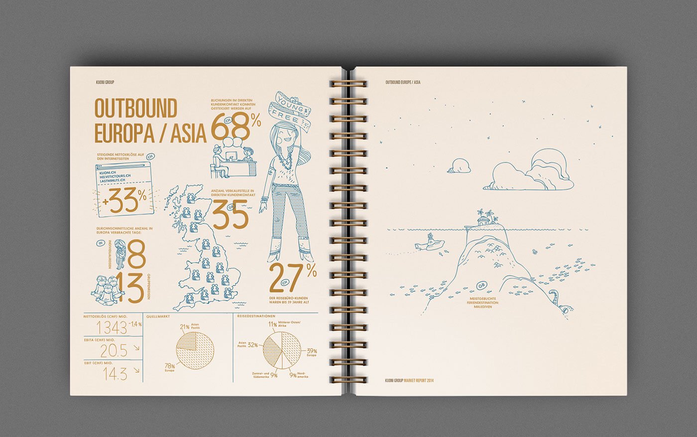
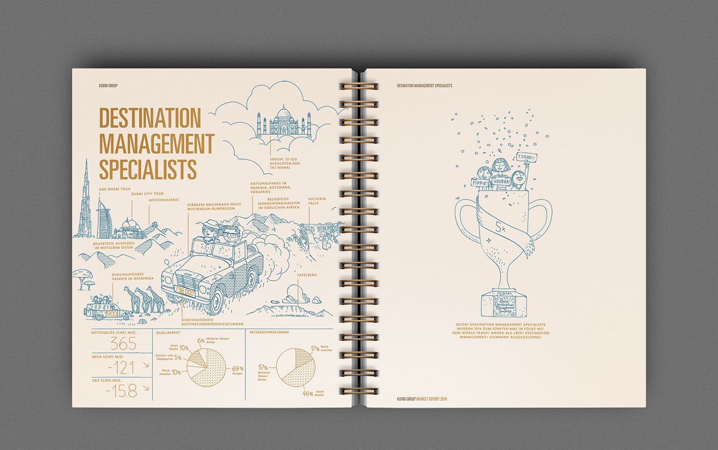 A beautiful example of using visualizations in a report, Kuoni Group 2014 Annual Report by Noord
Choose the right type of charts
Choosing the right types of data visualizations for your report is an important topic. There are many types of charts, graphs, and tables suitable for reports. When deciding on which type to choose you can think of the purpose of the report and the audience you are designing for. Also, it is very important to pick the right chart for the data you are working with.
If the report is intended to provide a quick overview of data, a simple bar chart or table might be suitable. However, if the report is meant to tell a story or provide more in-depth insights, more creative visualizations may be necessary to effectively convey the information.
Moreover, consider the knowledge level and preferences of your audience. More creative and sophisticated visualizations may be appropriate if your audience is familiar with complex data visualizations.
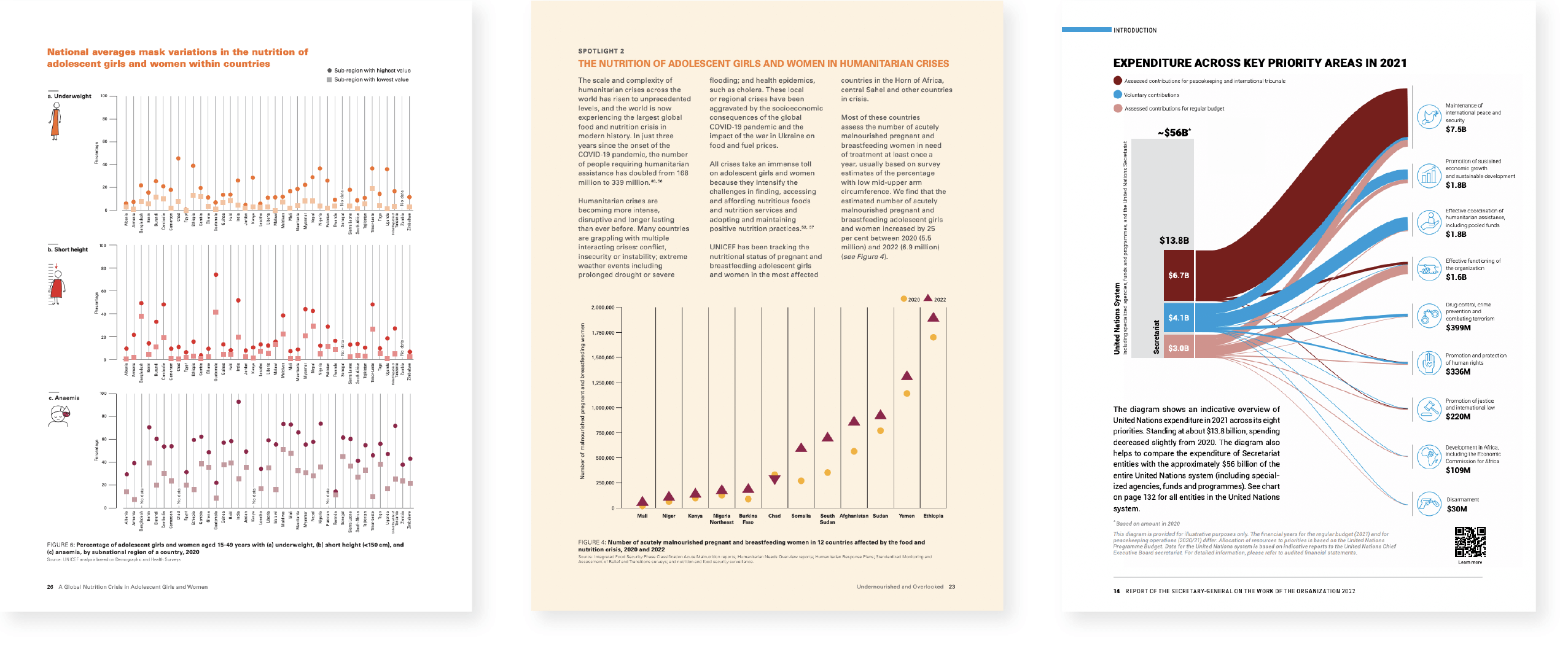 Examples of sophisticated visualizations for a report, Unicef report: Undernousihes and overlooked, United Nations Annual Report 2022
However, if your audience is not as familiar with data visualizations, simpler visualizations like bar charts, pie charts, and line charts may be more appropriate. Though, be careful that you don’t end up using only bar charts in the report. Adding some variety to the data visualizations makes the report engaging and inspiring.
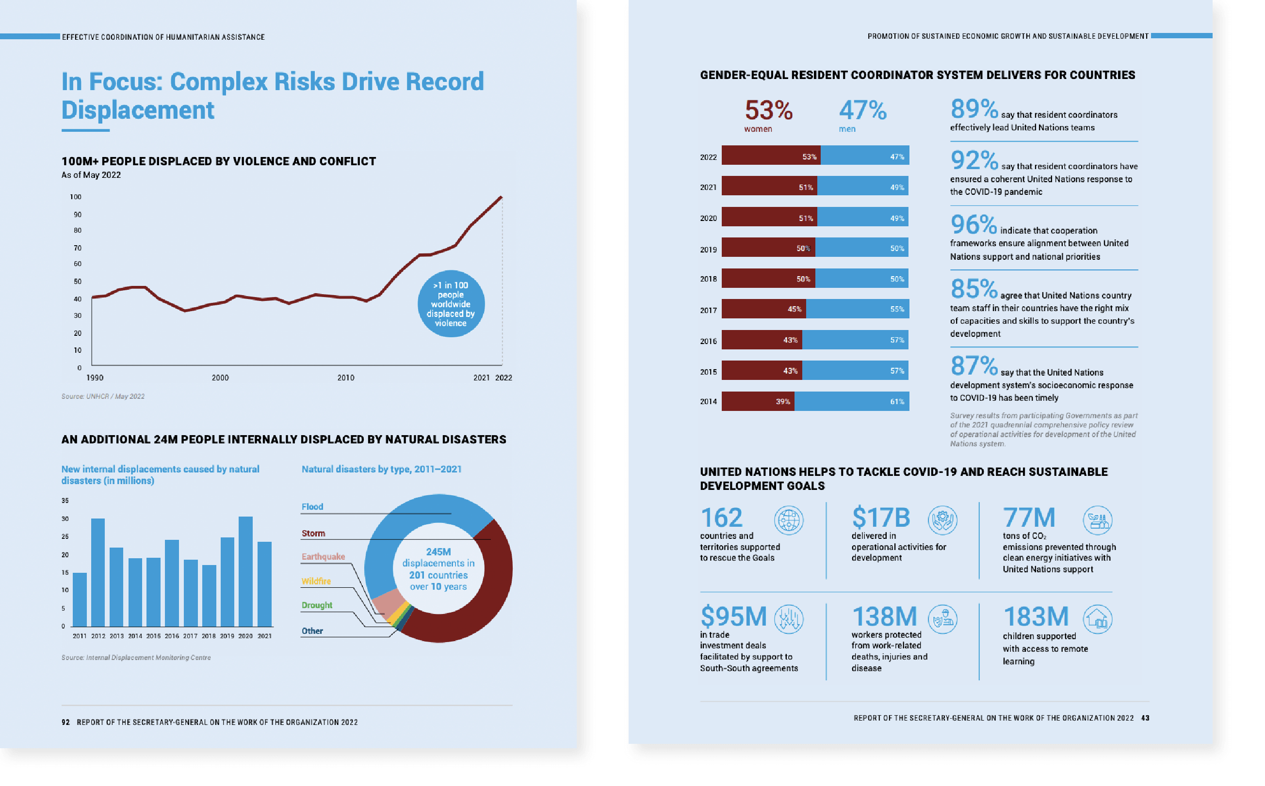 Example of simple and familiar charts for a report, United Nations Annual Report 2022
Design for readability
Design for readability is a critical aspect of report design, and it involves several key elements, including font type, font size, number of lines per paragraph, layout, the hierarchy of design, white space, consistency, and accessibility.
Fonts
Firstly, font type and font size play a crucial role in ensuring that a report is easy to read. Sans-serif fonts such as Arial or Helvetica are often used in report design as they are clean and easy to read. The size of the font should be appropriate, with the recommended size being between 10-12 points for body text.
The number of lines per paragraph
The number of lines per paragraph is also essential for readability. A good rule of thumb is to keep paragraphs to no more than 6-8 lines, as this helps to break up the text and make it more scannable for the reader.
Layout
Another choice you are facing when designing a report is choosing the layout for the report. Two commonly used formats are slide format and standard A4 format. Slide format is concise and visually appealing, suited for business reports, presentations, and discussions. It encourages brevity and focuses on key points. In contrast, the A4 format provides ample space for detailed analysis, supporting data, and visualizations. It is ideal for in-depth reading and study. The choice depends on the purpose, audience, and context of the report: slide format for dynamic presentations and A4 format for comprehensive analysis and documentation.
The second choice with regard to layout is the number of columns. A one-column layout makes it easier to read the report as there is a clear visual flow and it provides more space for visual elements such as data visualizations. Though, for longer documents, it may require more scrolling or flipping through pages. On the other hand, a two-column layout makes efficient use of space, allowing for more content to be presented on each page. Moreover, this type of layout makes it easier to add visual breaks and group information. But the biggest disadvantage is less space for (data) visualizations, which can make the report less engaging.
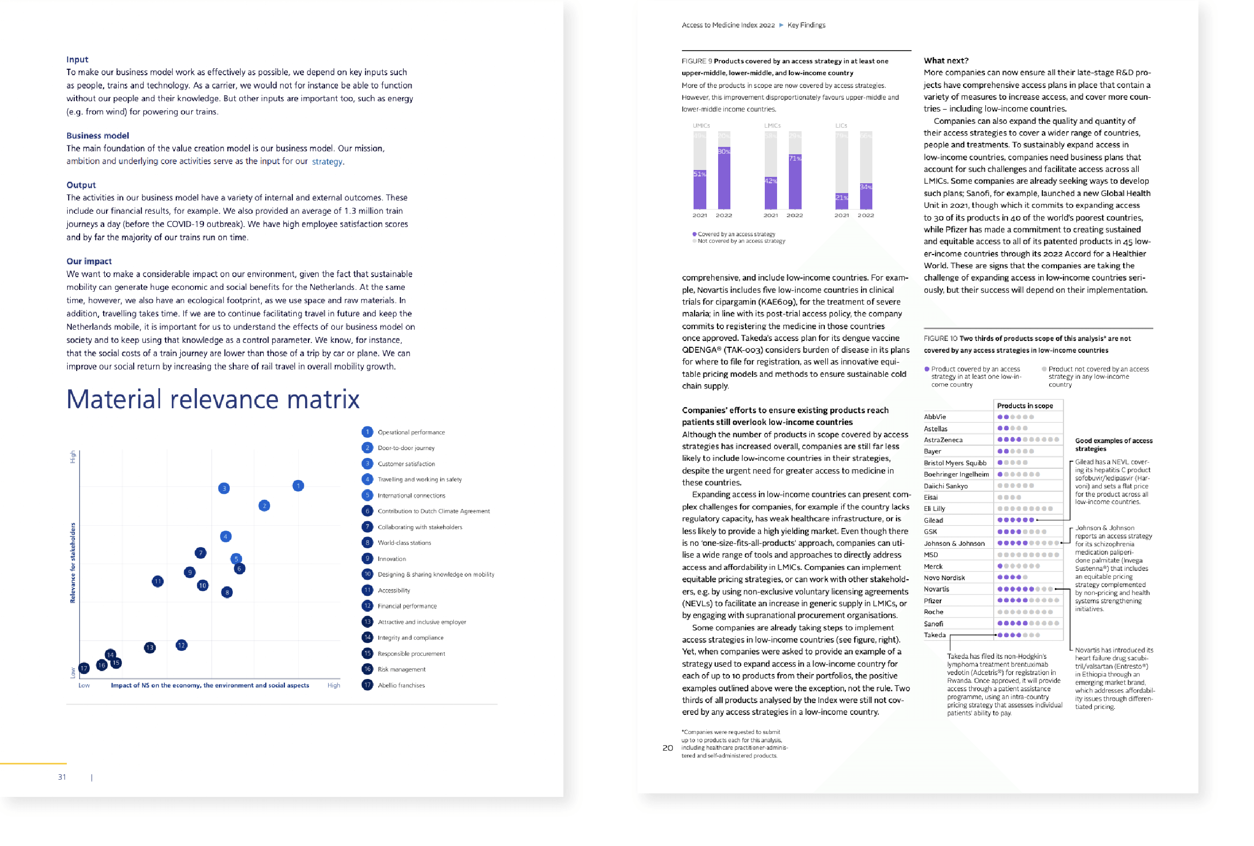 Examples of a one-column layout (left) and a two-column layout (right), NS Annual Report 2021, Access to Medicine Report 2022
Ultimately, the choice between a slide format and A4 and a one-column or two-column layout will depend on the specific needs and goals of the report, as well as the preferences and habits of the intended audience. It's important to consider all of these factors when making design decisions to ensure that the report is effective and engaging for its intended purpose.
Hierarchy of the design
Hierarchy is a key element of effective report design. It involves the use of visual cues such as typography, color, and layout to create a sense of importance and structure within the report. By establishing a clear hierarchy, the designer can guide the reader through the report and help them to understand the most important information. The use of headings and subheadings, for example, can help to break up the text into sections and provide a clear structure to the report. Larger fonts, bold or italicized text, and contrasting colors can also be used to create a visual hierarchy and draw attention to important information. Also, adding a table of content can help in guiding the reader through the hierarchy of the report.
Though, always be careful not to overwhelm the reader by using too many colors, font types, and sizes. In the next visual I show you an example of a report page where too many differences in font types, font sizes, colors, headings, subheadings, and visuals make it difficult to find a hierarchy. You probably notice that your eyes are crossing the page from left to right and from top to bottom because there is no clear focal point.
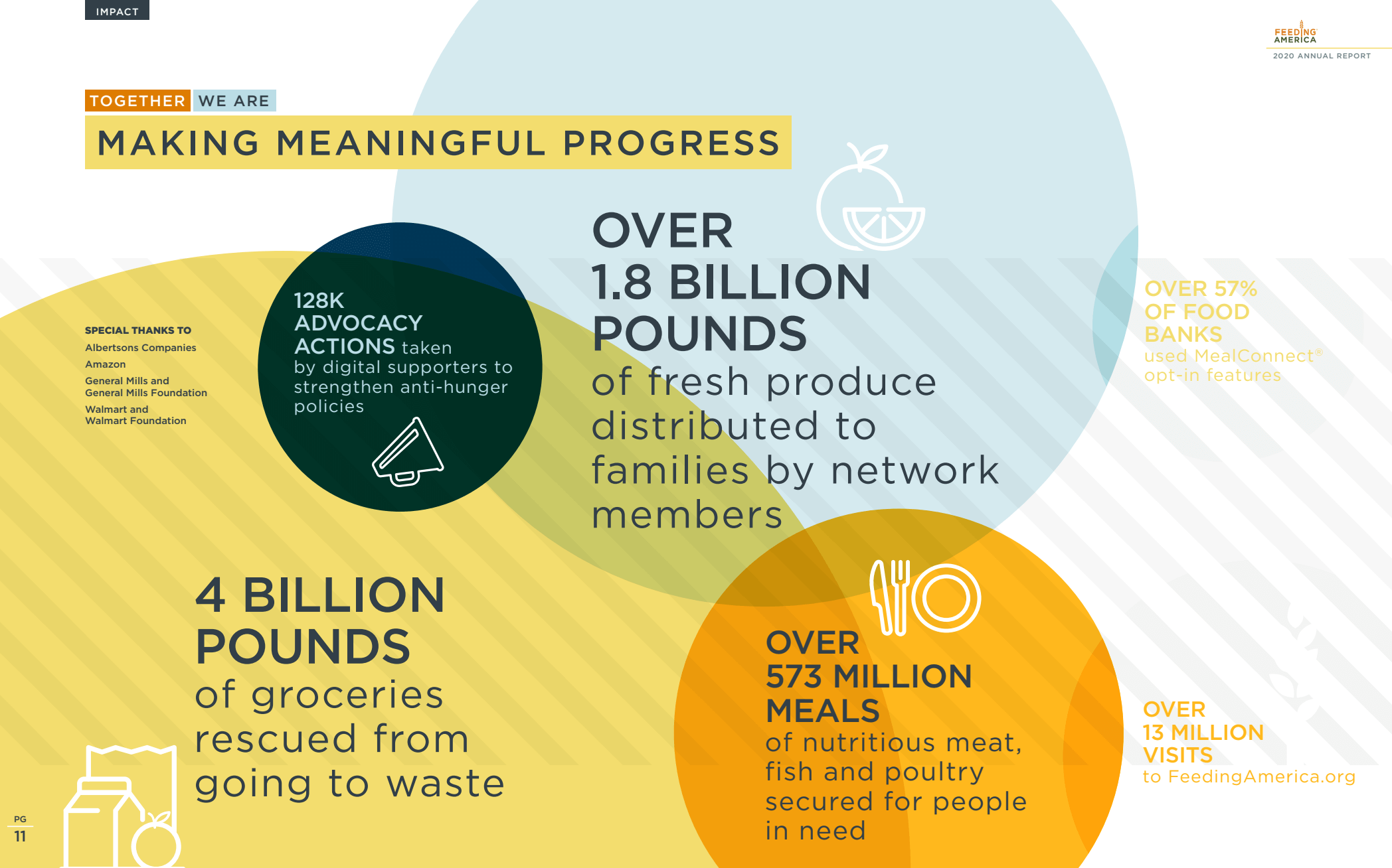 Example of a report page with different types of hierarchy, Annual Impact Report Feeding America 2020
Breathing Room
Adding breathing room or white space to a report is also crucial for readability. The breathing room, or the area of a design that is left blank (not necessarily white), helps to create a sense of balance and clarity in the design. It also helps to break up the text and make it more scannable for the reader. This can be done by adding breathing room around texts and visuals but also by using large margins on the top, bottom, and sides of the report.
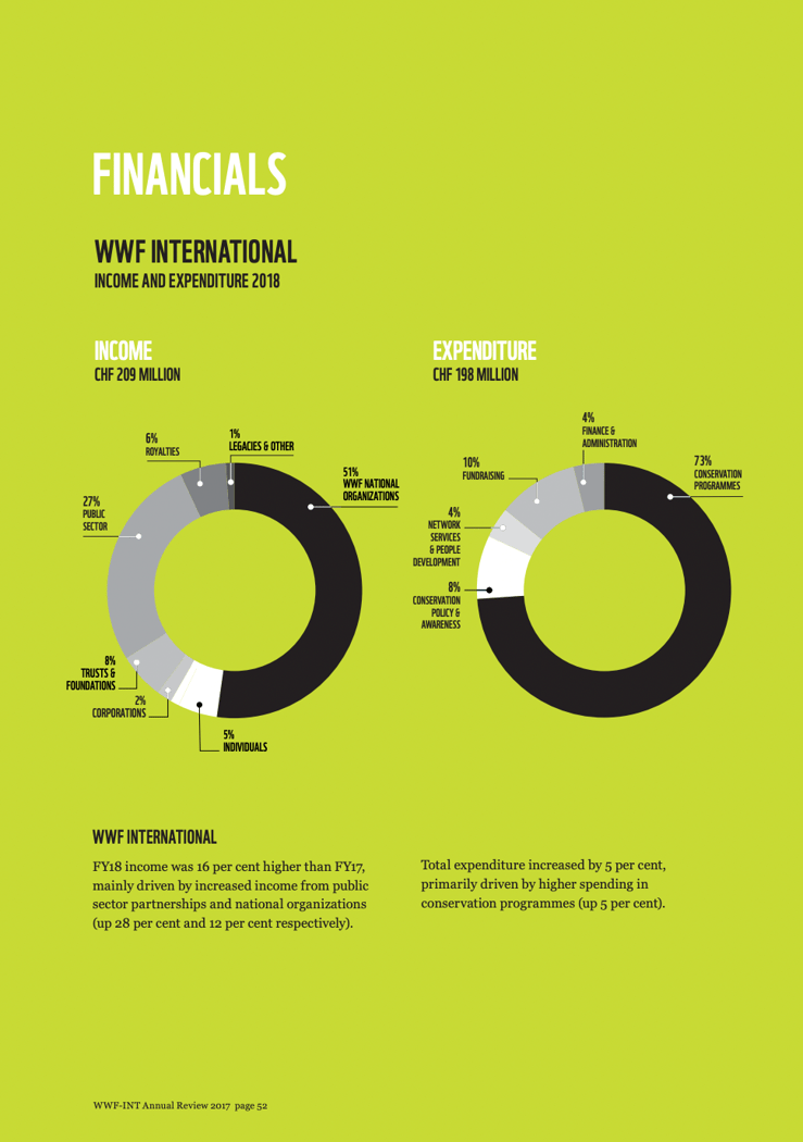 Example of using breathing room in a report, that is not necessarily white, Annual Review WWF 2018
Consistency
Sixthly, consistency in design is also essential for readability. Consistency in font type, font size, and color palette helps to create a cohesive and professional look for the report. This consistency also makes it easier for the reader to navigate the report.
The same holds for the data visualizations in the report; use the same colors for categories throughout the whole document and use the same style for all of the charts to make it cohesive.
In the next visual I show you on the left an example of two charts of one report that are totally in line with each other; the style of both the charts is the same and the colors used for the categories are synchronized. Though, in the same report another chart on another page shows the same categories but with different colors, as illustrated on the right side of the visual. This makes it harder for the reader to interpret the chart fastly.
 Example of using (no) consistent colors in a chart, Greenhouse gas emissions in the Netherlands 1990–2021 National Inventory Report 2023
Accessibility
Finally, it's important to consider accessibility when focusing on the readability of a report. This includes making sure that the report is comprehensible for all readers, including those with disabilities. You can establish this by using a clear font type and size, providing alternative text for images, and ensuring that the colors are sufficient for readers with color blindness.
Use annotations
A good way to tell the story of the data is by adding annotations to the visualizations, tables, and charts. Whether you are designing for a big audience and want to give more context to the data, or you are designing for a decision-maker and want to add more details, annotation is a good way to accomplish this.
At Datylon we find using annotations very important, as it helps in data communication. This is also why it is really easy to create them with our Datylon plug-in for Illustrator.
Annotations are a powerful tool to highlight important data points, draw attention to specific trends or patterns, or provide additional information to help viewers interpret the data. For example, you might use annotations to label specific data points on a chart or add explanatory text to a chart. Annotations can also be used to provide visual cues to draw the reader’s attention to particular points in the visualization.
Annotations give the viewers context. For example, sometimes there is a confounding variable at work in the data which makes your data visualization spike at some point. Without annotations, the viewer could possibly make misguided interpretations and decisions based on this.
An example of a way to use annotations is shown in the next visualization of the Access to Medicine Report 2022. Here they used annotations to draw attention to some of the categories and give some more details about some of the products.
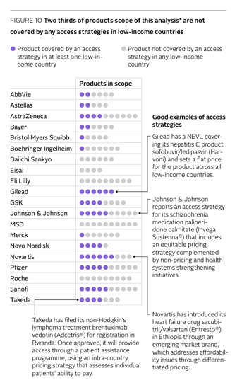 Example of using annotations in a report, Access to Medicine Report 2022
Be selective about the information you include
When it comes to designing a report, it's crucial to be selective about the information that you include to avoid overwhelming the reader. Including too much information can make the report difficult to read and digest, potentially causing the reader to lose interest. Instead, it's important to focus on the most critical information and present it in a clear and concise manner.
Using data visualization techniques, such as charts and graphs, can help to condense complex information into a more accessible format. Overall, being selective about the information included in a report is essential to ensure that the reader can easily understand and act upon the information presented.
Another way to avoid overwhelming the reader is by placing detailed text blocks, tables, and charts in the appendix at the end of the report. This gives the reader the choice to only read the most important information in the body of your report or to dig deeper into the details at the end of the report.
Use colors purposefully
Using colors purposefully is a critical element of effective report design. As already described earlier, using color can help in the hierarchy and consistency of the report design.
Using branding colors in the design creates a cohesive and consistent look and feel that reinforces the organization's visual identity. Using colors to highlight the most important information in the report and in data visualizations is important for the hierarchy in the design. This might involve using bright, bold colors to draw attention to key data points or trends, and using more muted tones to indicate less significant information.
Finally, a way to incorporate and make use of coloring in reports is by using colored backgrounds for some parts of the report. This is useful for chunking the information and making it easier for readers to digest the information in the report. Or otherwise, color blocks or backgrounds can be useful to show extra context or information about the subject.
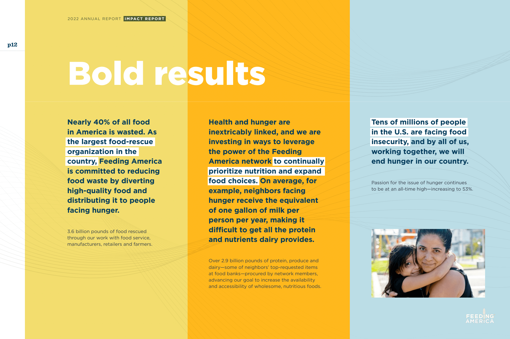
Example of using colored blocks in a report to chunk the information, Annual Impact Report Feeding America
It’s also good to take into account that, using too many different colors can create a confusing or chaotic visual experience while using too few can make the report feel dull or unengaging. Additionally, using colors that clash or are difficult to read can make the report harder to understand. By using colors purposefully and thoughtfully, you can create a report that is visually engaging, easy to read, and reinforces the key insights and trends revealed by the data.
Use the right tool
Choosing the right tool for report design is crucial for creating high-quality, visually appealing reports. Some of the most common software for report design include Microsoft Word, Excel, and PowerPoint, Adobe Indesign and Illustrator, Google Docs, and Canva. Each tool has its own advantages and disadvantages, depending on the project's requirements and the user's level of experience.
At Datylon we firmly believe that designing visually appealing and impactful reports should be achievable in a simple, efficient, and timely manner. The Adobe Creative Suite including Adobe Indesign and Adobe Illustrator are perfect tools to design a beautiful report. But there’s one particular thing that is missing – a powerful charting tool.
Due to the growing need for smarter dataviz solutions within Illustrator, i.e. report design, we developed Datylon for Illustrator. It’s the only plug-in that allows you to create perfectly customized reusable charts for your reports. It comes with numerous styling options and it works perfectly in the Illustrator workflow - truly, the best of both worlds. It works seamlessly with InDesign; for extensive paginated reports, import your Datylon charts in InDesign while keeping those charts up to date in Illustrator. With this tool, we were able to address the limitations of Adobe Illustrator's built-in graph tool.
Using the right tool is not only important for creating a report, but it is as important if you are interested in sharing your data story easily and effectively. So think about it the moment you start designing your report.
With the Datylon for Illustrator plug-in, we made it very easy to share a report with a broad audience or within an organization. The documents can be exported as SVG, PNG, or PDF, which makes it easy to import them into Powerpoint, Google Slides, or other tools. It is also possible to embed them in external apps and websites.
Moreover, many reports are still printed to reach the right audience. Therefore, it is good to already think about this aspect the moment you start. It is important you design your report in CMYK color mode to make sure your on-brand colors are printed accurately. The Datylon for Illustrator plug-in also supports CMYK color mode enabling on-brand color consistency for printing.
Use report templates
Using templates in report design can be an excellent way to save time and ensure a consistent, professional look across multiple reports. Beautiful templates can also make the design of the report more engaging and visually appealing. You can find a lot of beautifully designed report templates online for you to use. Though, wouldn’t it be nice if you can reuse these report templates when you have new data?
With the Datylon for Illustrator plug-in, designers can create data-rich report templates without creative limitations. These templates can then be uploaded to the online Datylon Report Studio, where users can make a new report with just one click by importing data from a file or linking to an online data source. By using templates this way, designers can focus on creating impactful content and let the tool handle the formatting, resulting in reports that are both visually stunning and informative.
Even more effortless is using the Datylon Report Server. With the Datylon Report Server it is possible to automate the production of your periodic and personalized reports or to embed reporting into your own application.
Curious about automated reporting? Explore our dedicated blog article or schedule a personalized demo with one of our experts.
Include a beautiful front page and (visual) summary
Beautiful front page
Creating a beautiful front page for a report can have numerous benefits. The front page is the first thing that the reader sees, and as such, it should be visually appealing and reflective of the overall content of the report. By creating a beautiful front page, designers can draw the reader in and encourage them to read on.
Additionally, a well-designed front page can help to establish the report's tone and purpose, making it clear to the reader what they can expect to learn. Finally, a professional and visually pleasing front page can lend credibility to the report and the organization that produced it, building trust with the reader.
Overall, creating a beautiful front page is a simple yet effective way to make a great first impression and ensure that the reader is engaged and motivated to read on.
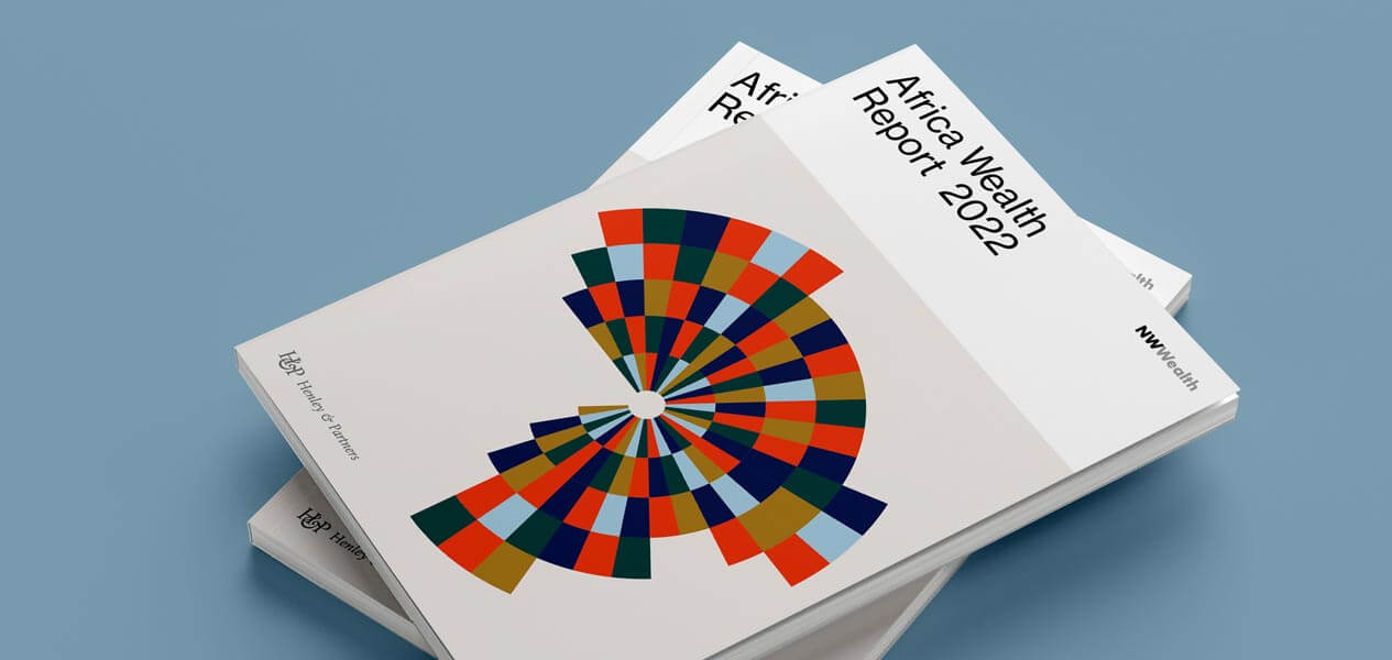 Beautiful cover of Africa Wealth Report 2022
(Visual) summary
Including a summary in a report is essential to ensure that the reader fully understands the key takeaways and implications of the information presented. To make this summary more engaging and easier to digest, it can be helpful to use visuals, such as charts or graphs, to highlight the most important data points and trends. This can help the reader to quickly and easily understand the main message of the report. Additionally, using visual summaries can be an effective way to emphasize the significance of the information presented, making it more memorable and impactful.
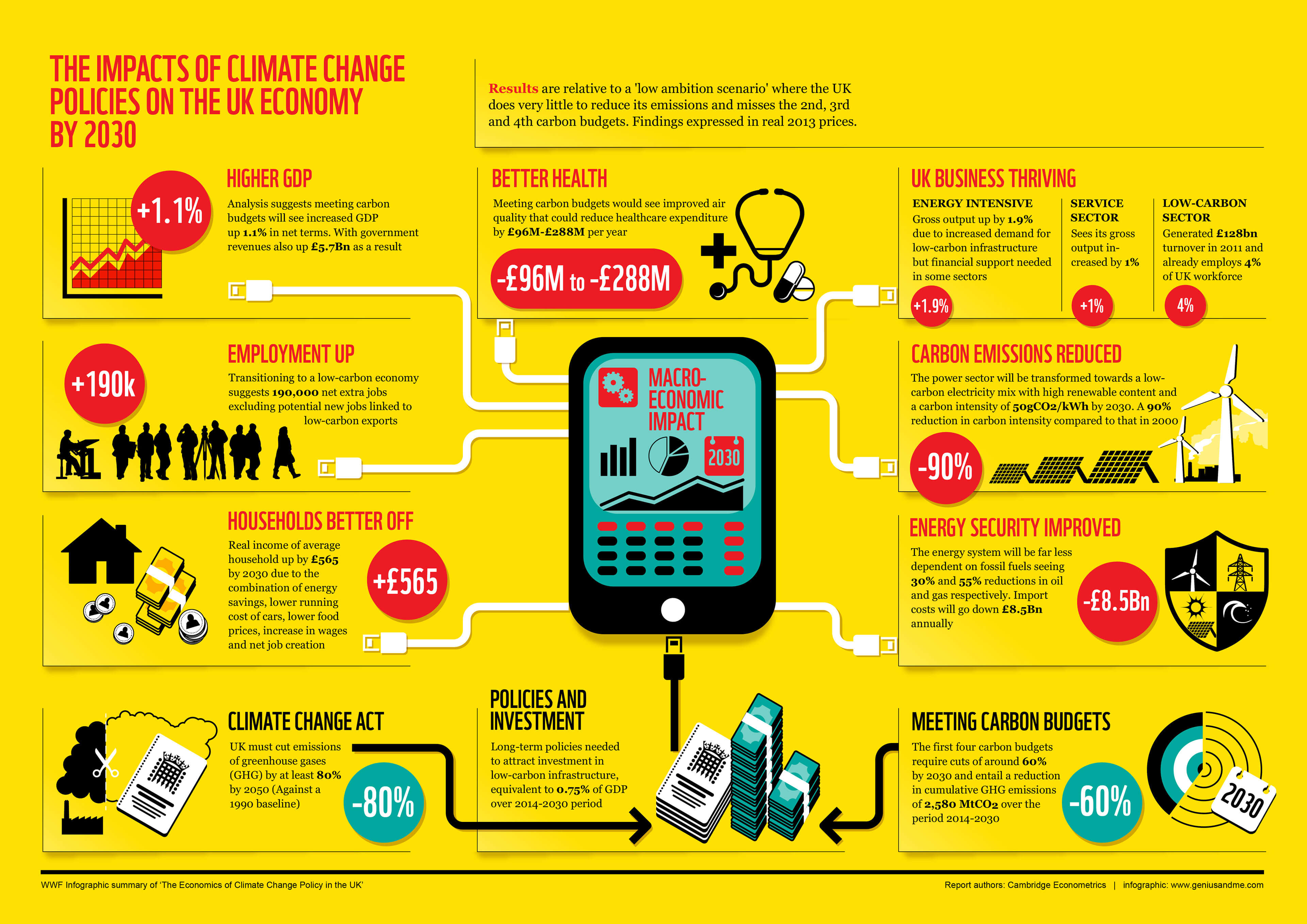 Example of a visual summary, WWF Infographic summary of “The Economics of Climate Change Policy in the UK” by Paul Weston
👉If you're keen on crafting custom data visualizations, visit our Bespoke Data Visualization Solutions page.
Further reading & resources

Dieuwertje van Dijk - Data Visualization Designer
Data, graphic design, illustration, food and mountains let her dopamine neurons spark on a daily basis. Most of the year she lives in Georgia where she spends her free time enjoying nature in a rooftop tent, eating khinkali and drinking wine.


