
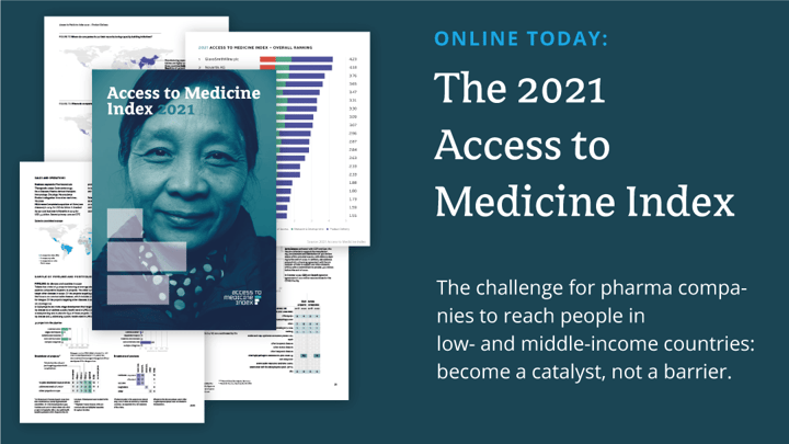
The 2021 Access to Medicine Index report was published early last year and got a lot of worldwide media attention. It has over 250 donut, bar or column charts, and heatmaps which had to be delivered or published in multiple formats. Quite a nice challenge for the Netherlands-based Klaas van der Veen from Explanation Design.
Introduction
Klaas van der Veen is the owner of Explanation Design in The Netherlands. He helps knowledge-driven organizations to make their expert content more accessible and easier to understand for a wider public. As a well-versed information designer, he develops the story, creates structure & style, and develops engaging illustrations or visualizations to improve the overall readability. All with the final objective to create broader support for positive action.
One of Klaas’ customers is the Access to Medicine Foundation, a non-profit organization that stimulates and guides the pharmaceutical industry to do more for people living in low- and middle-income countries. Klaas worked with them on one of their key tools, the 2021 edition of the biennial Access to Medicine Index.
Challenge
The 2021 Access to Medicine Index report with over 250 donut, bar or column charts, and heatmaps had to be delivered or published in multiple formats: a complete report in pdf, individual charts in SVG file for the website, individual charts in PNG file for email & third party use, and possibly later a print version of the report.
In this project, the workflow was particularly important. Over 15 researchers were involved in compiling the data. The data as well as the insights kept evolving during the whole report design & production process.
Klaas needed the right tool to create charts & graphs while being able to keep on working in Adobe Illustrator & Adobe Indesign for the rest of the design & layout work. He also needed to be able to continuously update charts & graphs with new data without losing any design efforts.
Solution
Klaas already used Datylon for Illustrator for other customers and was very glad he could now work with the tool for this project. Datylon for Illustrator is a very powerful chart design & production tool right within Illustrator, but there were three main areas that made the difference:
Linked data for easy updating
When working on the designs and layouts of the charts, there were various iterations, for various reasons, to come to the final look & feel. In parallel, the data and insights from the researchers were evolving and impacting the data visualizations until the end of the production process.
With Datylon for Illustrator, the source data remains linked to the charts during the complete workflow. This gave Klaas the freedom to keep on updating chart designs and the report layout in Adobe Indesign in a very easy and flexible way while staying productive. A tremendous advantage and time saver when the data of your report changes a lot and you are working in a very agile way with the data analysts.
Extensive styling features
Details are important. As a designer, Klaas wanted to be able to style the charts with the highest level of detail. Making his own design decisions and customizing the design for this specific project of the Access to Medicine Foundation. He also wanted to ensure the optimal readability of the report with an attractive, clear, and consistent layout to share the insights.
All design or styling features that matter are at hand in Datylon for Illustrator. Klaas carefully chose the appropriate chart types and styled all the chart elements such as axes, axis labels, colors, font types, annotations, and so on, just as he wanted it. And, of course, apply them consistently across the 250+ graphs in the report.
A productive, time-saving workflow
The Access to Medicine Index 2021 report and its individual graphs had to be delivered or published in multiple formats for different channels such as press, pdf, web, social, and possibly later print. Keeping it all organized as well as ensuring design consistency and data correctness across all formats were major tasks for Klaas in this project.
You can store all charts made with Datylon (including the different output formats) in one single Illustrator document while keeping the charts linked to the source data. Updating the 250+ graphs across all its formats with a new data set becomes just a matter of one click. This saves a lot of time, but also it results in a flawless report.
For this complex project, with 200+ pages, Klaas managed the whole report design and production workflow. However, other customers with smaller, but recurring reports, may want to do data updates and produce their reporting more independently from the design team or agency. In that instance, the combination of Datylon for Illustrator together with the Datylon Report Studio offers an easy solution to work together. Klaas can focus on his core expertise of designing impactful charts or data visualizations, while other people manage the rest of the process from creating variations, and doing data updates to producing multiple output formats for different channels.
As data and designs stay linked throughout the workflow, Datylon for Illustrator is a huge time saver when the data of your report evolves a lot.
Conclusion
When creating data-rich reports it is essential to have full freedom of design to ensure optimal readability for your audience, while staying productive at the same time.
With Datylon for Illustrator, you can benefit from:
- Powerful styling features to create on-brand chart templates that can be efficiently reused across the complete report.
- Seamless integration with Adobe InDesign, so that charts updated in Datylon for Illustrator are automatically updated in the report layout in InDesign.
- Efficient data management. Source data remains linked to the charts during the complete workflow, ensuring data updates with just one click.
- An easy and efficient workflow from design to production, with multiple output options including print.
Looking to take your chart or report production workflow even further? With the Datylon Report Server, you can automate the generation of charts and reports—perfect for recurring publications. Curious how it works? Book a demo with our team.