


Geographical heatmap
If there is a spatial dimension to your data, you can add a color layer to a map. This way, geographical heatmaps can be used to show anything from population density and distribution to weather patterns and the prevalence of diseases in certain regions.


Choropleth map
While it may appear similar to a geographical heatmap, the two display data differently. In choropleth maps, regions are colored according to geographic or artificial boundaries and represent a proportional value, such as an average, for the delineated area.


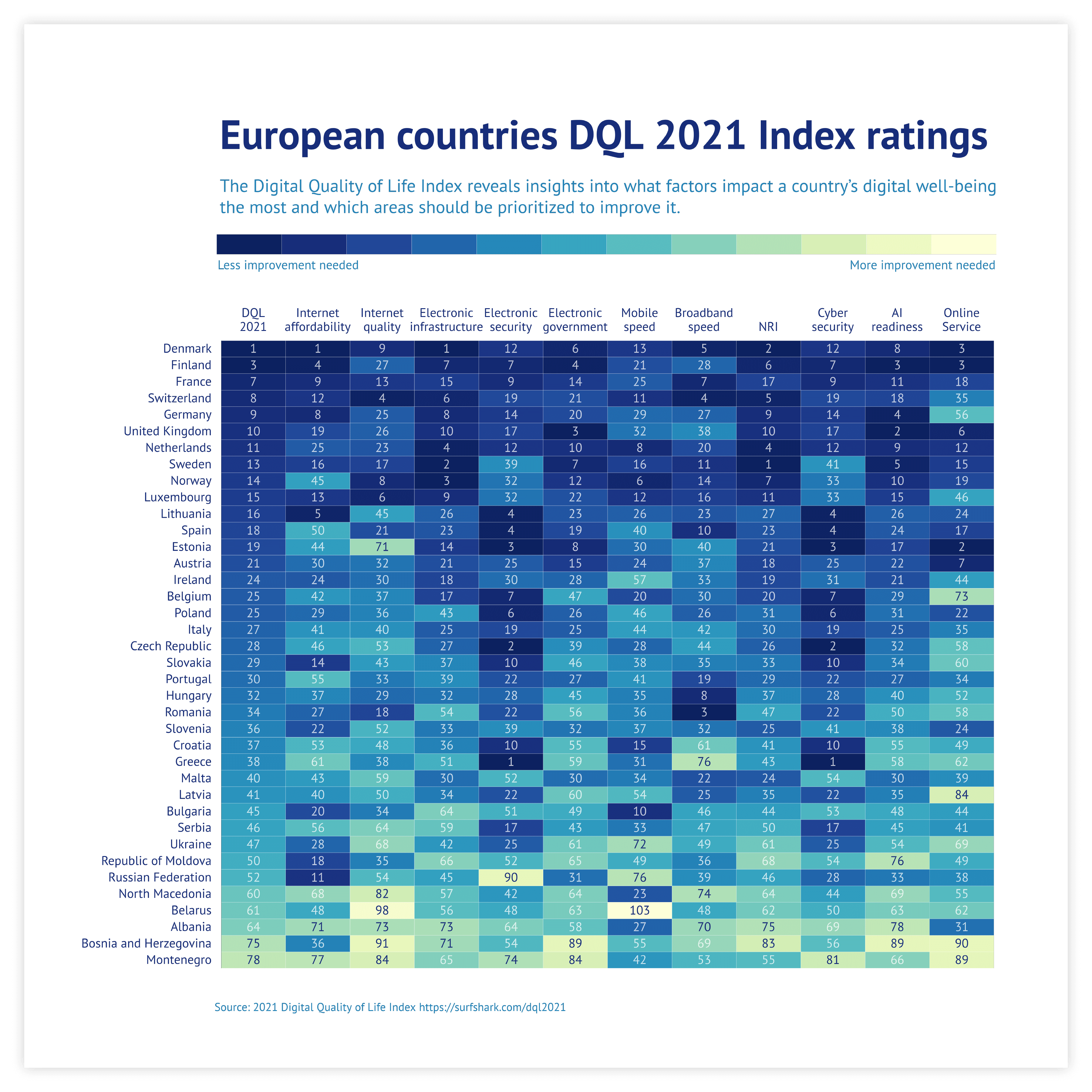
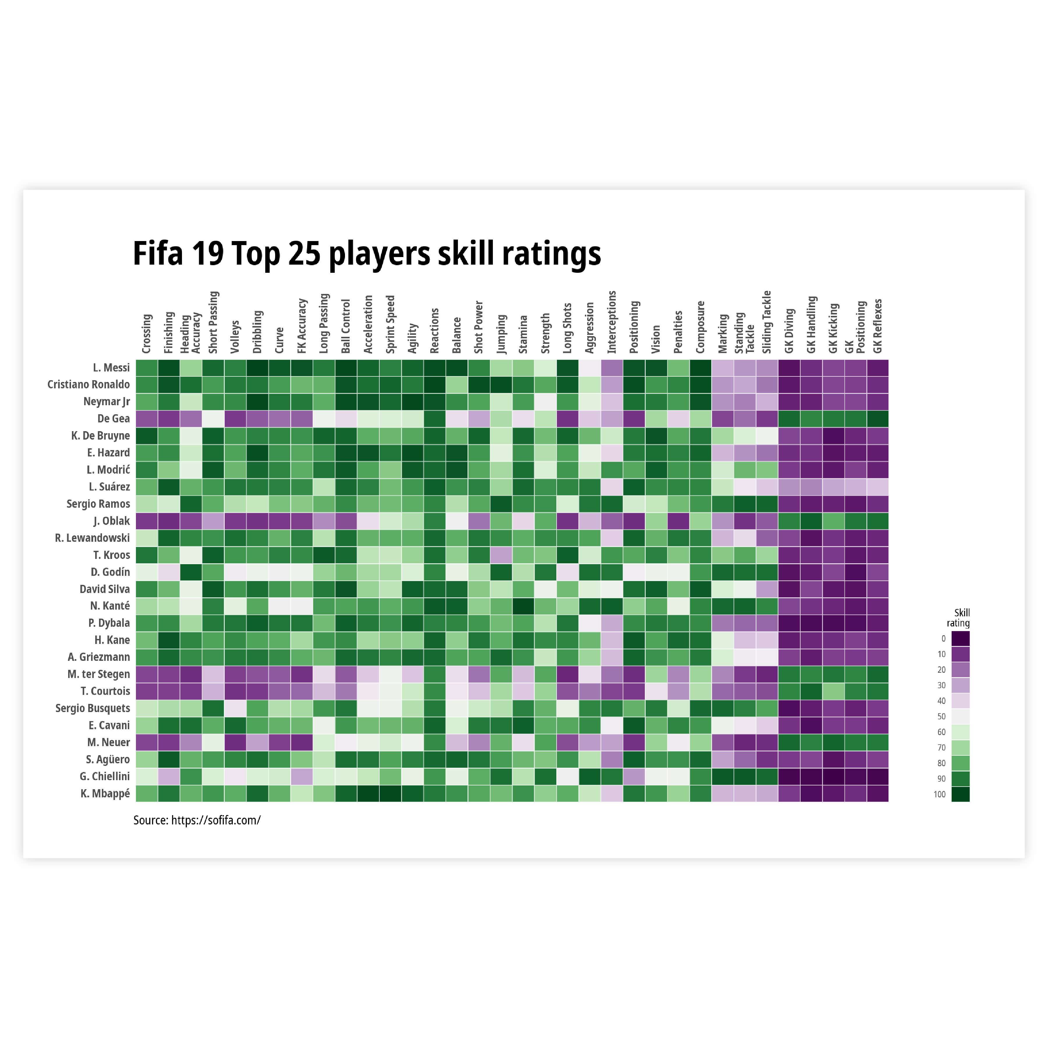
Coloring - 3 types of scales
Choosing the type of scale depends on the type of data that gives color to your heatmap and on the level of detail you want your reader to have. We can choose between a categorical, a numerical sequential or a numerical diverging scale.
Read more
Coloring - numerical or categorical scale
If your data has an order to it, meaning that it is somehow sortable, a numerical scale is the one to go with. If the data is nominal, you should choose a categorical one.
When the data only varies in one direction, a sequential scale is the best choice. When your numerical data has a logical breakpoint and the data varies in two directions, a diverging scale is the way to go.
Read more
Coloring - stepped or continuous scale
Finally, there is a difference between stepped or continuous scales. With data that is not continuous, but ordinal, you should always go for a stepped scale.
But with continuous data, we can choose what scale we want. Choosing a stepped scale for continuous data helps you make your point more clear and lets your readers derive values more easily. A continuous scale gives a more nuanced view and allows more interpretation up to the reader.
Read more
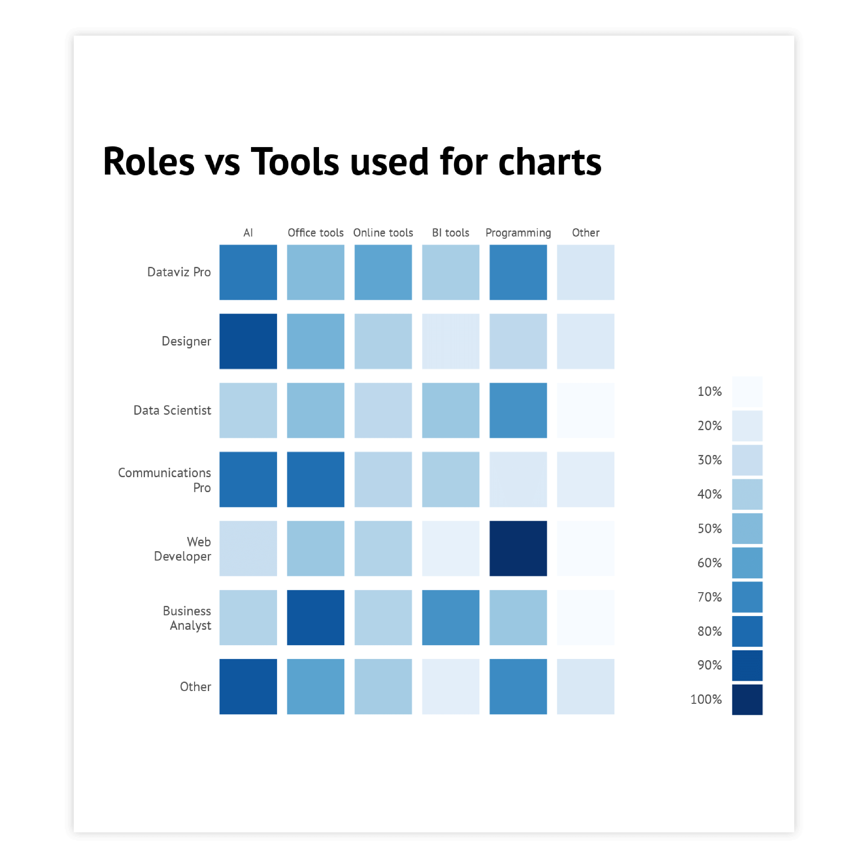
Sorting
Sorting the columns in a tabular heatmap is not always possible.
If your x-axis is numerical or temporal, you cannot sort it at all.
If it is categorical, and there is no order to be followed, sorting it ascending or descending might improve readability. This also goes for the categorical Y-axis.

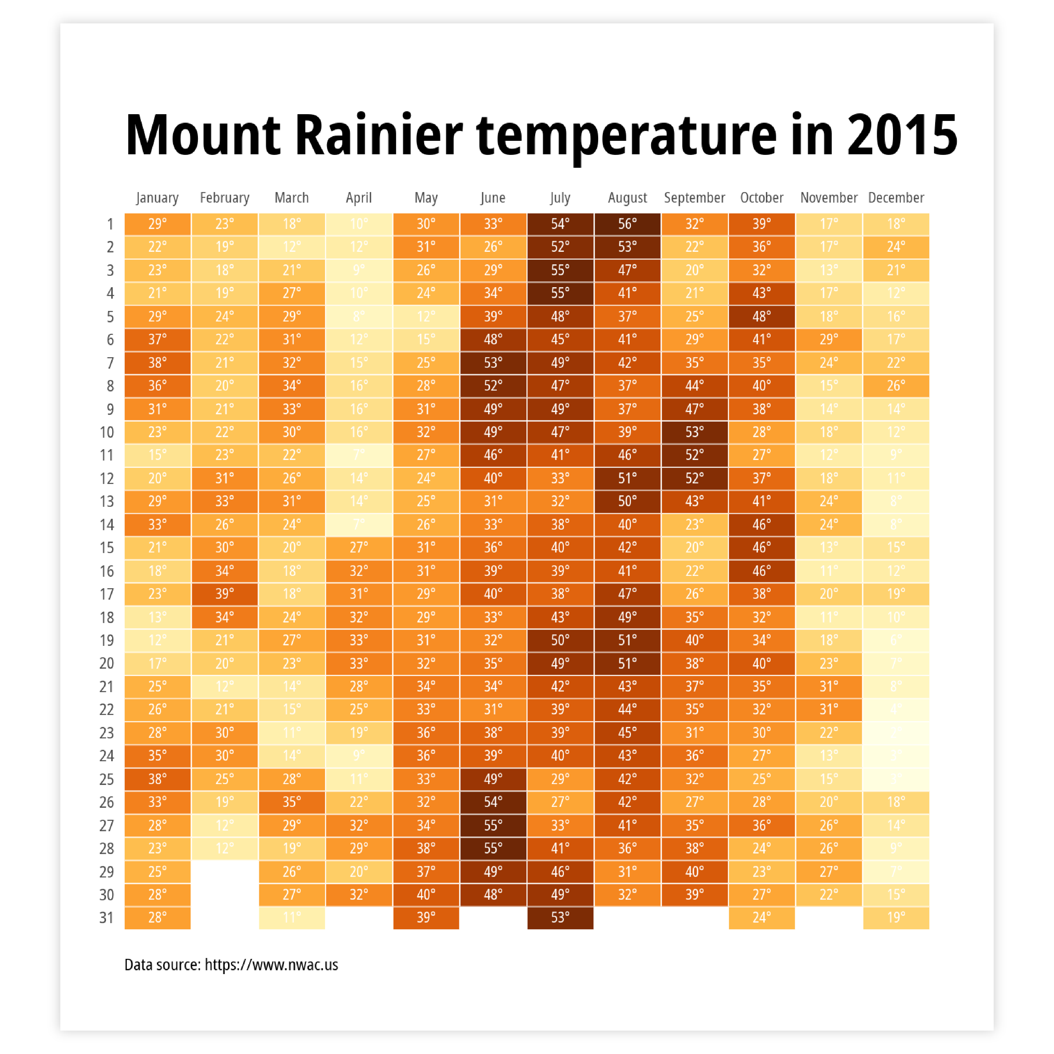
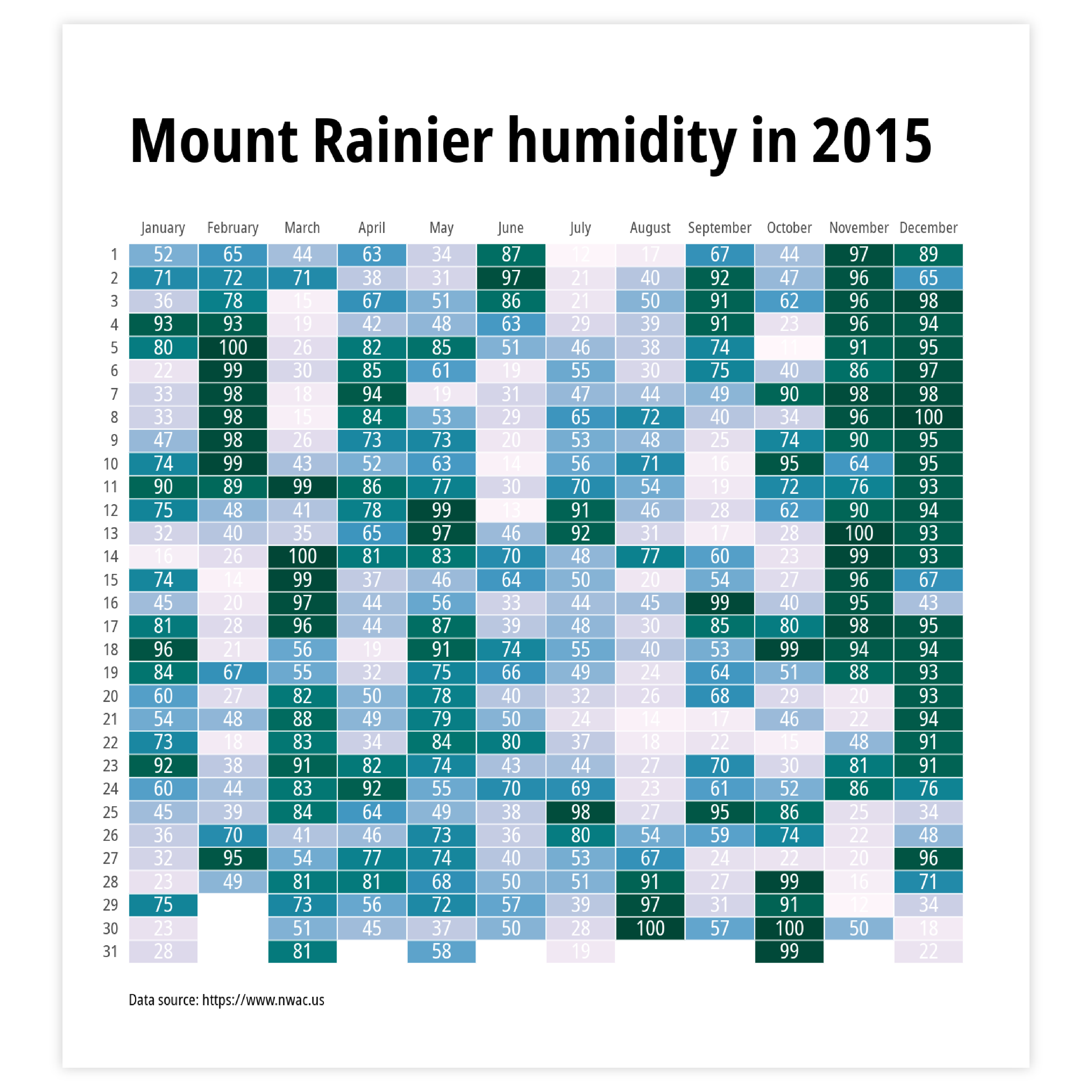
Labeling
If you do want to add an extra layer of detail to your heatmap, you can add data labels to every ‘cell’ in the matrix. This also works the other way around. If you have a flat table or data sheet, adding a color layer to the values can instantly help the readability and comprehension of the data.
Read more