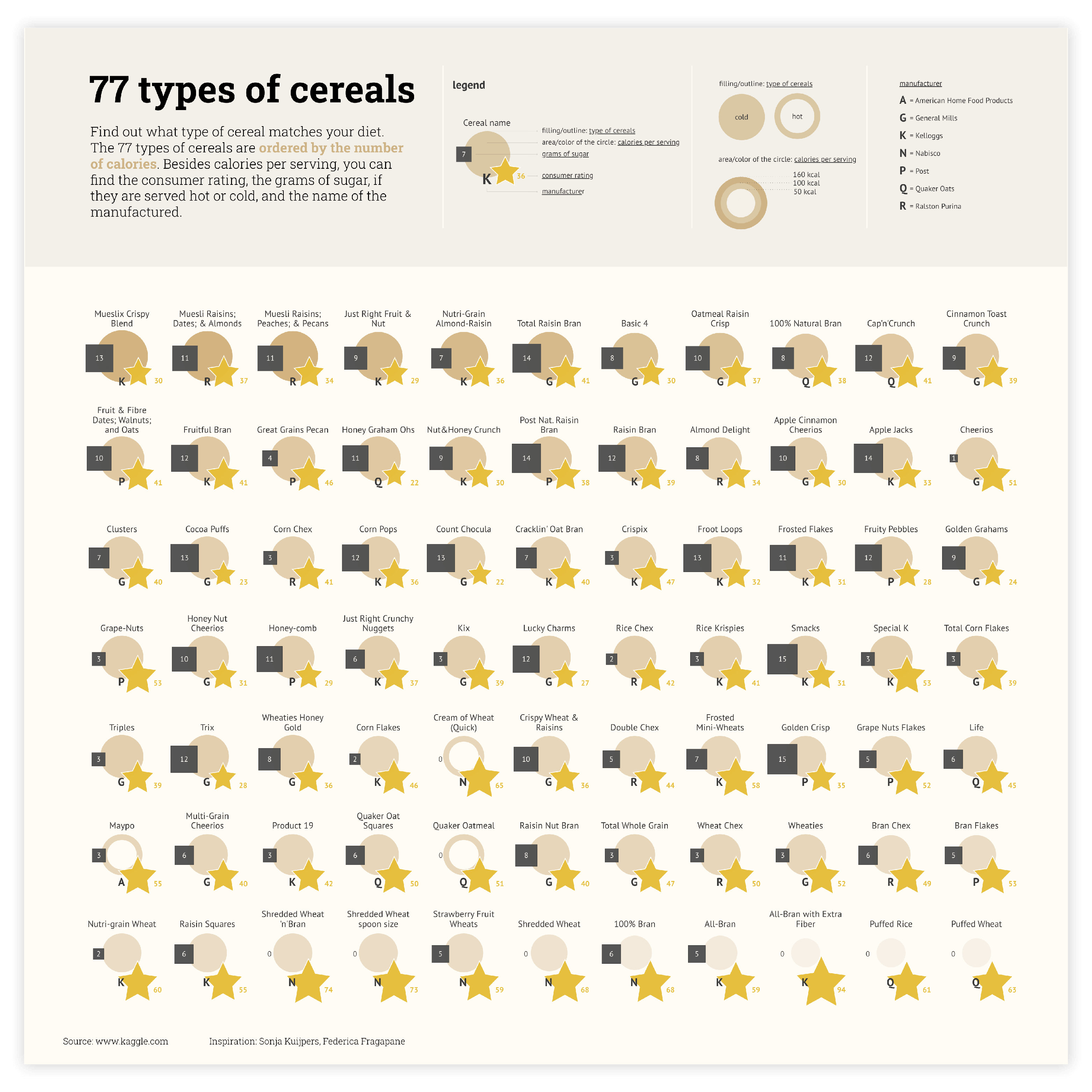
The blue icon represents an icon chart

Icon chart

DATYLON > CHART LIBRARY > ICON CHART

What is an icon chart?

An icon chart is a set of icons with the same shape. The most common shapes used are circles and squares. Usually, icons are aligned, but sometimes they can be placed in a specific way to highlight certain data. The area of every icon represents quantitative data. The color allows us to visualize additional variables – both categorical and numerical.

Icon charts are often used as an alternative to bar charts in case of a wide data range. In this case, the bar chart would take too much space to make the bars distinctive. Icon charts in this case have an advantage – they are using two dimensions to visualize the value and it makes the chart compact and readable at the same time. The backside is that a lot of viewers might read icon charts not based on the area of the figure but on the diameter (of the circle) or length of one side (square).

Icon chart is a common chart and can be used in every possible field, from demographic data and political polling to market shares, revenue breakdowns, and budget allocation.

icon-example-2

Variations of icon charts

The charts below are variations of an icon chart. To learn how to make them with Datylon, check out the icon chart user documentation in the Help Center.
A yellow icon shows a simplified example of a colored icon chart with a Datylon icon next to it indicating you can make it with Datylon.
A pale icon (only visible when you hover on the yellow icon) shows a simplified example of a colored icon chart with a Datylon icon next to it indicating you can make it with Datylon.

Colored icon chart

If an additional variable needs to be visualized, the coloring of the icons might help. It can be used to present both categorical and numerical variables.

A yellow icon shows a simplified example of a squared icon chart with a Datylon icon next to it indicating you can make it with Datylon.
A pale icon (only visible when you hover on the yellow icon) shows a simplified example of a squared icon chart with a Datylon icon next to it indicating you can make it with Datylon.

Square icon chart

While circle icon charts are popular due to their pleasing roundness, square or rectangular icon charts can be a good alternative – it’s easier to read a square area than a circle area.

A yellow icon shows a simplified example of a nested icon chart with a Datylon icon next to it indicating you can make it with Datylon.
A pale icon (only visible when you hover on the yellow icon) shows a simplified example of a nested icon chart with a Datylon icon next to it indicating you can make it with Datylon.

Nested icon chart

A nested icon chart can be useful if you want to compare multiple items sorted by size in a way that all the smaller icons are contained inside the bigger ones.

Alternatives to an icon chart

Substitute your icon chart with any of the charts below when you need a visual alternative that still allows you to compare values within and between categories.
A yellow icon shows a simplified example of a column chart with a Datylon icon next to it indicating you can make it with Datylon.
A pale icon (only visible when you hover on the yellow icon) shows a simplified example of a column chart with a Datylon icon next to it indicating you can make it with Datylon.

Bar / column chart

If the visualized values are in the same order, the bar chart will be a better option. Icon chart in this case might fail to show the difference between the values.

A yellow icon shows a simplified example of a treemap chart with a Datylon icon next to it indicating you can make it with Datylon.
A pale icon (only visible when you hover on the yellow icon) shows a simplified example of a treemap chart with a Datylon icon next to it indicating you can make it with Datylon.

Treemap

A treemap might be considered a compact version of the icon chart. All the areas are packed inside the main rectangle in an optimal way to save overall space.

A yellow icon shows a simplified example of a categorical scatter plot with a Datylon icon next to it indicating you can make it with Datylon.
A pale icon (only visible when you hover on the yellow icon) shows a simplified example of a categorical scatter plot with a Datylon icon next to it indicating you can make it with Datylon.

Categorical scatter plot

If one category per icon is not enough, this chart might help. It allows icons to represent the intersection of two categories at once. It looks like a table with icons instead of numbers.

Pro tips for designing an icon chart

Learn how to improve the readability and visual appeal of your icon chart.
An image supporting the paragraph about

Labeling

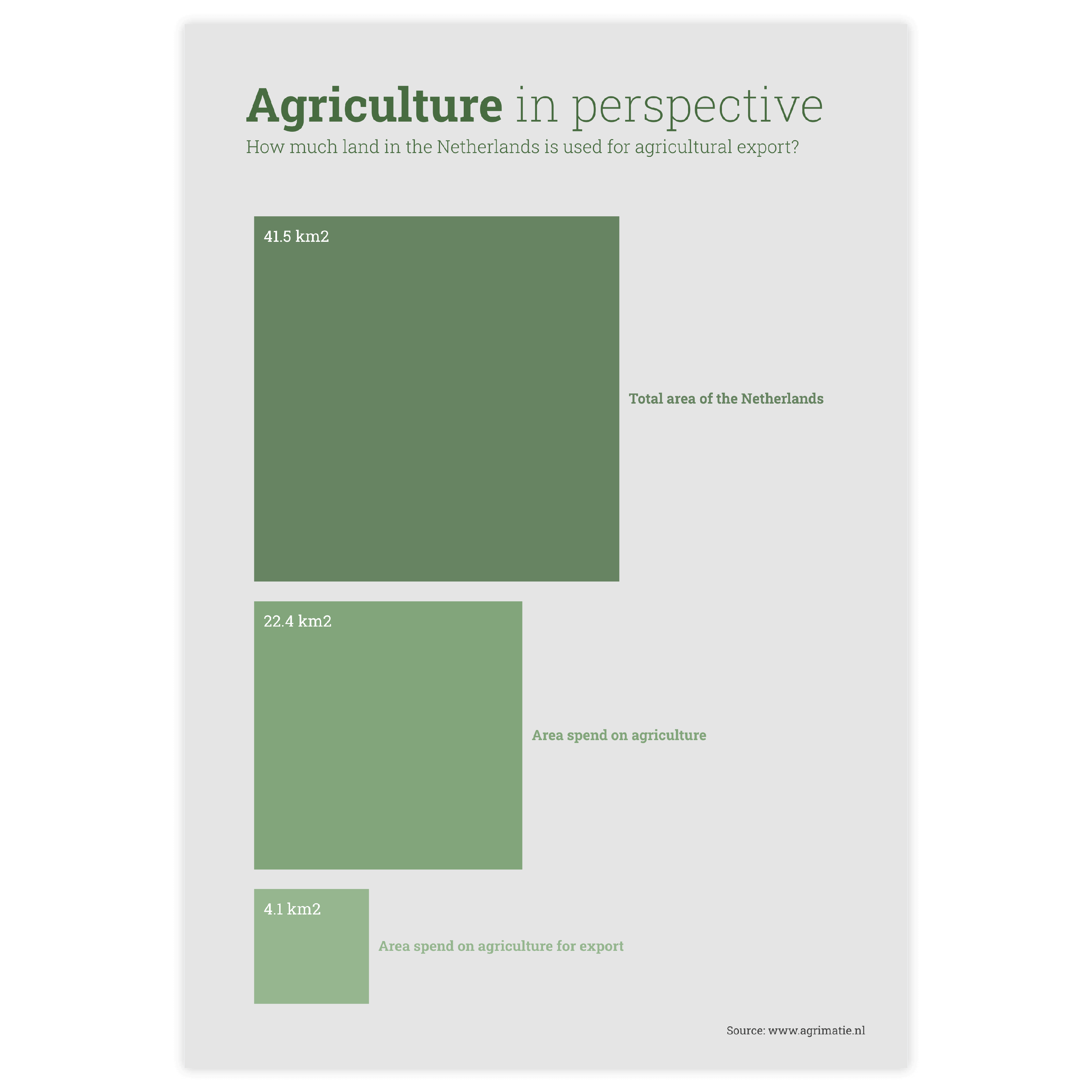
In the icon chart there are no axes, so the only way to know which value an icon represents is to add a value label for each icon.

Read more
An image supporting the paragraph about coloring icon charts shows two different approaches to coloring these charts, explained in the paragraph next to it.

Coloring

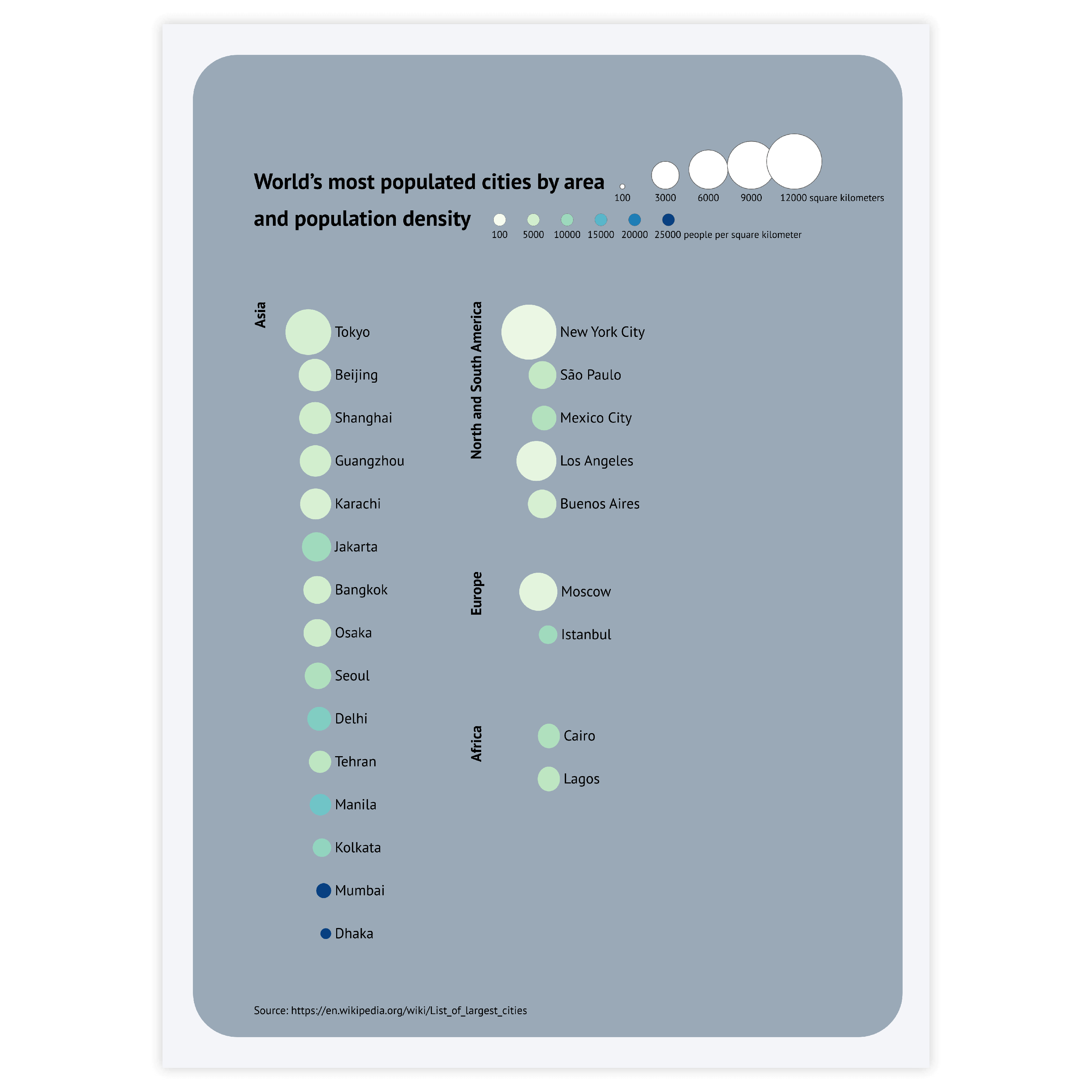
Usually, icon charts are used to visualize numerical values via the size of the icon. In this case, the color of the icons should be the same. But if there’s a second dimension that should be visualized, a categorical or sequential color palette is there to help you.

Read more
Image supporting the paragraph about highlighting icon charts.

Highlighting

To draw attention to the most important categories represented by an icon, a good solution is to highlight these icons and color all the other icons using the same color. Our brain is programmed to notice deviations instantly. This way, highlighting a specific icon will help catch the reader’s eye immediately.
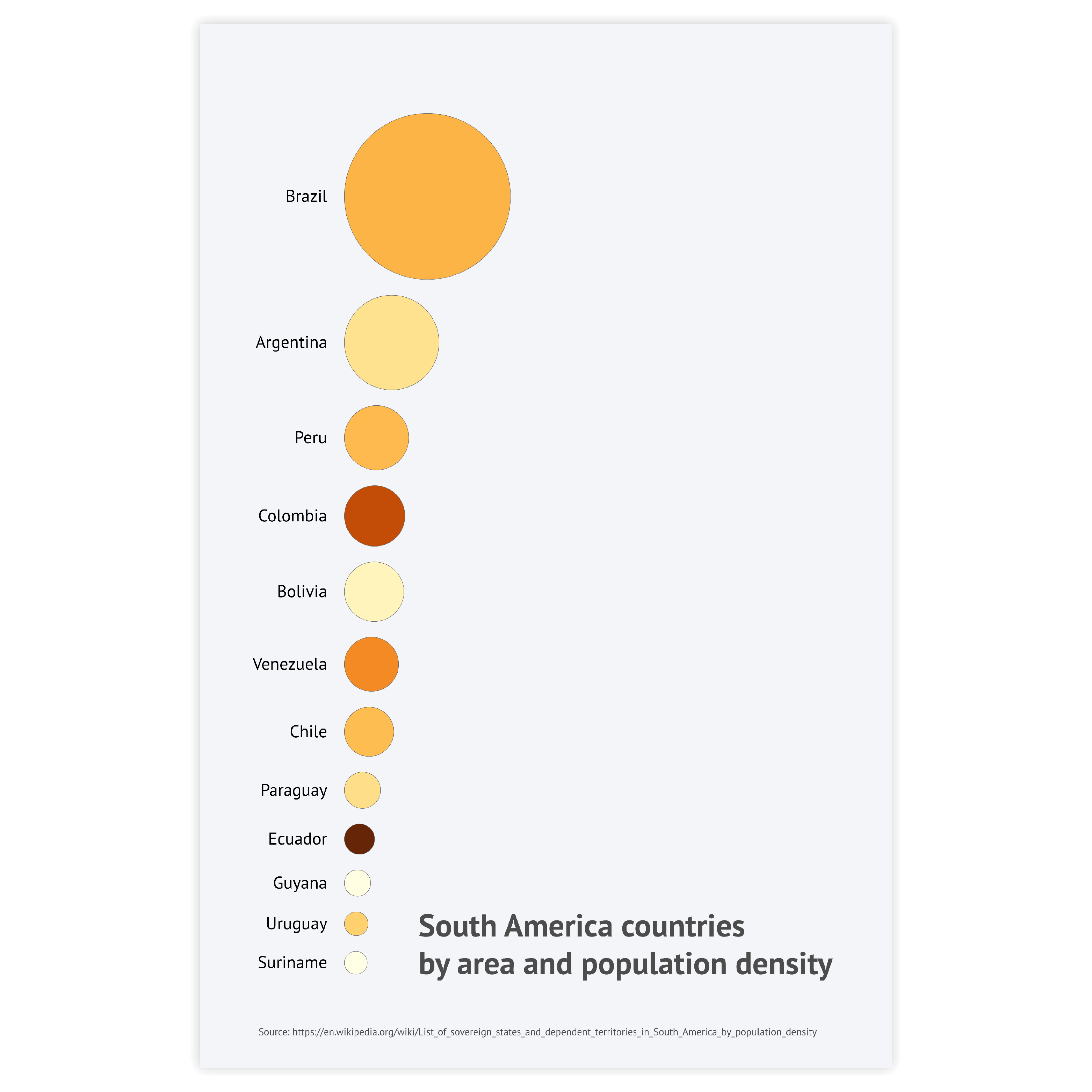
Read more
Image supporting the paragraph about sorting data in ascending or descending order in icon charts.

Sorting

Using ascending or descending sorting puts icons in order and helps the user to read the chart. It also reduces the time needed to compare the differences between different icons.
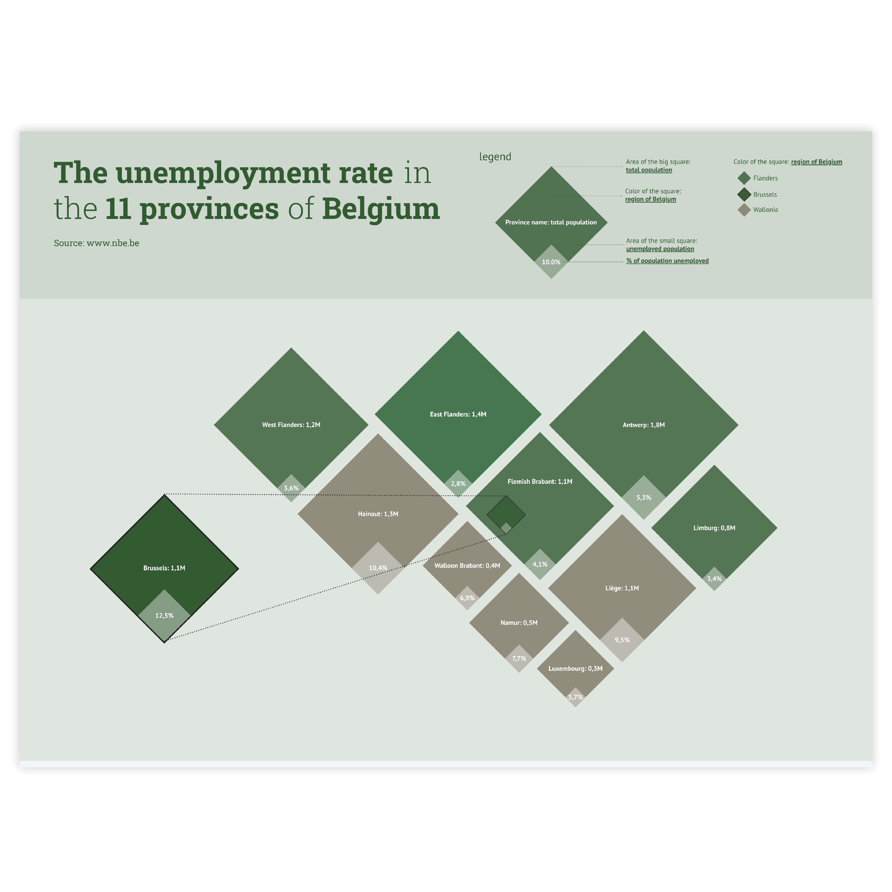
Read more
Image supporting the paragraph about nesting icons in icon charts.

Nesting

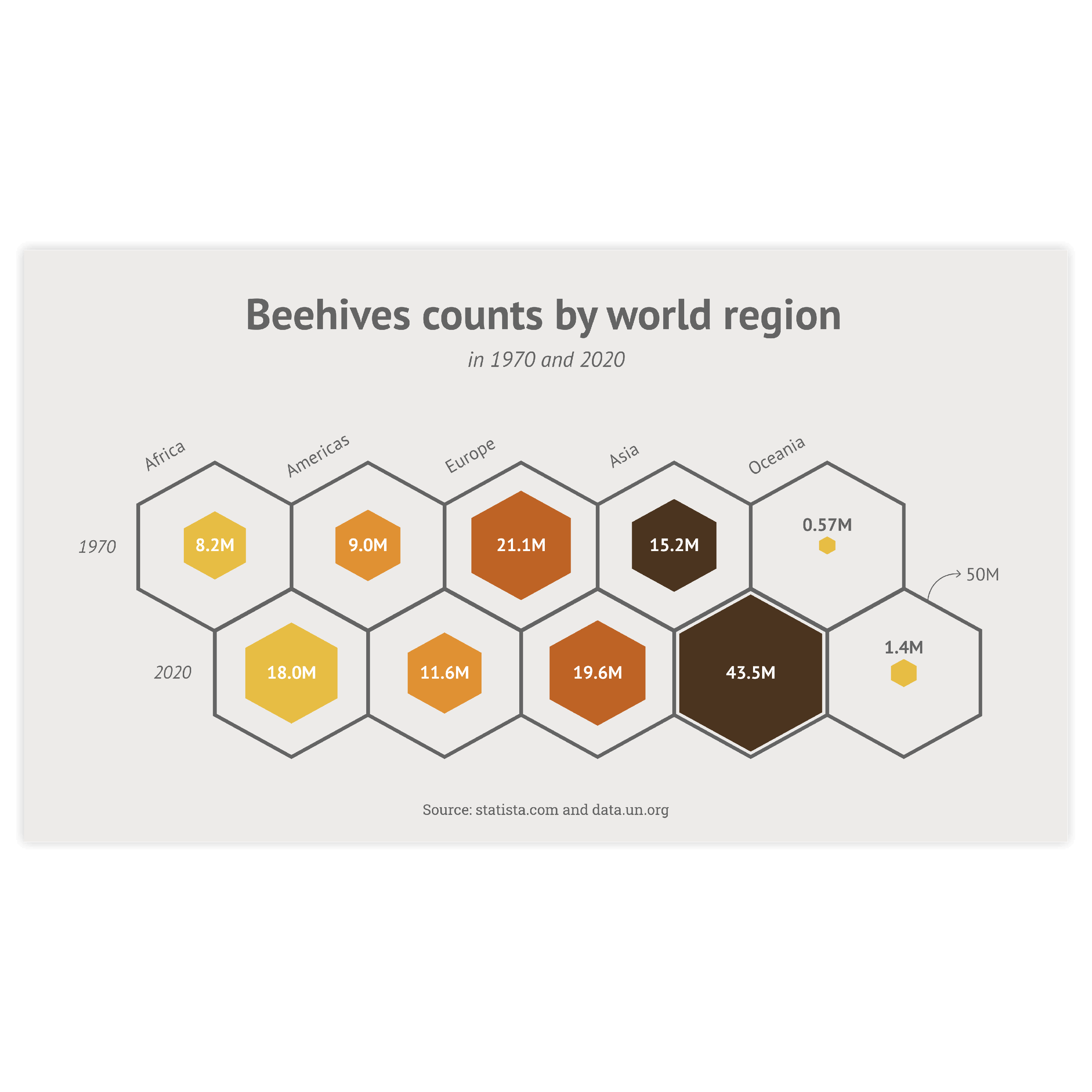
By reducing the spacing between icons to 0 a nesting icons effect can be achieved. It is a very compact and handy way to compare the size of the icons.

Read more

Create your own icon chart

Join Datylon for free and get started online or download our Datylon for Illustrator plug-in with a 14-day trial. Connect with a Datylon expert for a demo session.

Icon chart examples & inspiration

Scroll and click on the images below to find inspiration samples of icon charts. With your Datylon account, you can use these designs, customize them and update them with new data. Or start designing your very own icon chart!

Discover more charts in our Chart Library

Learn more about the different types of charts and graphs you can design with Datylon. Discover other resource pages in our Datylon Chart Library.