Master the rules - then break them
Rules are everywhere. In modern society, you can not go anywhere without rules to follow. Imagine going on a well-deserved vacation and you booked an apartment through Airbnb, and the first thing you find on the table is a list of things you should and shouldn’t do during your stay. Sometimes people try to hide that they have rules for their space and call them “basic etiquette”. On such a list, you will find rules like respecting the space, being a good person, or containing the mess. Am I the only one who gets a bit disturbed when rules like this are listed explicitly upon arrival?
Though, sometimes, the rules are really necessary. Think about what medical staff in a hospital needs to do to sterilize the operation room, play rules for a board game without cheating, or rules on how to write a good story. Nevertheless, sometimes it is fine to break them if you think about the consequences and understand the purpose of the rule. Especially in creative fields where rules should rather be seen as guidelines that could be useful in some circumstances.
Picasso took this seriously and really dared to be different and break the rules. He first mastered the art of painting after which he pioneered and developed the art form known as Cubism. This led to his famous saying:
“Learn the rules like a pro, so you can break them like an artist”. - Picasso
Data visualization is also a field where this saying is really applicable and rules shouldn’t be applied one on one. As Alberto Cairo mentions in one of his talks:
“Designing visualizations doesn’t consist of applying any rules. Rather, it’s based on making justifiable - ethically and functionally - choices according to certain goals and within various constraints”.
In this article, I will show you some of the data visualization “rules” and how you can thoughtfully break them by making functional choices. I will highlight these rules with the help of a data visualization design I created for the Storytelling with data challenge of June 2022. For this challenge, we had to find exceptions in data visualization rules and make thoughtful decisions on how to break them. The data visualization I submitted was about meteorite landings between 1990 and 2012, shown in the image below.
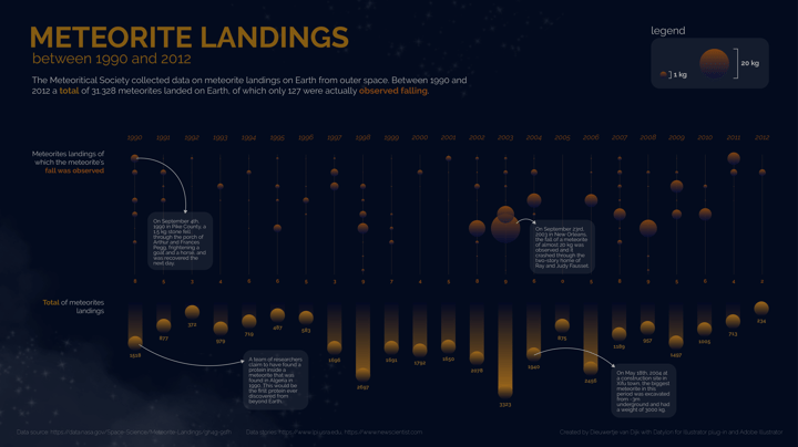 My data visualization submission for #SWDchallenge in June 2022
Table of contents
1. Rules in data visualization 2. Conclusion |
Rules in data visualization
1. Axes rules
Don't flip the vertical axis
The first rule I broke is to not flip the vertical axis. Normally, the vertical axis starts at the bottom and the horizontal axis starts at the left. This means that for the vertical axis larger values are placed above smaller values and for the horizontal axis larger values are placed on the right of smaller values.
This is in line with how we speak; if we say that a value is going up, we imagine a line or a bar going up to the sky. But what if you want to visualize something that is not going up the sky but falling down from the sky? Yes, I am talking about meteorites. This was therefore the first data visualization rule I wanted to play with to see what would happen and if it made sense to flip the vertical axis to represent a falling meteorite.
I am not the only one that experimented with this rule. There is a very famous and award-winning data visualization that hit the nail on the head by flipping the vertical axis: Iraq’s bloody toll by Simon Scarr. Scarr’s visualization illustrates all the soldiers and Iraqis that lost their lives during the war with a very striking visual. But to show what it would look like if Scarr actually followed the “rules” in data visualization, Andy Cotgreave created the more standard approach version of the visualization on the right.
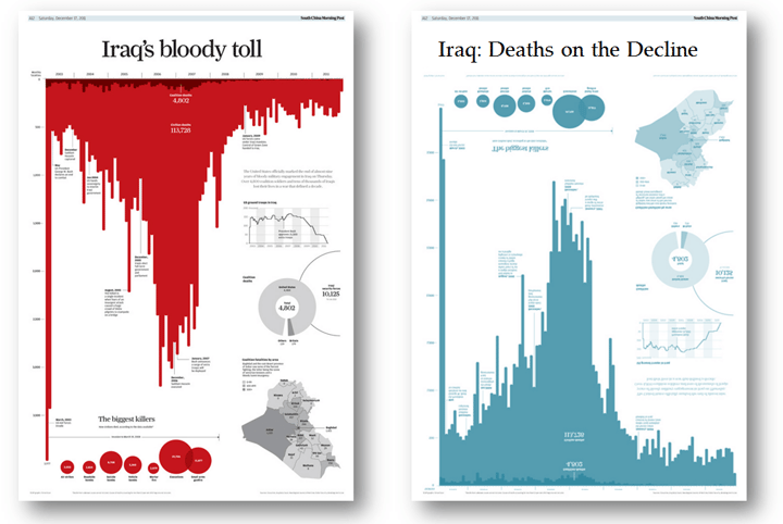 Award-winning data visualization by Simon Scarr (left),
and a copy/remake of that visualization which follows the rules, created by Andy Cotgreave (right).
Given these examples, we think it is sometimes legit to flip the axis. If you are convinced that flipping the axis will help convey the message of your data story in a better or more clear way, by all means, go for it!
Bar charts should always start at zero
Along these lines (pun intended), there are some more rules for axes in data visualization, which I actually did stick to in my submission for storytelling with data.
For bar charts, the axis with values should always start at zero. Otherwise, you are distorting the data which will mislead the audience. Viewers mostly need to decode the bars’ length and position, which makes bar charts very easy to understand. When distorting the length of the bars by not starting at zero, it will be very difficult to compare the values fairly.
Though, we think there might always be exceptions. If you are very sure the audience knows about the distortion of the axis, for example for internal use in an organization, and it will really help to show small differences between values, we will not be there to stop you.
Put the data in order
Another rule for axes is to put them in natural order if there is a natural sequence in the data. For example, time-series data should always be presented in the natural order. This means that for left-to-right languages the lowest point in time should be on the left and the most recent point in time on the right. For right-to-left languages, it is the other way around. This holds for example also for education levels or age groups. If there is no natural order for the categories, order them by value to make it easier to consume the data. We think this is a very important rule that you should always stick to, in order to make your data visualization easy to understand.
2. Color rules
Use a light background
Let's start with the dark background I used for my visualization. There is still an ongoing debate on whether using dark or light backgrounds is better for the perception of (data) visualizations. Last decade we started using more devices and applications, very frequently and using a light background became standard. Often it is recommended to use dark texts on a light background since the brain is better at processing it than the other way around. Though, you might have noticed that in the last couple of years a lot of companies and services introduced the dark mode for devices or websites. What's up with that, you probably wonder.
Well, there are also some great advantages to using a dark background. For example, a dark background is a good choice during low-light situations or when you are presenting something on a large screen. Moreover, it can be used to provoke emotions in the viewer and tell a story, just like I did with the meteorite landing data visualization where the dark background represents the galaxy.
Don't use gradients to spice it up
One other thing I did with the color in my meteorite landing data visualization is the use of a gradient. It is generally recommended against using gradients for the simple reason of just making your bar chart less boring. Gradients should only be used to communicate values of continuous data, for example in bar charts or heatmaps. Though, I broke this rule and only added the gradient to mimic the fall of the meteorite.
For this visualization, using a gradient was a design choice to inspire and evoke emotions on the viewer's side. Imagine a standard bar chart without a gradient and without a flipped axis. Do you think the data would be remembered as well as in the design I made?
Though, for this visualization, I was more interested in stretching the rules and showing a beautiful data visualization over a really detailed and accurate data visualization. If the latter is the case, you should really avoid using gradients the way I used them.
Use color to communicate additional information or highlight information
The last color rule I will discuss in the article is to only use color if it adds additional information to the data visualization. For example for a bar chart, using one color should be enough. Don’t use a new color for every bar just to make it beautiful, it will only make it harder to read.
Using colors is a super powerful tool for drawing attention since our brain is programmed to notice deviations instantly. Therefore, instead of using colors for every bar or line, you can highlight the most important one to help catch the reader’s eye immediately. An example of a data visualization with highlights to draw attention is shown below, in the chart about Irish Whiskey Sales created by vizwiz. Four of the lines are highlighted in green to accentuate them. Ireland deserves even more attention and is highlighted in a different color.
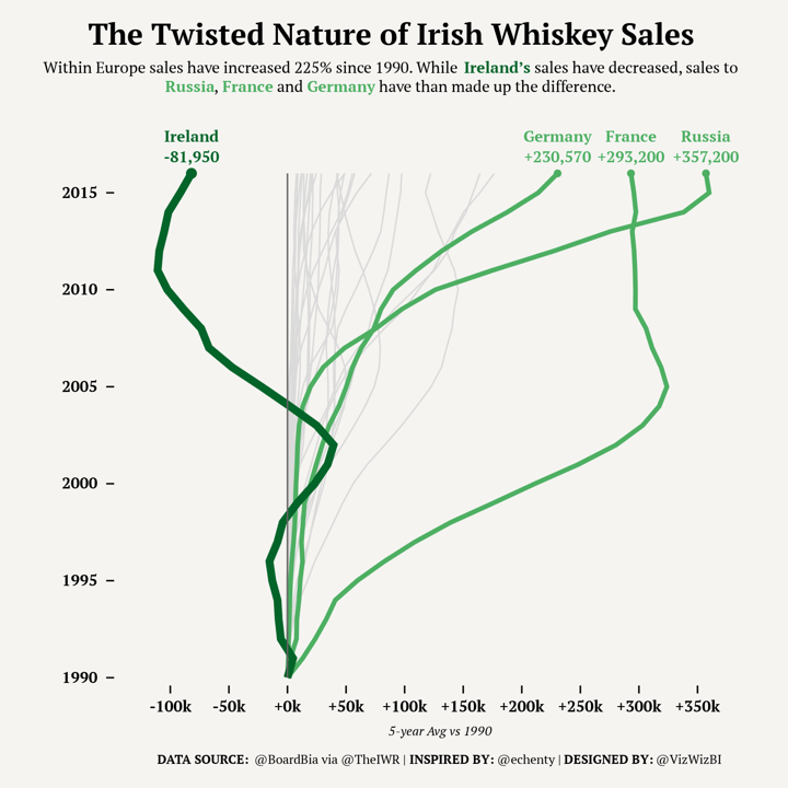 A remake of a line chart visualization, originally designed by vizwiz, and recreated with Datylon for Illustrator plug-in.
For the meteorite data visualization, I made the decision to use two different colors for the two different charts to make sure people understand that they represent two different categories: The total of meteorites (yellow), and the meteorites of which the fall was observed (orange). So always consider if the colors you are using add to the understanding of the chart, and make a decision accordingly.
Discover how to apply color to your data visualization in a colorblind-friendly manner.
3. Maximize data-ink ratio
The last section of this article I will devote to maximizing the data-ink ratio. This term was invented by Edward Tufte and means that you should get rid of all elements in the chart that do not add new information; in other words - chart junk.
Tufte created five rules:
- Above all else show the data
- Maximize the data-ink ratio
- Erase non-data ink
- Erase redundant data-ink
- Revise and edit
These rules make data visualizations easier to understand and process. Though, one study found that people actually preferred chart junk over the minimalistic designs Tufte suggests. So always be careful with applying this rule and think about the goal of your data visualization. Do you want people to fastly understand the data, or are you more interested in provoking emotion and long-term memorization?
Consider designing less classical charts to evoke emotion or long-term memorization.
For the meteorite landing data visualization, I tried to maximize the data-ink ratio by removing axis, gridlines, legends, and tick marks. Though, I also stretched the rule of maximizing the data-ink ratio a bit in some ways to see what would happen. I didn’t avoid chart junk and I did use data markers. In the next paragraphs, I will discuss them in more detail.
Avoid using grid lines and remove tick marks
The first thing I did to maximize the data-ink ratio in the meteorite landing data visualization is to let go of (some) gridlines. For some charts, gridlines are not necessary to make them more understandable. For bar charts, they are easy to avoid by placing the data labels directly on the chart, instead of using gridlines and an axis.
Though, for other charts where it is harder to place data labels directly on the chart, like a line chart or scatter plot, we recommend minimizing the gridlines as much as possible.
Moreover, in almost all cases it is best to remove all tick marks in a data visualization. Most of the time they do not add to the understanding of the data story.
For me, these rules are very important to always hold on to. Therefore, I decided not to go against them in the meteorite landing data visualization.
Don’t do legends
Another rule I did stick to is to avoid using a legend. In data visualization, there are multiple ways to avoid using legends. First, it is possible to specify categories by using colors in text, just like I did in my design. You can mention categories in subtitles or annotations and highlight them with the same color as used for the categories in the data visualization. This is a very elegant way of maximizing the data-ink ratio by avoiding legends. See another example of such a color application here.
Secondly, it is also possible to make use of direct labels to avoid using legends. Direct labels are labels to categorize the groups and are placed directly next to the concerned category. You can do this for a lot of types of charts such as the line chart, bar chart, or pie chart. For line charts, we recommend mentioning the categories on the right side of the lines, next to the last data point. For bar charts, the direct labels can be placed inside the bars and we recommend only mentioning them once in one of the bars. For pie charts, we advise placing the labels inside the slices (if possible) and otherwise directly next to the slices.
Avoid chart junk
The first thing I didn’t do to maximize the data-ink ratio is avoid chart junk. Examples of chart junk we recommend avoiding or minimizing as much as possible are unnecessary texts, gimmicky font types, frames around the chart, additional figures or pictures, 3D effects, and ornamental elements.
Other types of chart junk that you should generally avoid are colored backgrounds and gradients, which I actually added in the meteorite landing data visualization. In this project, I also added some images in the background with stars from the galaxy to stick to the meteorite theme which is something Tufte wouldn’t be happy about. Though, I tried to be as subtle as possible to avoid distracting elements, but just enough to help evoke the right emotion.
An example of a less subtle way of using chart junk is a famous data visualization created by Nigel Holmes about the monstrous costs of total house and senate campaign expenditures, which is shown in the next image below. Holmes didn’t really stick to the general rules and guidelines in data visualization. However, you will probably remember this chart and data better and longer than if a minimalistic design was used. So of course, we always advise you to first think about the goal of your visualization.
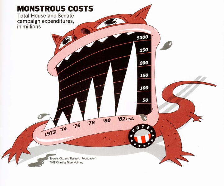 'Monstrous Costs’ by Nigel Holmes (1982). An example of a design that makes use of chart junk.
Don’t use data marks
Lastly, a data visualization will really benefit from not having any data marks. With data marks, we mean the dots (or other shapes) that are placed on top of the data point. Especially in bar charts, data marks most of the time do not add anything to the data visualization. They can actually be bad, since the viewer doesn’t know if the data point is located on the top, middle, or bottom of the data mark.
Though, I did decide to use them in a bar chart included in my meteorite visualization. In this design, the data marks represent the actual meteorites, which makes them more than just plain data marks. However, it makes it harder to accurately read and compare the data, so keep that in mind.
Conclusion
In this article, I presented to you some of the general rules in data visualization and how you can thoughtfully break them by making functional (and creative) choices. The key take-out is to always consider the goal of your data visualization and make decisions accordingly. Sometimes it is better to break the general rules to make your visualization more memorable, evoke emotions, or convey the message in a better, more engaging way.
While breaking data visualization rules can lead to more memorable and impactful designs, many organizations also need reliable, scalable solutions for delivering reports on a regular basis. Imagine automating report generation while retaining the flexibility to create custom designs that challenge conventional visualization norms. To achieve this, you need a tool that not only supports custom styling but also automates chart generation seamlessly.
With Datylon Report Server, you can create fully customized chart templates using the Datylon for Illustrator plugin, connect them dynamically to your data source, and automatically generate visually stunning reports—eliminating the need to manually recreate each one.
This approach allows you to balance the creativity in design with the efficiency of automation, ensuring you deliver impactful, customized reports at scale. Whether it's daily operational reports or executive-level dashboards, our server-based solution can handle the heavy lifting of static report generation, leaving more room for creativity where it counts.
Want to see our tool in action? Schedule a demo and experience it firsthand.
👉If you're keen on crafting custom data visualizations, visit our Bespoke Data Visualization Solutions page.
Further reading & resources
- What is automated data reporting? A complete guide - We'll examine the key components, and the challenges and best practices involved.
- Mind your data visualization - How to present your data effectively by getting the most out of your reader’s brain capacity.
- 9 types of data visualization - How to choose the right type for the right audience.
- Datylon Chart Library - Pro design tips to make the best charts and graphs and take your data visualization to the next level.
- Our take on data storytelling - Why is data storytelling so important?

Dieuwertje van Dijk - Data Visualization Designer
Data, graphic design, illustration, food and mountains let her dopamine neurons spark on a daily basis. Most of the year she lives in Georgia where she spends her free time enjoying nature in a rooftop tent, eating khinkali and drinking wine.

