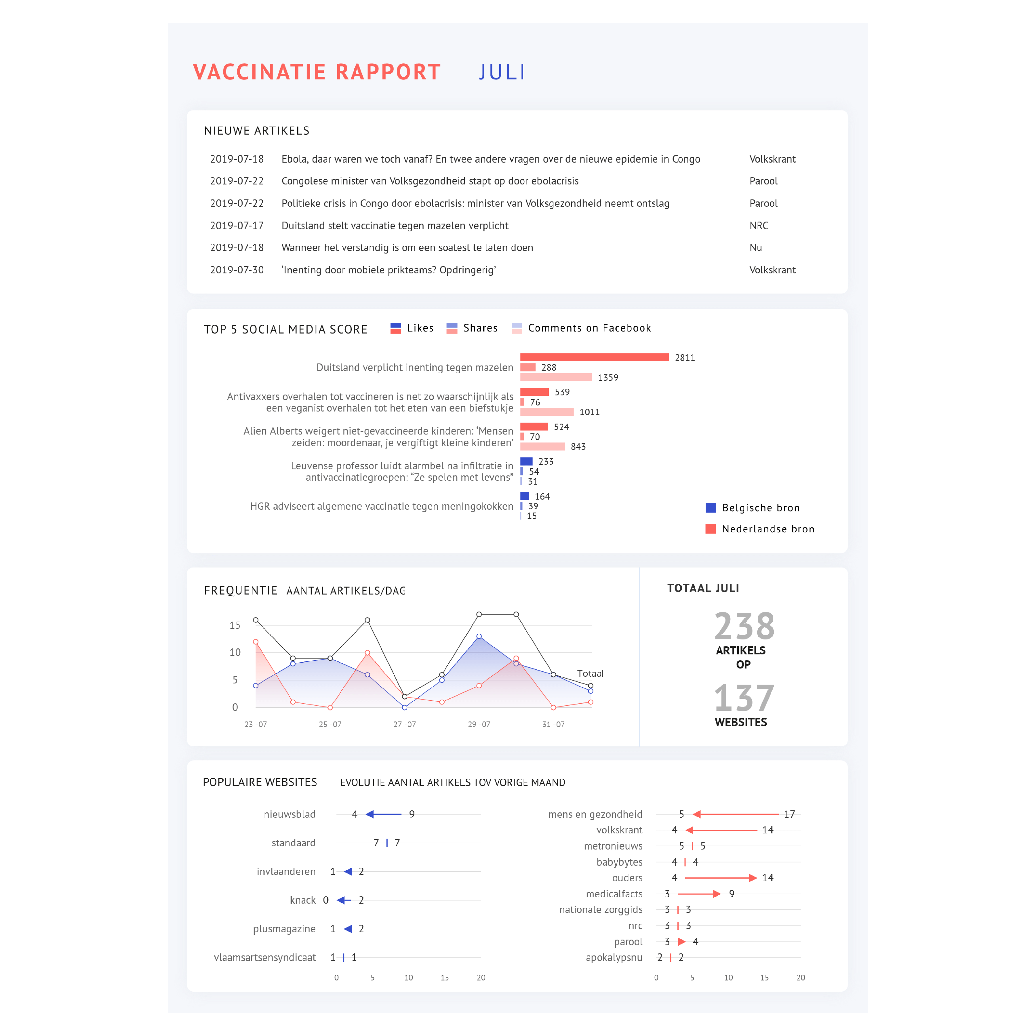
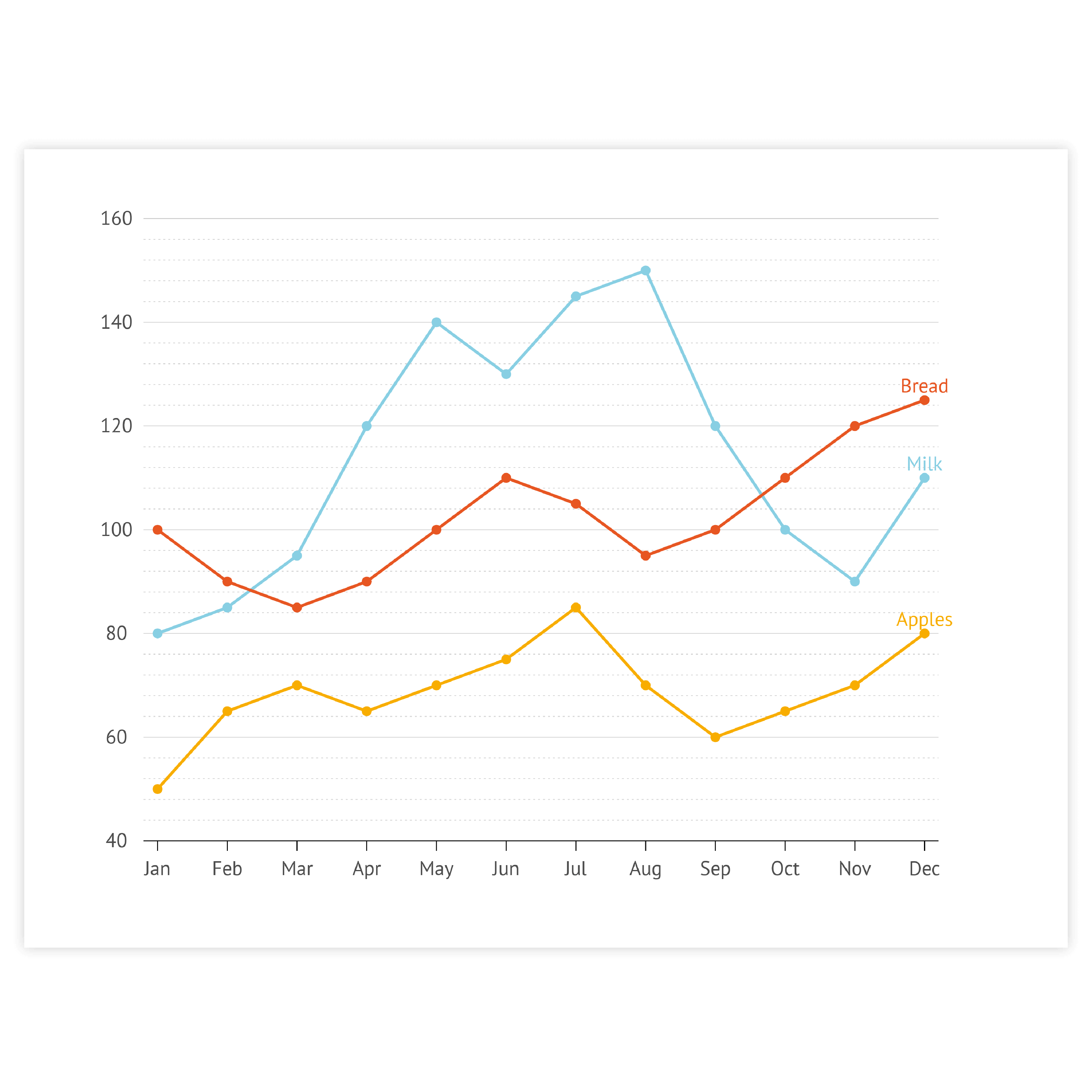


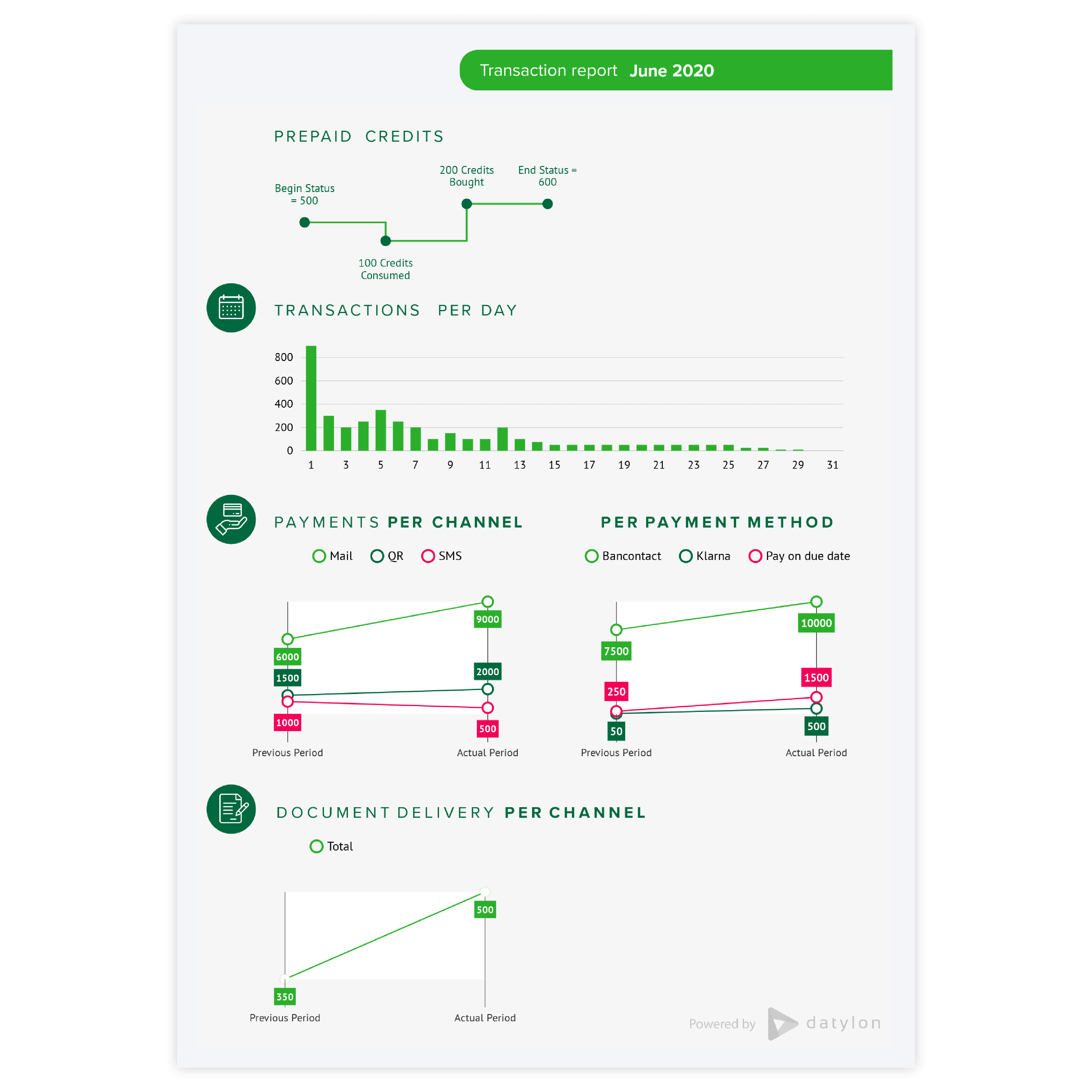
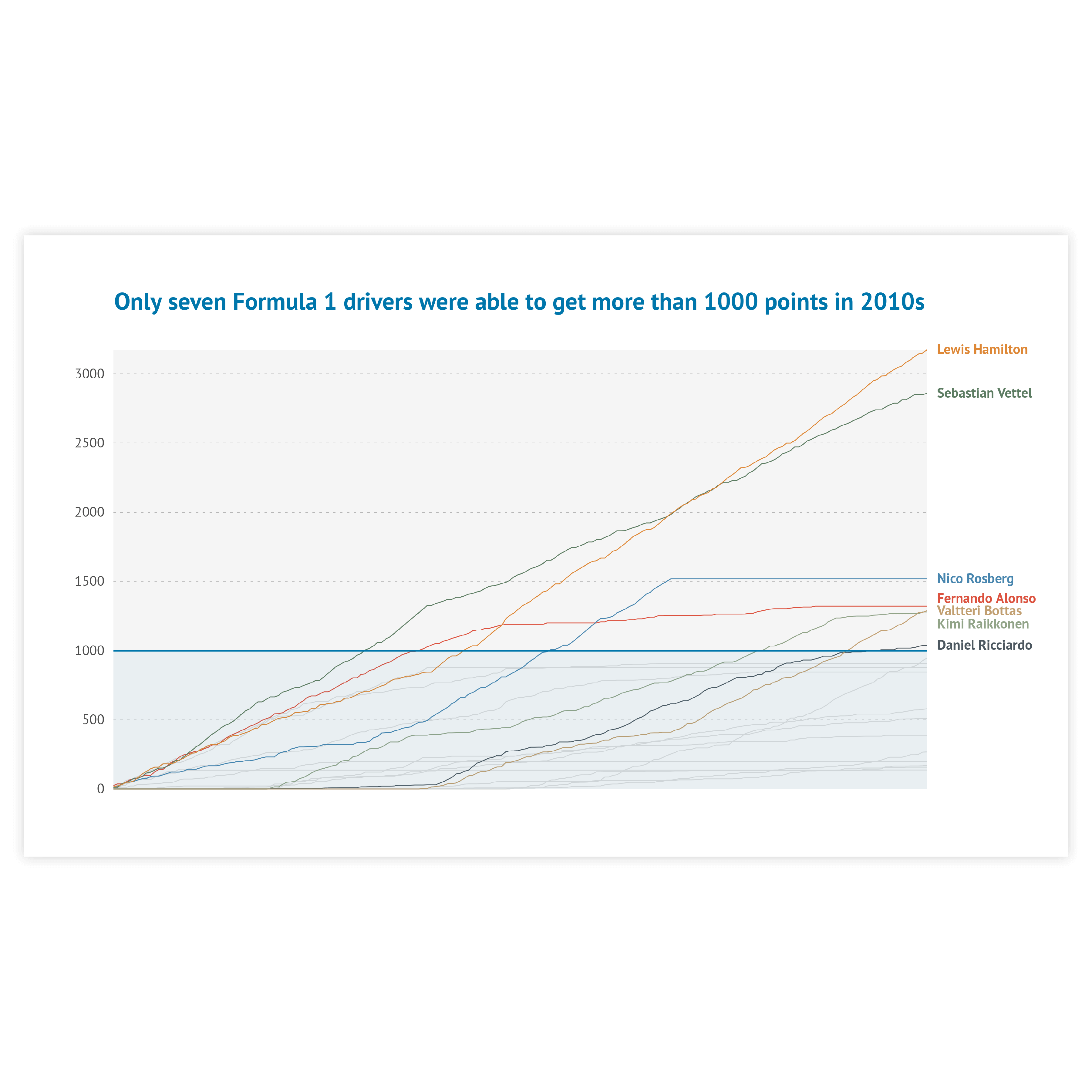


Labeling
You can label the data in your line chart directly or via a legend. In general, direct labeling is preferred. Direct labeling includes placing the names of the categories right next to the corresponding line. This is more beneficial as the viewer does not have to switch between the chart and the legend to learn which lines correspond to which category. Moreover, it makes it easier to read the chart by color blind people or readers of the chart printed in greyscale. To make it even easier for your viewer, color-code the label with the same color as the corresponding line. In Datylon chart maker you can use the color link option to make the colors of the Direct Labels the same as the corresponding lines.
Read more
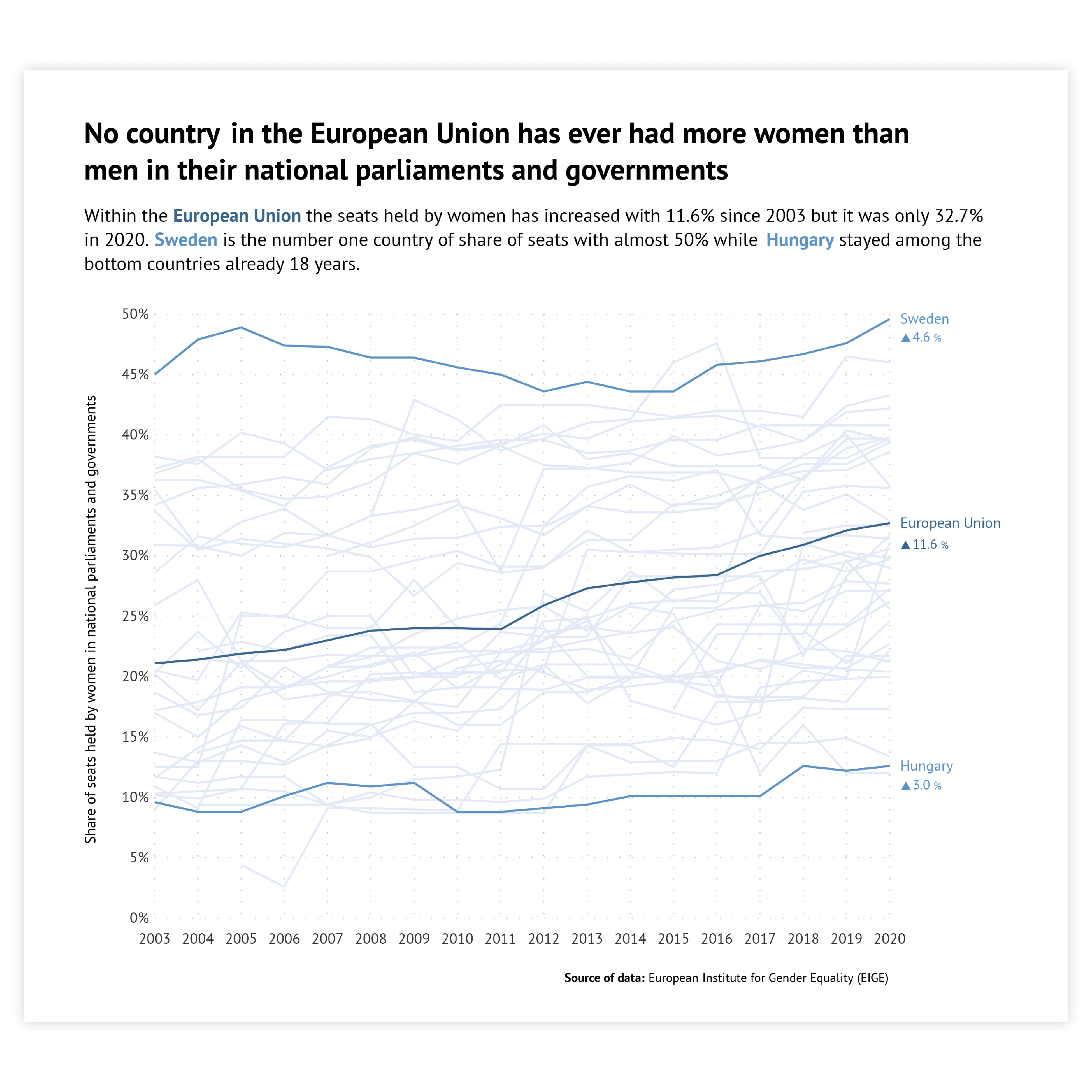
Highlighting
To draw attention to the most important categories of the line chart, a good solution is to highlight these lines and color all the other lines the same way in a basic color. Our brain is programmed to notice deviations instantly. This can be done, for example, by applying changes in size, movement, or color. This way, highlighting a specific line will help catch the reader’s eye immediately.
Read more
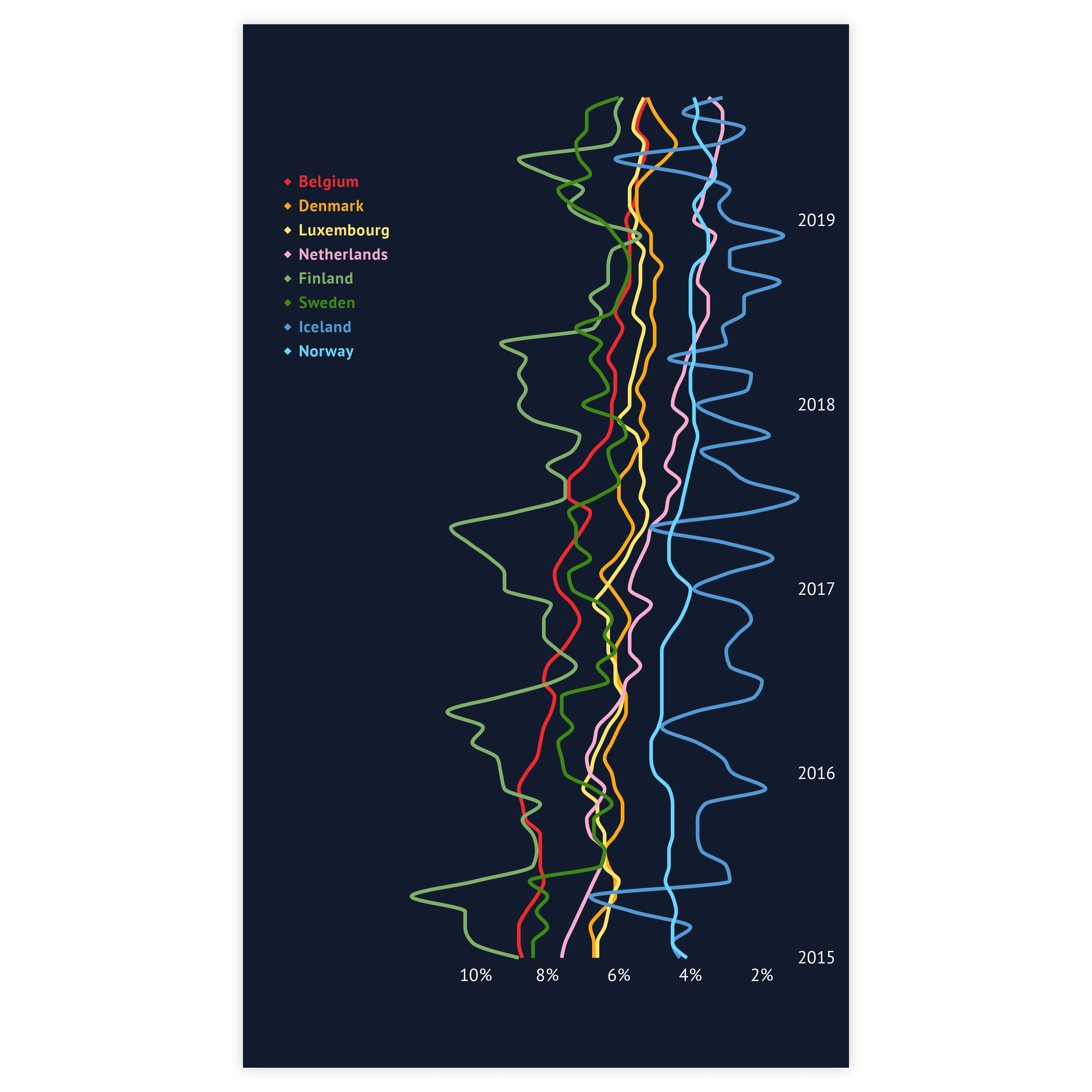
Number of lines
To avoid a spaghetti chart, try to minimize colored lines to a maximum number of five lines. Too many lines are really hard to compare and trends become less visible. When it is not possible to minimize the number of lines to a maximum of five lines, highlight the most important lines in your chart.
Read more
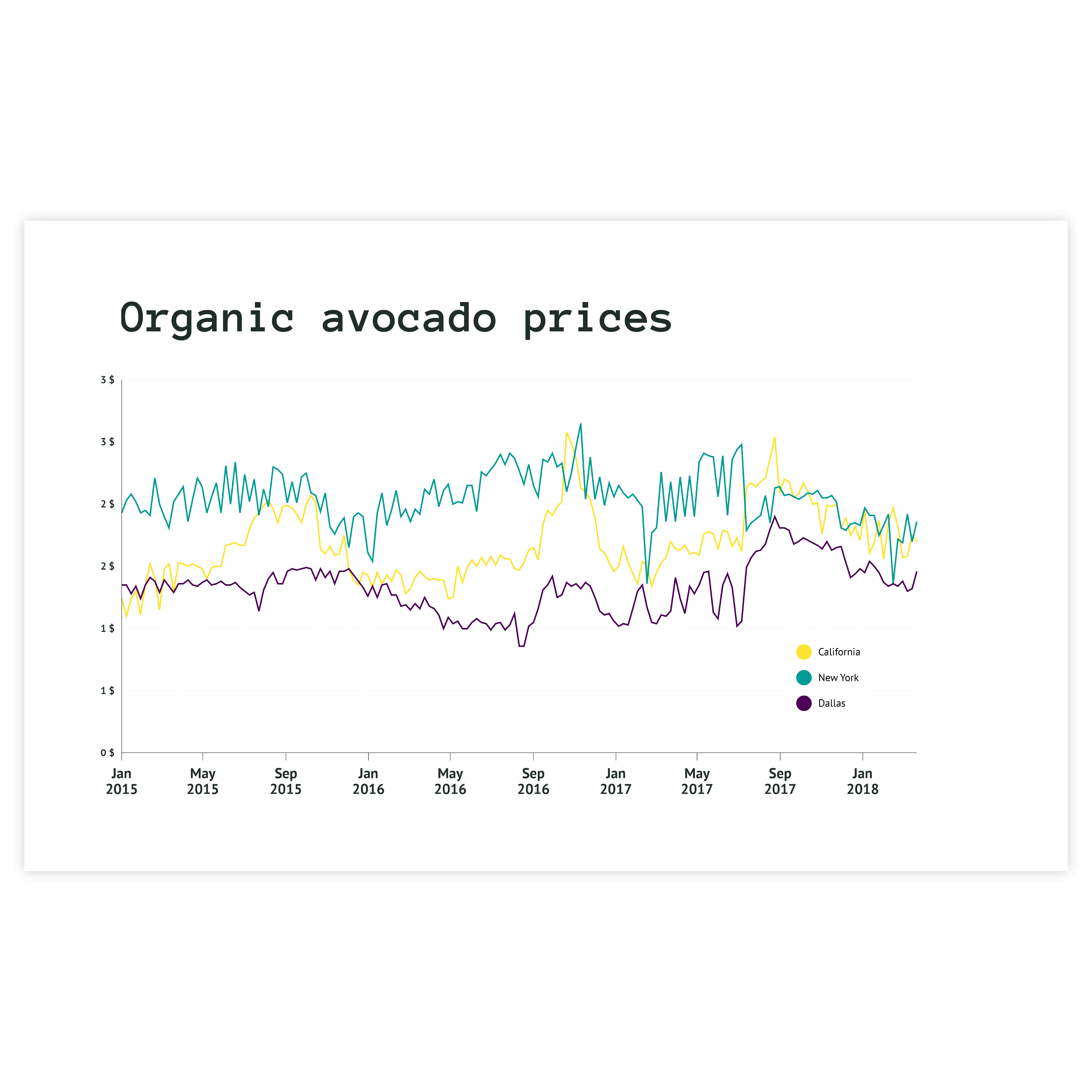
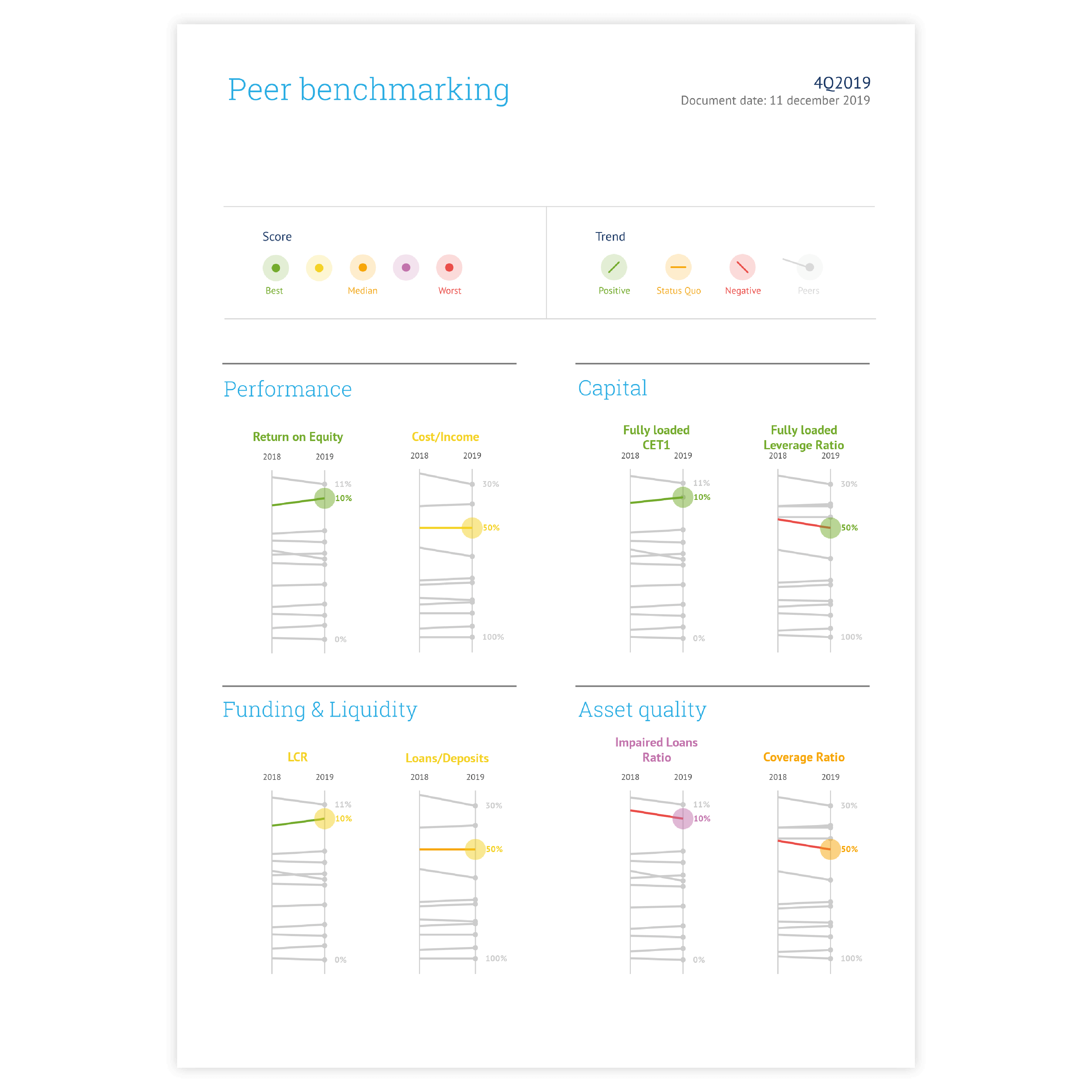
Data marks
You can decide whether you keep the dots with the actual data points or leave them out. In general, it is better to leave the dots out of the line chart. For example, because the data points are clear without showing them or you are only interested in showing the trend of the data. There is only one reason to show the dots: the slope of the line chart is not changing for a longer period because some data is missing.

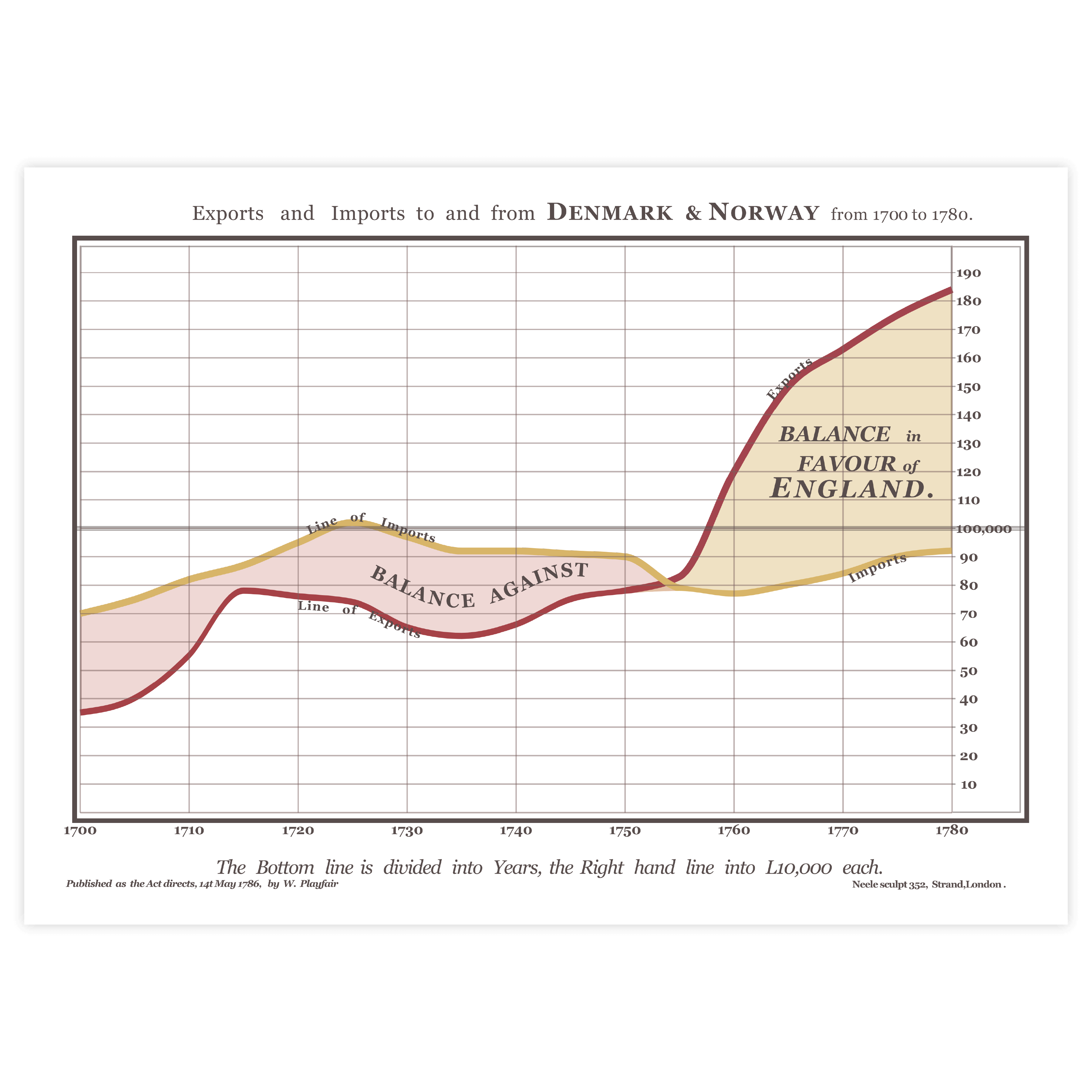
No dual axis
To compare multiple measures with different scales, a dual-axis could be used. Dual axes are two separate axes that are placed on top of each other in the same chart. Using dual axes puts a line chart at great risk of misinterpretation; the lines in a dual-axis chart can not be fairly compared. Therefore, we recommend not to use a dual-axis.
Read more
Using the right scale
For almost all charts it is absolutely recommended to start the x-axis at zero to avoid misleading the audience. However, for a line chart, the most important goal is to show the changes in data and to emphasize what’s relevant in your data. Therefore, it is not always necessary to start the axis at zero as sometimes a trend will be more visible and easier to interpret when zooming in on the data. As Edward Tufte says: “Use a baseline that shows the data, not the zero point.”

Dealing with missing data
There are multiple ways of dealing with missing data. Besides showing data marks as a solution for missing data (as you read before), another solution is leaving a gap in the line or drawing a dotted line between the two data points where the data is missing.
Read more