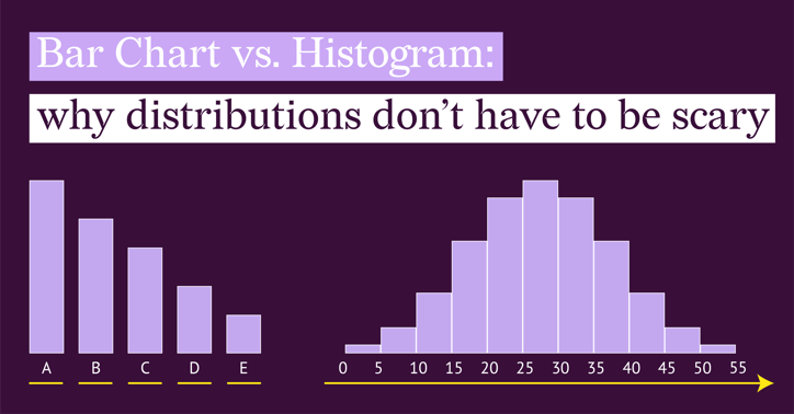
Histograms and bar charts look almost identical. If you have ever stared at your data trying to decide which of the two to use, or realized too late that you picked the wrong one, you are not alone.
Many of us were introduced to histograms in a classroom setting, which made them feel abstract and intimidating. But in everyday work, they can be vital.
Take delivery times, for example. If you want to see if packages are arriving consistently or if delays are random, a bar chart will not tell the whole story. You need a histogram to see the spread.
In this article, we will clear up the confusion. By the end, you will know exactly when to use which chart to tell the best story with your data.
Part 1: The Experiment
(Why Bar Charts Fail on Continuous Data)
Let’s start with a test with some fictional data. Imagine you have a dataset of 100 package deliveries. You want to answer a simple question: "What is our normal delivery time?"
Your data isn't simple categories like "Truck A" or "Truck B." It is specific, flowing time measurements. You have a list of Package IDs (#1 to #100) and the exact hours it took for each one to arrive.
If you instinctively throw this raw data into a Bar Chart, you are going to get a mess.
(Note: The datasets and charts shown below are fictional and created for demonstration purposes.)
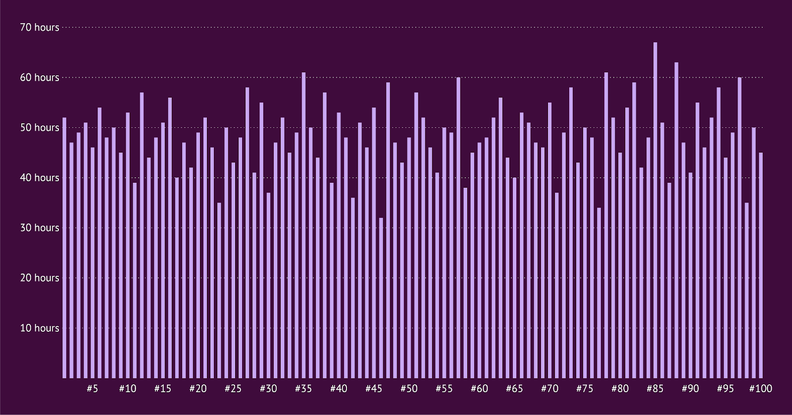
Because the bar chart treats every single Package ID as its own distinct category, it draws 100 separate bars standing next to each other.
It looks like a broken comb or a barcode. Is 52 hours normal? Are there a lot of delays? It is impossible to say.
This is technically a chart, but it is practically useless. It fails because it focuses on the items (Package #1, Package #2) rather than the pattern.
Part 2: The Fix
(Enter the Histogram)
To make sense of this, we need to stop looking at the individual packages and start looking at ranges.
We group the delivery times into buckets (also called "Bins"). Instead of plotting 100 individual bars, we count how many packages fell into specific time slots (e.g., 24–27 hours, 48–51 hours, etc.).
Suddenly, that messy "broken comb" transforms into a clear, solid shape.
(Note: The datasets and charts shown below are fictional and created for demonstration purposes.)
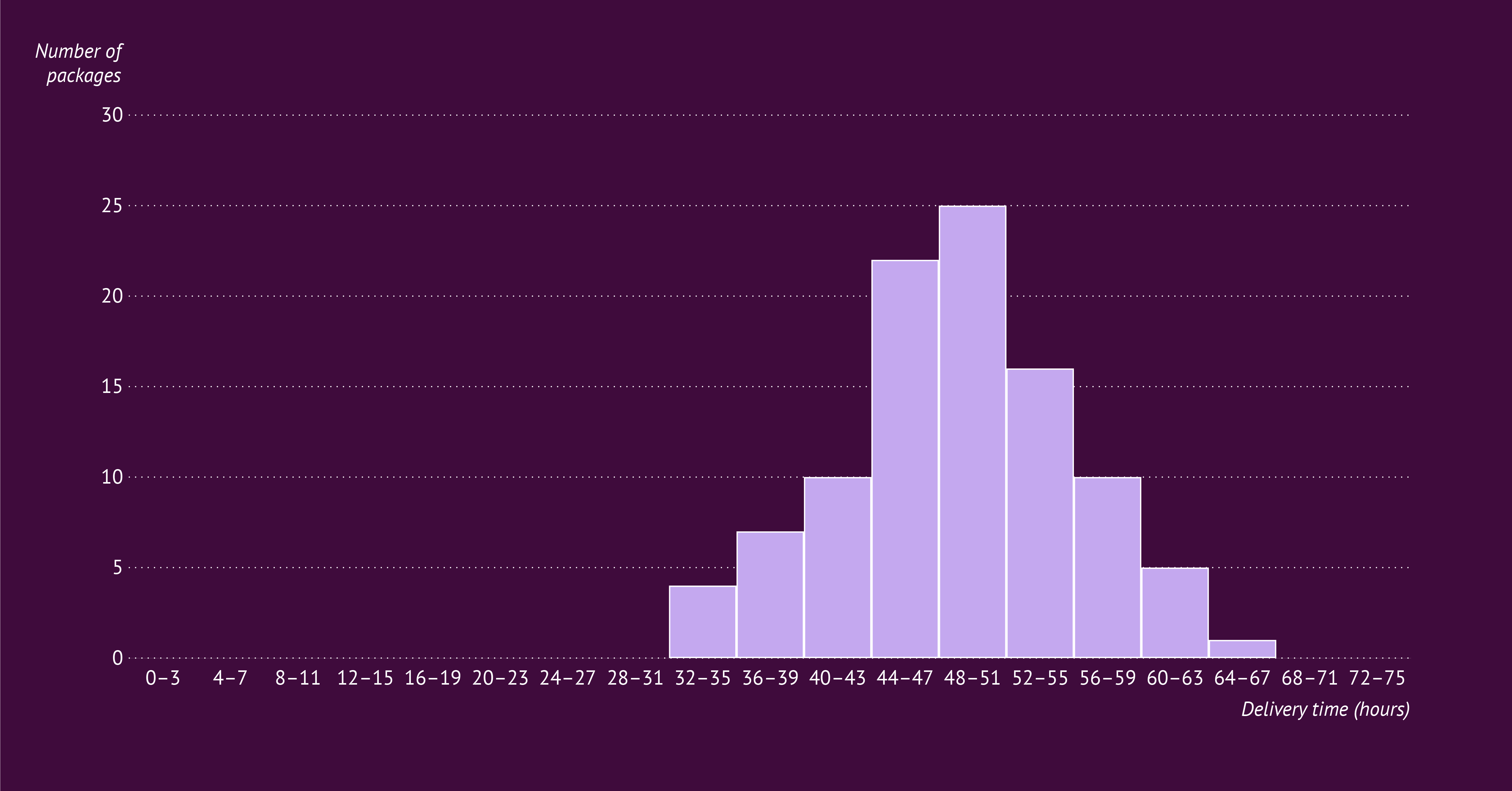
Now you can see the story:
- The peak: You can instantly see that the most common delivery time is between 48 and 51 hours (with 25 packages landing in this bin).
- The spread: The majority of your deliveries happen consistently between 44 and 55 hours.
- The outliers: You can easily spot the exceptions. Very few packages took longer than 60 hours, and none took longer than 67.
This is the superpower of the Histogram: It sacrifices specific details (we don't know exactly which package took 67 hours) to show you the big picture (the trend).
Part 3: What a Bar Chart Is Actually Good At
Now that we have seen what happens when you try to force continuous numbers into a bar chart, let’s take a step back and look at what a bar chart is designed to do. When your data fits the chart, a bar chart is one of the clearest and most reliable ways to communicate a message.
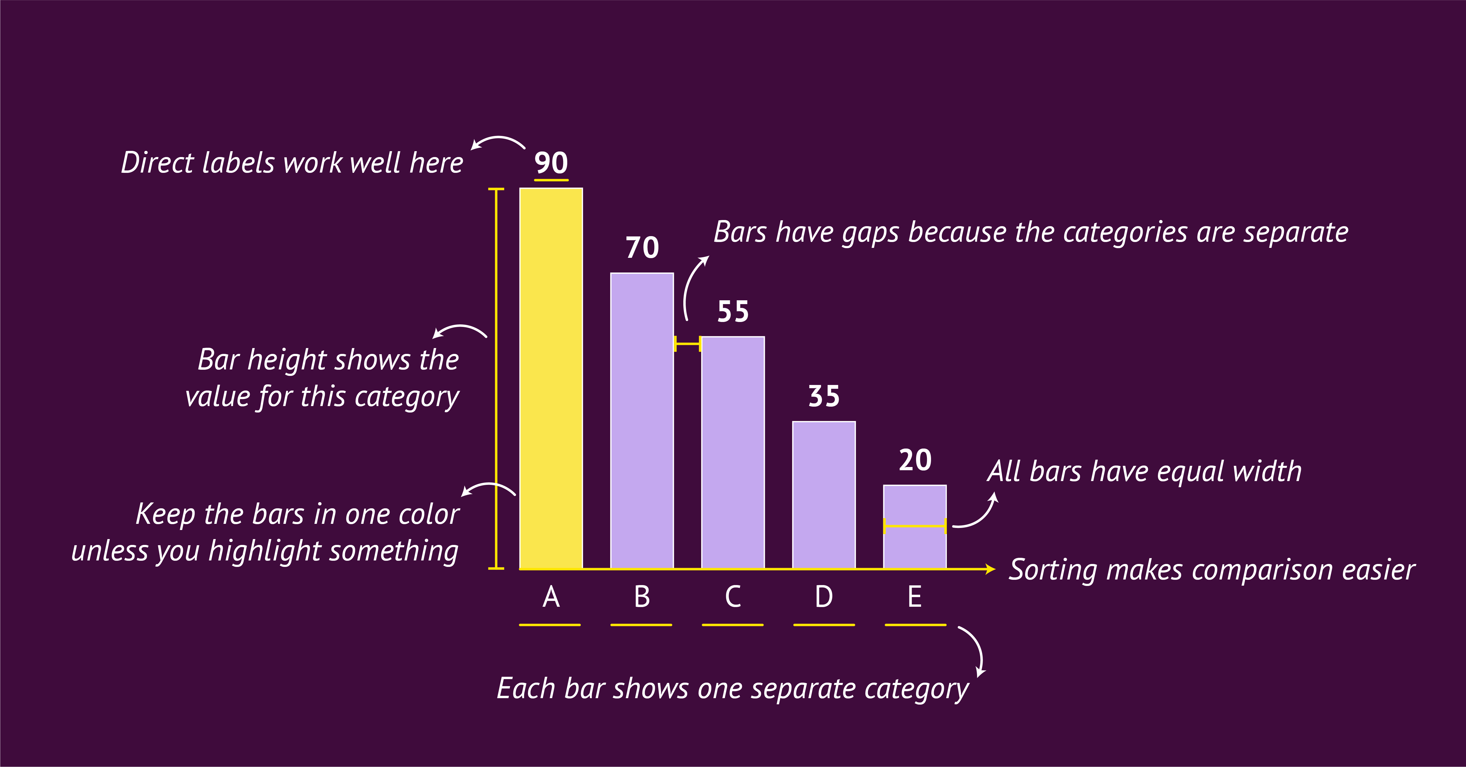

At its core, a bar chart is a group of rectangles whose lengths represent values. Each bar stands for one category. This simple idea is what makes bar charts so effective. Our eyes are very good at comparing lengths, which is why differences between categories are easy to spot.
Bar charts use gaps between the bars to show that the categories are separate. The x-axis lists the categories, and the y-axis shows a numeric value such as a count or a total. This setup makes the chart straightforward for almost anyone to read.
Bar charts often work best in a horizontal layout, because there is more space for the category labels. Sorting the bars from high to low or low to high also helps readers understand the differences quickly. Sometimes categories already follow a natural order, such as days of the week or age groups. In that case, it is better to keep the natural order and use the vertical version, the column chart.
Color is most effective when used in a simple way. One color is enough for most bar charts. If you want to highlight something important, you can use one accent color to draw attention without overwhelming the rest of the bars.
For labeling, direct data labels often work better than relying on the y-axis and gridlines. This keeps the chart clean and helps the reader focus on the values.
When to use it:
Use a bar chart when your data contains clear categories and your message is about comparing those categories.
Part 4: What a Histogram Is Actually Good At
Now that we have seen why bar charts struggle with continuous data, let’s look at the chart that is built for it. When your goal is to understand the shape of your data, a histogram is one of the clearest and most informative charts you can choose.
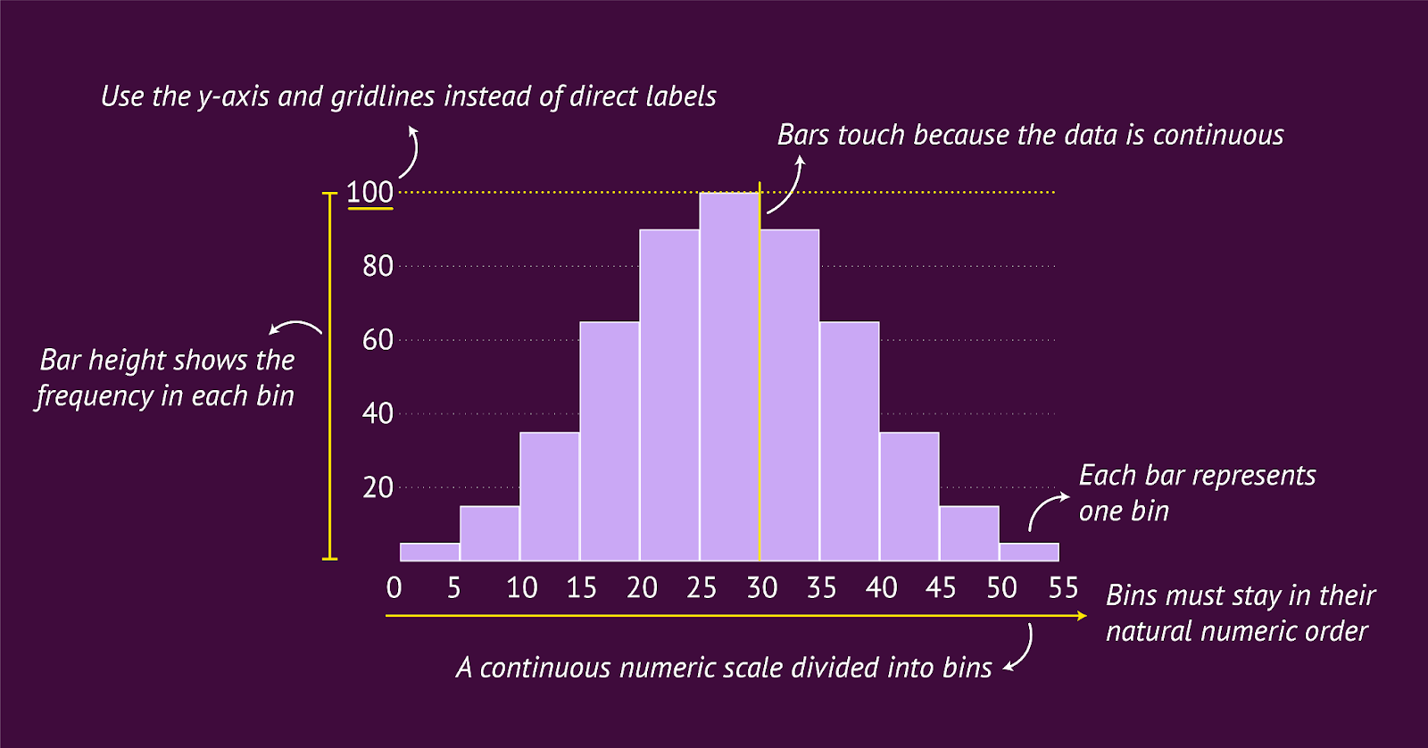

At its core, a histogram also uses rectangles, but with a different purpose. Each bar represents a range of values rather than a single category. These ranges are called bins. The height of each bar shows how many data points fall inside that bin, the frequency. This simple grouping is what allows a histogram to reveal patterns and variation in continuous data.
Histograms have no gaps between the bars, because the bins follow each other along one continuous scale. The x-axis shows the numeric scale divided into these ranges, and the y-axis shows how many times values fall within each range. Together, these elements reveal the structure of your data in a way a bar chart cannot.
Histograms work best when the bars follow the natural order of the numeric scale. You cannot sort the bins in another way, because the order is part of the meaning. The shape comes from the data itself, not from the categories.
Color works best when kept simple. One color is usually enough, because the goal is to help the reader focus on the shape of the distribution. If you want to highlight something important, you can use one accent color to draw attention to a specific bin without distracting from the overall pattern.
Labeling also works differently. Direct labels do not work well in a histogram, because the bars sit close together and form a continuous distribution. There is also rarely a need to show the exact value of each bin, since the goal of a histogram is to reveal the overall shape of the data. Clear axis labels and a few gridlines are usually enough for readers to understand the frequency and the pattern.
When to use it:
Use a histogram when your data sits on a continuous numeric scale and your message is about the distribution. A histogram helps you understand what is common, what is rare and how values spread across the range.
Part 5: Choosing the Right Chart
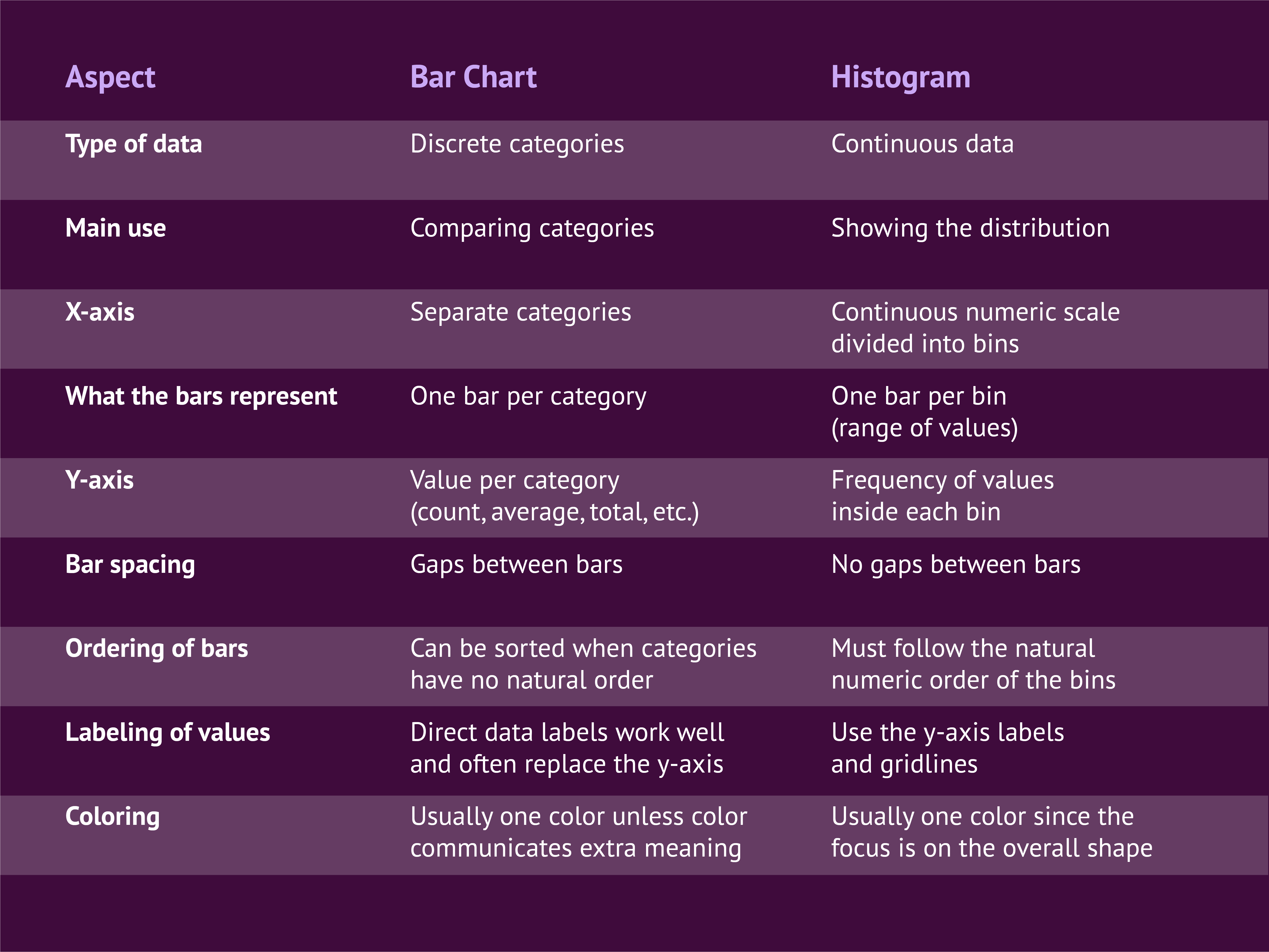
By now you have seen both charts in action and how differently they behave. To make the choice even clearer, here is a simple side-by-side overview of the most important differences. Use it as a quick guide whenever you are unsure which chart fits your data and your message.
A bar chart is the best choice when your data consists of clear, separate categories and your goal is to compare those categories. A histogram is the best choice when your data sits on a continuous numeric scale and you want to understand the distribution.
The table below shows how both charts differ in structure, purpose and design. Each row highlights one aspect that can influence your decision.
Part 6: Best Practices for Using a Histogram
A histogram is a powerful chart, but only when it is designed with care. Because it is less common than a bar chart, many readers need a little extra guidance to understand what they are looking at. The practices below will help you create histograms that are clear, accurate and easy to interpret.
Use histograms carefully when sharing insights
A histogram is great for your own analysis because it helps you explore patterns and detect variation in the data. When you present a histogram to others, think about whether your audience is familiar with this type of chart. Some readers may not immediately understand that a histogram groups values together and that the bars represent ranges. If you choose to include one, make sure the context is clear and the viewer knows why the histogram is the right tool for the question.
Give a short explanation of what the chart shows
Because histograms are less common, a quick explanation helps a lot. Clarify that the x-axis is divided into bins and that each bar contains multiple data points. This prevents viewers from reading the histogram like a bar chart with separate categories. Even a simple sentence can make the structure clear and help your audience interpret the distribution correctly.
Choose a vertical layout
Although a histogram can technically be rotated, the vertical layout works best. It reinforces the natural flow of the numeric scale from left to right and makes it easier for readers to follow the progression of the bins. A horizontal histogram is possible, but it often hides this natural order and can feel less intuitive.
Use clear axis labels
Axis labels are essential in a histogram.
- The y-axis should clearly state that it shows a frequency.
- The x-axis should make it obvious that the values are grouped.
Labels such as “Delivery time (hours, grouped in 4-hour bins)” help the reader understand why one bar represents multiple data points and what the ranges mean.
Choose the right bin size
Bin size has a strong impact on the shape of the histogram.
- Large bins give a broad overview.
- Small bins reveal more detail.
There are formulas that estimate a good bin size, such as Sturges’ rule:
K = 1 + 3.322 log(n)
Where K is the number of bins and n is the number of observations.
Sturges’ rule is used in many tools but is sometimes criticized for smoothing the data too much. In practice, it often works to start with an estimated bin size and then adjust it to match the logic of your data and the message you want to tell.
Part 7: Two Examples That Show the Difference Clearly
Sometimes a single example is not enough to show why bar charts and histograms behave so differently. Below are two short scenarios that use the same dataset in two different ways. In each case, the bar chart and the histogram answer a different question. This makes it easier to see when to choose which chart.
(Note: The datasets and charts shown below are fictional and created for demonstration purposes.)
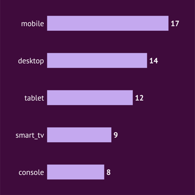
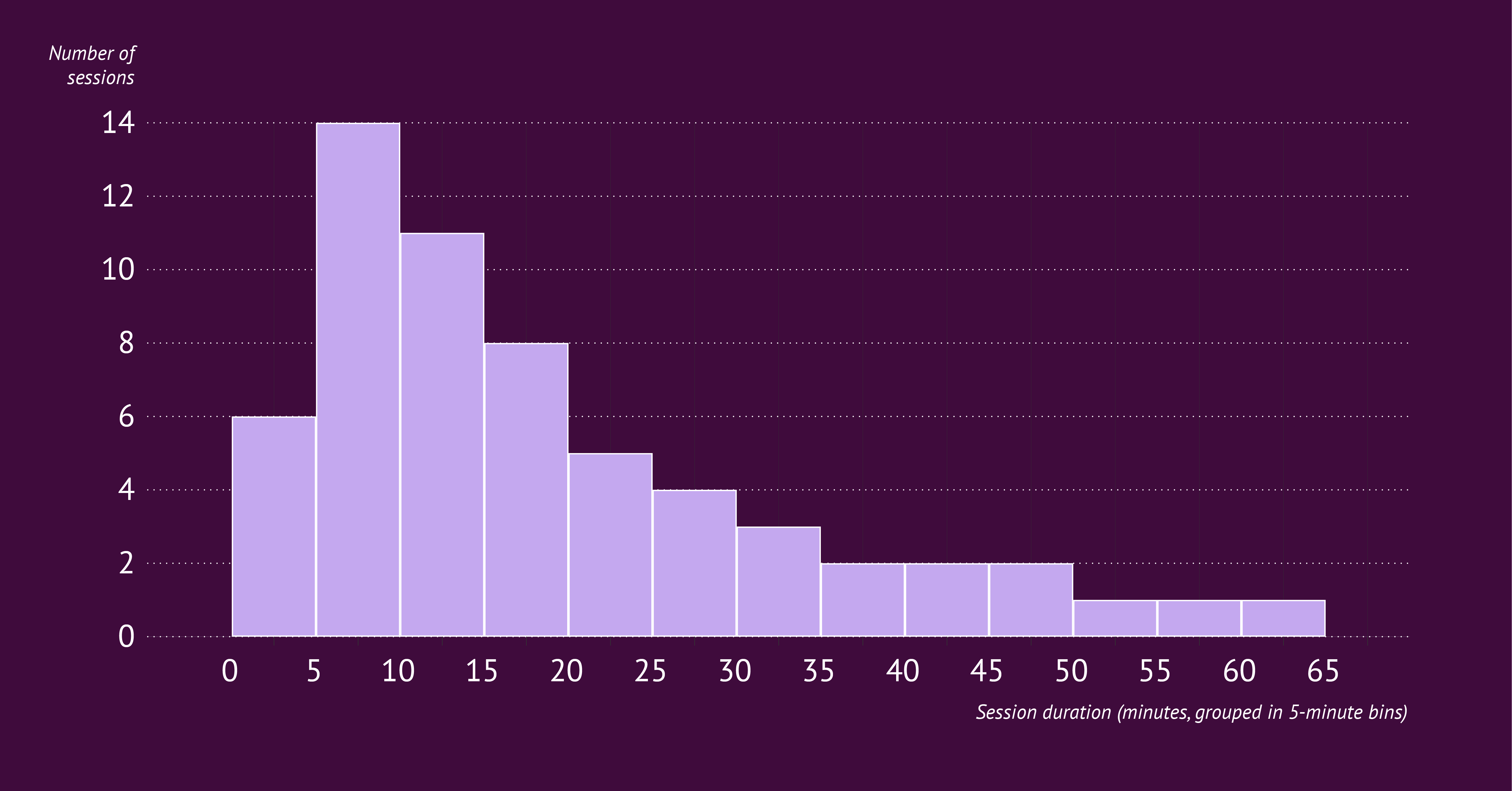
Example 1: Website Session Duration
This dataset contains the duration (in minutes) of 60 website sessions, along with the device used. Sessions range from just a few minutes to nearly an hour.session_id device duration_minutes1 mobile 32 desktop 123 mobile 74 tablet 45 desktop 226 mobile 17 desktop 98 mobile 15...(60 rows total — fictional sample data)
How the data transforms into a bar chart
To create a bar chart, you need categories. That means reorganizing the data so each device type becomes one bar. You can do that by creating a pivot table that counts how many sessions came from each device. Now your chart is ready, because each device is a clean, discrete category.
It answers the question: Which device type accounts for most sessions? This is a pure category comparison. It works because “mobile”, “desktop” and “tablet” are discrete groups.
How the data transforms into a histogram
For a histogram, categories are not useful. You need ranges, not device types. You can do that by creating 5-minute bins (0–4, 5–9, 10–14, etc.). Then count how many sessions fall inside each bin. This converts 60 individual durations into a frequency distribution.
It answers the question: How long do sessions usually last? You see patterns in the spread: a cluster of very short visits, a group around 5 to 15 minutes, and a long tail of longer sessions.
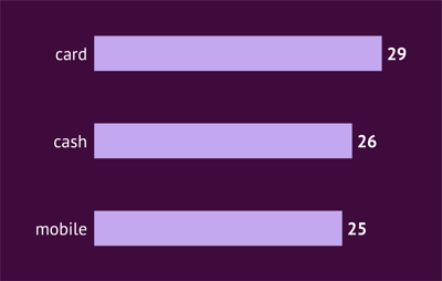
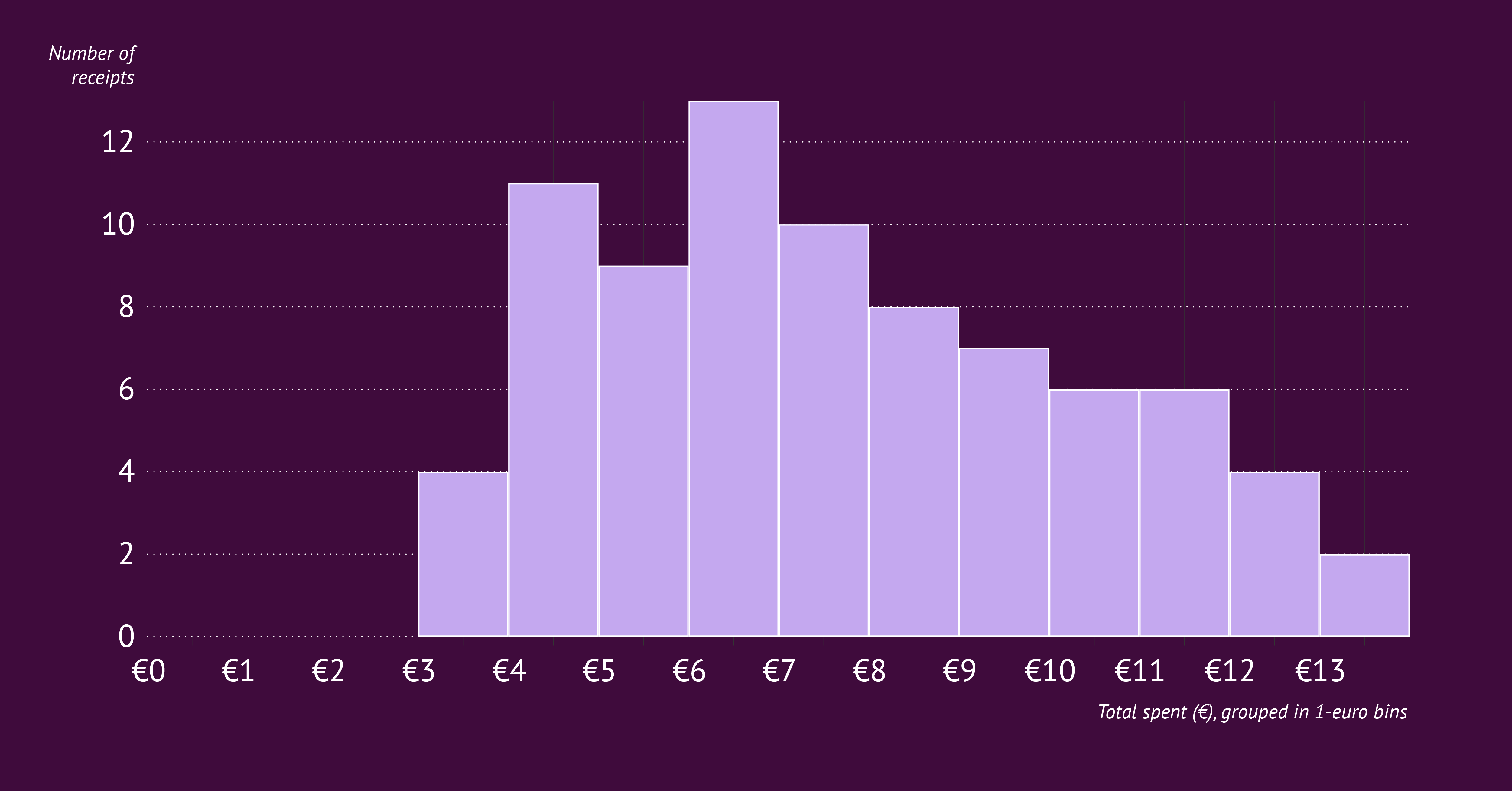
Example 2: Coffee Shop Sales
This dataset contains 20 receipts from a fictional coffee shop. For each receipt you see the payment method and the total amount spent (in euros). The values range from small purchases under €5 to higher amounts above €10.
receipt_id payment_method total_eur1 card 4.82 cash 6.13 card 3.94 mobile 5.25 card 7.46 cash 9.87 card 4.58 mobile 10.2...(80 rows total — fictional sample data)
How the data transforms into a bar chart
To create a bar chart, you again need categories. Here, “payment_method” is the clean categorical field. To prepare the data, create a pivot table that counts how many receipts were paid by each method.
Your new dataset becomes something like:
- card: X receipts
- cash: Y receipts
- mobile: Z receipts
Now your chart is ready, because each payment method is a clear, separate group. The bar chart answers the question: “Which payment method is used most often?”
It reveals something about customer behavior. Maybe card payments are dominant, mobile payments are growing, or cash is declining. These are category-level insights you cannot see in the raw numbers.
How the data transforms into a histogram
For the histogram, you ignore the payment methods entirely. Instead, you look at the amount people spend. To prepare the data, group the totals into bins such as: €0–4, €4–8, €8–12, €12–16. Then count how many receipts fall into each range.
The histogram answers a different question: “How much do customers typically spend?”
It shows the shape of the spending distribution:
- a cluster around €4–6
- another around €6–10
- a few higher purchases above €10
This gives you a sense of what is “normal” spending and how wide the spread is.
The Final Takeaway: Trust the Shape of Your Data
Histograms might bring back memories of dusty textbooks and strict statistics rules. But as we have seen, they do not have to be scary. They are simply a tool to help you see the shape of your data. A shape that a bar chart often hides.
While bar charts are great for declaring "winners" (like which carrier is fastest or which device is most popular), histograms are necessary for understanding "reliability" and "normality". They answer questions like: How consistent are we? What is the typical range?
The next time you are staring at your dataset and fighting the urge to just pick the chart that looks the prettiest, ask yourself one simple question: "Am I comparing distinct groups, or am I looking for a trend in the numbers?"
- If it is distinct groups, give them space. Use a Bar Chart. Start making bar charts right now with our bar graph maker.
- If it is a trend in the numbers, let them flow. Use a Histogram. You can start right now with our histogram maker.
Mastering this distinction is a small technical step. But it makes a huge difference in how clearly you communicate your work. And hey, maybe now those statistics class memories will not feel quite so alarming.
Once you know which chart you need, you can start shaping it to match your story. Datylon for Illustrator makes this part simple. You can remove the gaps to turn a bar chart into a true histogram, adjust the x-axis to show your bins clearly, restyle the y-axis and gridlines, or add prefixes and suffixes to your labels. Once your design is set, you can reuse the same chart as often as you like by updating the data. And if you want to go one step further, you can even automate it with our tools.