
How do we see the world in colors? It all starts with the light. The light can come from the Sun, fire or a lamp sending waves of different lengths. The surfaces around us have different capacities for absorbing wavelengths, so some of the waves are absorbed, while others are reflected. The ones that are reflected can be perceived by our eyes. These waves go through the cornea and pupil and hit the retina. The retina consists of cones and rods. Cones are the ones that are responsible for color perception. The combination of waves that hit the cones form in our brain the perception of color.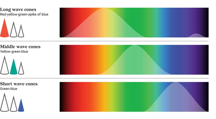
There are three types of cones: The first type is sensitive to long wavelengths (starting from red, peaking at yellow, and declining at green). The second type is sensitive to middle wavelengths (starting at orange, peaking at green, and declining at blue). The third type is sensitive to short wavelengths (starting at green and peaking at blue).
Table of contents
1. What colors can color blind people see? 3. How to make charts color blind friendly? |
What colors can color blind people see?
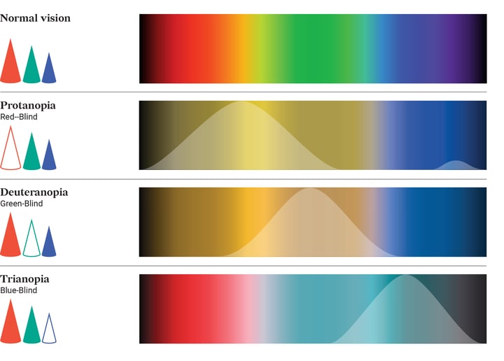
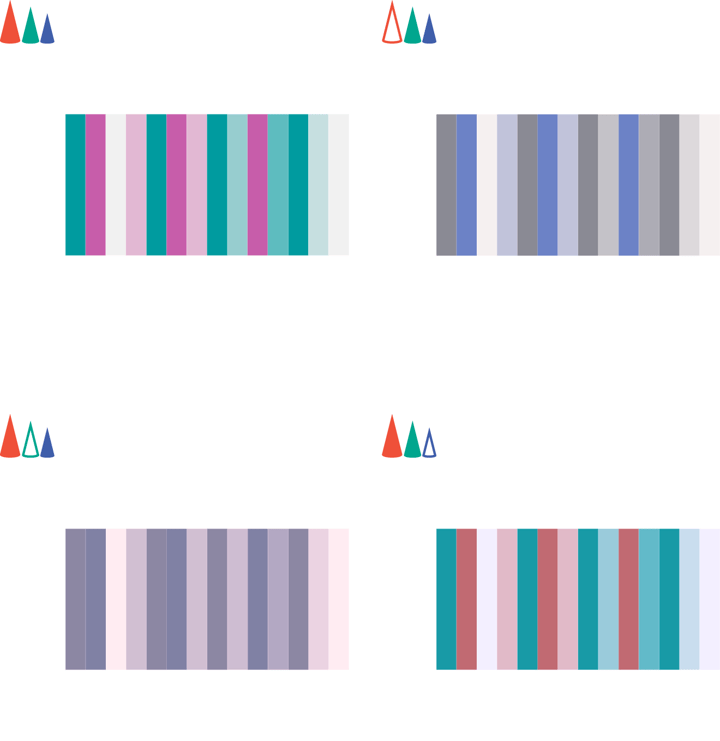
Actually, it depends on what type of cones don't work. There are three common types: protanopia (red-blind), deuteranopia (green-blind), and tritanopia (blue-blind). There can also be an intermediate state, color weakness - when the colors can be distinguished but some of the hue details are lost. There’s also a very rare state when all the cones are not working and the person is completely color blind – it’s called complete achromatopsia. In the next picture, the simulation of what colors can color blind people see is presented.
There are around 300 million people in the world who are colorblind. About 8% of men and 0.5% of women are colorblind, so making your chart color blind safe is a reasonable thing to do.
Color blind palette
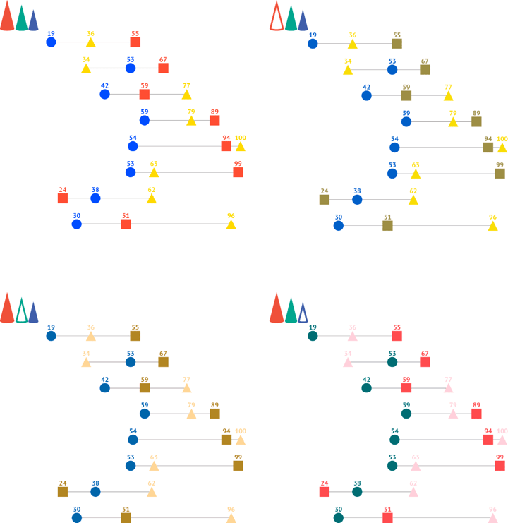
The picture below shows that for all of the types of color blindness there is a pair of colors that can be distinguished – red and blue – these are color blind safe colors. As for the green, it is the number one among the colors to avoid for the color blind. Most of the issues for colorblind people come from the prevalence of red-and-green combinations as a pair of opposites in design. The first rule of making a palette for colorblind – avoid combining red and green. So if you’re aiming to create a color blind-friendly palette try to use only two basic hues: blue and red (orange and yellow will also fit). The other colors should be made out of these two hues. All the variations can be made by using different saturation or lightness of the basic color. Based on these rules we’ve created a color blind palette and checked it for three color blindness types.
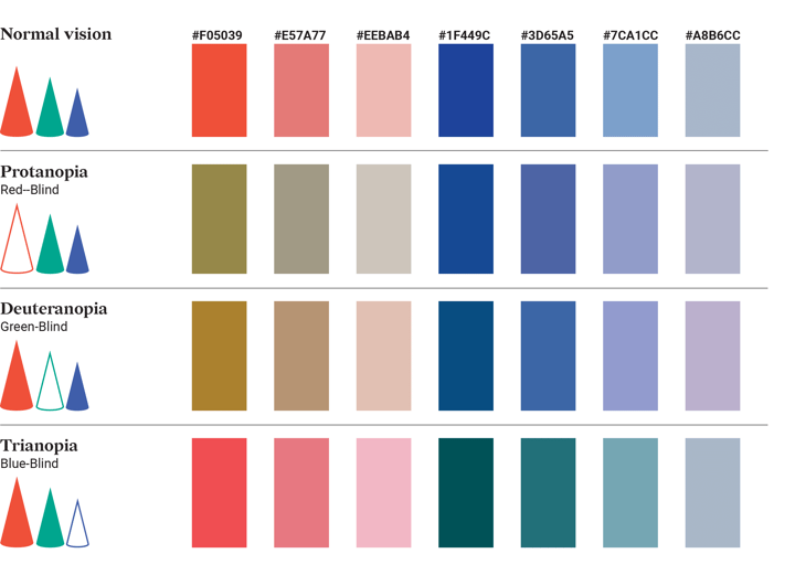
As you can see the palette worked for all types of color blindness, but you should always be aware that the variation of color-blind colors can vary significantly from person to person, so it’s always important to double-check. If you have a friend who is colorblind – ask for feedback. Alternatively, you can look up a colorblind community online and reach out to them. Don’t forget about people with complete color blindness and remember that 100% best colors for colorblind are black and white. So if your visualization works in greyscale you should be safe. Another advantage of using black and white data visualization is that they’re print-ready. But remember, if the palette is grayscale one should use other tools to distinguish chart elements.
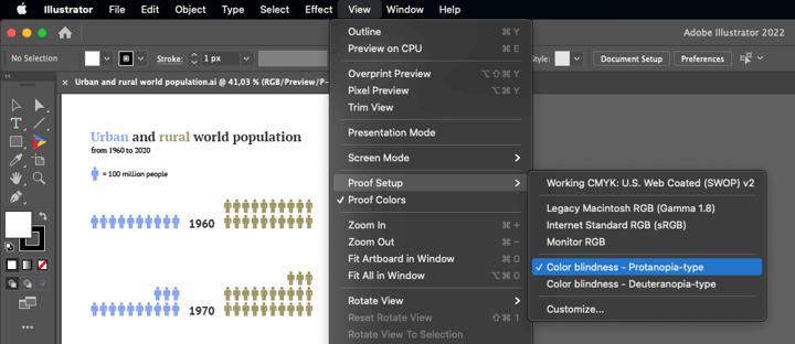
There are a few tools that can help you to check your visuals. For this article, a color-blind simulator was used from the Colorblindor website. There’s also a helpful internal tool in Adobe Illustrator. You can access it under View > Proof Setup > Color-Blindness - Protanopia-type or Deuteranopia-type.
How to make charts color blind friendly?
Use shapes and icons as an addition or alternative to color-coding. In case one needs to use colors that are not perceptible by colorblind users, a chart can be saved by using icons as an addition to color, duplicating its informational function.
![]()
Typically, it’s better to use direct labels instead of a legend – it saves the time and attention of a reader. Another advantage of direct labels is its ability to fix the usage of palettes that are not color blind friendly.
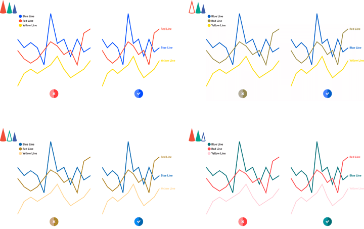
For line charts and their variations, dashed lines and lines with various stroke thicknesses can be a very helpful alternative to coloring.
Adding strokes around chart elements might also help to distinguish one element from the other if the color might look the same for color-blind users.
If the usage of color is inevitable try to use a single hue palette. It will make the chart readable for all kinds of color blindness including monochromacy (when no color can be recognized). The second option is to use a red-yellow-blue palette. It will work for all kinds of color blindness except monochromacy.
Use color for groups, not the individual categories. By doing that the number of colors will be reduced, as well as visual clutter and the possibility of color confusion.
Good and bad charts for color blind viewers
Most of the charts can be modified to be colorblind-friendly, the difference is that some of the charts won’t suffer from the lack of color while the others are heavily dependent on color. Our recommendations are based on how easily one or the other chart can work without any color coding.
Comparison charts
✅ Good choice: Dot plot (and Parallel coordinates)
Dot plot could be both great and challenging. If the color is used for dot differentiation – it won’t work well. But if the dots are substituted with different colors per category it will make a very good choice for comparison of multiple categories at the same time.
Check out the dot plot resource page and learn how to design the best dot plots that will impress your audience.
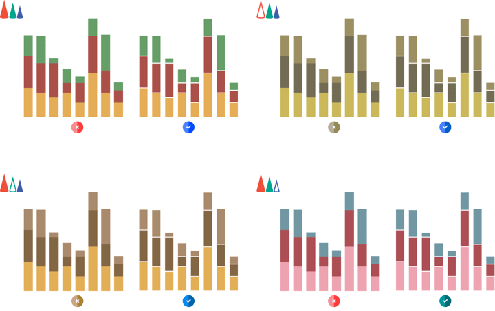
❌ Bad choice: Grouped bar/column chart
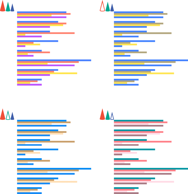
Grouped bar charts are usually based on the color differences of the bars of the same group. This makes it difficult to read for colorblind users. With a large number of categories, this chart becomes unreadable to everyone.
Correlation charts
✅ Good choice: Bubble chart
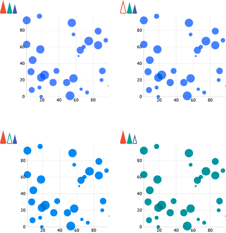
It can be easily used without color. X- and Y- axes, size, and different icons provide 4 dimensions already which is easily enough for most of the visualization tasks.
➡️ Datylon chart maker allows you to create beautiful bubble charts. Give it a try for free!
❌ Bad choice: Heatmap
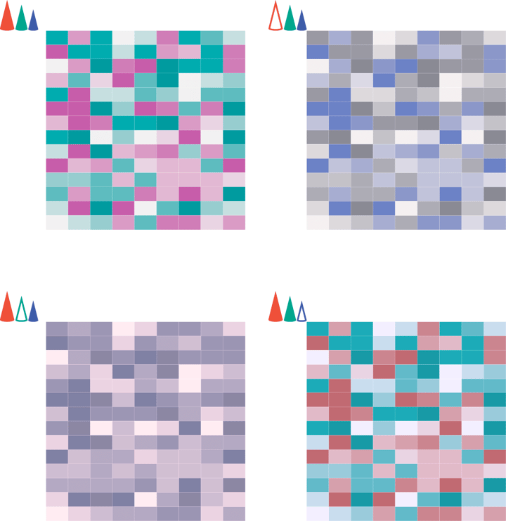
Heatmaps are heavily dependent on color, so the only way to make it safe for colorblind readers is to use one hue or grayscale palette.
Part-to-whole & hierarchical charts
✅ Good choice: Icon array
![]()
Icon array is a rare case of a part-to-whole chart that doesn’t depend on colored areas or sectors. With the use of icons instead of color differentiation, this chart becomes a preferable chart type for colorblind people among all part-to-whole charts.
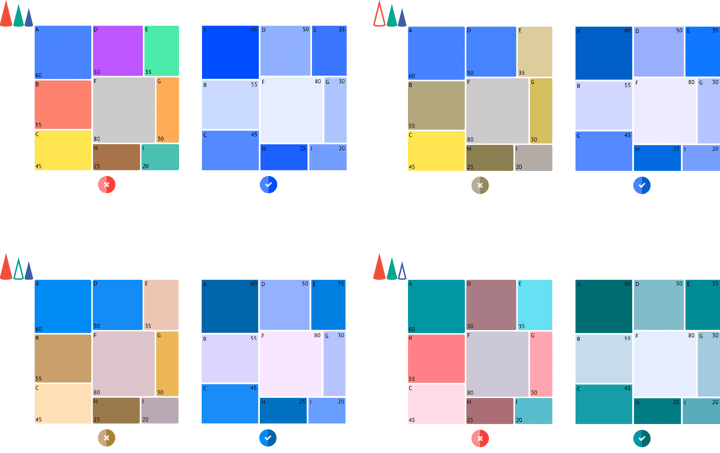
❌ Bad choice: Treemap
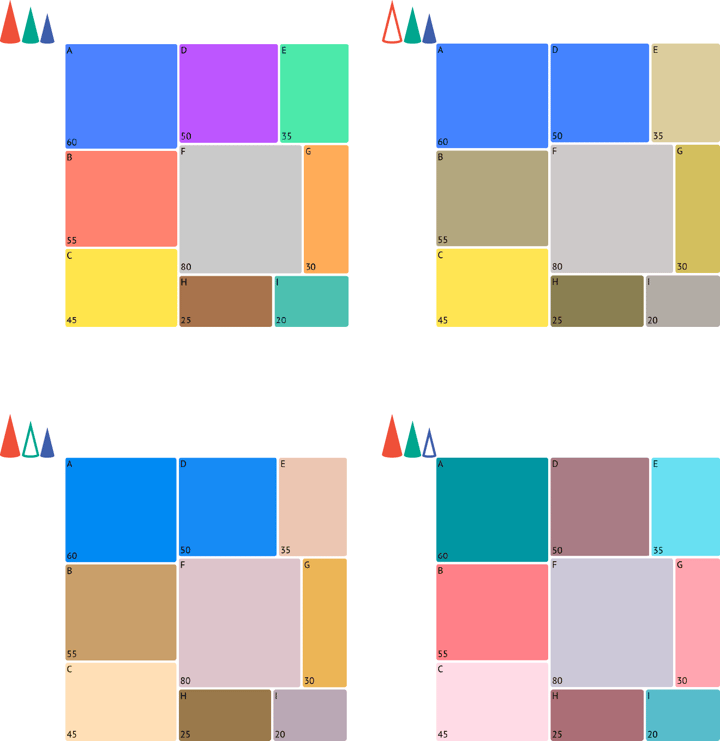
Similar to heatmaps, treemaps are famous for their extensive use of color. Surely, a treemap can be made also with a mono hue palette or just with the help of stroke borders, but the lack of color will weaken its visual strength, especially if a complex hierarchical structure should be presented. One of the things that can save a treemap is spacing between cells.
Date over time charts
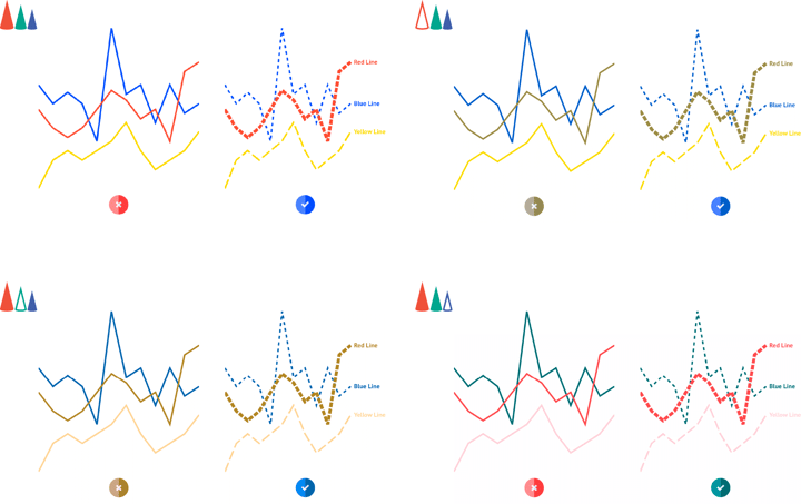
✅ Good choice: Line chart
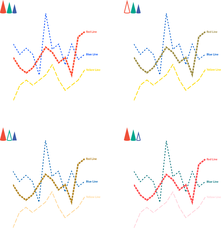
The simplest and most flexible temporal chart that can be modified in various ways to make it readable for a colorblind audience. In the case of multiple categories, the line width can be modified as well as various types of dashed strokes. Direct labels and data marks can also be used to differentiate lines. Discover even more pro design tips on our dedicated line chart resource page and advance your data visualization with Datylon.
You can also easily create colorblind-friendly line charts with the Datylon chart maker. Sign up for free using this link.
❌ Bad choice: Streamgraph
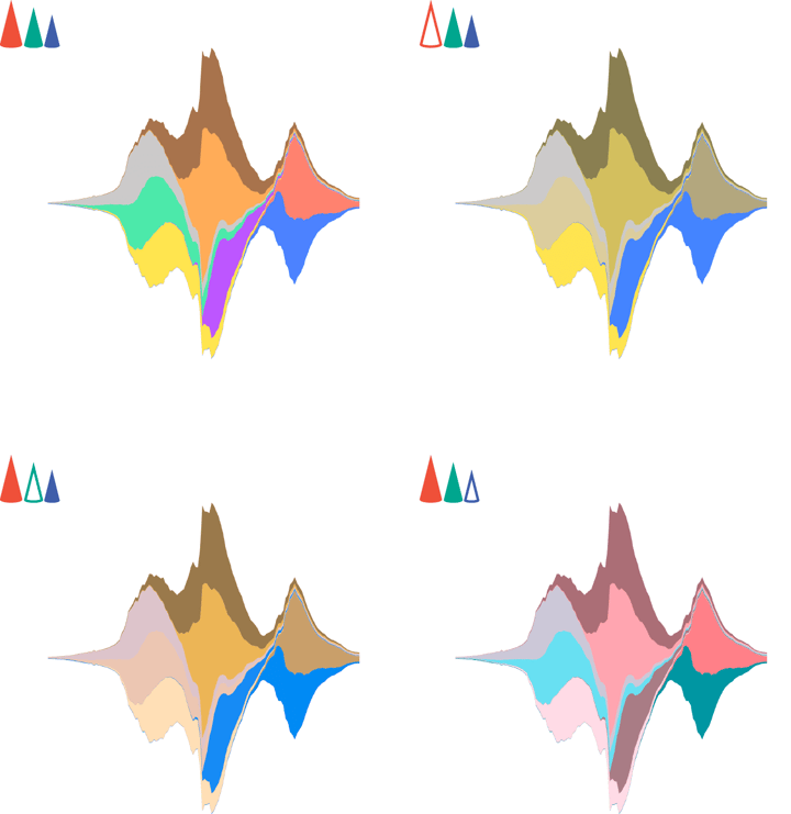
A very beautiful chart, but helpless without color. It loses its attractiveness and readability right away.
Distribution
✅ Good choice: Density and ridgeline plots
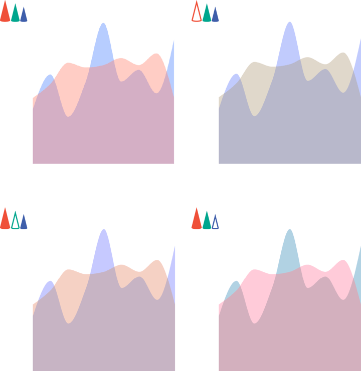
A good choice for visualizing both single and multiple distributions. Opacity and direct labels can substitute the need for coloring.
❌ Bad choice: One-dimensional heatmap
A one-dimensional heatmap can quickly become a bad choice if multiple colors are used. One hue palette can work pretty well though.
Further reading and resources
- Mind your data visualization - How to present your data effectively by getting the most out of your reader's brain capacity.
- 9 types of data visualization - How to choose the right type for the right audience.
- Datylon Chart Library - Pro design tips to make the best charts and graphs and take your data visualization to the next level.
➡️ If you want to apply all these tips and make your data visualizations truly inclusive for different types of audiences, you need the full freedom of design to do so. Thankfully, you can do it with Datylon. You can sign up here – it's free and only takes a few seconds.
👉If you're keen on crafting custom data visualizations, visit our Bespoke Data Visualization Solutions page.
💡 Bonus: For teams or agencies that need to regenerate these color-blind–safe charts on a regular basis, Datylon Report Server lets you set up fully automated, template-driven charts and reports. If you are interested in automated reporting you can explore our dedicated blog article or schedule a personalized demo with one of our experts.