Recently I wrote a ‘deep dive’ blog post about bar charts. The bar chart is used often because of its simplicity and because it is very easy to understand for the general public. However, sometimes you might want to look beyond such classical charts to communicate data in a fun, creative, and gimmicky way. This means you have to think out of the box, which in turn makes room for unusual and creative designs.
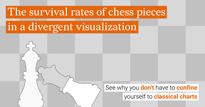
With this article, I will show you the ever-changing face of data visualization and show you what opting for less classical charts can be like. In the data visualizations that will be discussed, the survival rates of chess pieces are communicated.
Oliver Brennan researched this topic by looking into 2.2 million chess games. As shown in the next chart created by Oliver Brennan, both kings have the highest survival rates (100%), followed by the h,g,f, a, and b-pawns (>56%). After that, the rooks (around 55%) and the queens (around 49%) have the highest survival rate in a game of chess.
As discussed by Oliver Brennan on the Quora forum: “The most survivable central pawn is the White c-pawn (42%), while White’s d-pawn is the most doomed of all the chessmen (24%) - more so even than the knights (~26%). There's a pleasing symmetry in the survival rates of the White and Black c- and e-pawns that suggests they're frequently exchanged on the d-file.”
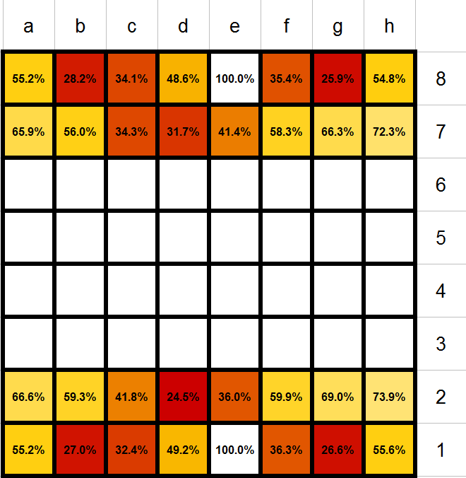 Heatmap showing the survival rates of chess pieces, created by Oliver Brennan
As shown in the above visual, Oliver Brennan decided to show the data for each chess piece in a heatmap resembling the chessboard; very clever. It is immediately clear which fields contain the chess pieces with the lowest and the highest survival rate. Though, he left it up to the public's knowledge to know which field corresponds to which piece.
So with the next design, I want to show you what data visualization can look like when you go beyond classical charts. I created a pictorial chart, where the filling of the chess pieces represents the survival rate of that piece.
By using this type of chart, it is immediately clear that the chart is about chess. Moreover, this type of chart is a very simple way of presenting data as the color filling of the pieces is so easy to quickly understand since it visually reflects the survival rate of that piece.
Also, this type of chart, just like the bar chart, is great for comparison. The differences in length of the filling are easier to perceive, than, for example, differences in size and color. Though, it is a bit harder in a pictorial chart to compare the length, than in bar charts. Therefore, always add a data label to the chart to make sure the audience has another tool to compare the values accurately.
How to create a pictorial chart with Datylon for Illustrator plug-in
With the Datylon for Illustrator plug-in, it is possible to create a pictorial chart by combining the plug-in with the pathfinding tool and using layers in Adobe Illustrator. First, start with the design of your data visualization project and create a mask layer in the background of your design. Behind that mask layer, the charts will be placed later on.
For example, for my design, I created a mask layer of the chess pieces. This means that all chess pieces were cut out of the gray squares. This can be done by selecting both the background (gray square) and the pictogram (chess piece) and selecting the two squares at “Pathfinder” where the top element is subtracted from the bottom element (see picture). In my design, I also wanted to show the outline of the chess pieces, which is why I first copied the chess pieces and pasted them on top of the mask layer.
 Pathfinder tool, substrating top element from the bottom element
Now you can continue by defining the height and width of your charts in the design and create the charts accordingly. This means for my design that I created four bar charts with every eight bars for rows 1, 2, 7, and 8, corresponding to the data values.
Now, this is the first part where Datylon for Illustrator wins from the standard bar graph tool in Adobe Illustrator. With the plug-in, it is super easy to resize the charts to the desired format, whereas with Adobe Illustrator this is a frustrating and time-consuming process. Though, resizing the charts is super important and essential for creating pictorial charts.
So now you can resize the bar charts according to the design, in this case, according to the size of the pieces on the chessboard. Finally, you can bring the charts to the back by Right-clicking > Arrange > Sent backward. Now your charts are behind the masking layer.
You can now try our chart maker plug-in for Illustrator for 14 days, for free. You don’t even need a credit card. Join Datylon today and get started with your design!
👉If you're keen on crafting custom data visualizations, visit our Bespoke Data Visualization Solutions page.