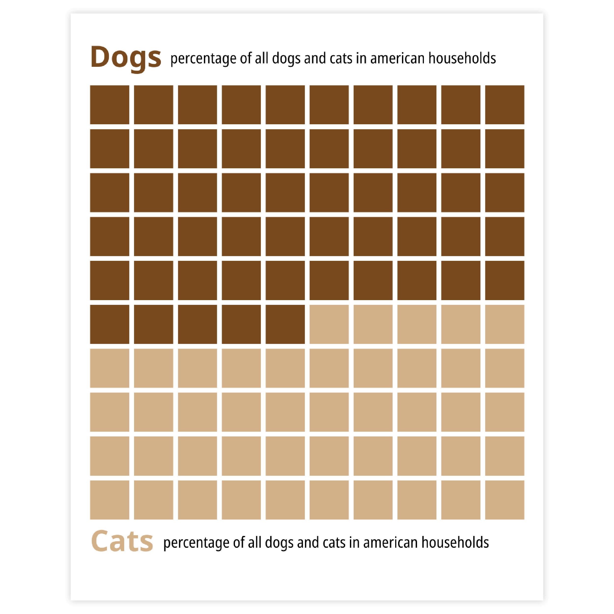
The blue icon represents an icon array chart

Icon array

DATYLON > CHART LIBRARY > ICON ARRAY

What is an icon array?

An icon array chart is a rectangle or square grid of equal-sized icons. The whole set of icons represents the total value. Each icon shows a proportion from a total value. Groups of icons representing the same category are filled with the same color or have the same shape.

Icon array charts are used to visualize part-to-whole data. They are often used for visualizing surveys, voting results, market shares, demographic data, and many more.

Icon array charts might be considered as a successor of the Isotype pictorial language whose purpose was to make data visualization more accessible. That’s why icon array charts, being extremely easy to interpret, are often used to simplify the presentation of data.

iconarray4

Variations of icon arrays

The charts below are variations of an icon array. To learn how to make them with Datylon, check out the icon array chart user documentation in the Help Center.
A yellow icon shows a simplified example of a progress icon array chart with a Datylon icon next to it indicating you can make it with Datylon.
A pale icon (only visible when you hover on the yellow icon) shows a simplified example of a progress icon array chart with a Datylon icon next to it indicating you can make it with Datylon.

Progress icon array chart

It tracks and displays the progress towards the goal or task completion. Icons fill up as the process advances.

A yellow icon shows a simplified example of a colored icon array chart with a Datylon icon next to it indicating you can make it with Datylon.
A pale icon (only visible when you hover on the yellow icon) shows a simplified example of a colored icon array chart with a Datylon icon next to it indicating you can make it with Datylon.

Colored icon array chart

For visualizing a part-to-whole relationship, a group of same-colored icons is used for each category.

A yellow icon shows a simplified example of a waffle chart with a Datylon icon next to it indicating you can make it with Datylon.
A pale icon (only visible when you hover on the yellow icon) shows a simplified example of a waffle chart with a Datylon icon next to it indicating you can make it with Datylon.

Waffle chart

It's considered the most efficient form for an icon array as it follows the chart's structure, enhancing readability.

Alternatives to an icon array chart

Substitute your icon array chart with any of the charts below when you want an alternative that shows a part-to-whole relationship.
A yellow icon shows a simplified example of a stacked column chart with a Datylon icon next to it indicating you can make it with Datylon.
A pale icon (only visible when you hover on the yellow icon) shows a simplified example of a stacked column chart with a Datylon icon next to it indicating you can make it with Datylon.

Stacked bar / column chart

A stacked bar chart has extended possibilities in terms of visualization compared to an icon array chart, as it’s possible not only to compare part-to-whole on the scale of one stacked bar but also between bars. It means an additional dimension can be visualized.

A yellow icon shows a simplified example of a pie chart with a Datylon icon next to it indicating you can make it with Datylon.
A pale icon (only visible when you hover on the yellow icon) shows a simplified example of a pie chart with a Datylon icon next to it indicating you can make it with Datylon.

Pie chart

A direct functional alternative, as it's also used for visualizing both part-to-whole data as well as progress. The difference lies in the way data is presented. The pie chart might be considered abstract, while the icon array is simpler and straightforward.

A yellow icon shows a simplified example of a treemap with a Datylon icon next to it indicating you can make it with Datylon.
A pale icon (only visible when you hover on the yellow icon) shows a simplified example of a treemap with a Datylon icon next to it indicating you can make it with Datylon.

Treemap

Treemaps, as well as stacked bar charts, have additional possibilities in terms of visualizing part-to-whole relationships. Treemaps can visualize multiple levels of hierarchical data, while in an icon array, only one level can be visualized.

Pro tips for designing an icon array

Learn how to improve the readability and visual appeal of your icon array chart.
An image supporting the paragraph about

Grid size

A grid size should be chosen based on the data used. A balance between readability and accuracy should be achieved. A grid with a few icons is good for readability but lacks accuracy as rounding to an icon value will be too rough. On the other hand, the smaller icons will be more accurate but due to the smaller size of icons, a chart will be harder to read. As a rule of thumb, a 10 by 10 grid is an optimal solution as it also allows us to show the percentages of each category visually.

Read more
An image supporting the paragraph about adding legends and labels to icon array charts, explained in detail the paragraph next to it.

Legend and labeling

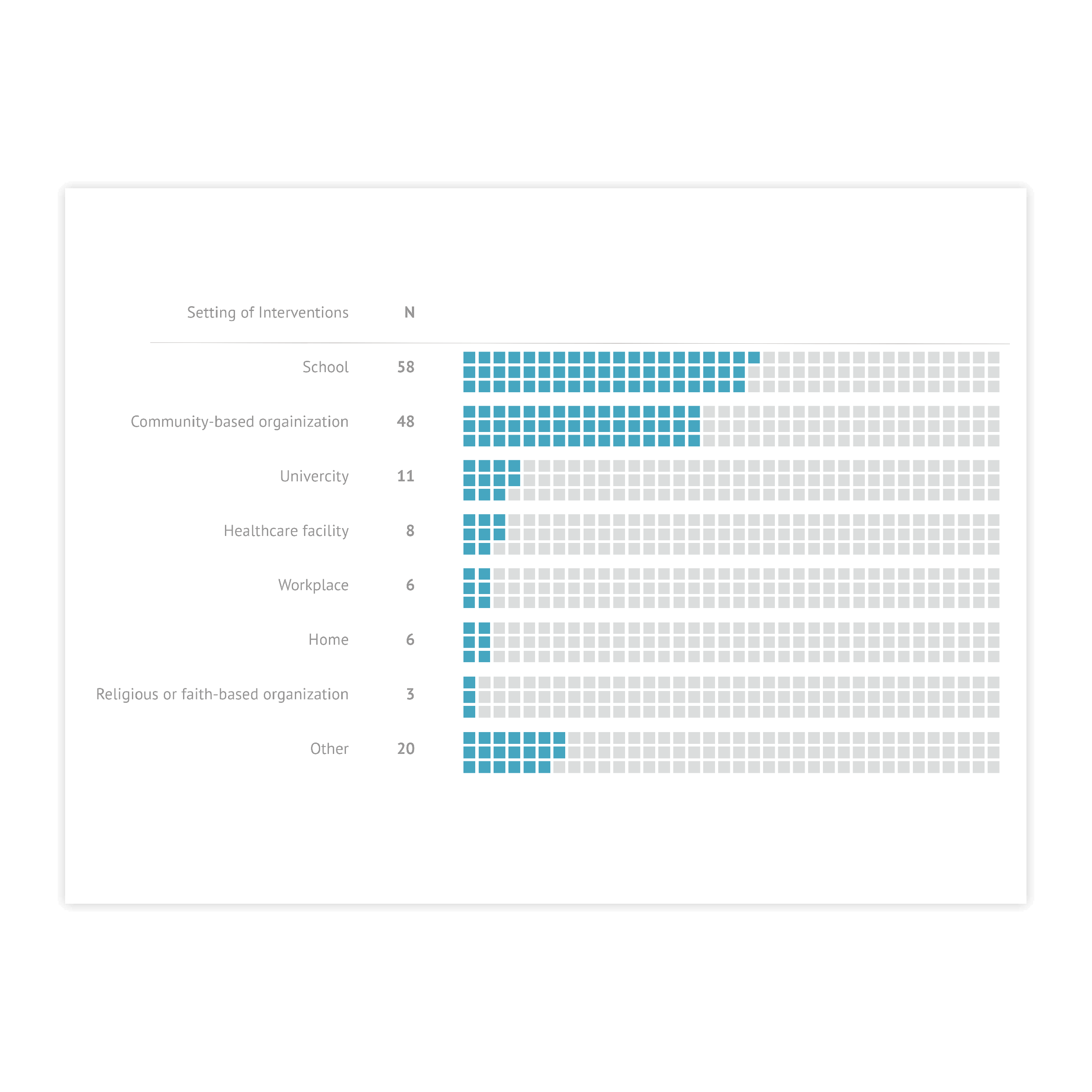
Icon array is a tough chart to label the categories directly, as the positions of the groups of icons can vary from chart to chart and it’s hard to find a proper placement for direct labels. The optimal solution for an icon array is using a legend. It can be placed independently of the chart and allows users to update a chart without changing the location of the labels.

Image supporting the paragraph about the correct number of categories in icon array charts.

A number of categories

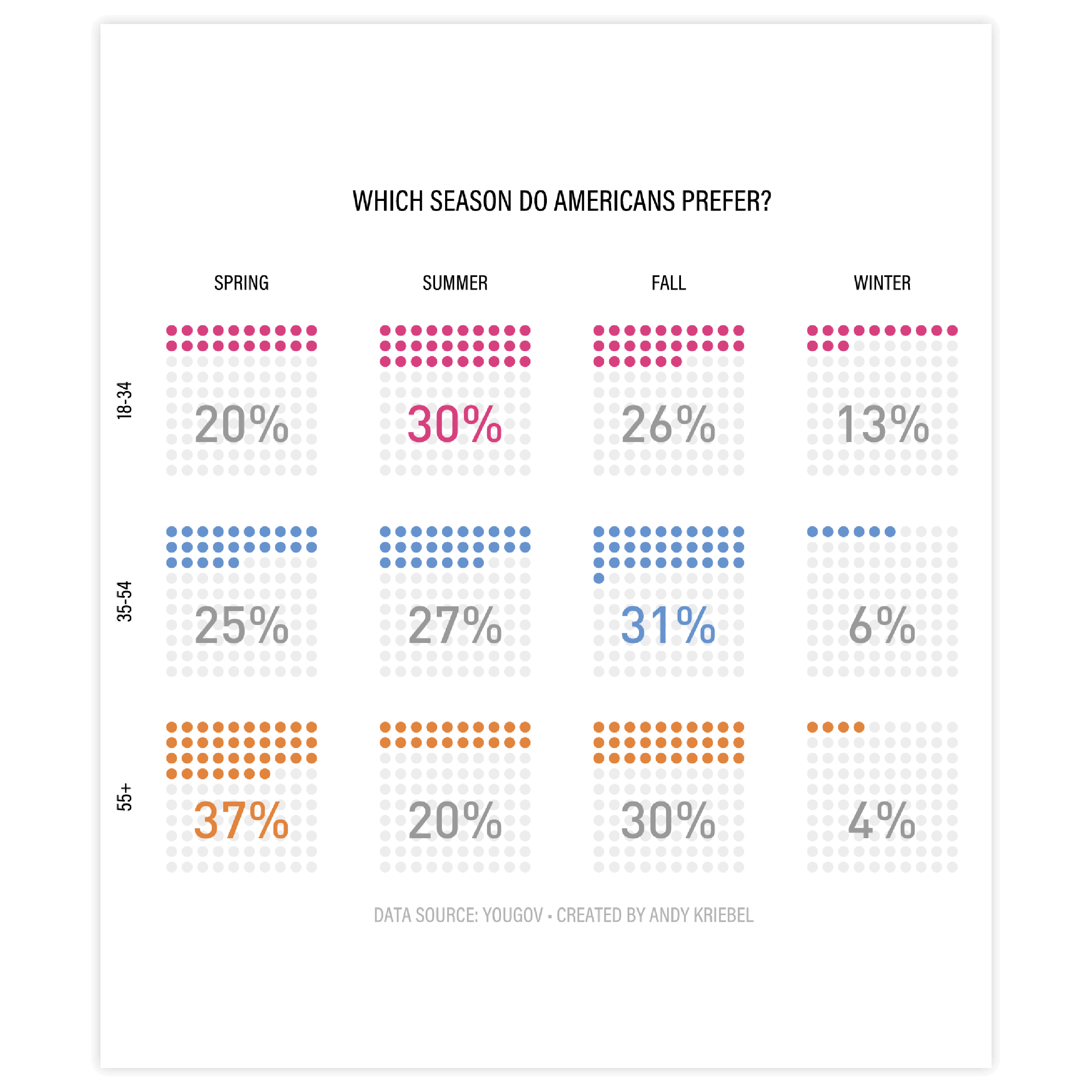
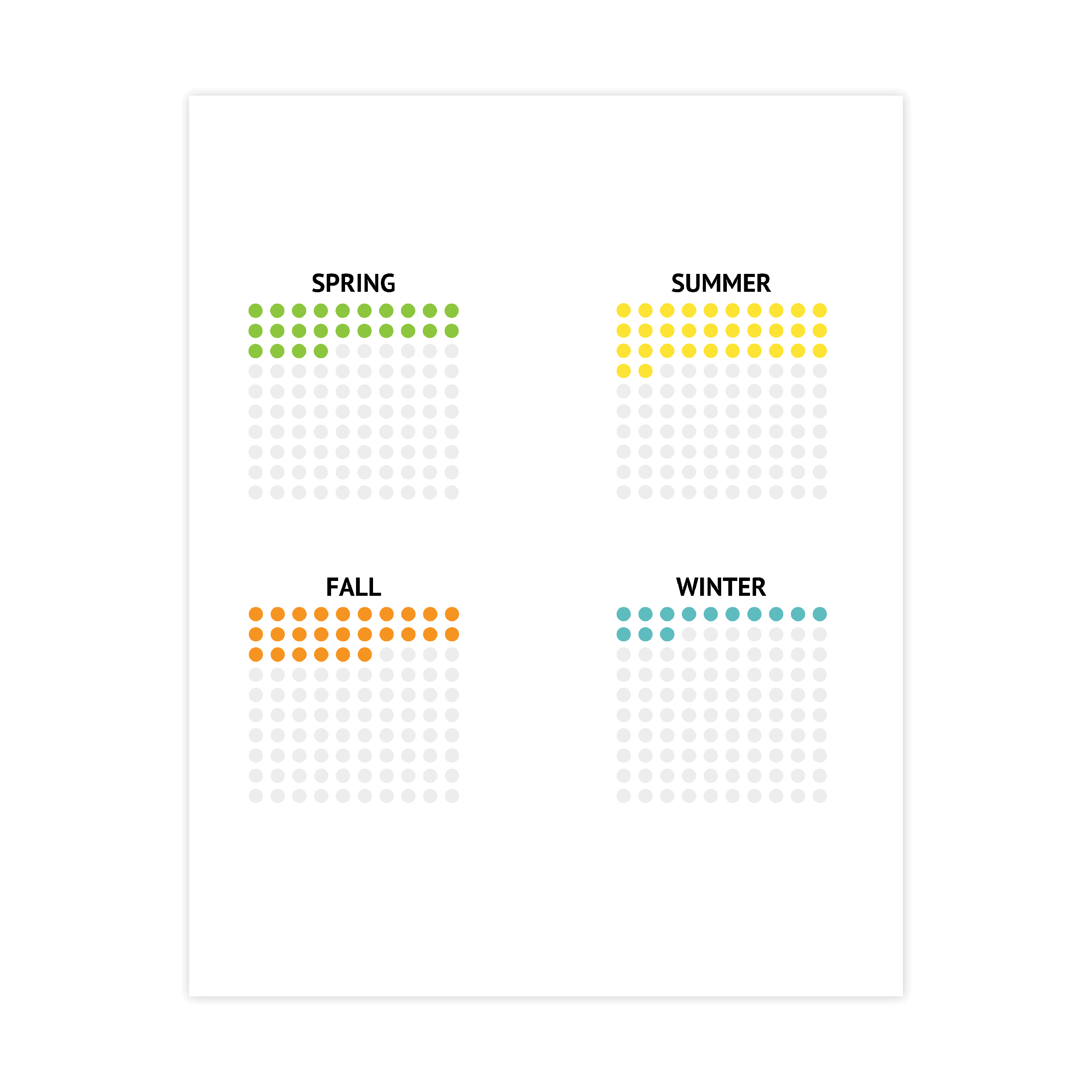
A similar rule applies in icon arrays as in pie charts; it’s better not to use more than 5 categories. Otherwise, the chart becomes cluttered. If there are more than 5 categories it’s recommended to add a “rest” category.

Read more
Image supporting the paragraph about the correct coloring for accessibility of icon arrays.

Coloring and accessibility

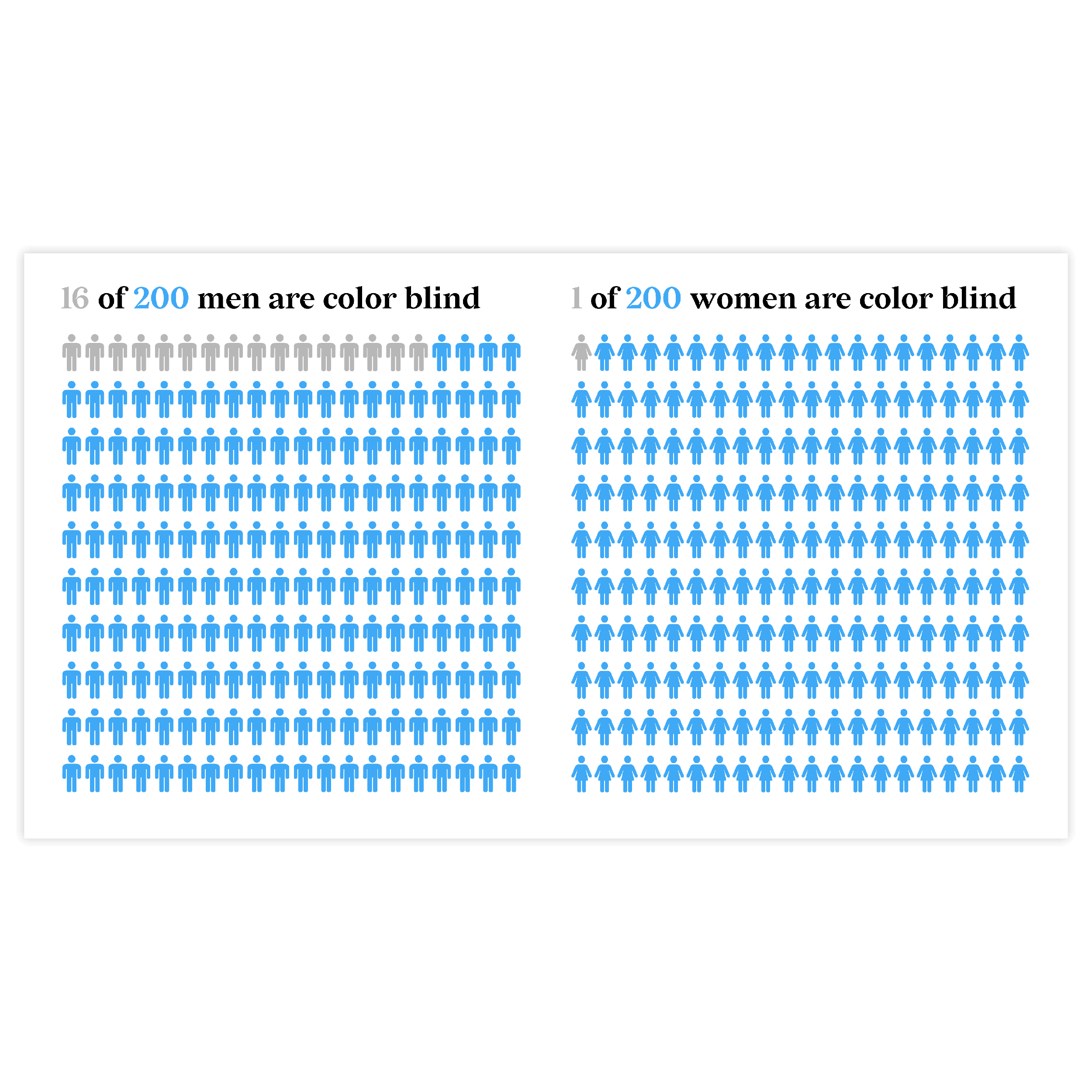
For a progress array chart the coloring rule is easy: use dark color for completed icons and light or no color for non-completed. For an icon array chart with multiple categories, one should consider accessibility and use a colorblind-friendly palette or bind a unique icon for each category.

Read more
Image supporting the paragraph about the correct placing of the icons in the icon array charts.

Icons placement

There are two ways icons can be placed. One-sided or both-sided. If one-sided placement is used icons from the same category can be separated while being on the neighbor line. The both-sided placement allows having clusters of icons. This makes category icon groups clearly visible.

Read more
Image supporting the paragraph about the visualizing a boolean variable.

Boolean variables

Icon charts are perfect for showing progress or visualizing a boolean variable (a variable with only two possible values: “Yes” or “No”, “True” or False” etc.). It can be done by using a filled icon for the first value and outlined for the second value.

Create your own icon array

Join Datylon for free and get started online or download our Datylon for Illustrator plug-in with a 14-day trial. Connect with a Datylon expert for a demo session.

Icon array examples & inspiration

Scroll and click on the images below to find inspiration samples of icon arrays. With your Datylon account, you can use these designs, customize them and update them with new data. Or start designing your very own icon array!

Discover more charts in our Chart Library

Learn more about the different types of charts and graphs you can design with Datylon. Discover other resource pages in our Datylon Chart Library.