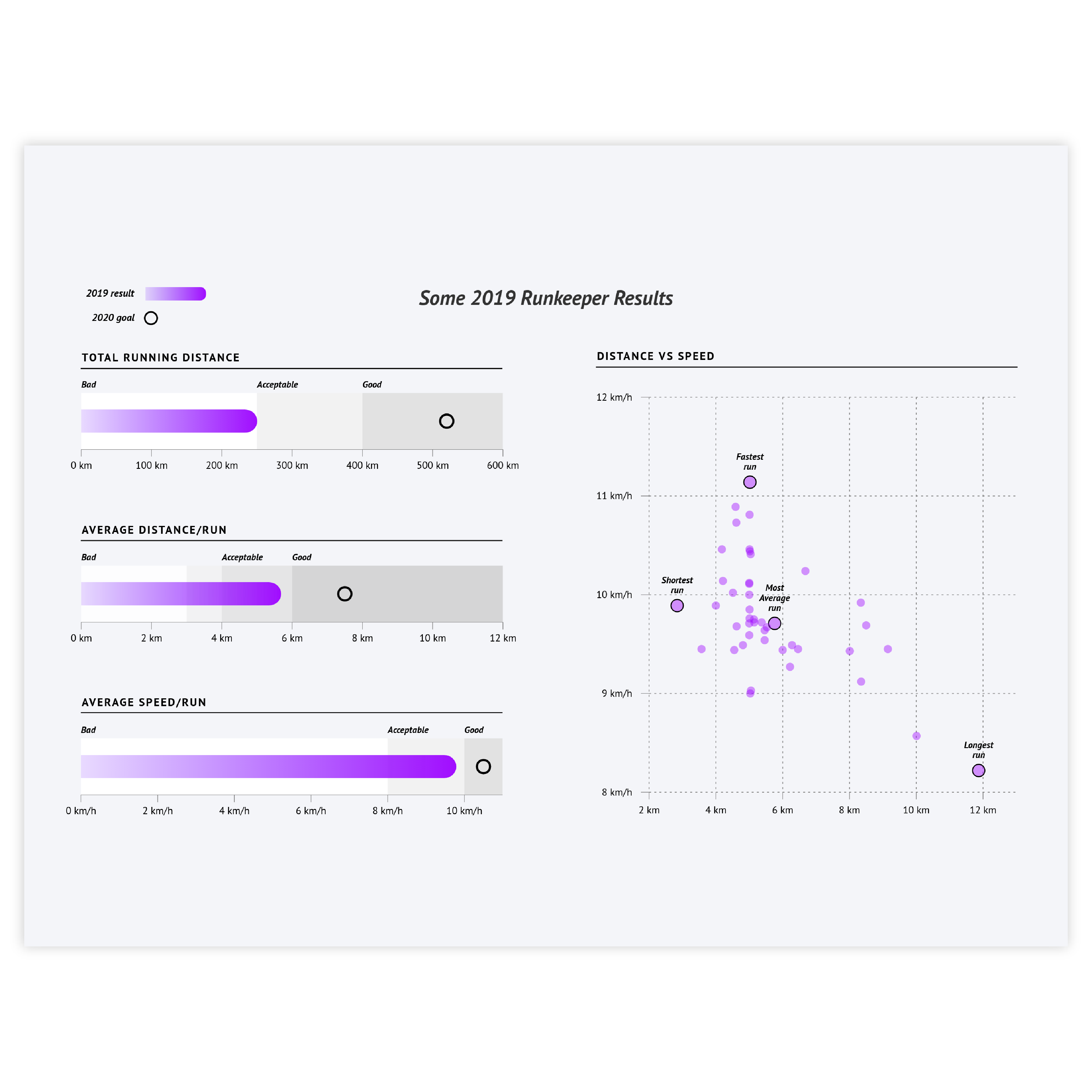
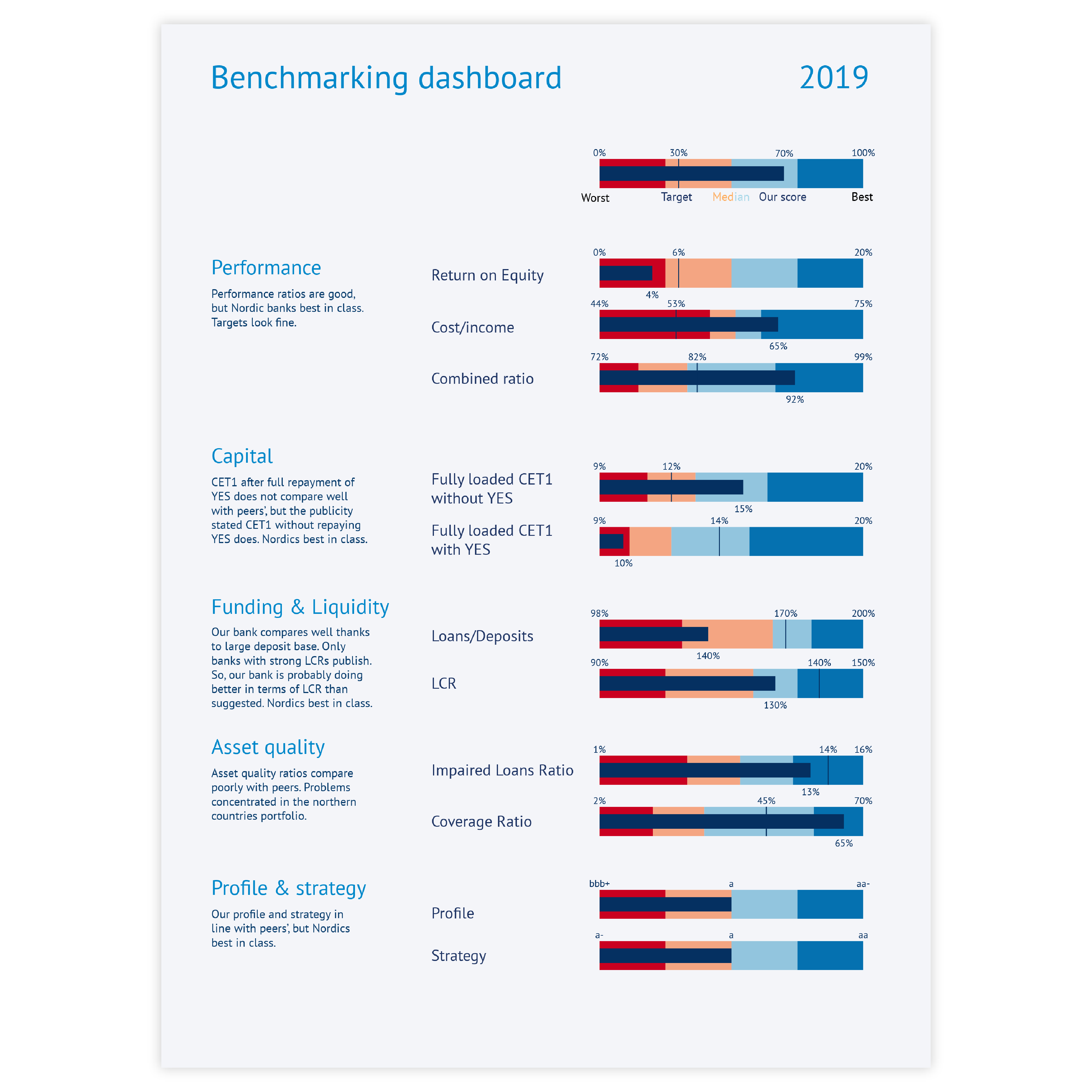
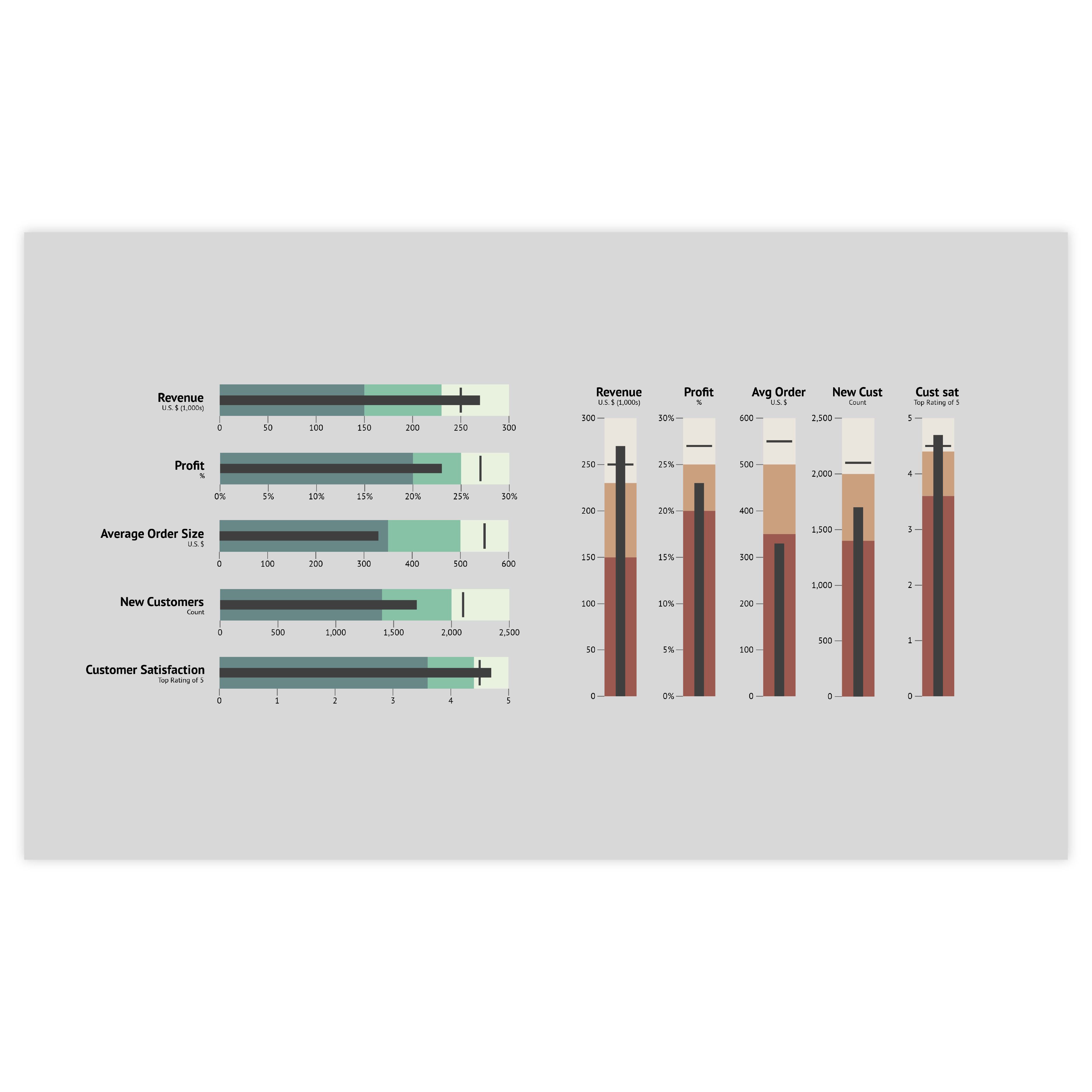
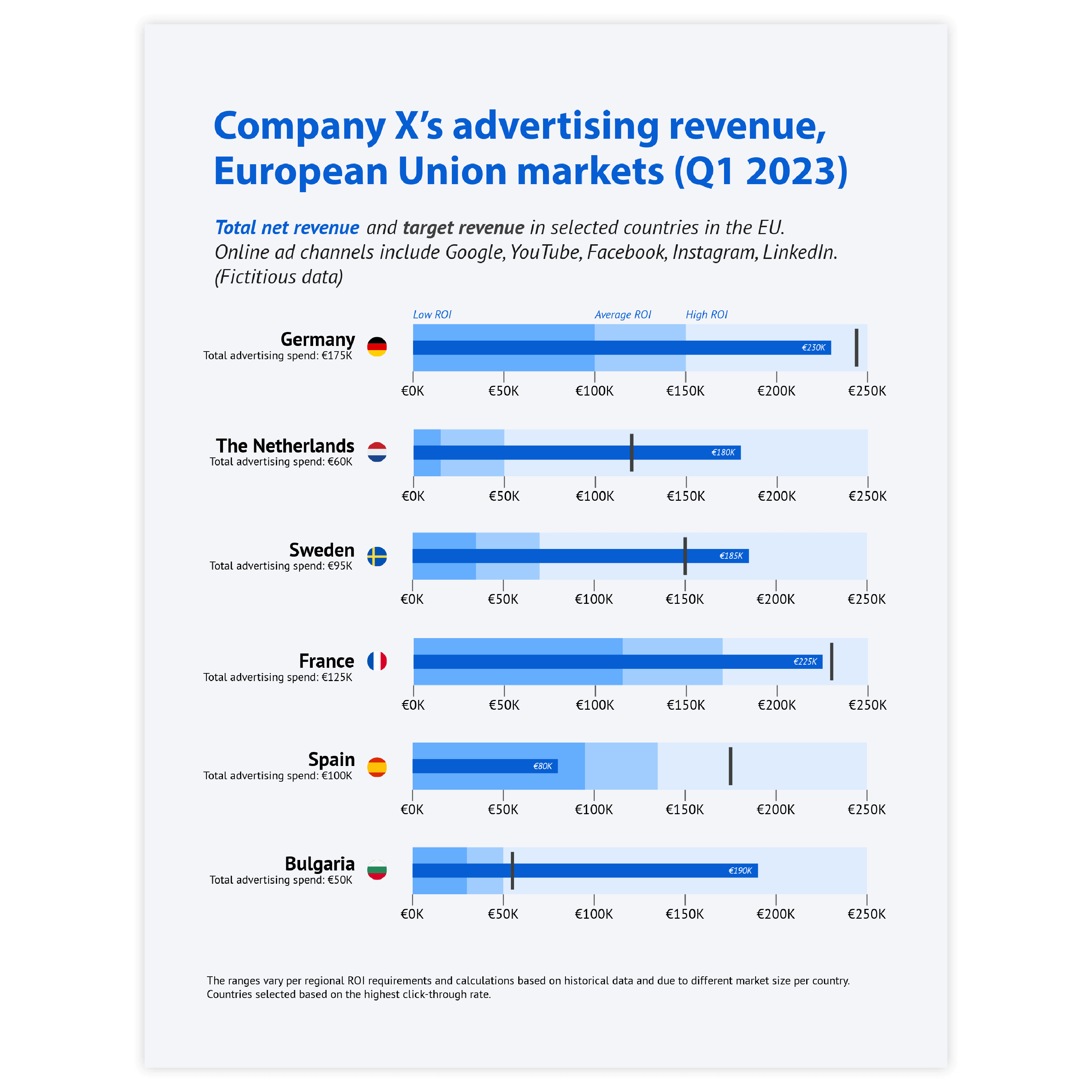
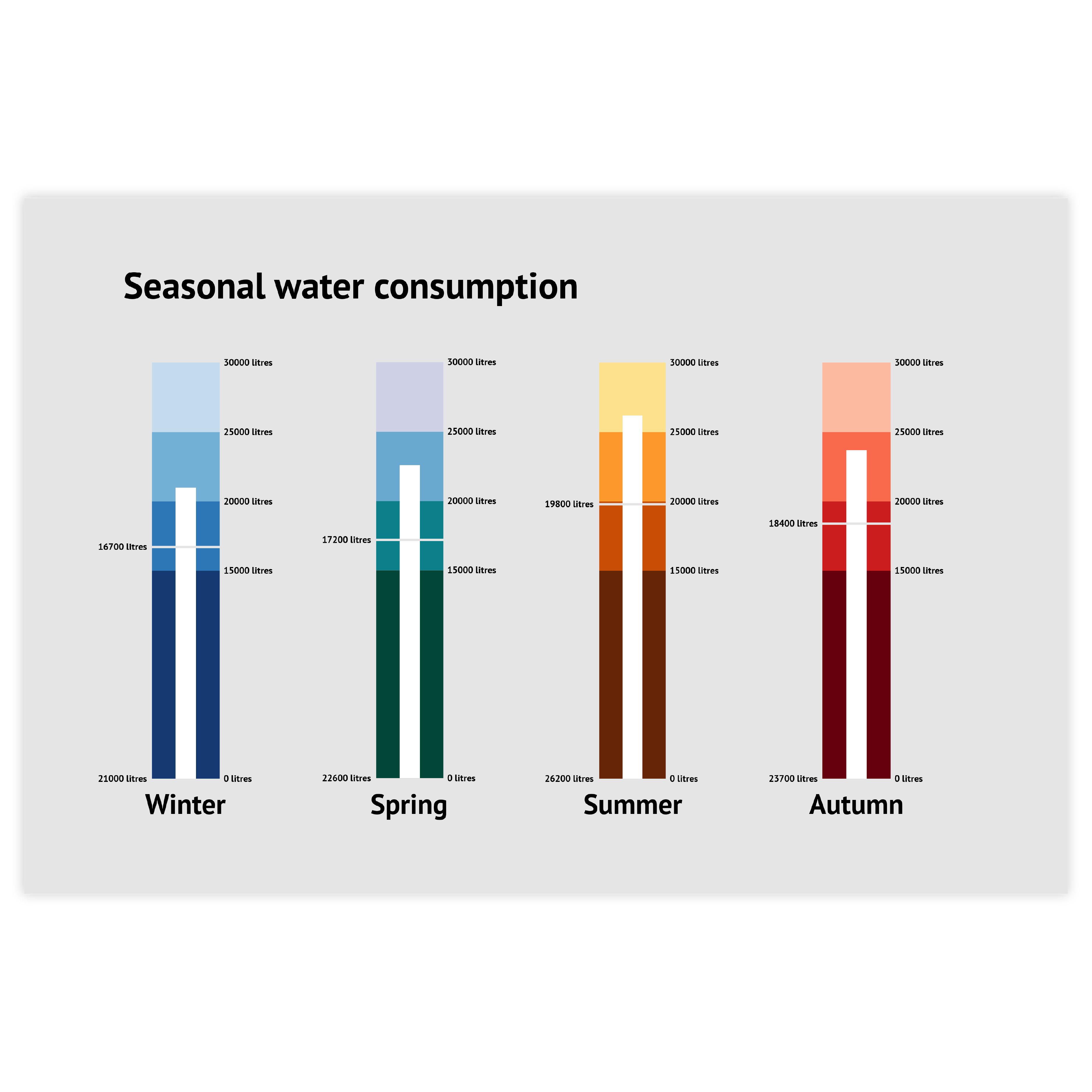
datylon-bullet-chart-icon

Bullet Chart

DATYLON > CHART LIBRARY > Bullet Chart

What is a bullet chart?

 
Alternative name: Bullet graph
 
The Bullet chart was designed by Stephen Few as an alternative to space-inefficient meters and gauges. A bullet chart is aimed at dis-playing performance data in comparison to a target measure in a scope of a qualitative range.

It consists of a single, quantitative primary measure (for example, current year-to-date revenue) and compares that to another measure or target. The primary measure is then related to defined qualitative ranges such as poor, satisfactory and good, or percentiles. The qual-itative ranges are displayed as varying intensities of usually a single hue.

Bullet charts have proven to be very useful for many different purposes ranging from financial reports to industrial dashboards to business performance benchmarks.

Variations of bullet charts

The charts below can be considered variations of a bullet chart. To learn how to make them with Datylon, check out the chart user documentation in the Datylon Help Center.
A yellow icon shows a simplified example of a bar chart with a Datylon icon next to it indicating you can make it with Datylon.
A pale icon (only visible when you hover on the yellow icon) shows a simplified example of a bar chart with a Datylon icon next to it indicating you can make it with Datylon.

Bar chart

A bar chart (aka a bar graph) is a base for a bullet chart. However, the main difference between the two is that in bullet charts, every category has its own scale while in bar charts a scale is always shared.

A yellow icon shows a simplified example of a grouped bar chart with a Datylon icon next to it indicating you can make it with Datylon.
A pale icon (only visible when you hover on the yellow icon) shows a simplified example of a grouped bar chart with a Datylon icon next to it indicating you can make it with Datylon.

Grouped bar chart

Grouped bar chart with two series can be a substitute for a bullet chart if the scale is the same for all bars. In this case, one of the bars shows a performance value, and the other shows the target measure.

A yellow icon shows a simplified example of a stacked bar chart with a Datylon icon next to it indicating you can make it with Datylon.
A pale icon (only visible when you hover on the yellow icon) shows a simplified example of a stacked bar chart with a Datylon icon next to it indicating you can make it with Datylon.

Stacked bar chart

If you want to have very specific ranges you can use a stacked bar chart for showing either qualitative or quantitative ranges as an element of a complex bullet chart with a shared scale.

Alternatives to a bullet chart

Substitute your bullet chart with the charts below when you want an alternative representation of the data comparison.
A yellow icon shows a simplified example of a dot plot with a Datylon icon next to it indicating you can make it with Datylon.
A pale icon (only visible when you hover on the yellow icon) shows a simplified example of a dot plot with a Datylon icon next to it indicating you can make it with Datylon.

Dot plot

If the chart scale doesn’t contain a zero, it’s best not to use a classic bullet chart. Instead, a dot can be used. Both the performance score and target measure can be presented with data marks.

A yellow icon shows a simplified example of a line chart with a Datylon icon next to it indicating you can make it with Datylon.
A pale icon (only visible when you hover on the yellow icon) shows a simplified example of a line chart with a Datylon icon next to it indicating you can make it with Datylon.

Line chart

An alternative option for a bullet chart with the same scale for multiple categories is the line chart. In this chart, the performance value, target value, as well as ranges, can be presented by lines.

A yellow icon shows a simplified example of a circular gauge.
A pale icon (only visible when you hover on the yellow icon) shows a simplified example of a circular gauge.

Circular gauge

Having the same function and essential elements as a bullet chart, this chart's drawback is the extensive use of space. But in certain cases, if there’s no lack of space, a circular gauge can be an interesting option.

Pro tips for designing a bullet chart

Learn how to improve the readability and visual appeal of your bullet chart.
The image shows two bullet charts. The first one, on top, is very colorful, which we advised against doing when designing a bullet chart. The second bullet chart below is a good example of how to correctly color them: with just one color, blue, being used in varying intensity.

Coloring

It’s important to use a subtle color palette for all elements. The exception is the performance bar – it has to stand out. The subtleness of visual elements is important for all charts, but for bullet charts, it becomes more important because it has a lot of visual elements involved.

Read more
This image shows two types of bullet charts. The first one does not start at

Range of values for the qualitative scale

The ranges for the qualitative scale should be chosen based on values that are considered the boundary for the given indicator. If there are no such values, a scale can be divided into generic ranges, i.e. quartiles.

Read more
This image shows several bullet points, each one describing in detail what it shows.

Detailed labeling

As the bullet chart is a complex chart including multiple elements, all of them should be properly marked.

Create your own bullet chart

Join Datylon for free and get started online or download our Datylon for Illustrator plug-in with a 14-day trial. Connect with a Datylon expert for a demo session.

Bullet chart examples and inspiration

Scroll and click on the images below to find inspiration samples of bullet charts. With your Datylon account, you can use these designs, customize them and update them with new data. Or start designing your very own bullet chart!

Discover more charts in our Chart Library

Learn more about the different types of charts and graphs you can design with Datylon. Discover other resource pages in our Datylon Chart Library.