

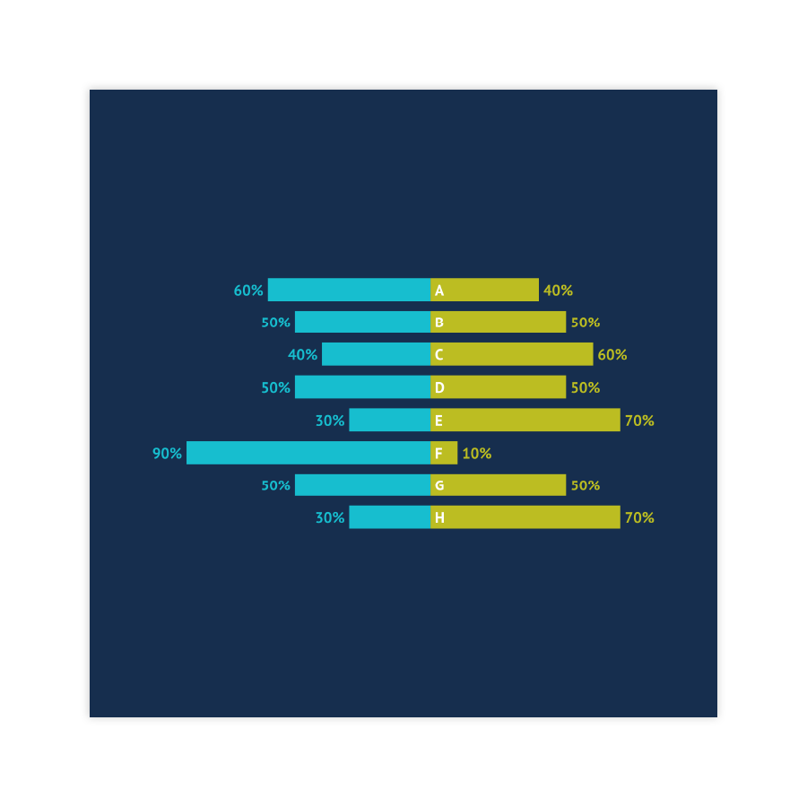


Coloring
The essential part of the diverging chart DNA is the coloring. Especially if it’s a stacked diverging bar chart. Left and right side of the chart (related to the baseline) should be colored in different hues and single bars differ in lightness or saturation of the color. Also consider accessibility of colors. You can learn more about it here.
Read more
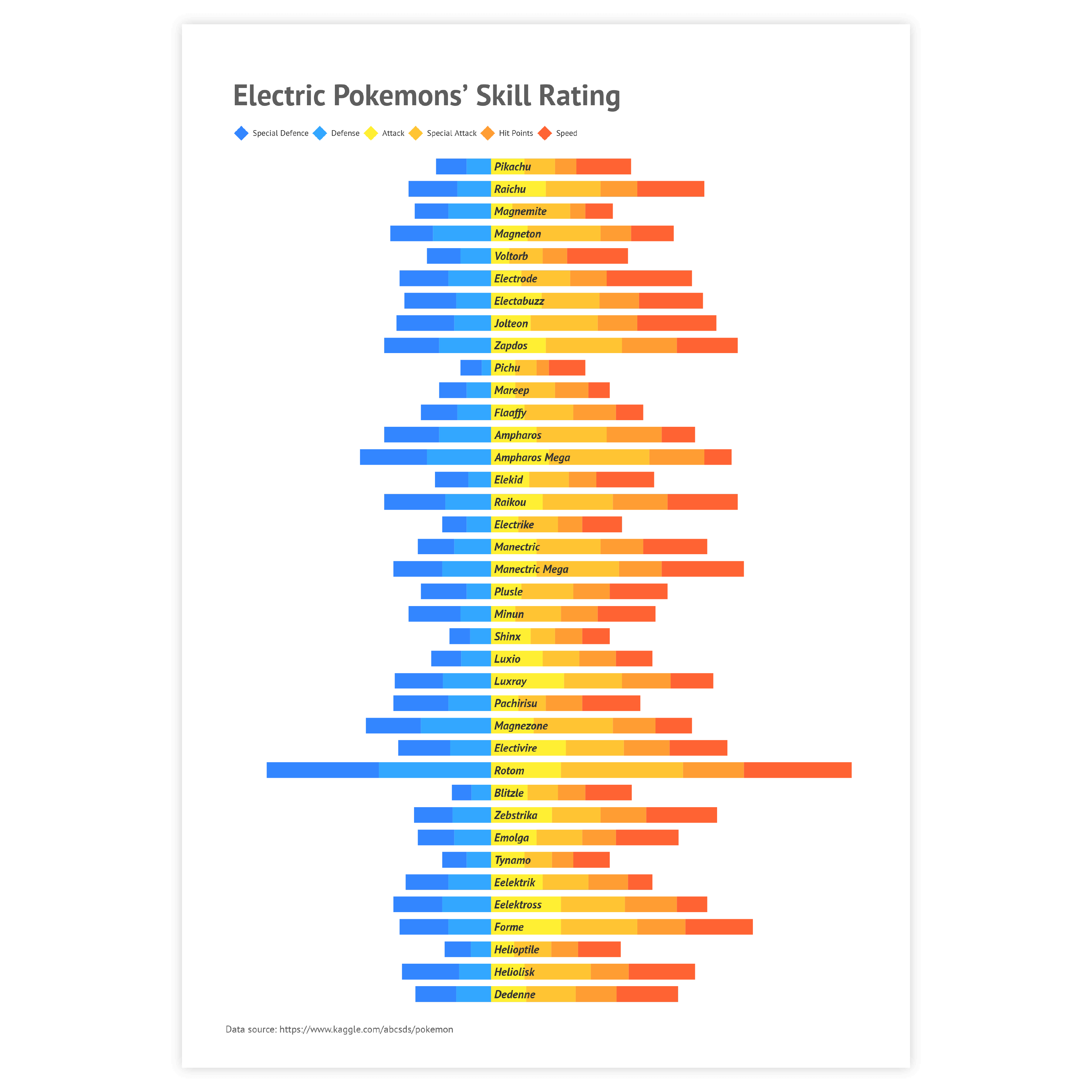
Labeling
Direct labels are the best option for diverging bar charts, especially if there are multiple bars. The optimal place for labels in diverging bar charts is in the center of every bar. Categorical labels are usually placed to the side or in the middle, between the bar stacks.
Read more
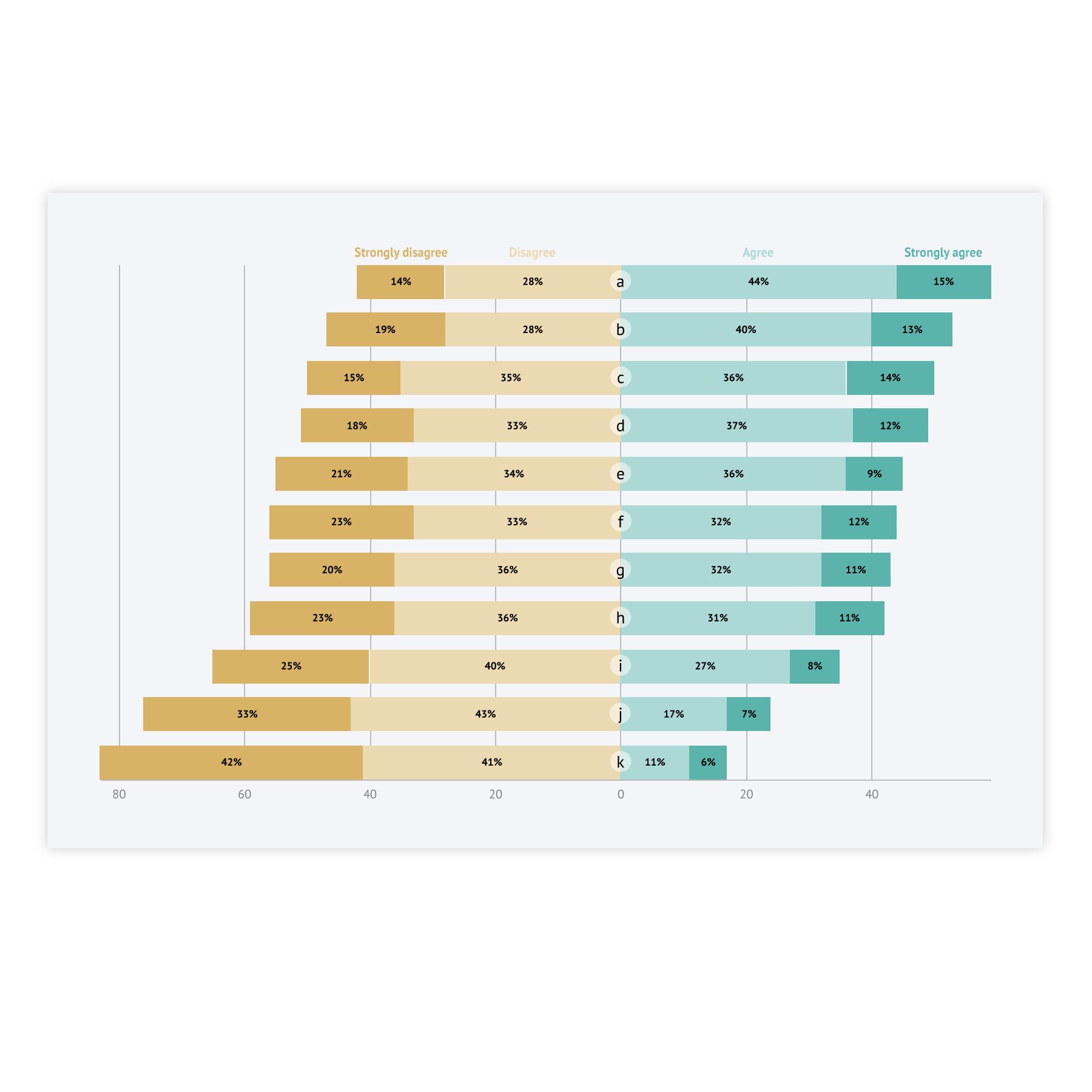
Neutral category in surveys
If there’s a neutral category in surveys, it can be a challenging task to visualize it properly, as usually it is placed in the middle, and the bars in diverging chart are usually placed around the baseline. There are several solutions to this:
– place the neutral category next to the baseline to the positive or negative side, separating it with the color;
– divide the neutral category between two series, using the same color for both of them;
– add an additional chart for neutral category only;

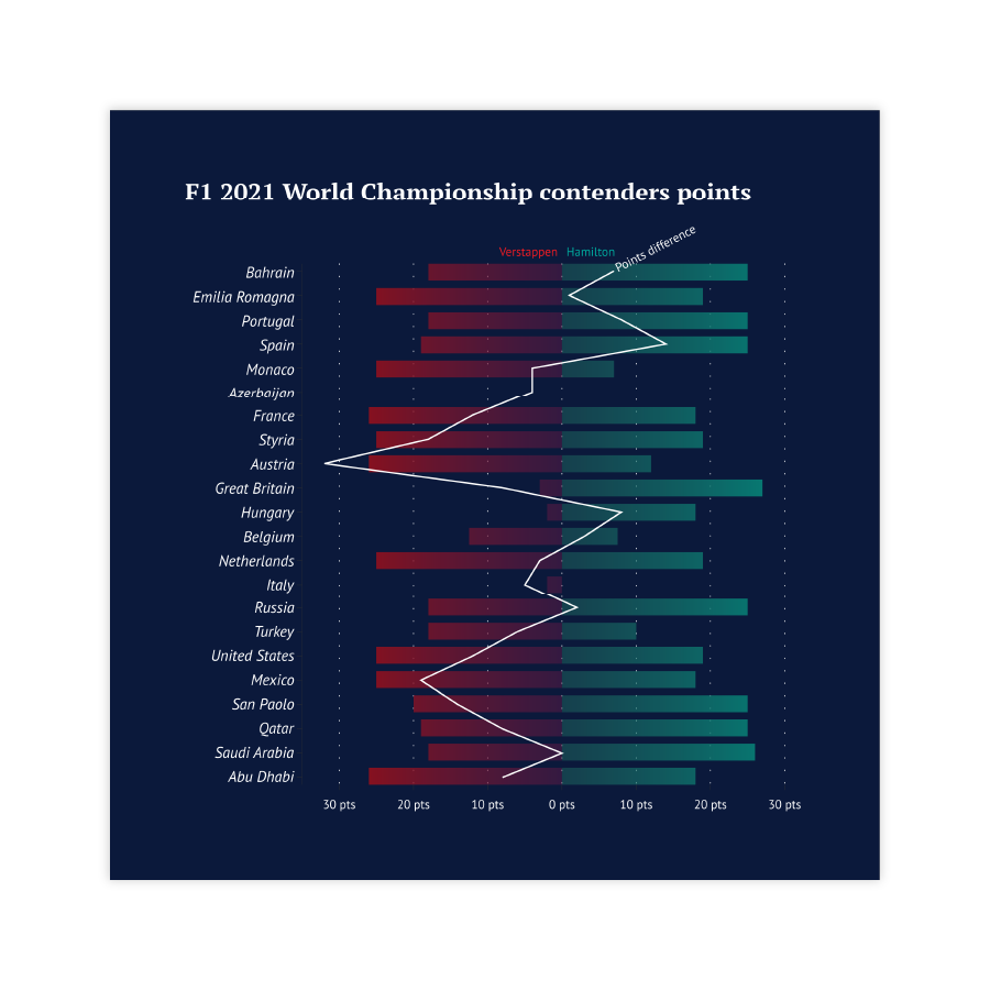
Zero baseline
Sometimes it’s not obvious where is the border between two parts of the chart is placed. In this case it’s better to add an actual line for a zero baseline. This can help avoid confusion for the reader.
Read more