We enjoy working in Illustrator. This is the industry-standard design tool that can do A LOT in the domain of vector graphics. But there’s one particular thing that is missing – a powerful charting tool. The Illustrator Graph tool is still there, it's included as a default tool, but it hasn’t been properly updated for over 20 years. Because of this, and due to the growing need for smarter dataviz solutions within Illustrator, we developed Datylon for Illustrator. It’s the only plug-in that allows you to create a perfectly customized reusable chart. It comes with numerous styling options and it works perfectly in the Illustrator workflow - truly, the best of both worlds.
We surfed through the user forums to find what was missing in the Illustrator graph tool according to users. There were some particular limitations pointed out by the community. In this article, we will list these limitations and the way we addressed them.
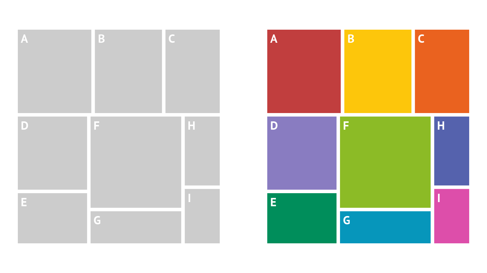
Chart types
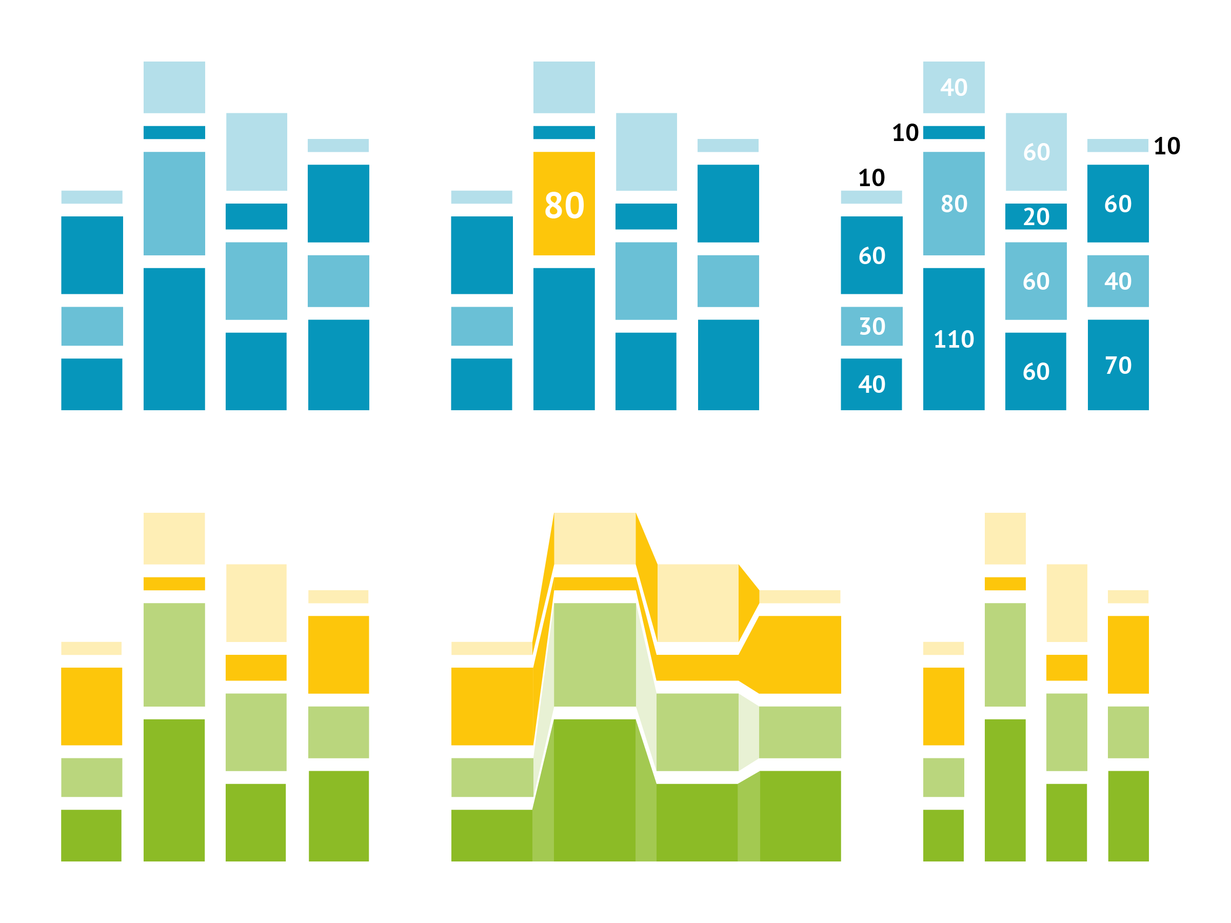
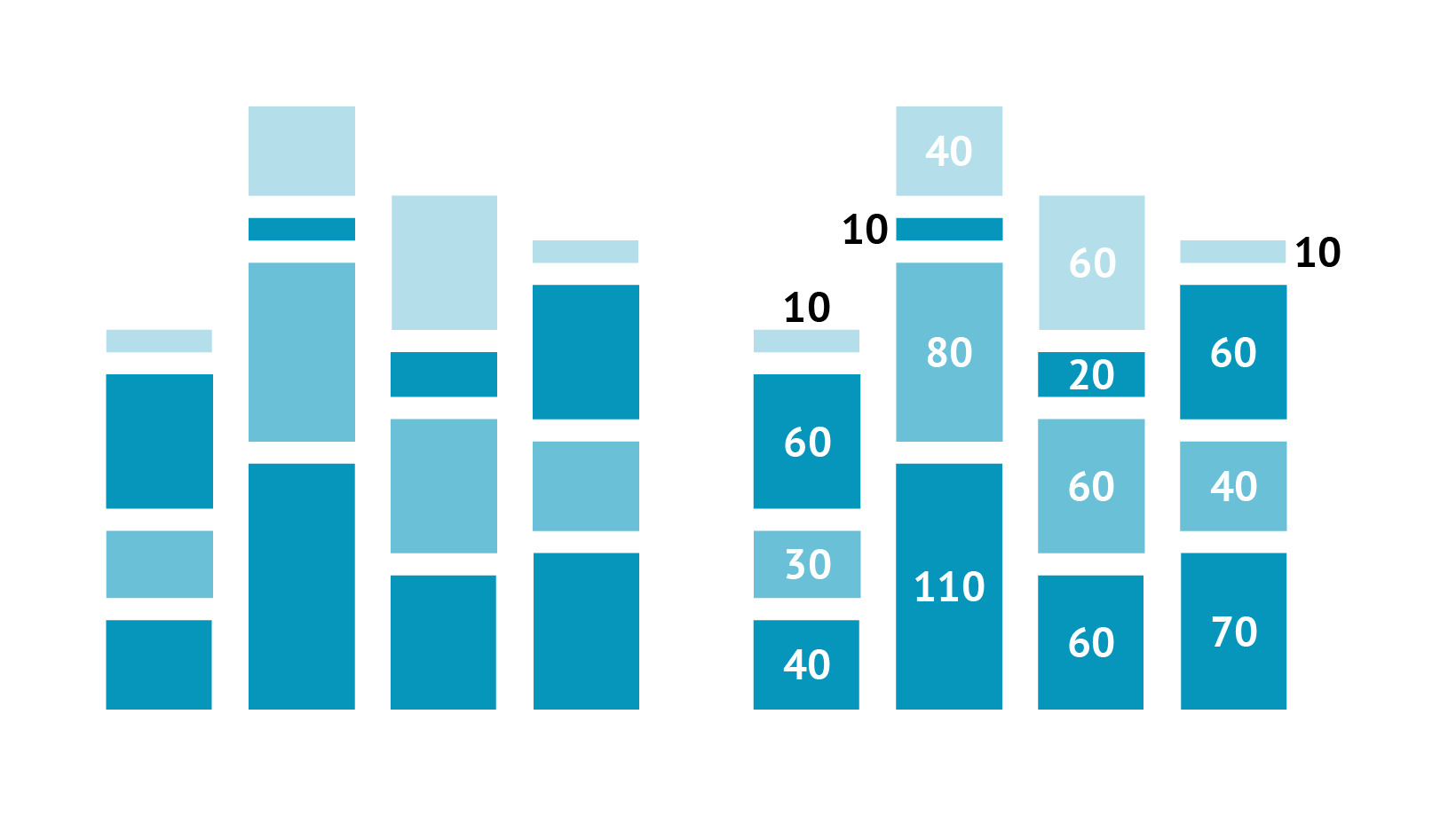
Datylon has an extensive set of built-in chart categories (14) which can be applied to build more than 130 different chart types. Datylon is continuously developing new types. Datylon and Illustrator generic toolbox can work perfectly in combination – using Illustrator’s layer function even more complex and sophisticated charts can be built.
At the moment of writing, Illustrator has 6 chart categories delivering 9 different chart types, missing some of the chart types long requested by the community (including bubble chart, donut chart, heatmap, etc.). On the other hand, it offers some additional chart types, such as radar charts and proportional and stacked pie charts.
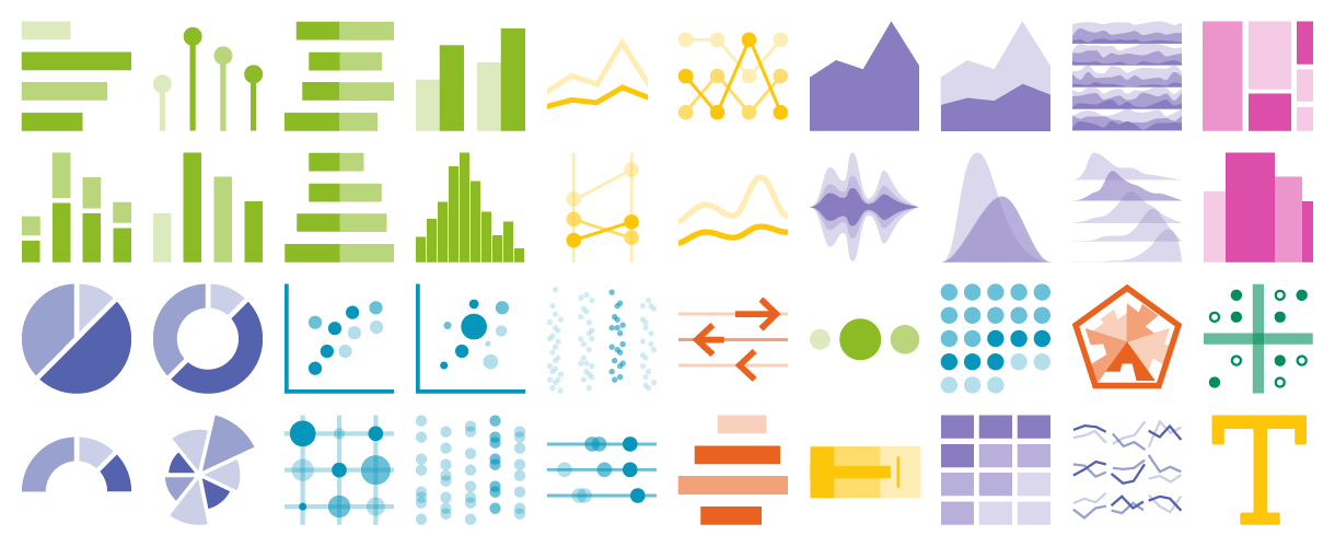 Chart types that can be made using Datylon for Illustrator plug-in
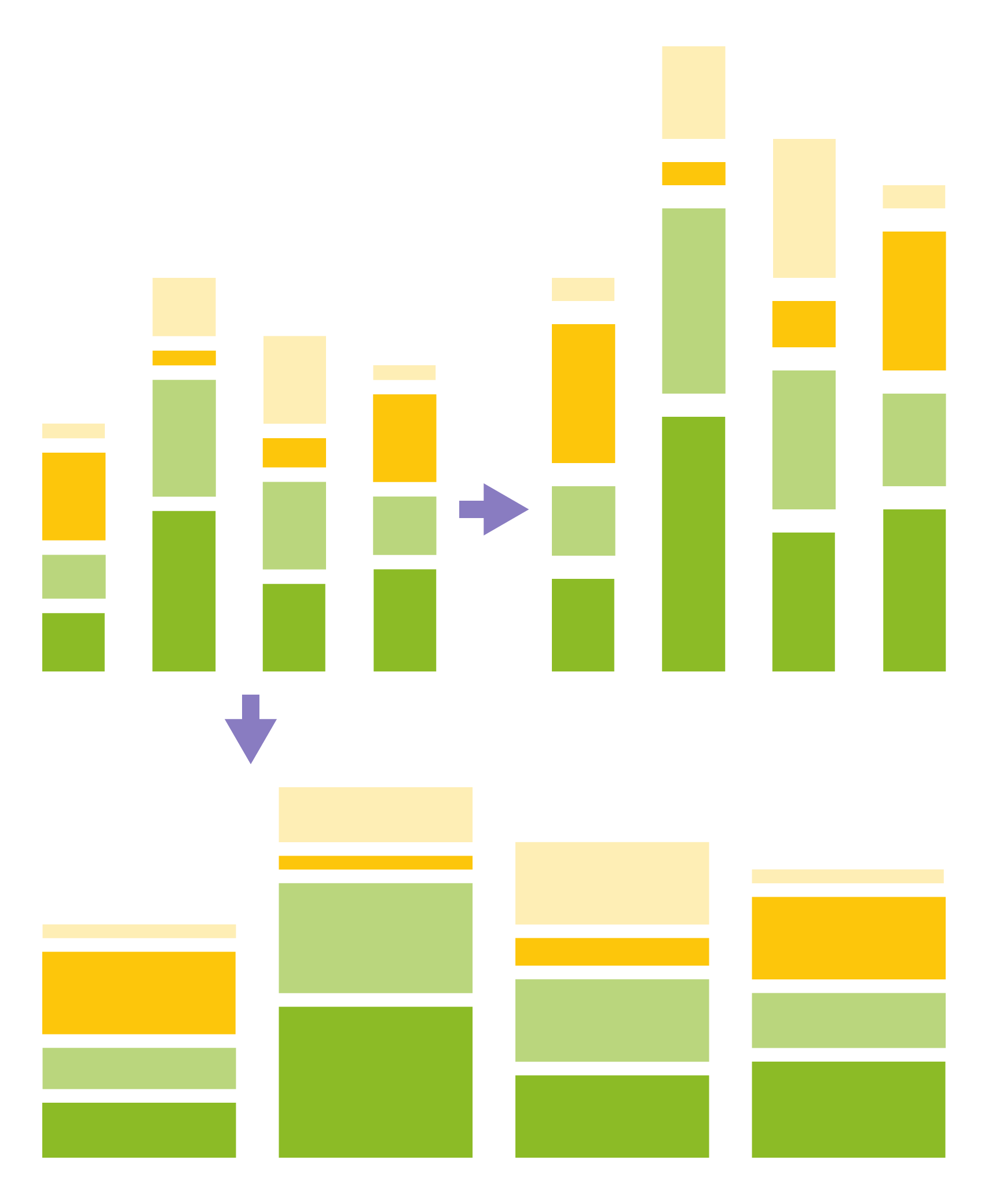
Creative control
Datylon makes it possible for you to style pretty much everything you can think of in terms of fonts, colors, positioning, shape, and size. Huge set of fixed and data-driven properties to style the chart elements, axes labels, and legends. On-brand and pixel-perfect. All styling options are kept when data changes.
There are a lot more things that Datylon can do. You might want to check our chart properties library where all the properties are documented.
In Illustrator Graph you can combine multiple chart types in one chart. It makes it easy to create combo charts. Another unique feature Illustrator Graph provides is the possibility to edit certain elements by clicking on them. All the selectable components can be changed using standard Illustrator tools, the downside is that after the data is changed the styling resets back to default, whereas for Datylon you can always update the data without losing your design progress.
 Styling possibilities of Datylon include multiple coloring options, highlighting certain chart elements, advanced label placements,
and non-destructive scaling.
Negative values for a stacked bar chart
In Datylon tools, negative values can be presented in a stacked bar chart. A variation of a stacked bar chart – diverging bar chart, is also available.
In Illustrator’s Graph, there’s no possibility to add negative values for a stacked bar chart.

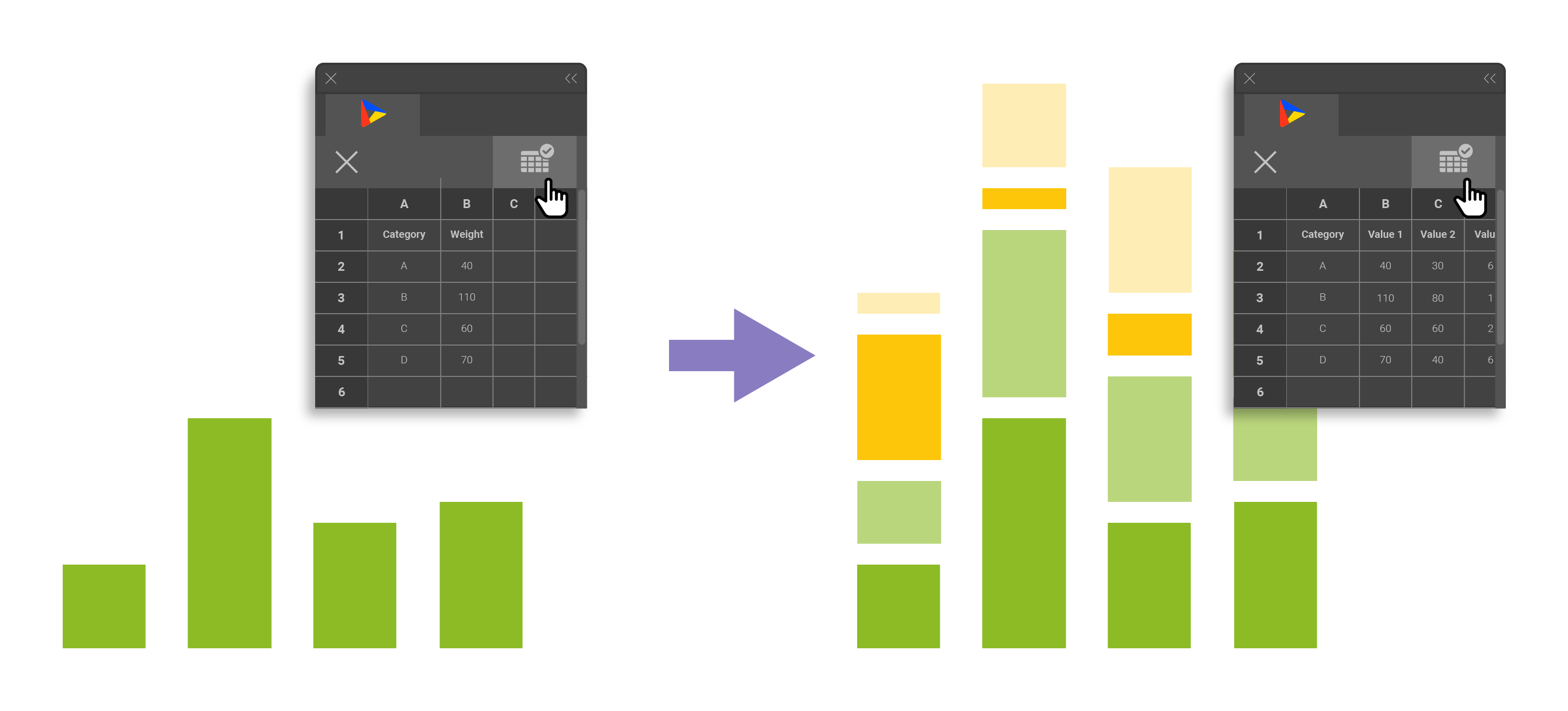
Data updates
Datylon charts are updated instantly right after the changes are made in the editor panel.
In Graph after the changes are made in the data panel you need to apply them to be able to see the results.
Data labels
Data labels are available in every Datylon chart. Not only can you style all of the data labels, all at once, but you can also style a single label using data point styling. You can read more about label properties here.
In Illustrator’s graph tool data labels are missing. They need to be created manually one by one. The labeling is limited to axis labels and legends.
Data marks
In Datylon different data marks can be added to the data elements and styled accordingly.
Custom illustrations can be added as data marks or instead of columns, this allows the creation of an isotype-style bar chart, for example.
Colors
Single color, gradient color, or color palettes can be applied to chart elements. On-brand custom color palettes can be saved. Color can be applied based on data to highlight certain data points or series. Color can be applied to chart elements, labels, and data marks. For some of the elements, a link option is available which allows coloring the labels with the same color as the corresponding chart element.
In Illustrator Graph generic fill and stroke color are used. No data-driven coloring nor palettes can be applied.
Scaling
Datylon charts can be scaled and resized, even disproportionally. And when doing so, all the styling properties nicely adapt to the new size.
In Illustrator Graph once you draw a chart box you can’t change the scale of the chart disproportionately without distorting the proportions of labels.
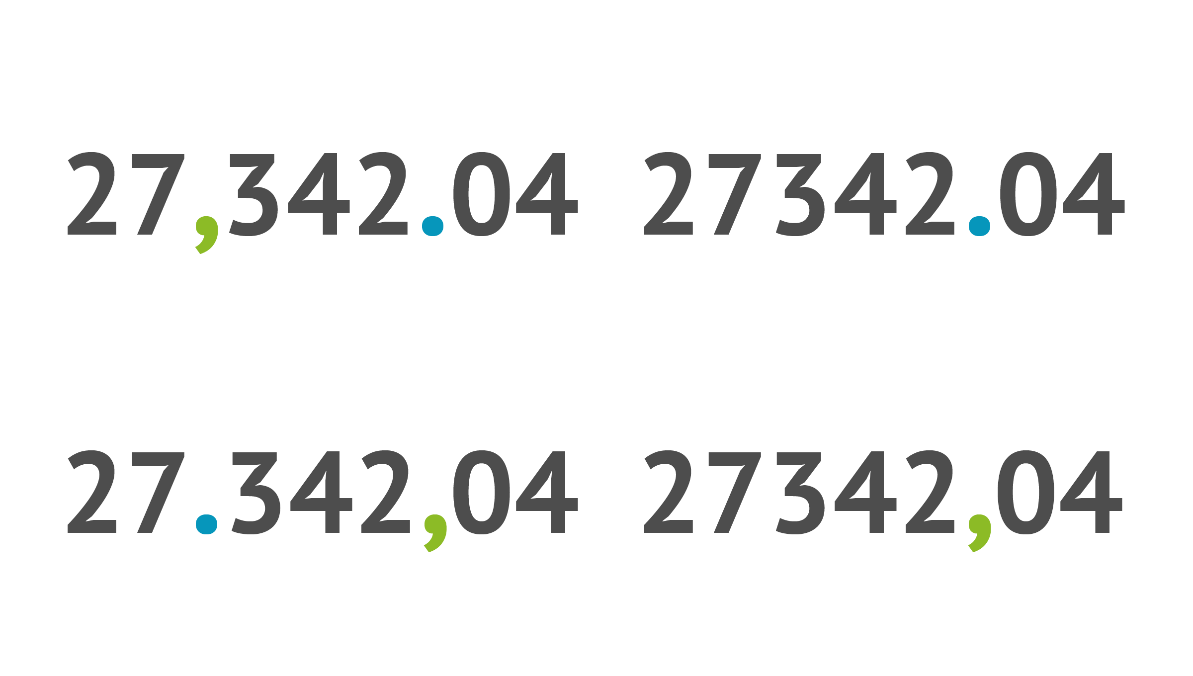
Data formatting options
In Datylon data can be placed in various formats and forms. Any separator can be used in a data sheet. Due to input formatting editing options, multiple data formats can be used: it’s possible to format incoming and output data as numbers or different date formats like days, months, quarters, etc.
Unfortunately, no data formatting is possible in Illustrator's built-in graph tool.
Data management and reusability
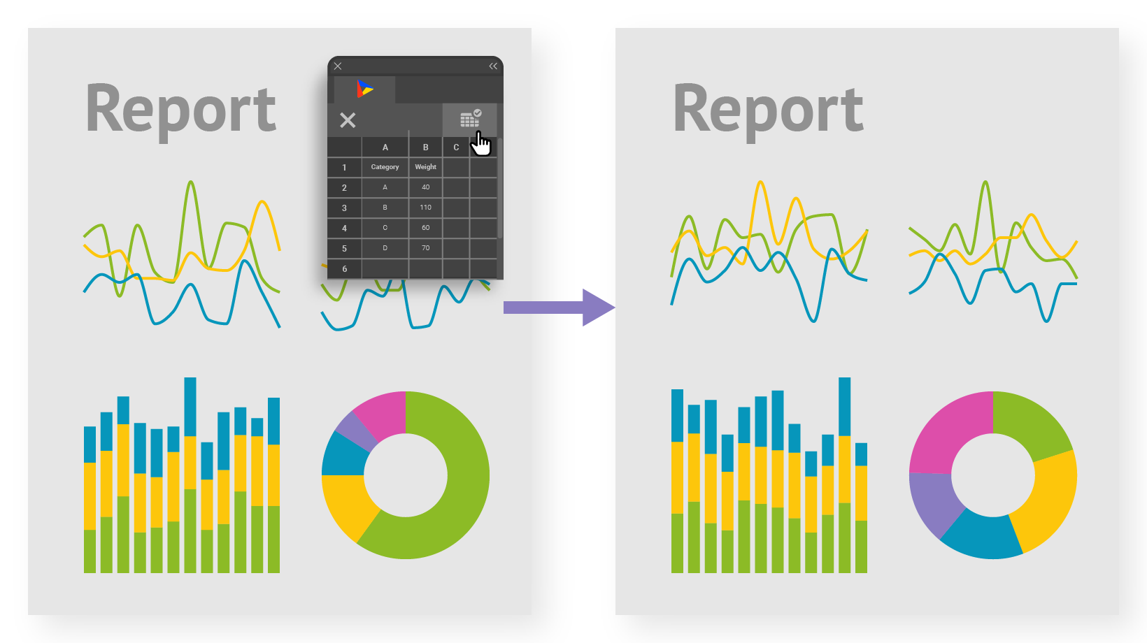
Datylon has a separate data management tool. Data workbooks can be uploaded for later use to link to charts. Data workbooks can be copied, renamed, and deleted. Moreover, one or multiple charts can be easily updated with new data by loading an xls, csv file or linking to an online spreadsheet (Google doc or One drive). Multiple charts on a complete layout can be edited at the same time. Our users report that making charts became significantly faster both on the designing and data-update side.
In Illustrator Graph new data can only be uploaded one chart at a time. No additional data management tool is currently available.
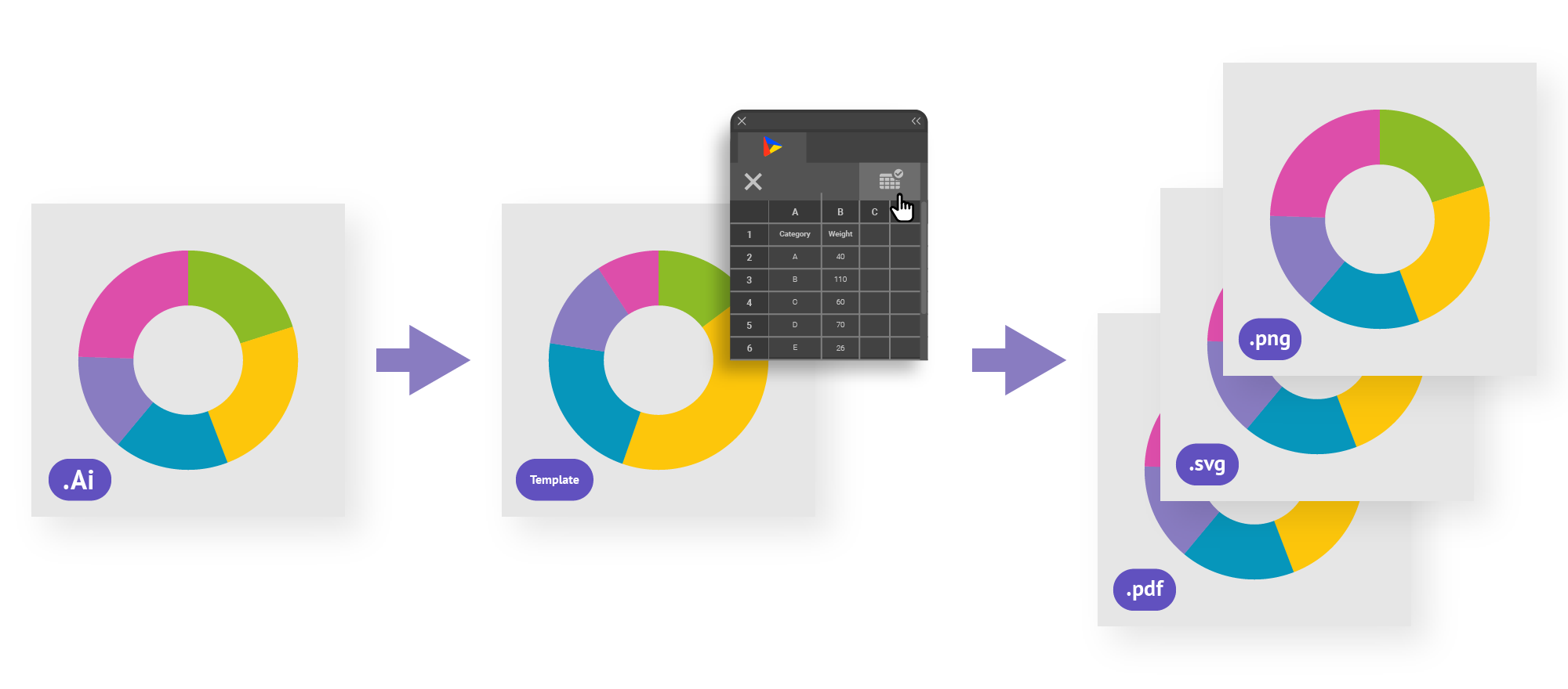
Output
With Adobe Illustrator only all the usual export options are available. After export, all the documents can be handled only as graphic elements, no data changes or updates can be done.
A chart made with Datylon for Illustrator can be exported as a template to Datylon Report Studio where it can be updated with new data (at any time) by designated users. To further optimize your reporting workflow, consider automating the entire chart and report generation process using the Datylon Report Server. Simply use the API, provide new data and the desired template, and the Datylon Report Server will automatically generate updated charts on-demand or according to your specified schedule.
To learn more about automated reporting we recommend you to read our specialized blog article.
Support
For Illustrator Graph only standard Adobe support is available. Dataviz support is not optional. On the other hand, Datylon offers technical and dedicated dataviz support via email or chat. Very often, with the same business day response.

Free trial
If you're a (data visualization) designer who works within Adobe's environment, you might be curious to try Datylon for Illustrator. This intuitive and very powerful plug-in for Illustrator will help you design the most complex and data-rich reports. Fully on-brand and pixel-perfect.
With a 14-day free trial, you can test Datylon for Illustrator without any limitations. You don't need a credit card. Use this link to sign up and download the plug-in. Do you prefer to see if the tool can meet your requirements and reporting/dataviz needs? We are happy to give you a free demo - pick your time here and let's talk!
👉If you're keen on crafting custom data visualizations, visit our Bespoke Data Visualization Solutions page.