
Reporting, Automated Reporting
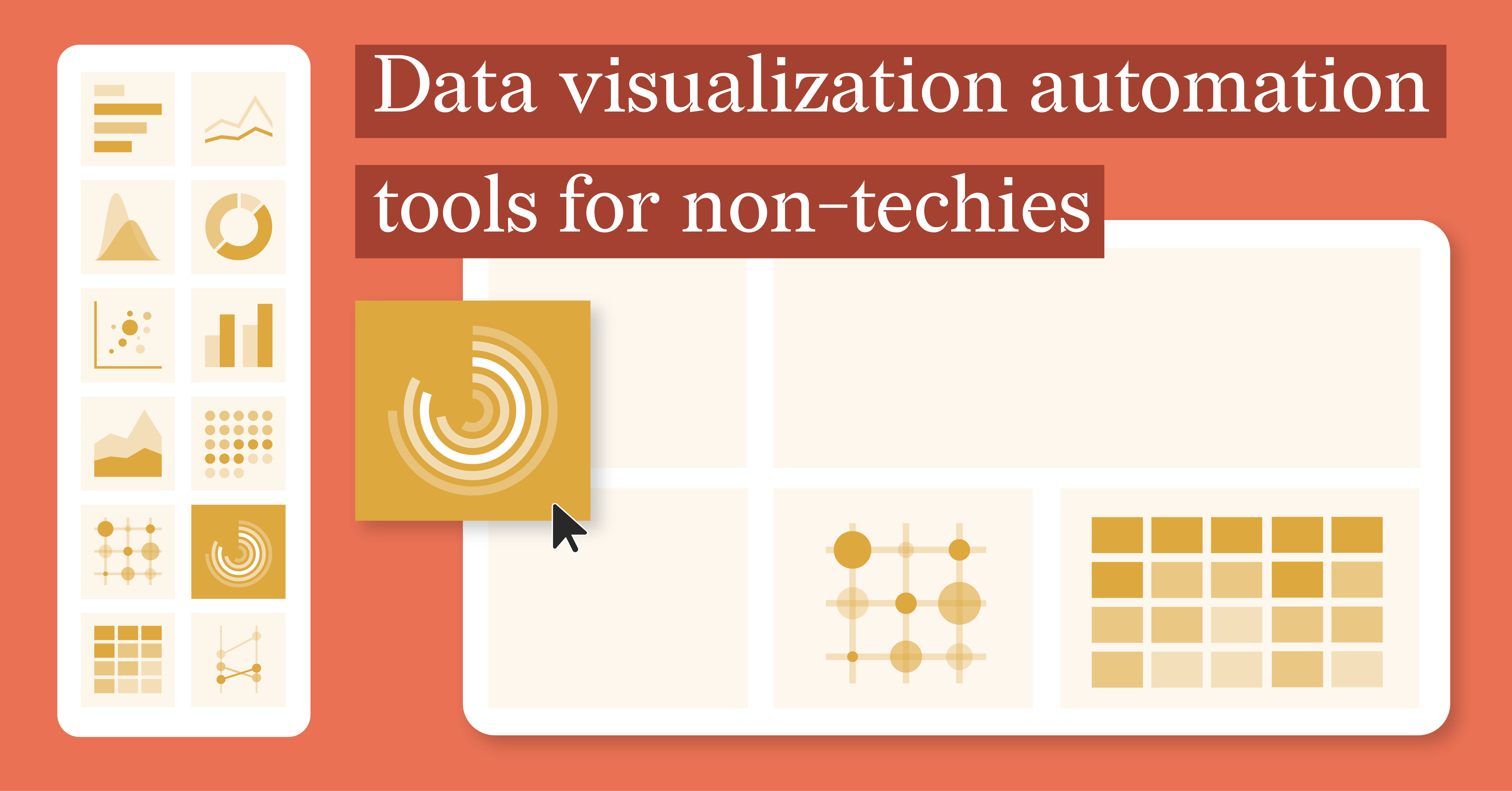
Data Visualization Automation Tools for Non-Techies
In today’s data-driven world, the ability to turn raw data into visually engaging insights is...
Reporting, Automated Reporting
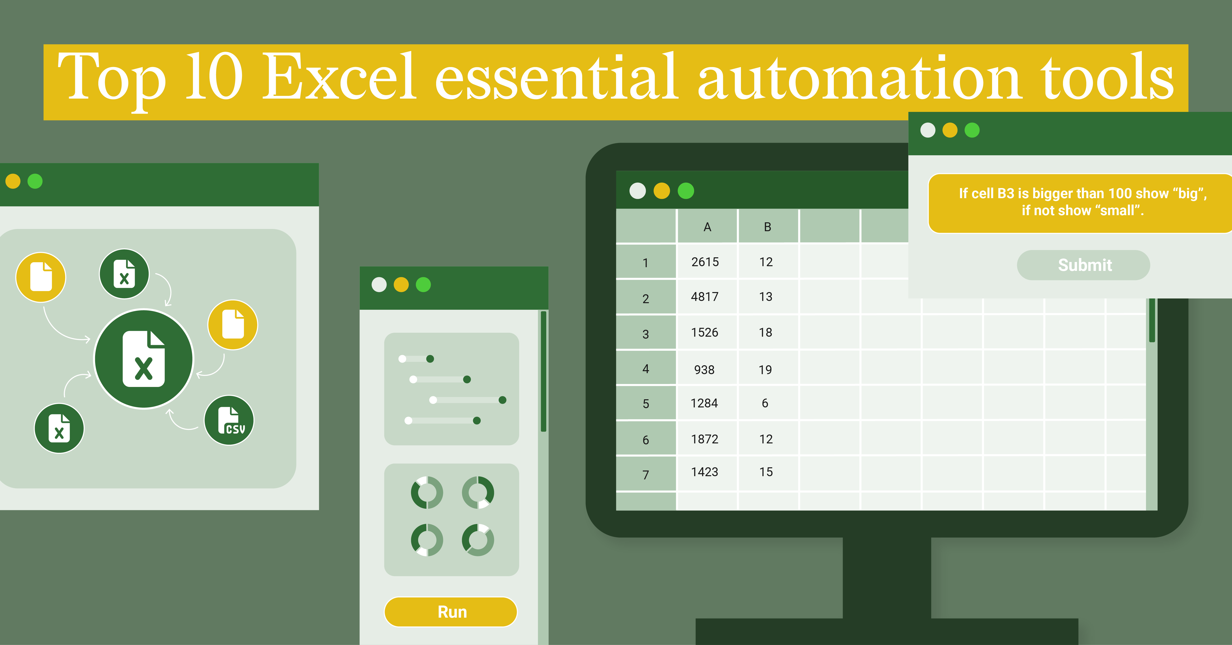
Top Excel Essential Automation Tools
Excel is a staple in the world of data analysis, offering an impressive array of features to...
Subscribe to our newsletter
Receive inspiration, practical advice, customer stories and news right in your mailbox

Report Design, Reporting
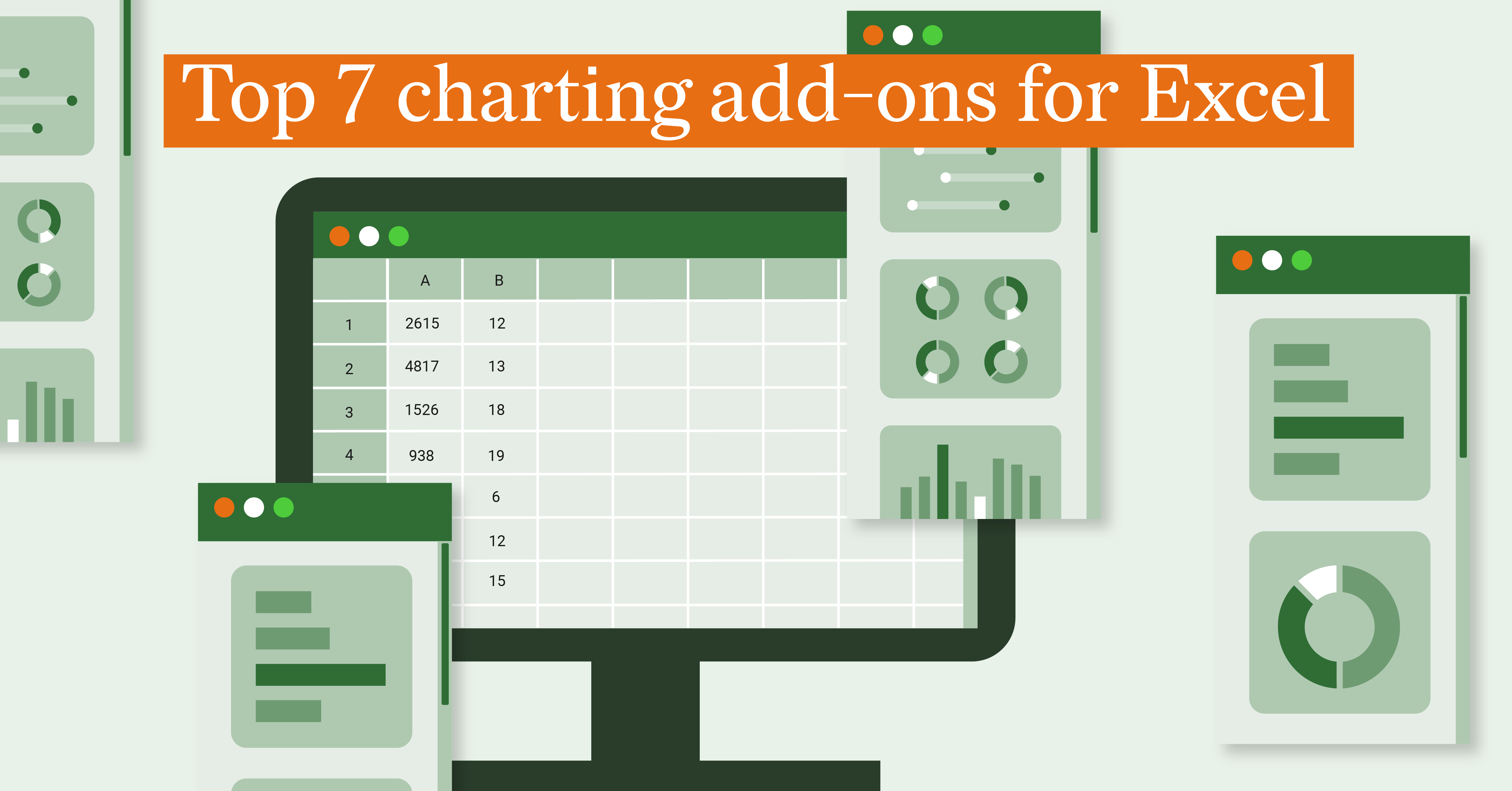
Top 7 charting add-ons for Excel
For professionals working with Excel, the need for advanced charting and visualization...
Report Server, Reporting, Automated Reporting
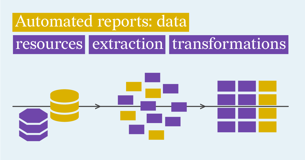
Automated reports: Defining Data Resources, Data Extraction and Transformation Options
In today’s fast-paced business environment, making timely and informed decisions requires more...
DataViz Best Practices, Financial Services, Dataviz Resources
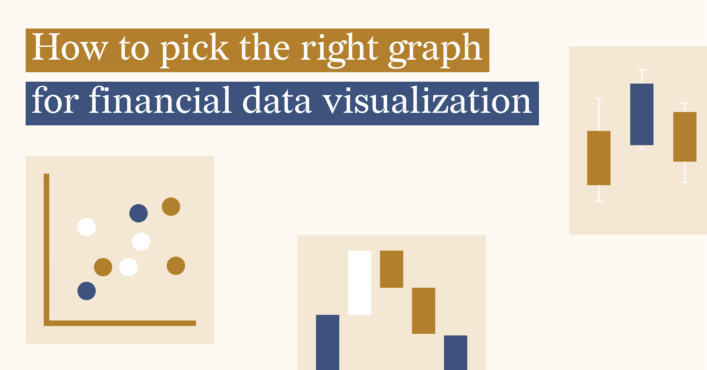
How to pick the right graph for financial data visualization
When it comes to selecting the right graph for financial data visualization, it's important to...
DataViz Best Practices
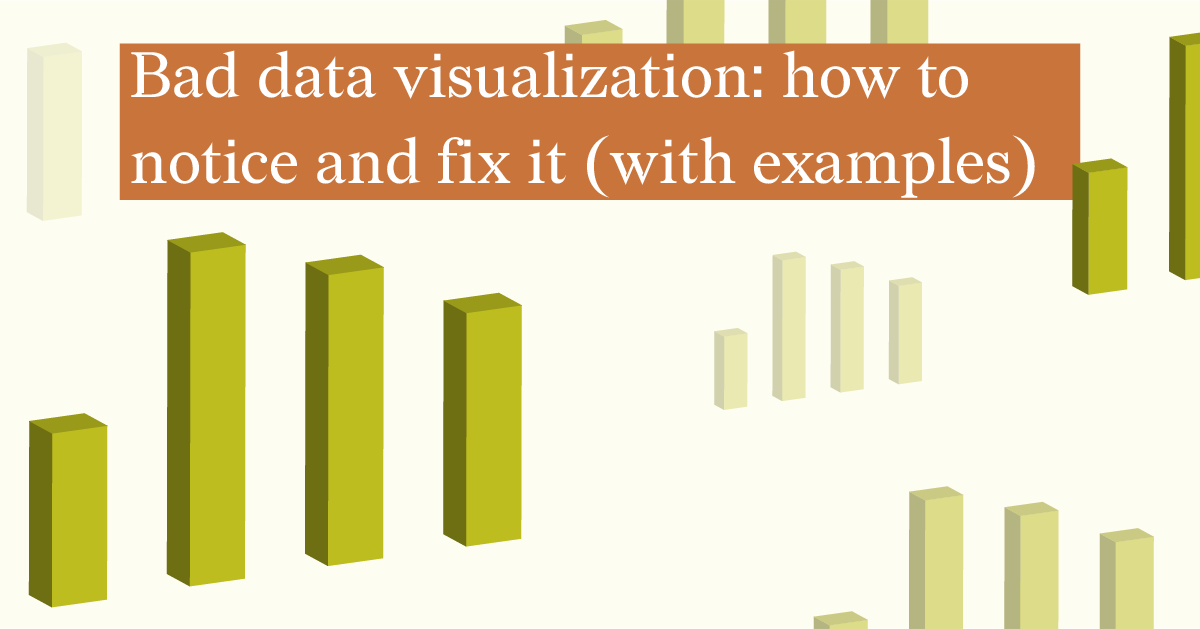
Bad data visualization: how to notice and fix it (27 examples)
Data visualization is a great tool for presenting complex data in a simple way. It is better to...
Report Design, Report Server, Reporting
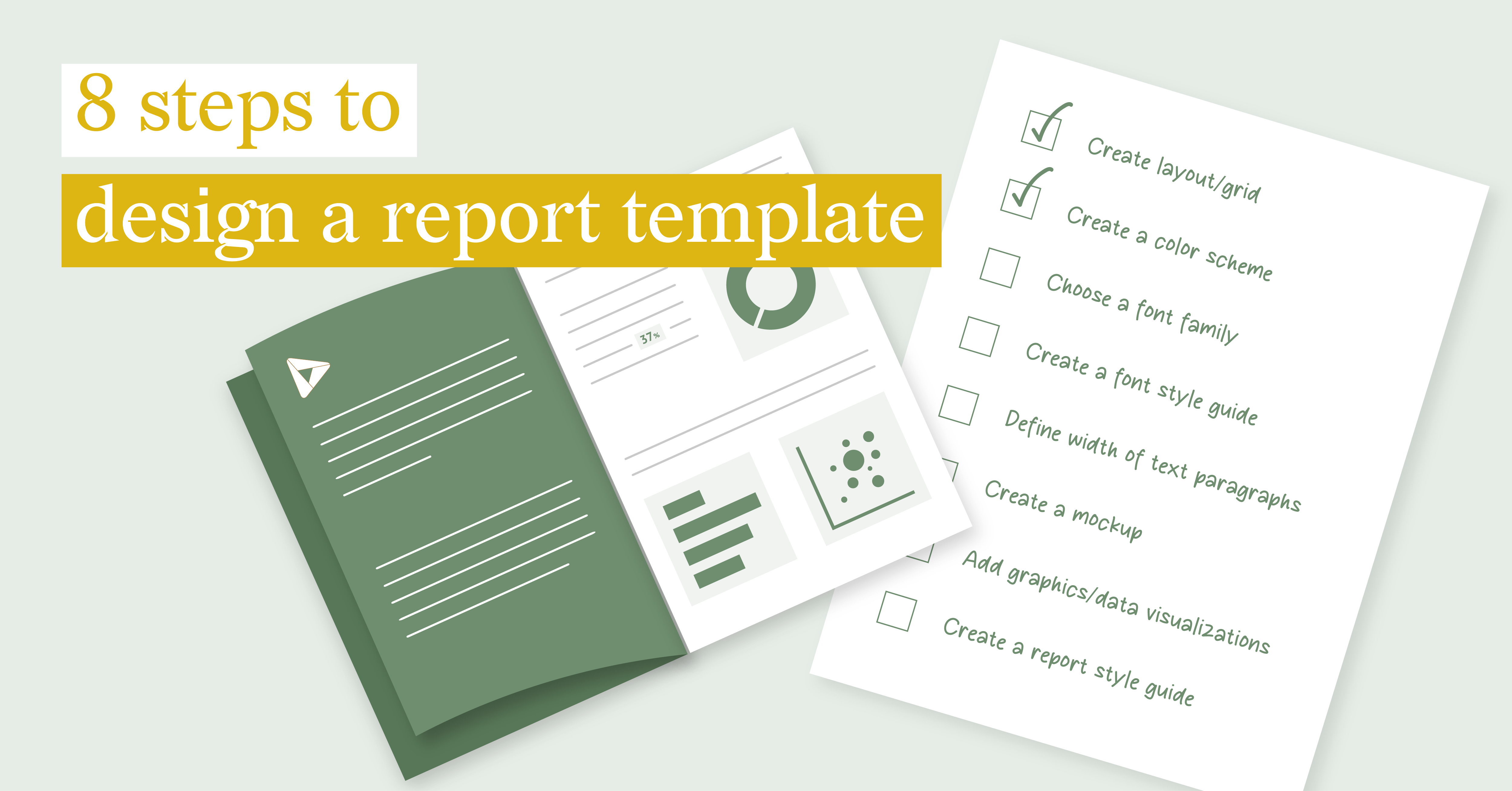
8 steps to design a report template

DataViz Best Practices, Report Design, Food For Thought, Reporting
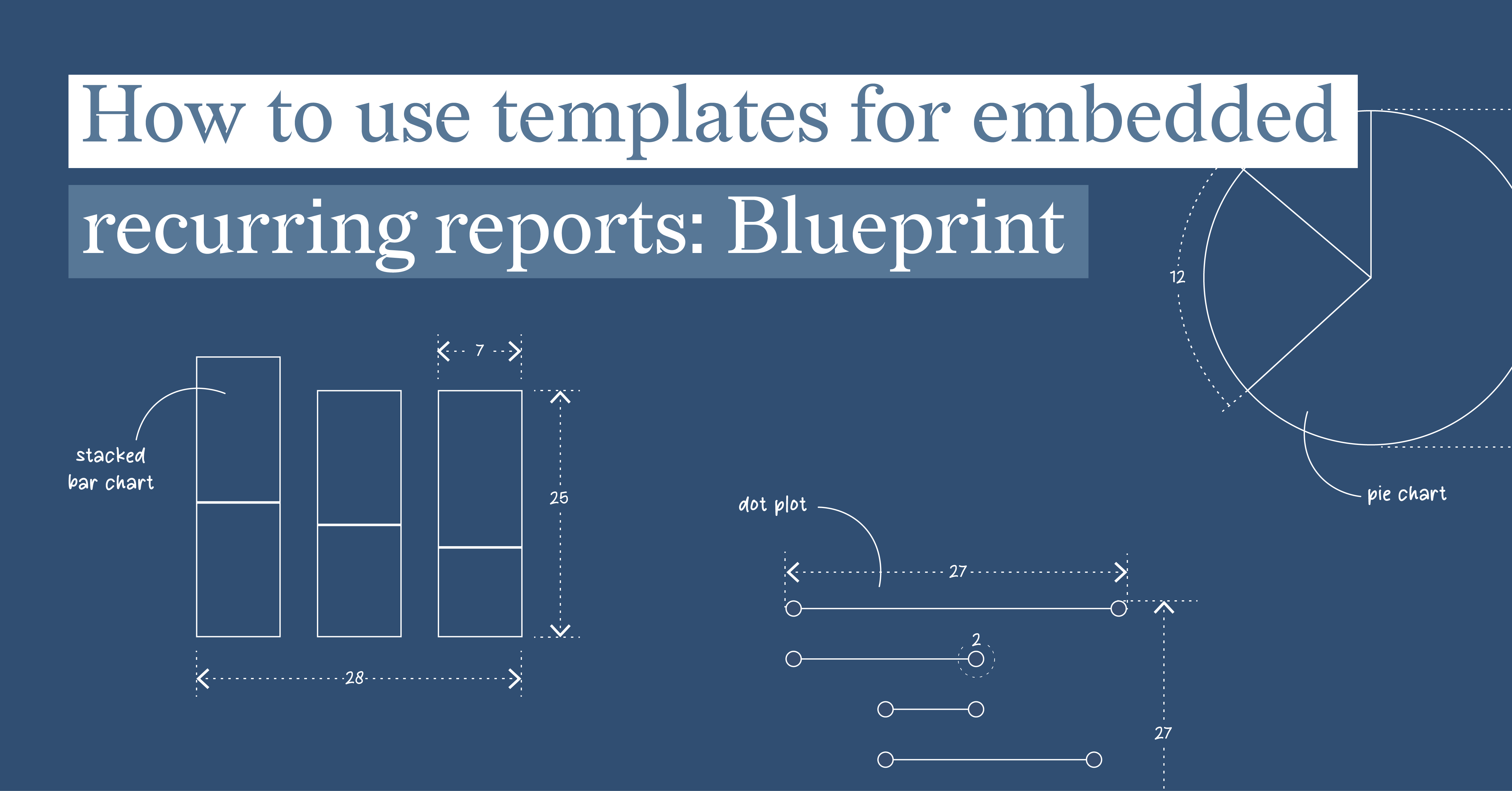
How to use templates for embedded recurring reports: Blueprint
Embedded reports play a crucial role in today's data-driven business landscape. By embedding...
Food For Thought
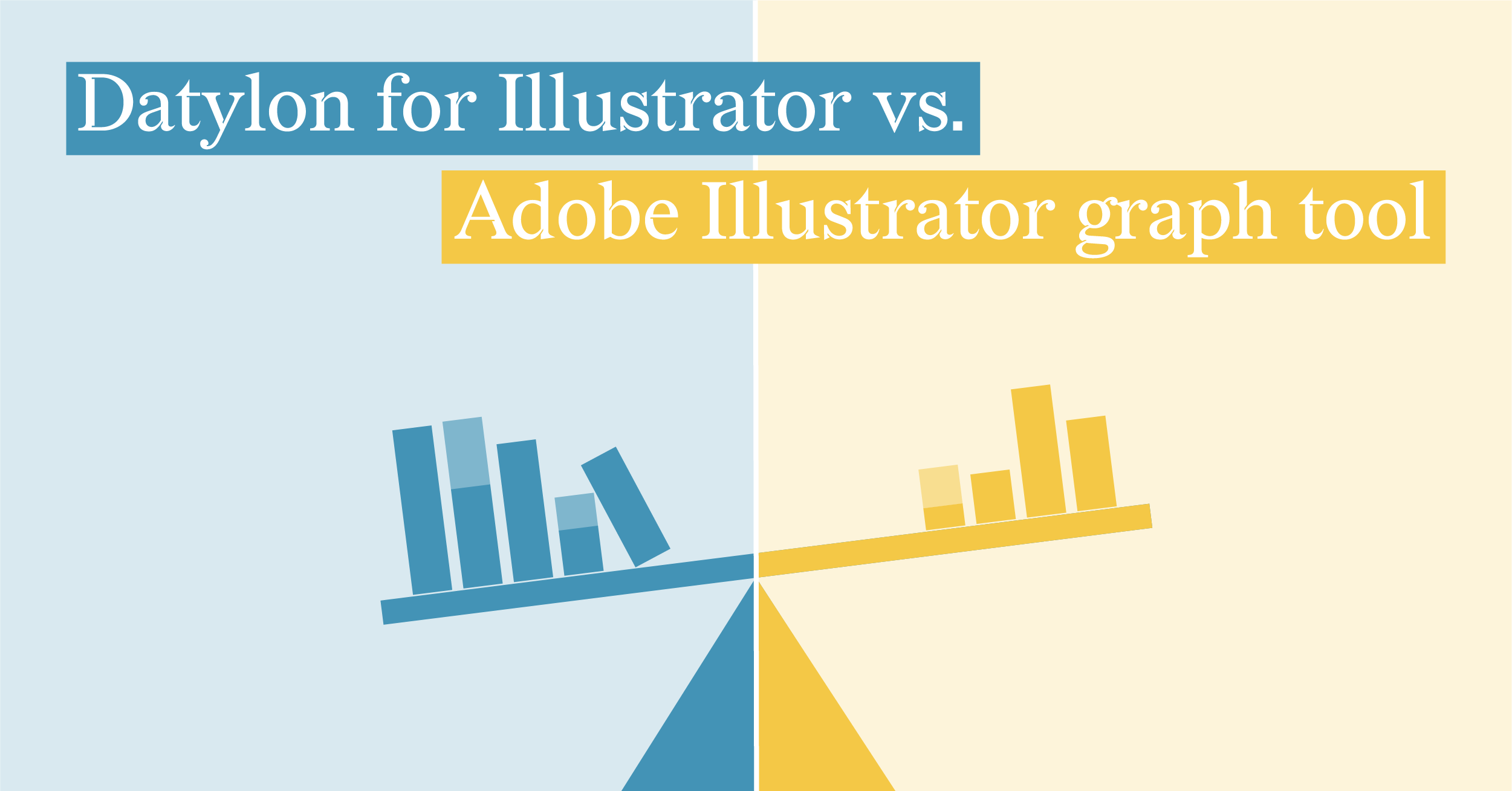
Datylon for Illustrator vs. Adobe Illustrator Graph tool
We enjoy working in Illustrator. This is the industry-standard design tool that can do A LOT in...
Dataviz Resources
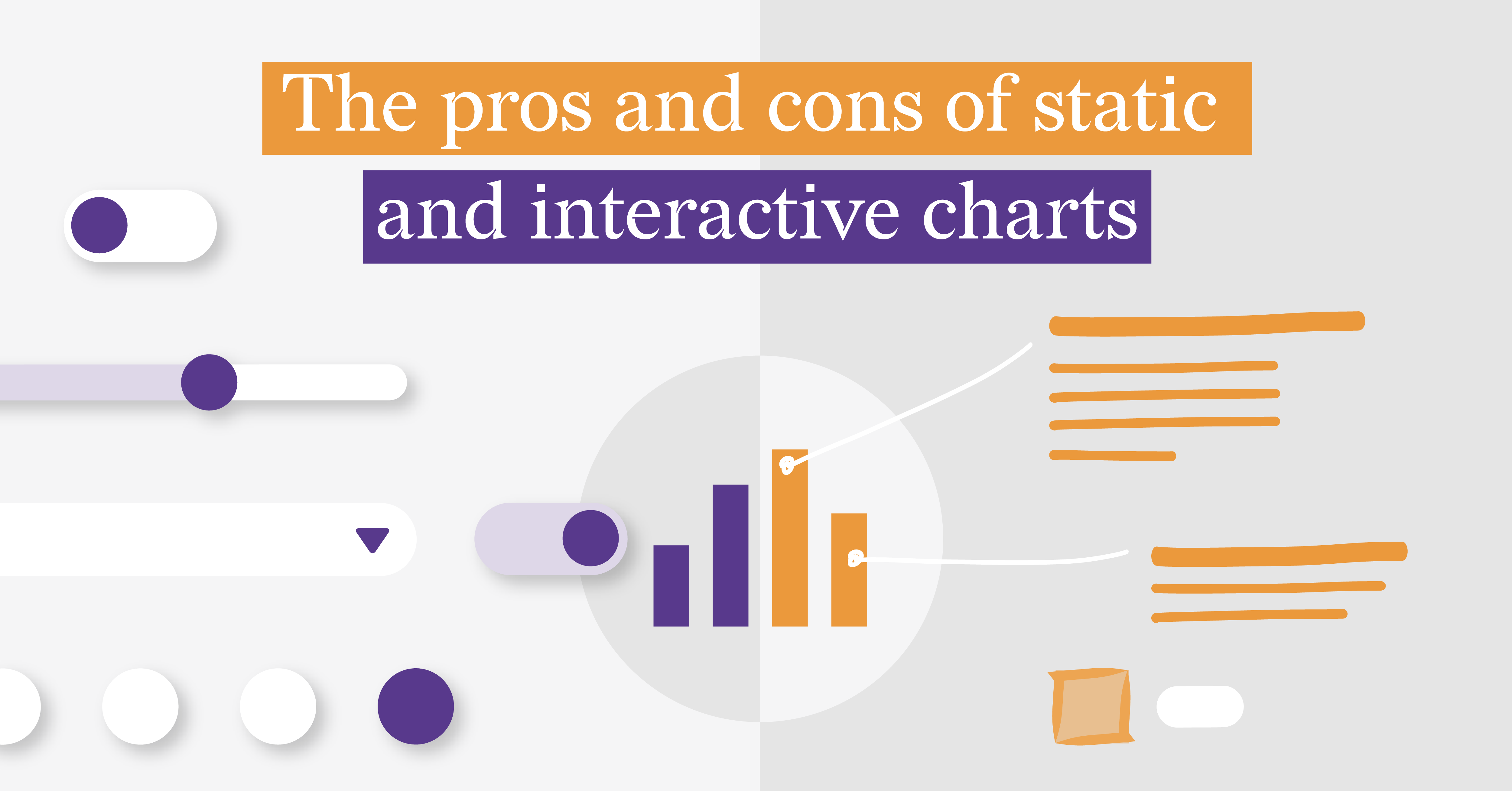
To click or not to click: static vs. interactive charts
So, you've decided that your presentation, article, or thesis needs some data visualization. And...