DataViz Best Practices, Technical, Product, Dataviz Resources
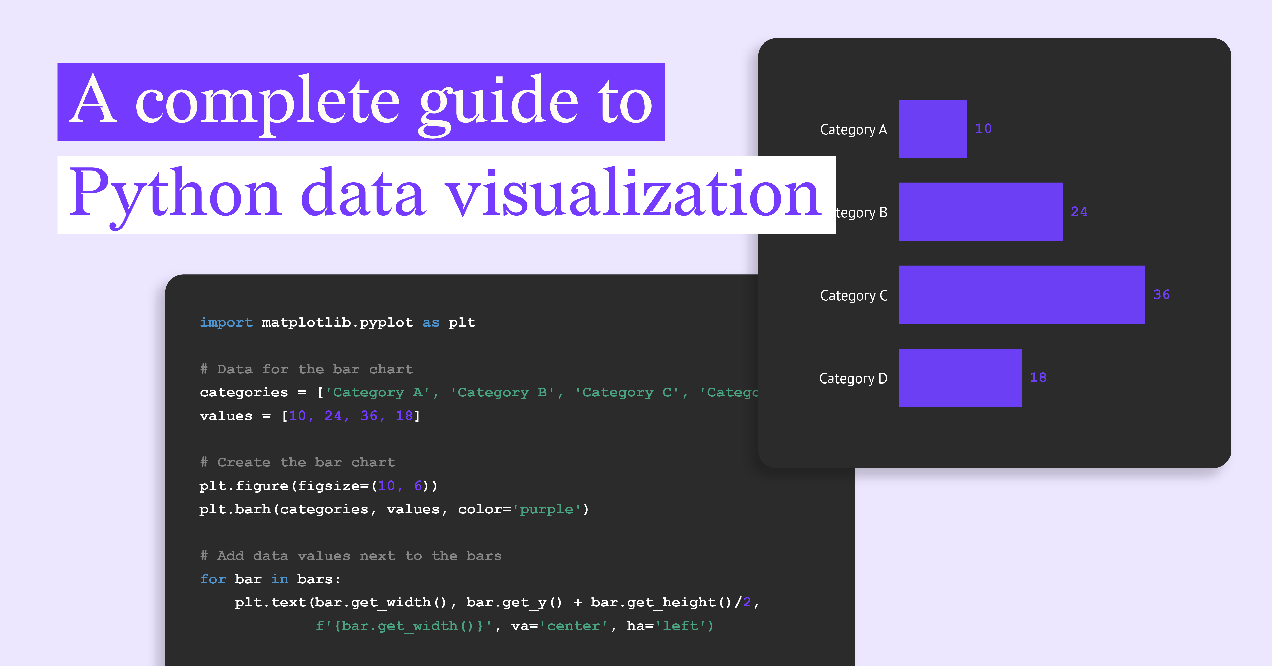
A Complete Guide to Python Data Visualization

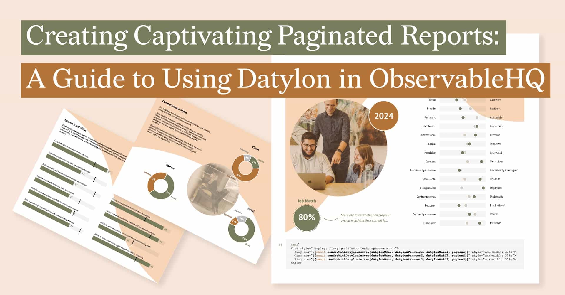
Technical, Financial Services, Report Server, Reporting
Automated Reporting in Asset and Wealth Management: Trends and Best Practices
The complexity of asset and wealth management has reached unprecedented levels as the industry...
Subscribe to our newsletter
Receive inspiration, practical advice, customer stories and news right in your mailbox

DataViz Best Practices, Technical, Dataviz Resources
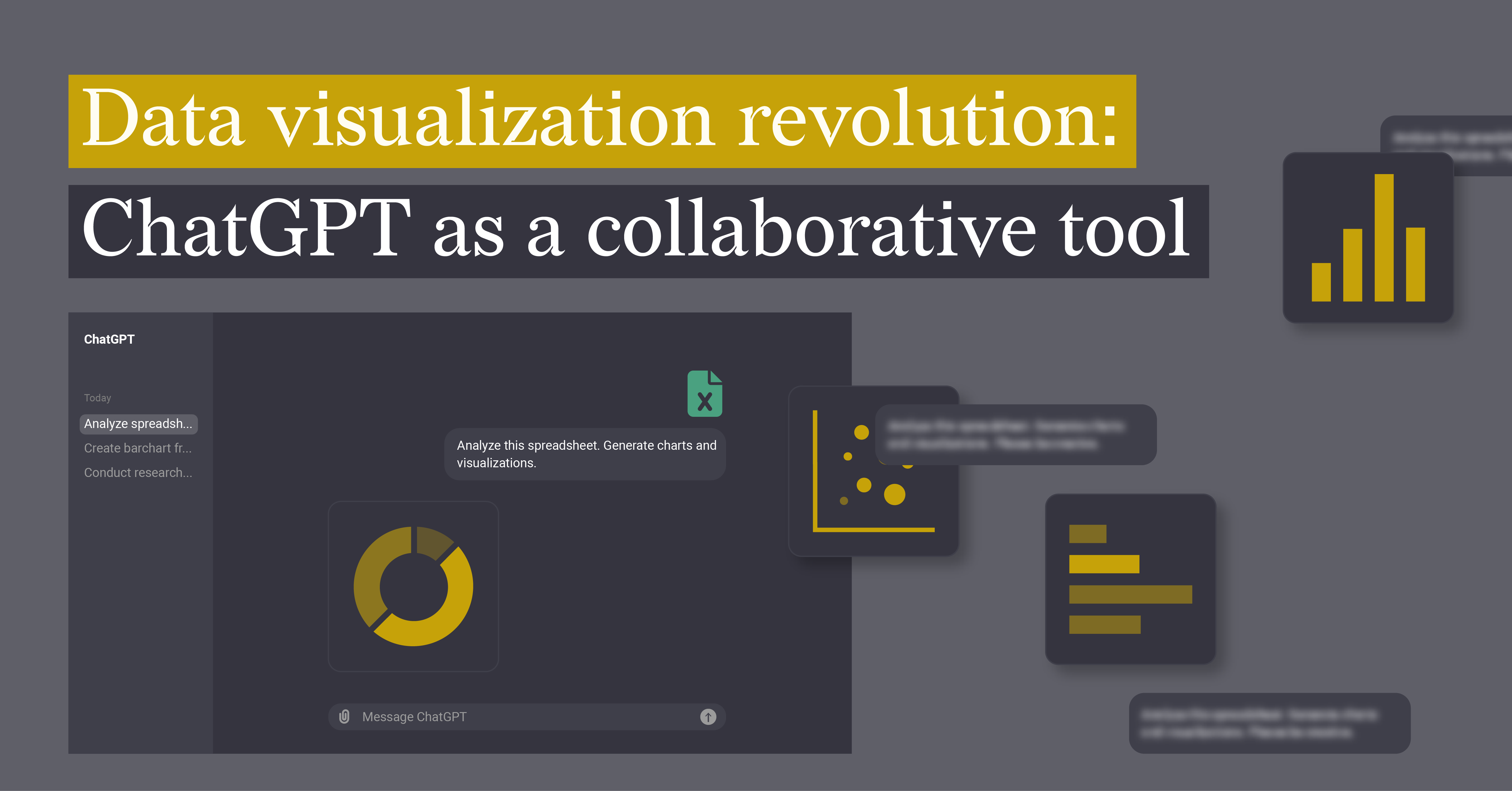
Data visualization revolution: ChatGPT as a collaborative tool
Want to transform your data into impactful visuals quickly and effortlessly? You spend hours...
Technical, Dataviz Resources
A Guide To Data Visualization using Excel & Datylon Plugin
Data visualization is a useful tool to help users better understand trends, patterns, and insights...
Technical, Food For Thought
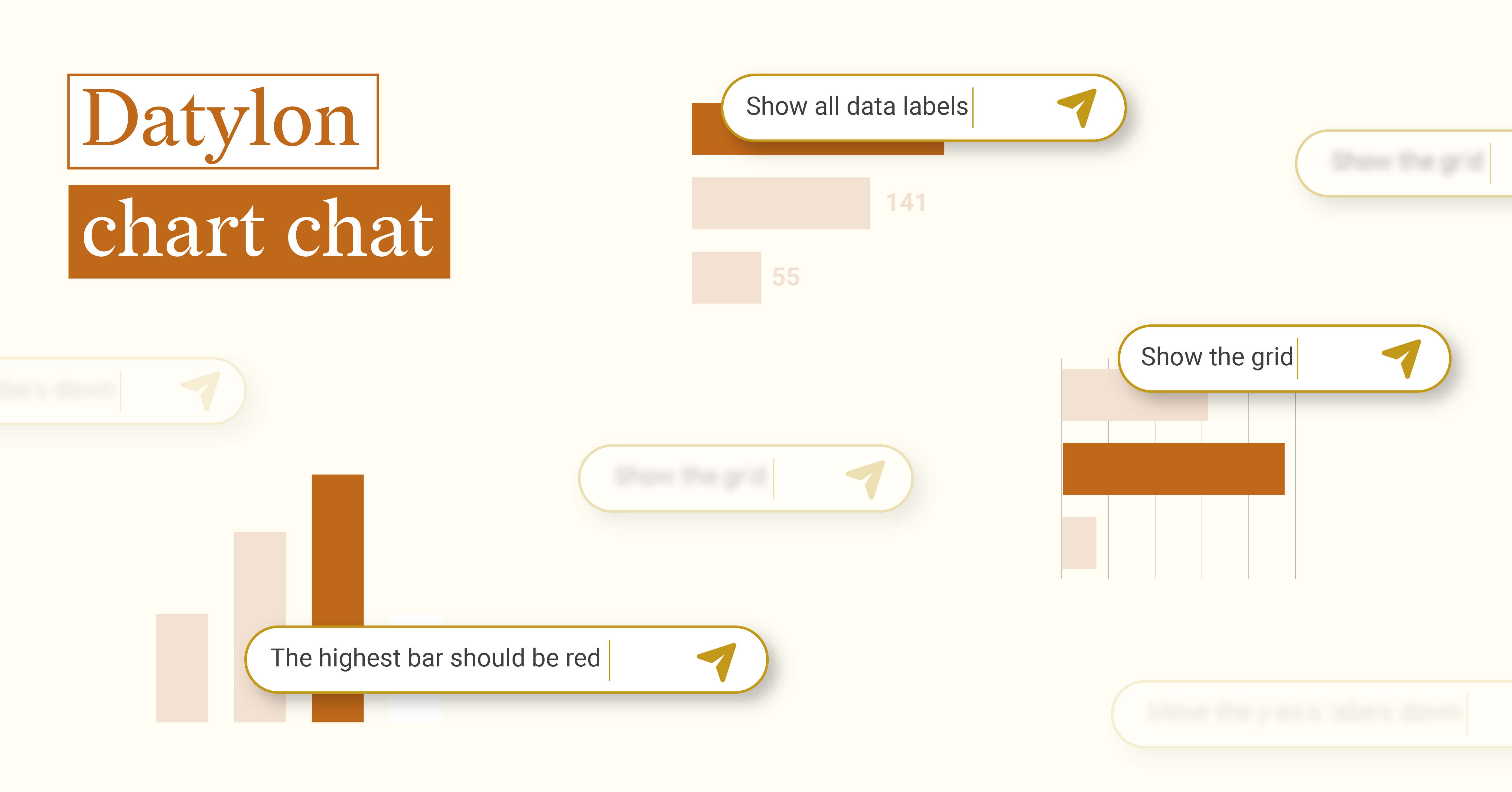
Datylon chart chat
When OpenAI released ChatGPT to the public in November 2022, both the potential and challenges of...
Technical, Report Server, Reporting
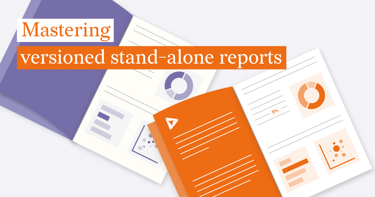
Mastering Versioned Stand-Alone Reports
In the world of data reporting, versioned stand-alone reports occupy a special niche. They are a...

Technical, Report Server, Reporting, SaaS
Building an automated reporting solution with Datylon Report Server
Closing the gap between engaging report designs and automated delivery of personalized information...
Technical
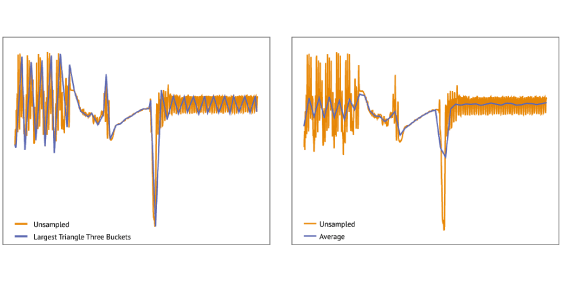
Line charts & sampling time series data sets
When venturing in dataviz space one quickly runs into the task of visualizing a time series...