In an earlier article (https://www.datylon.com/blog/building-automated-reporting-solution-report-server) a simple yet realistic Datylon report automation system was implemented using a straightforward Python script. In this article, the same Datylon design is integrated in the ObservableHQ (https://observablehq.com) platform to illustrate how the powerful data exploration and transformation features of ObservableHQ can be extended with the automatic rendering of high fidelity Datylon reports.
Combining the exploratory data visualization richness of ObservableHQ with the creative freedom of the Datylon platform results in a powerful toolset supporting the journey from collected data to shared insights.
Table of contents
|
Datylon Report
Both the report and the relevant data is explained in the earlier article (https://www.datylon.com/blog/building-automated-reporting-solution-report-server) and is summarized below.
- The data contains employee survey responses covering three different domains.
- personality
- communication style
- skills
- The data is provided as an Excel file and contains one sheet per domain and an extra sheet with benchmark data to compare the results of each employee with.
- For each employee in the data set, a three page report can be generated, each page highlighting a different aspect of the survey results.
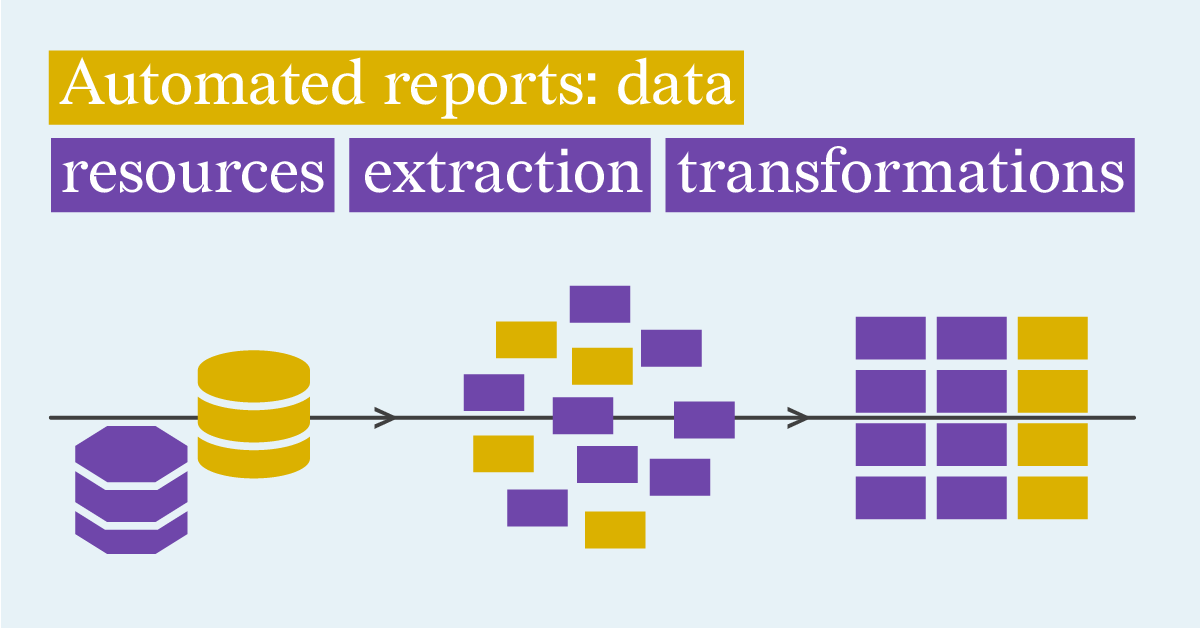
- Because the data format expected by the Datylon designs differs from the source data in the Excel workbook a bit of data conversion logic has to be implemented.
The ObservableHQ notebook
The notebook is available at https://observablehq.com/d/be499dd55aab0698.
Before you can render the Datylon report using the notebook, a few preparatory steps are required.
- The notebook contains four attachments. Start with downloading the three SVG files (survey-01.svg, survey-02.svg and survey-03.svg ) to your local computer.
- Create a free Datylon account at Datylon Report Studio by selecting ‘Join’ and signing up with a username, email and password. It’s important to not use “Sign up with Google” (you can use a Google email address though).
- You will receive an email asking for confirmation of your registration. Confirm the registration by clicking on the link in the email.
- Sign in at Datylon Report Studio using your new account.
- Select ‘Templates’.
- Select ‘Upload template’ and select, name and save the previously downloaded svg files one by one.
- For each of the uploaded templates, select the three dots in the tile and find the Copy Uuid item. Copy those in a temporary file.
- As a final step, fill in the UserName, Password, uuid1, uuid2 and uuid3 fields in the notebook.
At this point the notebook will invoke the Datylon Report Server and display the pages of the report, rendered as three bitmaps.

You can choose to render the report for a different survey respondent by using the “Select person” drop down.
The report can also be downloaded as pdf by clicking the “Download PDF report” button.
The notebook structure
-
The first part of the notebook collects the different configuration parameters (user name, password and the uuid’s of the Datylon Report Studio templates).
-
The second part interacts with the user.
-
Person selector using a drop down control
-
Per page png display of the three report pages
-
PDF download button
-
-
The third part reads in the Excel file and the different sheets.
-
The fourth part contains a number of helper functions.
-
buildPayload: extracts and transforms the Excel data to match the report requirements
-
renderWithDatylonServer: invokes the Datylon render server
-
fetchAsPdf and concatenatePDFs: render each of the three pages and concatenates them in one pdf document
-
Conclusion
The integration of Observable HQ's flexible data manipulation features with the user-friendly Datylon Report Server API enables the flexible creation of on-brand reports. The combination offers users advanced tools for data exploration and transformation, coupled with an efficient process for producing visually appealing reports.
If you are interested in learning more about how to use the Datylon Report Server for automated reporting, we recommend you to book a demo with one of our automated reporting specialists or read our comprehensive guide.
👉If you're keen on crafting custom data visualizations, visit our Bespoke Data Visualization Solutions page.