11 tips for designing accessible charts for visually impaired readers
Recently we’ve published an article about how to choose and refine a chart for colorblind viewers. Now we decided to broaden it up and we made a checklist that will make your charts accessible for people with visual impairments.
The checklist in this article consists of 11 points regarding different aspects of using text, color, shapes, and ways of interaction with visualizations and aims to make your charts more accessible. More detailed and specific information might be found in W3C standards and guidelines: Web-Content Accessibility Guidelines and Accessibility Requirements for People with Low Vision.
According to ICD-11, there are two groups of visual impairment: distance visual impairment (mild, moderate, severe, and blindness) and near vision impairment.
Currently, 2.2 billion people are estimated to have vision impairment to some degree. That’s 1 out of 4 people! 237 million of them have moderate or severe distance vision impairment and around 39 million people are blind. That’s more than the entire population of Canada.
These figures tell us that accessibility is an important thing to consider while creating your visuals. It’s worth noting that any action taken to improve accessibility will always be beneficial to all other users as well.
Text
1. Takeaway title
Usually, before creating the chart itself it’s better to pick out the main idea that should be delivered. The title focuses on a certain point of the provided data. It should be as specific and simple as possible. The title should be more assertive than descriptive and hold the idea that should be enough for most users as a takeaway from the chart.

2. Alt text and summary of the visualization
Alt text is one of the main ways for people who use screen readers to get the image's information. Screen readers are the primary tool for users with vision impairment for interaction with the computer. It’s an assistive technology that transforms text and visual content as speech or braille output. Every major OS has its own screen reader system. It reads the screen’s content and elements of navigation.
All the screen reader controls can be accessed via the keyboard. Usually, there are no issues with the text, but images and other visual elements (i.e. buttons) should be somehow transformed into self-explanatory text. This is why every picture has an “alt” attribute – it can be recognized by screen readers and read out the explanation or a comment that was given to an image or visual object.
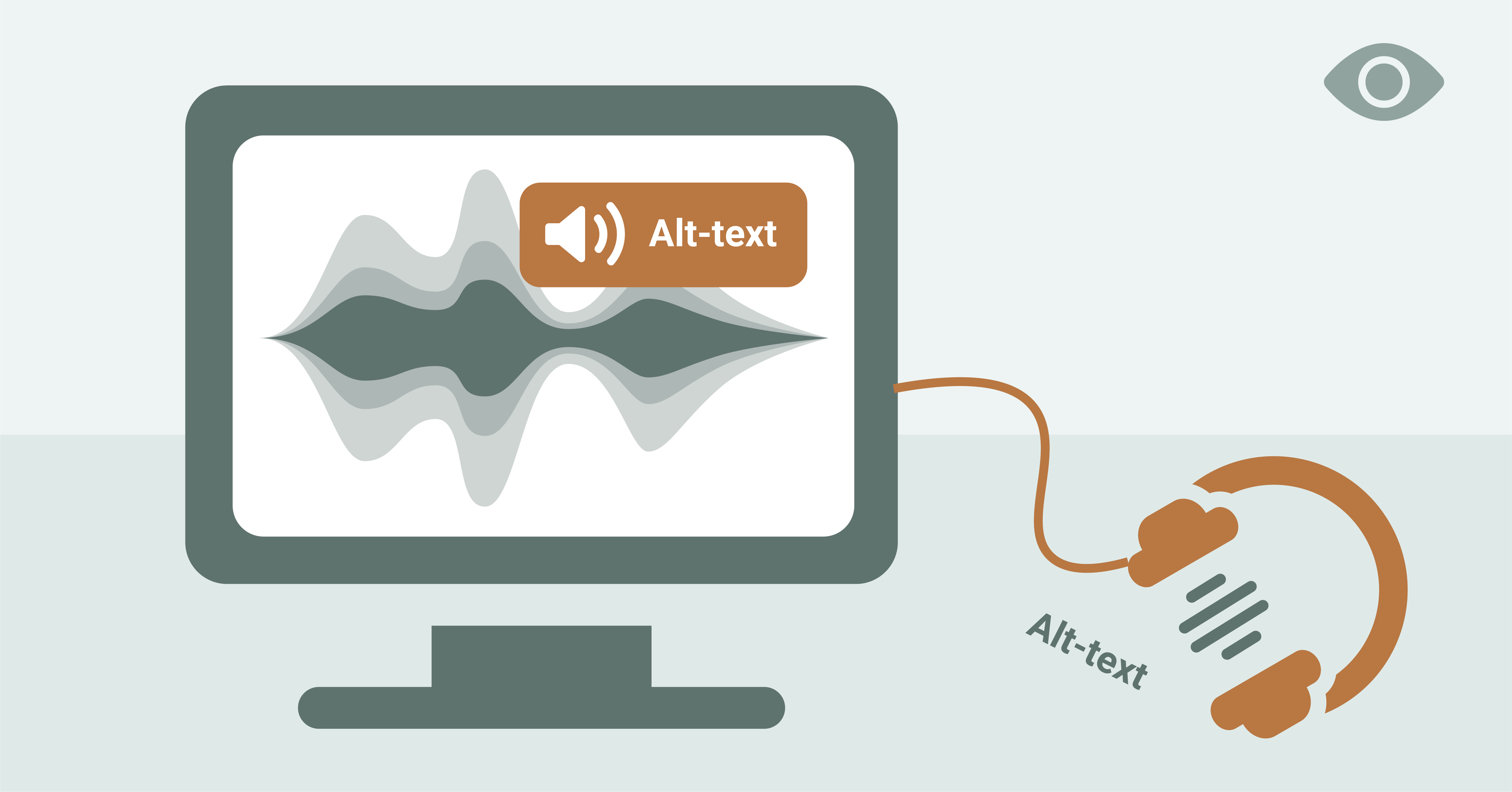
Amy Cesal suggested a great recipe for an alt text for data visualization. It should contain four elements: chart type, data that is presented, the main conclusion, and the link to the full dataset.
This way of presenting alt text is really useful for several reasons. The chart type, data, and main conclusion give a great overview of the chart that will be enough for most users. The link to the data source provides an additional opportunity to dive deeper into the data the chart was based on.
Besides an alt text, it’s a good practice to have a summary or an explanation of the visualization. It’s useful not only to users with different kinds of visual impairments but also to users that can have trouble understanding the chart. It’s not a rare case. A lot of complex visualizations can be really hard to grasp without special knowledge.
3. Direct labeling
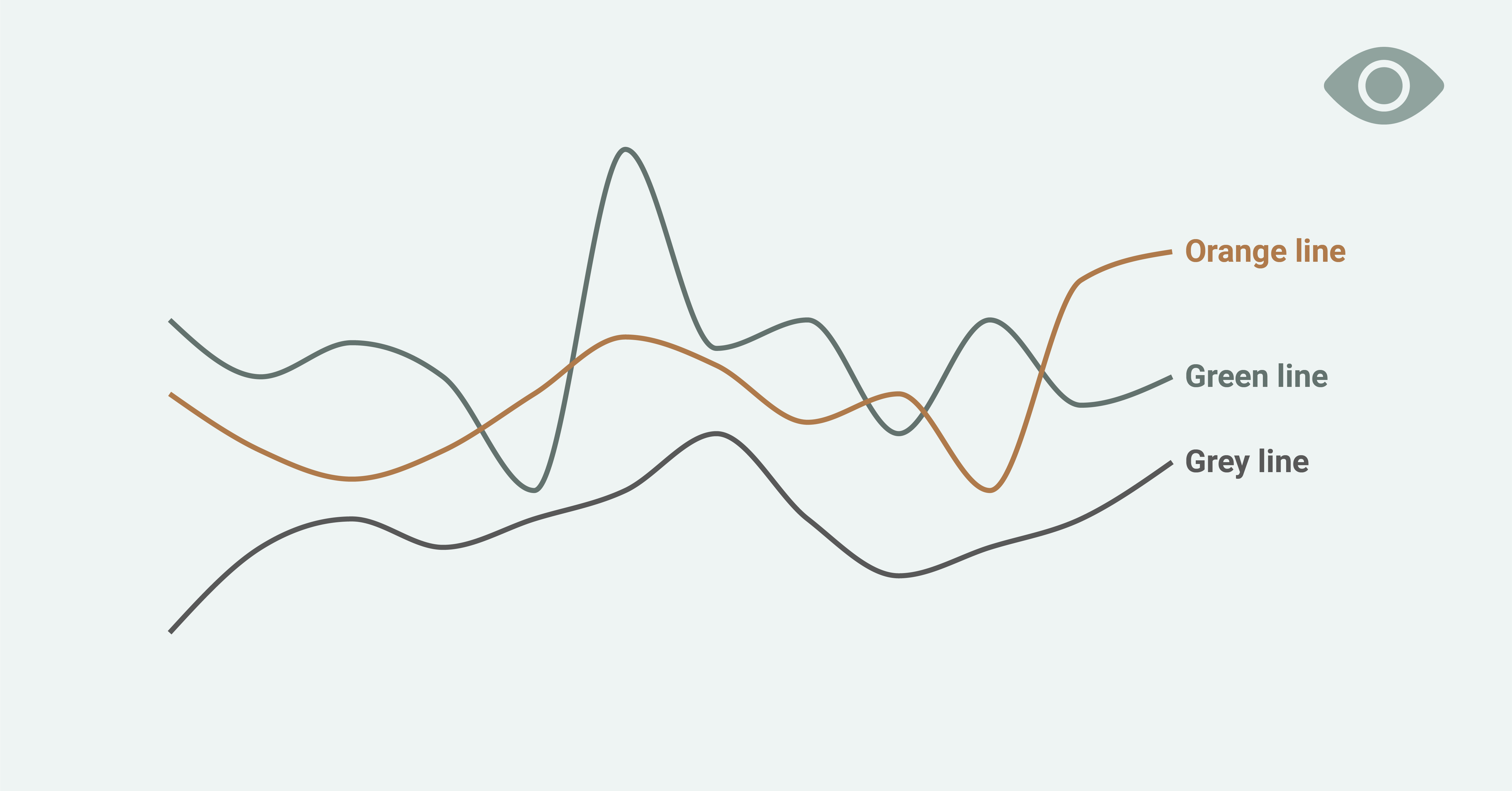
Direct labeling can be useful for multiple groups. Firstly, using direct labels instead of legends increases the readability and makes the chart more accessible. For colorblind users, direct labels provide a possibility to read the chart even if the coloring wasn’t perfect. A direct label that is linked with the corresponding element also provides additional info that can be transformed by screen readers that are used by people with low vision and vision impairment.
4. Text size and typefaces
There are no official minimum text size guidelines, but generally, it’s recommended to use 12pt (16px) size fonts for body text while using traditional monitor sizes. The minimum font size is 9pt (12px). Below its size font can become technically eligible for some platforms. Based on WCAG guidelines there should be an option for text to be resized without loss of content or functionality.
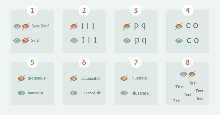
Typefaces that are used in the visualization can also make a huge impact on accessibility. It can make a difference for people with poor vision, learning disabilities, aphasia, dyslexia, or low adult literacy. Gareth Ford Williams picked out 8 points that you should consider while choosing a typeface.
- Use an appropriate font for your audience. If it’s children or people with low vision better to choose sans serif font and if your audience is fast-readers serif fonts will be a better choice.
- Avoid using similar forms for different symbols. Capital “i”, lowercase “L” and “1” should look differently.
- Avoid mirrored letters. For example “p” and “q” should contain differences other than mirroring.
- Letters should be easily distinguishable. One example is “o” and “c”. In this case, “c” needs to be noticeably opened so it’s hard to confuse it with “o” for people with low vision.
- Use Humanist typefaces instead of Grotesque, as they tend to have more variation in letter forms and are more legible at smaller sizes.
- Use fonts with more defined spacing between letters, as compact spacing tends to look glued which has a bad influence on readability.
- The capital letter height and ascenders should vary. As an example, capital “i’ and lowercase “l” should have a different height.
- Test the typeface in the context you’ll be using it.
Color
5. Follow color contrast guidelines
The most used color contrast guideline is WCAG. There are two most used color contrast levels: AA (minimum contrast) and AAA (enhanced contrast):
- Level AA requires a contrast ratio of at least 4.5:1 for normal text and 3:1 for large text. WCAG 2.1 requires a contrast ratio of at least 3:1 for graphics and user interface components.
- Level AAA requires a contrast ratio of at least 7:1 for normal text and 4.5:1 for large text.
There are a lot of color contrast checkers out there that can help you to follow the guidelines: WebAIM, Coolors, ColorContrast, and many more. But remember to do a manual check and test it with users, because the guidelines might sometimes be flawed.
6. Make a dark version of your visualization
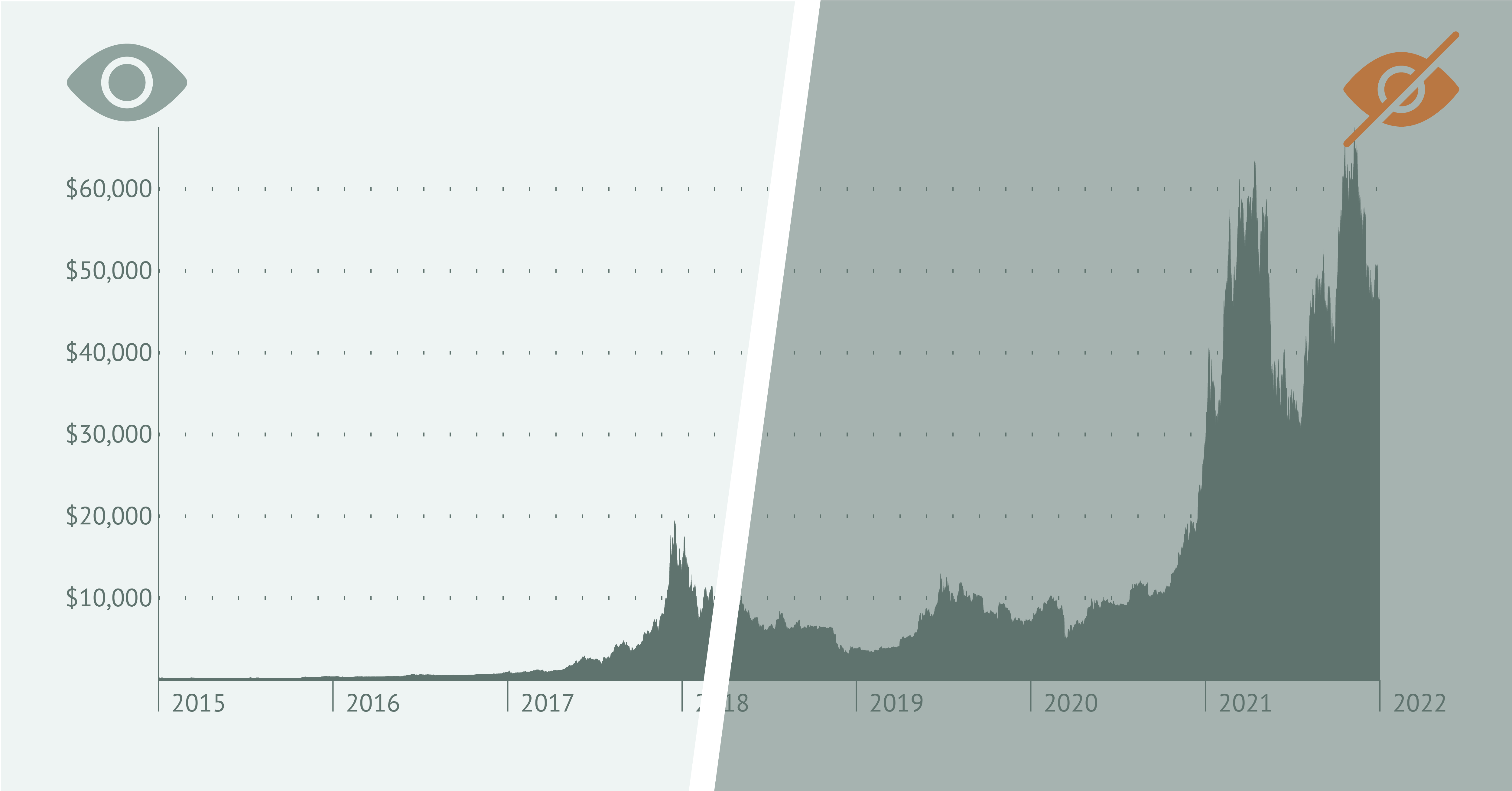
People with sensitivity to light usually struggle with light themes. Also, generally, a dark theme has its advantages – it reduces glare and blue light. A reduced amount of blue light helps to sleep better as blue light can interfere with sleep cycles.
On the other hand, dark mode causes the pupil to dilate and this causes the vision to be blurry. Dark mode can also increase the halation effect that is typical for people with myopia and astigmatism. So the general recommendation is to make a dark version of visualization but preferably in combination with a light version.
7. Use a single-hue palette
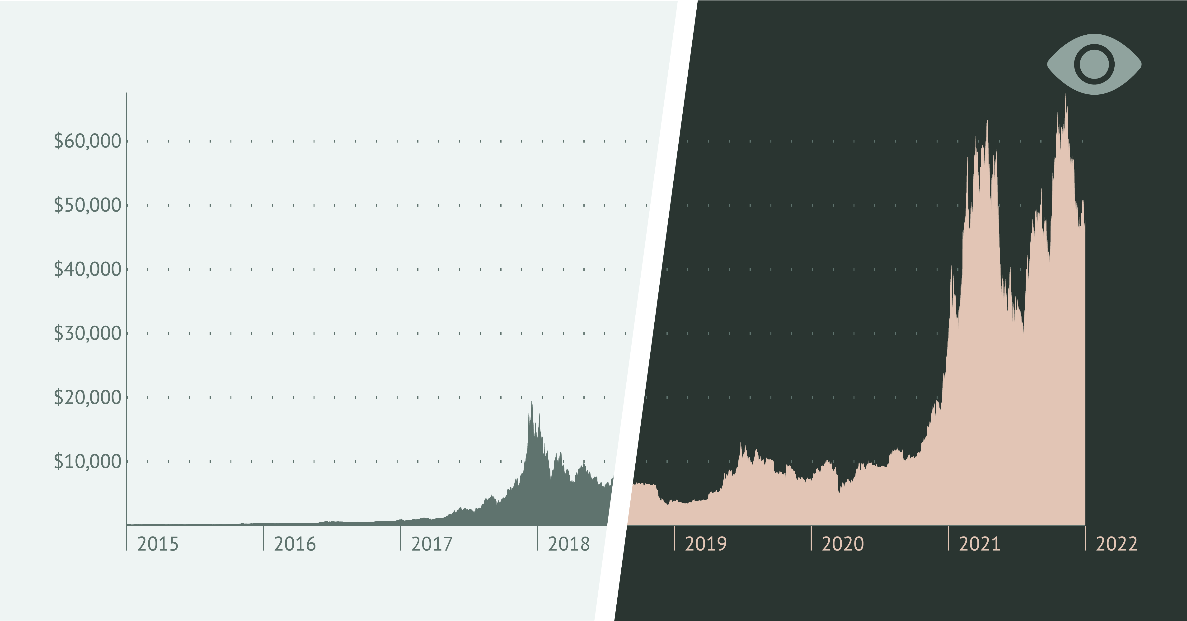
In case it’s essential to use color in your visualization try to stick to a single-hue palette. It will allow omitting the problems of color perception for color-blind users. But be careful with the range of the palette. It is better to have a limited number of shades to have enough contrast between neighboring colors.
8. Use non-color elements
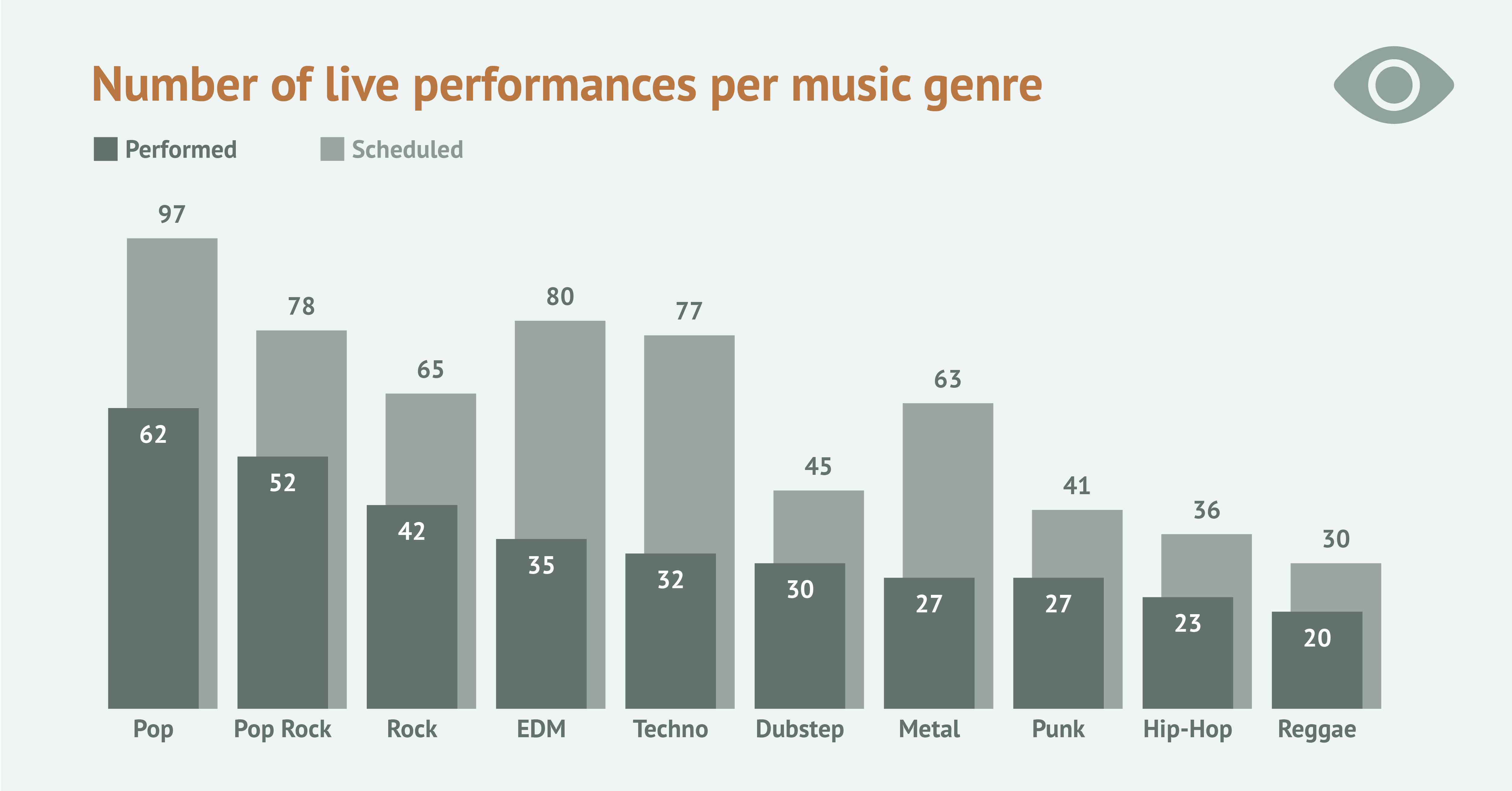
Using patterns, icons, dashed lines, and spaces between chart elements can be helpful to distinguish them from similar elements. For colorblind users, it’s an alternative to color coding, and for people with low vision – an additional way to identify a chart element.

Interaction
9. Cover keyboard-only accessibility
For people with low vision and visual impairment, their keyboard is a primary way to communicate with the computer. So every action that can be taken with the elements of the visualization should be available via keyboard. For example, if the chart is presented as a hierarchical structure, only arrow keys will be needed for navigating the chart – up and down to navigate levels of the hierarchy and left and right to navigate among the elements of the given level.

10. Make static visualizations a preferable option
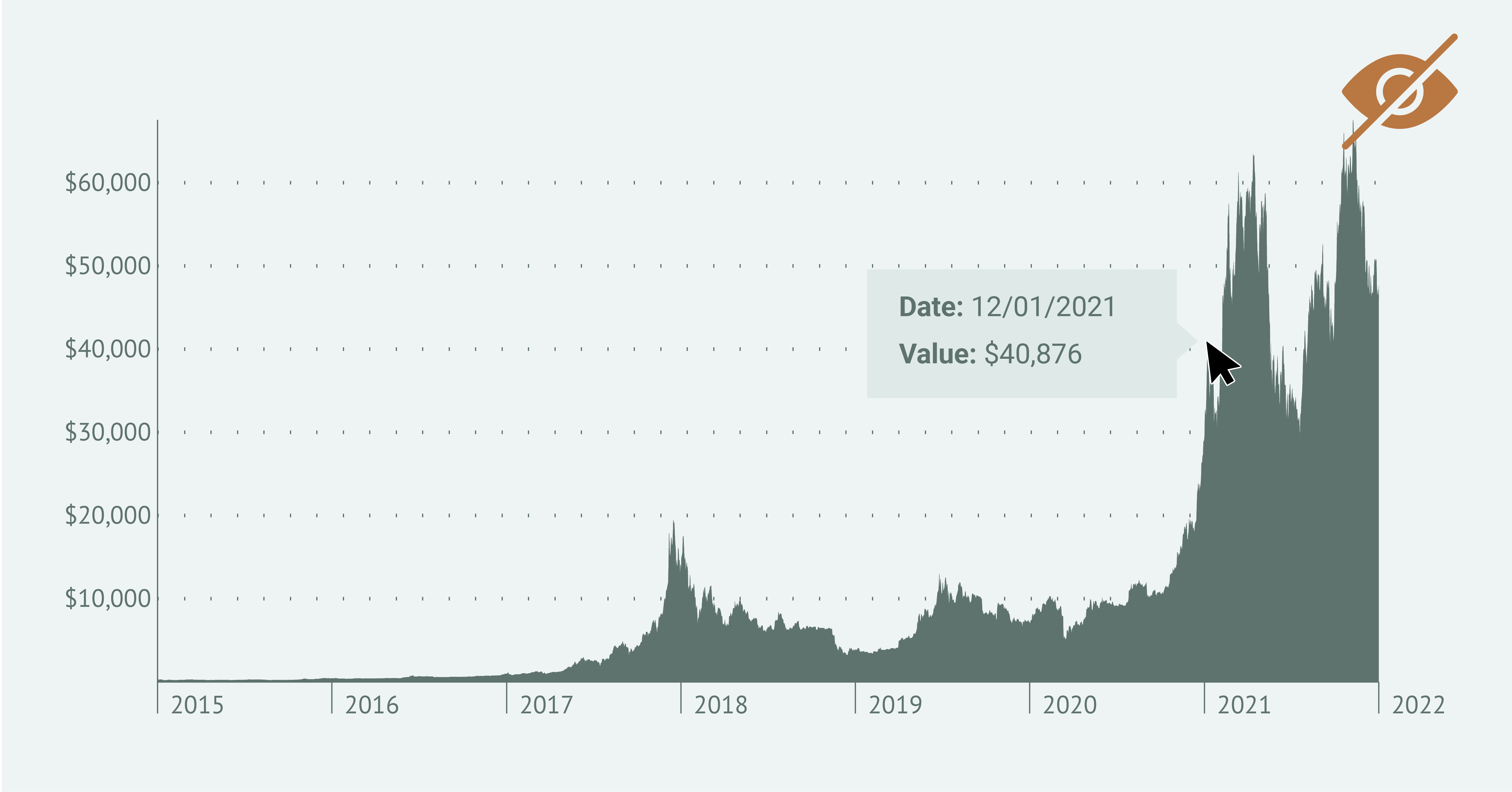
When choosing between static and interactive visualization be aware of the limited accessibility of interactive elements. In most cases, they need non-trivial interactions with a mouse, which limits the possibilities of users with a keyboard as the main input device.
Also, the changeable nature of interactive visualizations makes it difficult to create a comfortable experience for screen reader users. That said, static visualizations are devoid of the above disadvantages and make a good choice both for keyboard and screen reader users.
If frequent data updates are essential but you still want to keep the benefits of static visualizations, consider automated reporting tools. These tools can generate updated static charts on-demand or according to a schedule, ensuring accessibility without sacrificing dynamism. By designing a template and connecting it to a data source, you can automate the chart creation process. Datylon Report Server is a powerful solution for this purpose. To learn more about how it works, explore our comprehensive guide or schedule a demo with one of our experts.
11. Design a screen reader experience
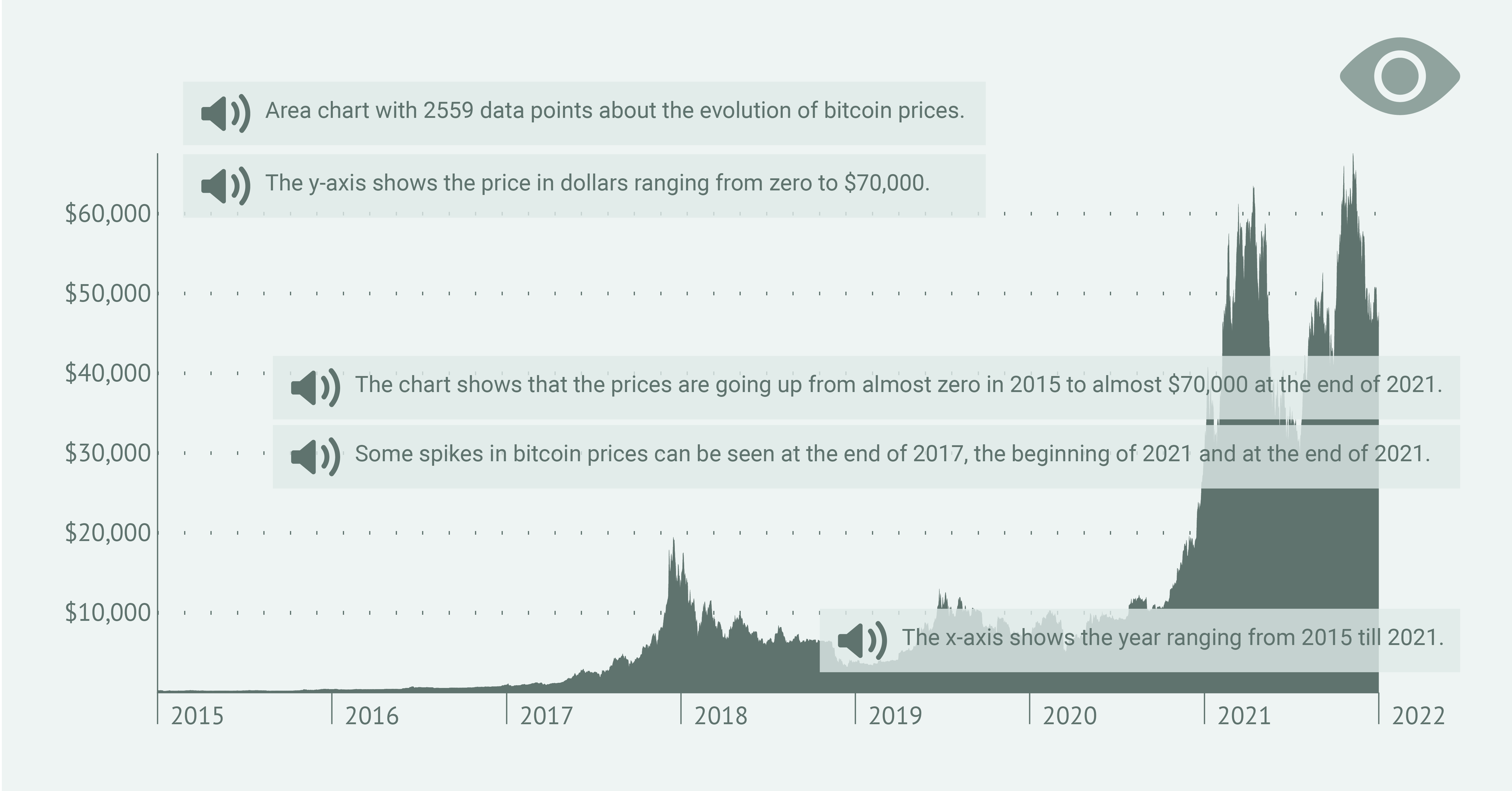
Though the visualization can have all the points mentioned above, the way it’s presented via screen reader might not be optimal in terms of user experience.
The first thing you need to check is the order of the presented data. It should be logical and allow the user with visual impairment to get the idea quickly and clearly. Elements that didn’t deliver any additional meaning should be excluded from the elements used by a screen reader.
👉If you're keen on crafting custom data visualizations, visit our Bespoke Data Visualization Solutions page.
Further reading & resources
- Datylon Chart Library - a collection of resource pages for different types of charts, each with unique and applicable design tips for accessible and stunning data visualization.
- The best charts for color blind viewers - an extensive article explaining different types of color blindness and listing the best charts for each type.
- A guide to effective data visualization - five steps to improve your next dataviz project.


