DATYLON > CHART LIBRARY > RANGE PLOT
What is a range plot?
Alternative name: Range chart
A range plot is based on two data points for each category and a bar or a line in between two data points which presents the difference between those values. Sometimes color and icons can be used to indicate the direction of such change (or a movement of the values).
A range plot is the easiest and most convenient way of presenting the minimum and maximum value of the category and the space between. Its simplicity makes it easy to understand and useful for presenting data to a wide audience.
Range plots are mostly used to depict gaps between paired values (demographic gap, gender pay gap) or simply the difference between the smallest and the biggest values from a set of multiple values.


Dumbbell chart
A dumbbell chart is a type of range plot characterized by a central line and flanked by two markers (typically circles) on each side. It resembles the shape of a dumbbell, as the name suggests. Instead of one of the circles, an arrow can be used to show the direction of the change in the range.


Dot plot
While a range plot serves the purpose of displaying two data points using a line or a stripe, a dot plot can be used to show multiple points, employing distinct colors to highlight each category. Dot plots excel in bringing attention to all important key points within a data range, as they pack a lot of information in a small space.


Box chart
Sometimes the range of values should be shown using not only min and max values but also median, 25th percentile, and 75th percentile. In this case, a box chart is a perfect option. It’s often used in statistical analysis and scientific papers, that’s why it’s well known and recognizable by the community.


Slope chart
Just like a range plot, a slope chart needs two points, but they are shown in a slightly different way. One line is used for placing start-points and the other is for the end-point. The angle corresponds to the degree of change. Space-wise it’s an economical chart, but the crossings of lines can cause confusion if too many lines are used.
Labeling
In most cases, start- and end-point values are essential for the range plot because they are the focal points of the chart, so they should be accompanied as labels. The exception is when the number of ranges is extensive and ranges are treated as a representation of trends. In this case, axes’ labels and gridlines will be a better choice.
Read more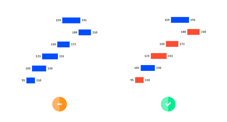
Coloring
Color coding is essential for a range plot if you want to show the direction of the changes. The simplest and more efficient way to color the directions is to bind blue color to the positive direction and red to the negative direction.
Read moreIndicating the direction with icons
Another way of showing the direction of changes is by adding an arrow. A combination of color and arrow icons makes a perfect combination for users with different degrees of color perception.
Read more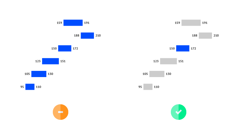
Highlighting
To draw attention to the most important categories of the range chart, a good solution is to highlight these ranges and color all the other bars the same way in a neutral color. This way, highlighting a specific bar will help catch the reader’s eye immediately.
Read more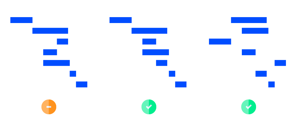
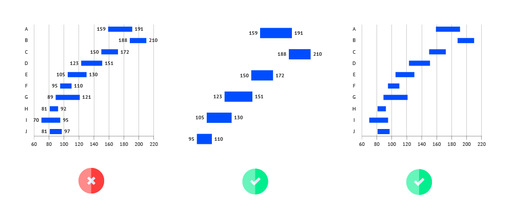
Sorting
Sorting can be a useful tool for presenting disordered data. You can sort the categories in the data. Either based on the highest value, the lowest value, or the range length. Using ascending or descending sorting puts the range in order and helps the user to read the chart. It also reduces the time needed to compare the differences between different ranges.