 - no coding skills needed!")


Industry, Report Design, Reporting, Consultancy
How Datylon helped Black Pearl Analytics to make dashboards 16x faster
Black Pearl Analytics provides financial consultancy for businesses, asset managers, owners of...

Project, Industry
How Datylon helps to make the City of Antwerp more sparkling
Datylon has been awarded by the city of Antwerp the project to build an IoT platform for remote...

Project, Industry
Streamliner – A collaborative supply chain platform
A collaborative supply chain platform for sharing and visualizing data in real-time.
Industry, Report Design, Reporting
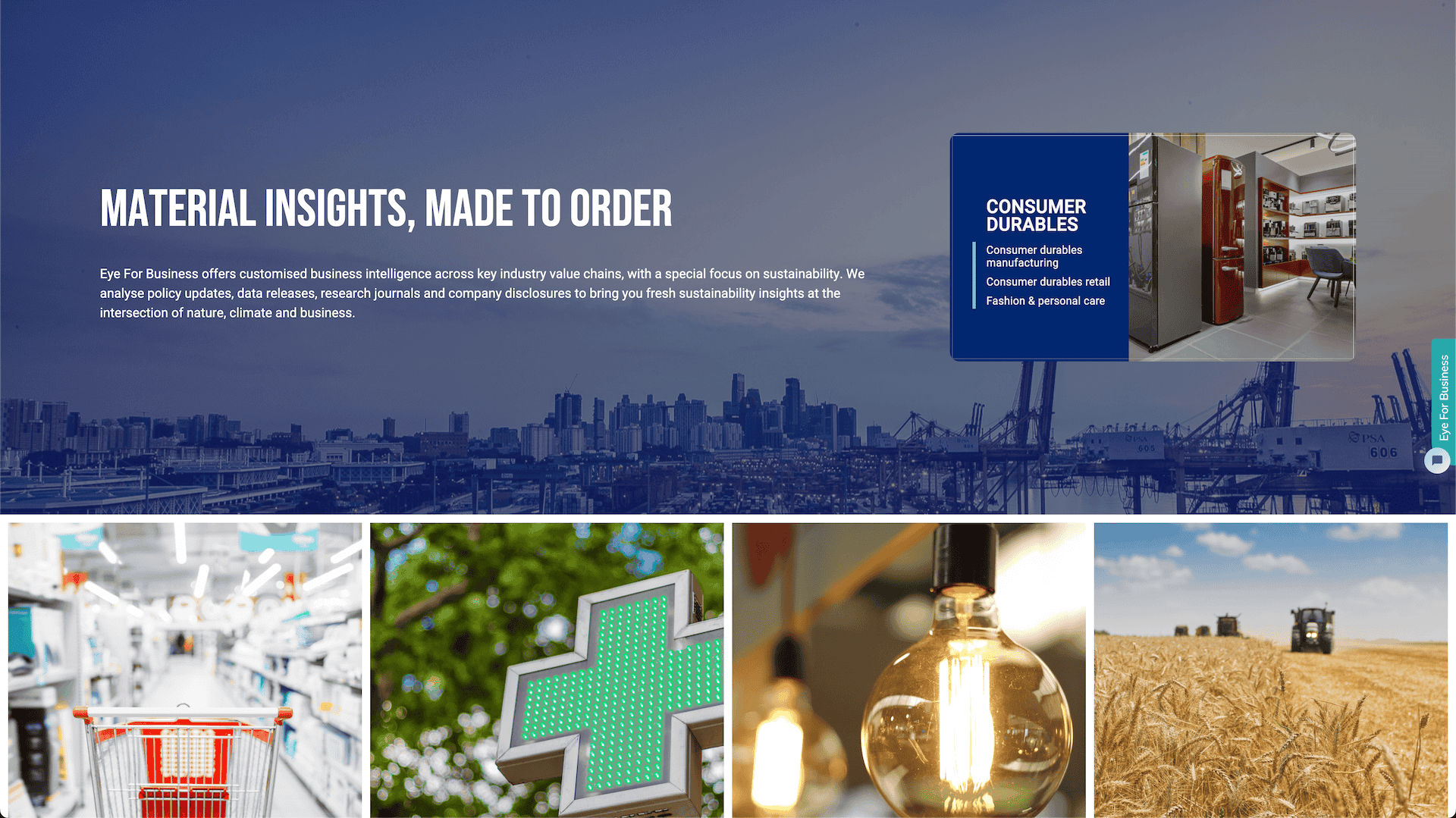
How Eye for Business Enhanced Sustainability Reporting with Datylon
Eye for Business is a platform that provides data-driven insights and expert guidance to empower...
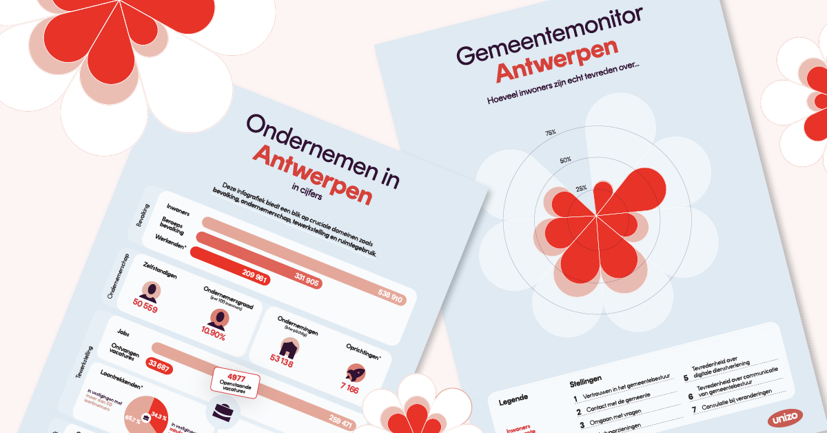
Government, Report Design, Report Server, Reporting, Automated Reporting
Targeted Reports to Empower Municipalities
Unizo is the largest Flemish employers’ organization in Belgium, representing over 80,000 small and...


/datylon-blog-Clear-Compelling-Compliant-%20How-to-Present-Long-Term-Sustainability-Goals-in-CSRD-Reporting-featured-image-2.png)