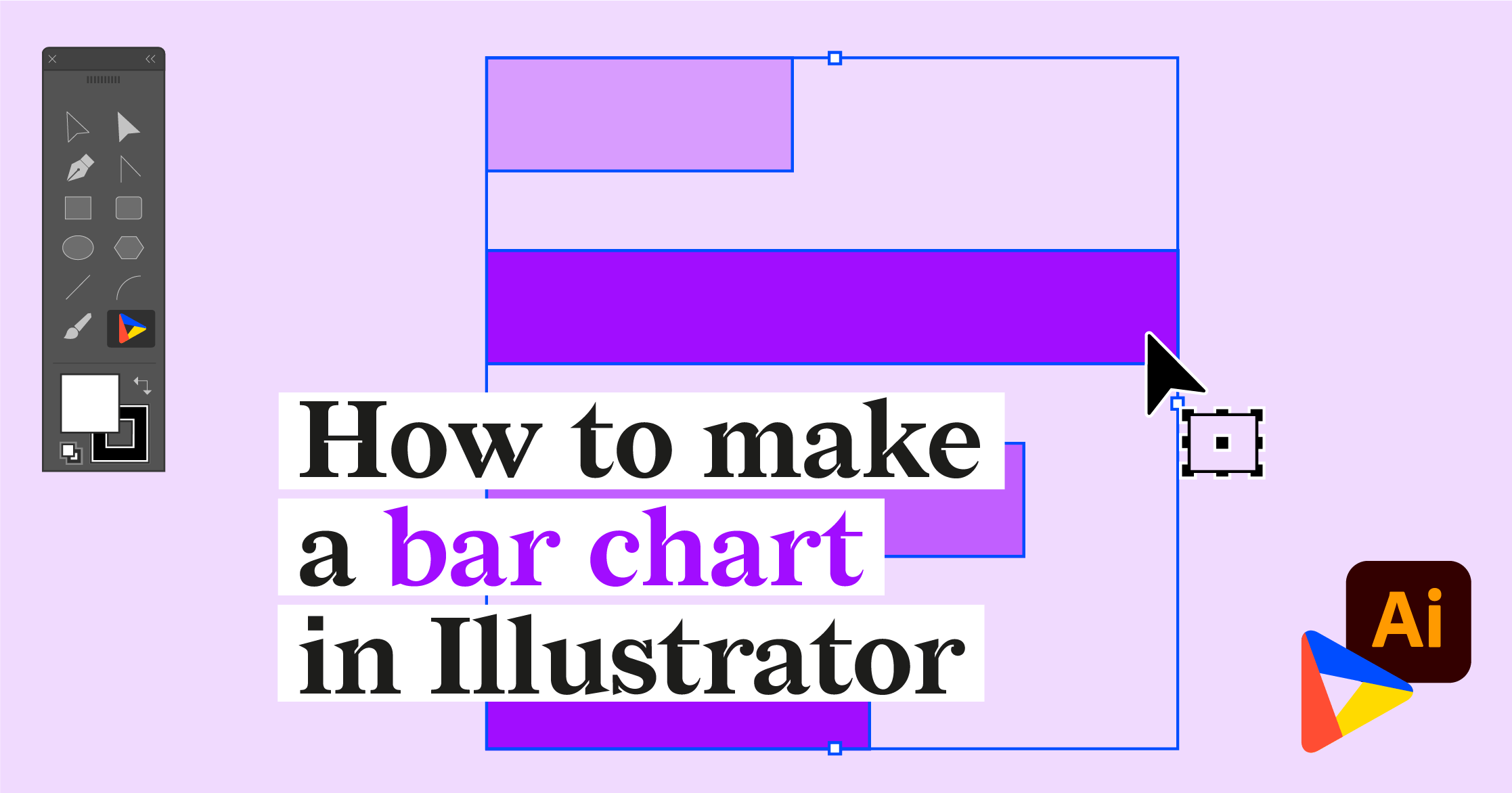
In this tutorial, we will make a multi-level (or multi-layered) pie chart that shows the chemical composition of the Earth. We will use three pie charts: for the crust, mantle, and core.
If you want to follow the steps, you can download the data that we are using here.
Download and install Datylon for Illustrator
For this tutorial, we assume you have already downloaded and installed the Datylon for Illustrator plug-in. If not, you can sign in and download the plug-in here. |
Together, we will make a pie chart, step by step. In the end, our chart will look like this:
Step 1: Preparing the artboard
It’s a good idea to prepare your artboard before creating a visualization. In most cases you need a chart of a certain size and proportions, so taking care of this in advance makes your life easier. For our design, we set the artboard to 1000 pixels by 1200 pixels.
Step 2: Drawing the chart area
First off, select the Datylon icon in the AI toolbar and draw a rectangle that more or less fits the desired dimensions of the pie chart. Don't worry about the size of your chart design. In Datylon for Illustrator, you can easily resize the chart at any moment: chart elements will be redistributed in the same proportions. This very important feature ensures that scaling does not mess up your design.
When releasing the rectangle, the Datylon pane will appear.
Scroll down a bit and select the right chart type in the chart library. Click on the pie chart card. Make sure you click the card and not the grey ‘Select’ button. That immediately opens the first default chart and that might not always be what you want. Instead, clicking on the entire tile displays all the different variations of a pie chart.

Default charts serve as a starting point to help you design your chart. So if you already know where you want to go with the design, these defaults could help you get there faster. In the case of the pie chart, we can choose from eight default charts.
The first four pie charts showcase different slice and stroke coloring possibilities. The fifth chart is a donut chart. The sixth is a semi-circle donut chart. The seventh is a Nightingale chart with different radius values for slices. The eighth is a pie chart with a pulled slice.
For this tutorial, we’ll go with the first default chart.
Step 3: Adding data
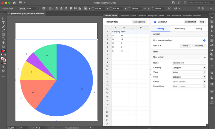
Once you have selected your default chart, the Datylon window appears. On the left, you can see the data pane, and on the right the property pane. The property pane consists of a Binding tab, a data Formatting tab, and a Styling tab.
But let’s take a look at the data pane first. There are three ways of adding data:
- You can start with a dummy sheet or an empty sheet and copy-paste your own data into it.
- You can upload a file from Datylon Report Studio if you have some data stored there.
- You can upload a locally saved file.
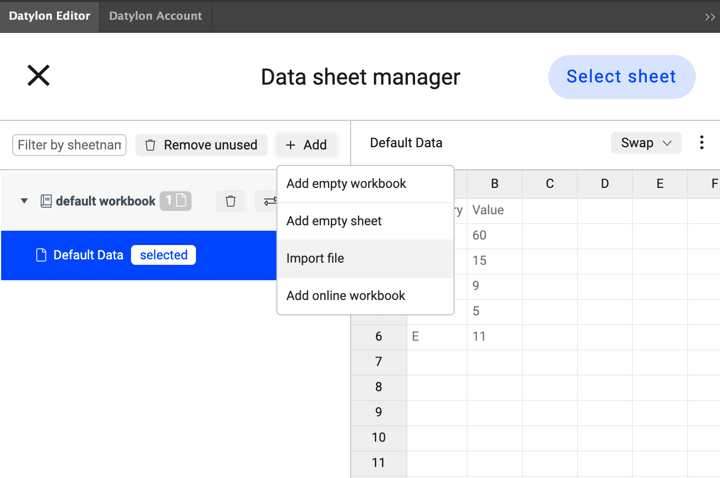
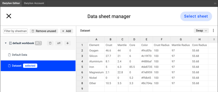
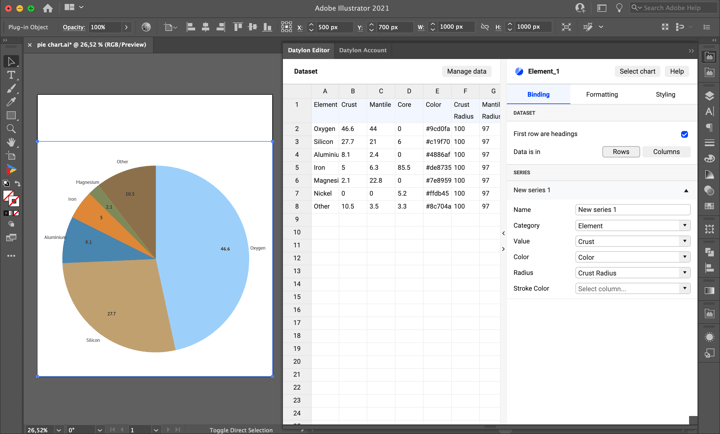
We are going to use a file we have saved locally on our computer. Simply click Manage Data > Add > Import File and browse to find your data file. As the data sheet is added you can see its preview. In our design, we are using a dataset that contains 8 columns: Element, Crust, Mantle, Core, Color, Crust Radius, Mantle Radius, and Core Radius. There are percentage values for every chemical element for every layer of the Earth. The “Color” column allows you to have consistent colors for all of the elements in different pie charts. Radius columns set the radius of every slice of a pie and allow us to see the approximate scale of the earth layers (*the mantle radius is reduced for the sake of crust visibility. In reality, the mantle would have a radius value of more than 99). After loading the data, click ‘Select Sheet’.
Once the update is complete, we see that the pie chart is updated with the new data.

Step 4: Binding the data
Now let’s start the binding process for the crust pie chart. Currently, Category and Value are bound correctly to Element and Crust correspondingly. Bind Color column to Color and Crust Radius to Radius. The Radius hasn’t changed because 100 is the maximum and default value. The color is still driven by the selected palette. To use the colors defined by HEX codes in the data go to Styling > Slices > Fill and set it to None. Now the right colors are applied.
Step 5: Styling the pie chart
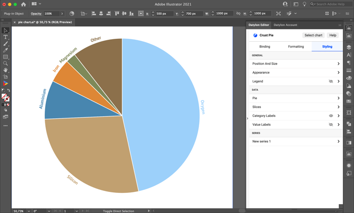
As there’ll be more charts on top of the “Crust” pie chart, the same margins should be applied for all of the charts. To fix that go to Position and Size. Plot Area is by default set to Auto-Fit. Auto-fit takes into account labels, ticks or other chart elements that fall out of the plot area, while in Fixed Positioning only the chart itself is taken into consideration. You need the latter one. Set Plot Area to Fixed Positioning and apply 150px Margins.
For this chart we will need only Categorical Labels as the Value Labels of three pie charts can make the visualization cluttered. You can turn off Value Labels by clicking on the eye icon.
Moving on to Categorical Labels. First, let’s change the color of the Categorical Labels to match the color of the slices. Go to Styling > Categorical Labels > Character > Color and set it to the Link option. Make sure that the font is large enough – set the Size to 20 px. Set the Typeface to PT Sans Bold. The bold typeface is a good choice for colored labels. It makes them more readable. To make Categorical Labels compact, set the Direction to Tangential. Also, make sure that Anchor Radius is a bit more than 100% – so that labels are near the slice, yet not overlapping with it - 105% works well.
To separate slices a bit go to Styling > Pie > Stroke Radial and set them 2px and white color. As there will be 3 charts, it's better to keep them organized so let’s rename it to “Crust Pie”.
Step 6: Adding the second pie, managing and binding data.
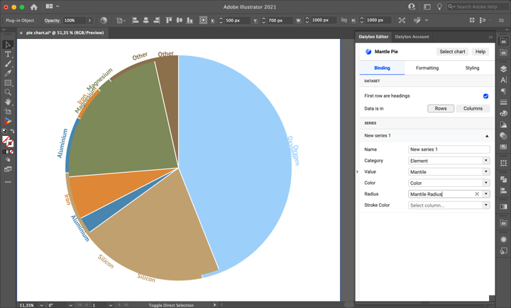
Now let’s move to the second pie. As the styling will be mostly the same it’s better to copy the current chart. To do this select the current chart, go to Illustrator Edit > Copy, then Edit > Paste in Place. The new visualization will be placed in the exact same spot as the previous one. If you want to have the possibility to edit the data for all the charts at the same time (f.e. colors) it's better to use the same dataset for all charts. Go to Manage Data and select the same datasheet that was used for the first pie. Then rename the new chart to “Mantle Pie” right away to keep everything organized. Then bind Value to Mantle, and Radius to Mantle Radius.
Step 7: Styling the second pie.
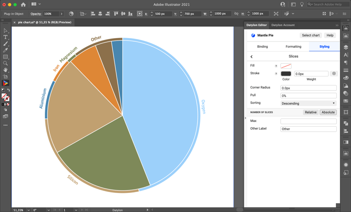
As you can see after the binding a 2nd pie becomes visible. Moreover, it's apparent that the Categorical Labels for the Mantle Pie don't look good. We can remove them because all of the elements that are present in the Mantle are also present in Crust. Also, the same elements have the same colors, so the Categorical Labels of the Crust Pie will work also for Mantle Pie.
It makes sense to add a stroke around the Mantle Pie to separate it from the Crust Pie. To do that go to Styling > Pie > Stroke Circumference and change it to white 2px wide.
It looks better, but the slices are not sorted properly. To sort them go to Styling > Slices > Sorting and set it to Descending.
Step 8: Adding the third pie, managing and binding data, styling
For the third pie, we’ll repeat all the procedures that were done with the second pie. First, select the second pie then go to Illustrator Edit > Copy, then Edit > Paste in Place. Then go to Manage Data and change the datasheet. Rename the chart to “Core Pie”. Bind Value to Core, and Radius to Core Radius.
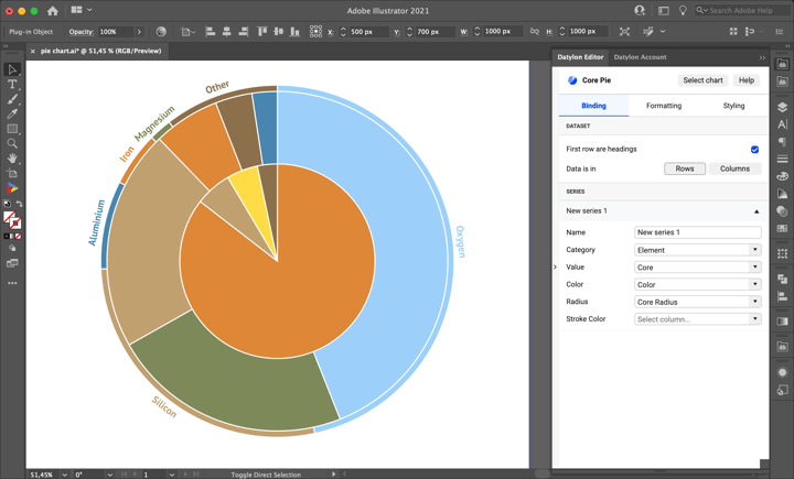
Almost done with our visualization. Only one label needs to be added. The yellow sector represents Nickel, but there’s no label showing it. To add this label data point styling will be useful. Go to Styling > Series > New Series 1 > Nickel and turn on the Category Labels by clicking on the eye icon. “Nickel” label is applied, but it overlaps with the white stroke, so it’s hard to read. To fix that the position of the label can be changed. Go to Styling > Series > New Series 1 > Nickel > Category Labels and set the Anchor Position property to “Start”. Now the label looks better. The main part of the visualization is finished, and now it is time to finish off with a title and subtitle.
Step 9: Adding title and subtitle
Select the Illustrator Type tool and the text at the top of the artboard. The title would be “What the Earth is made of”. To make it big enough use 64px PT Sans Bold. The reasonable option for the title color would be dark brown (#60421f) as there is a light brown slice in the pies. The subtitle would be: “Starting from outside: crust, mantle, and core chemical components”. Use the lighter color (#4886af) and 24px PT Sans Regular.
Step 10: Using and sharing
Once you are happy with your design, you can export this chart as an image like you would do with any other Illustrator design and use it in all kinds of editors, or embed it on a website by exporting it to Datylon Report Studio and copying the embedding code. Alternatively, you can place the AI file in an Indesign document and when updating the chart in Illustrator, the link will make sure it is also updated in the InDesign document.
Bonus Step: Automating
If you need to generate this multi‐level pie chart or your report including this pie-chart on a recurring basis, it can be convenient to automate the whole process with Datylon Report Server. For more information, see our specialized guide or book a demo with one of our automation experts.
Datylon Pie Chart Resources
- Blog: Deep dive into... pie charts
- Chart library: Pie chart resource page
- Chart properties: Pie chart properties