
DATYLON > CHART LIBRARY > PIE CHART
What is a pie chart?
Alternative name: Pie graph, Pizza chart, Circle chart
A pie chart visualizes a part-to-whole relationship. It shows how the data is divided into categories with a certain value (the slices), but it always keeps the link between the value of one category and the total sum of those categories (the pie).
This means that the slices should add up to a logical sum. If the data is in percentages, the total should round up to a hundred. If the data is in absolute values, for example in euros, the categories should form a meaningful total.
This relative approach of comparing a part to a whole is key to understanding how to use a pie chart. If the focus of the visualization is on comparing values between categories, it’s better to use another chart type.
A pie chart works best with only a few categories, otherwise the chart becomes an unreadable clutter. It is also very suitable when one category is very big or very small compared to the other categories. But if the differences between the categories and thus between the slices are small and not easily recognizable, another chart - for example a bar chart - is much better suited.

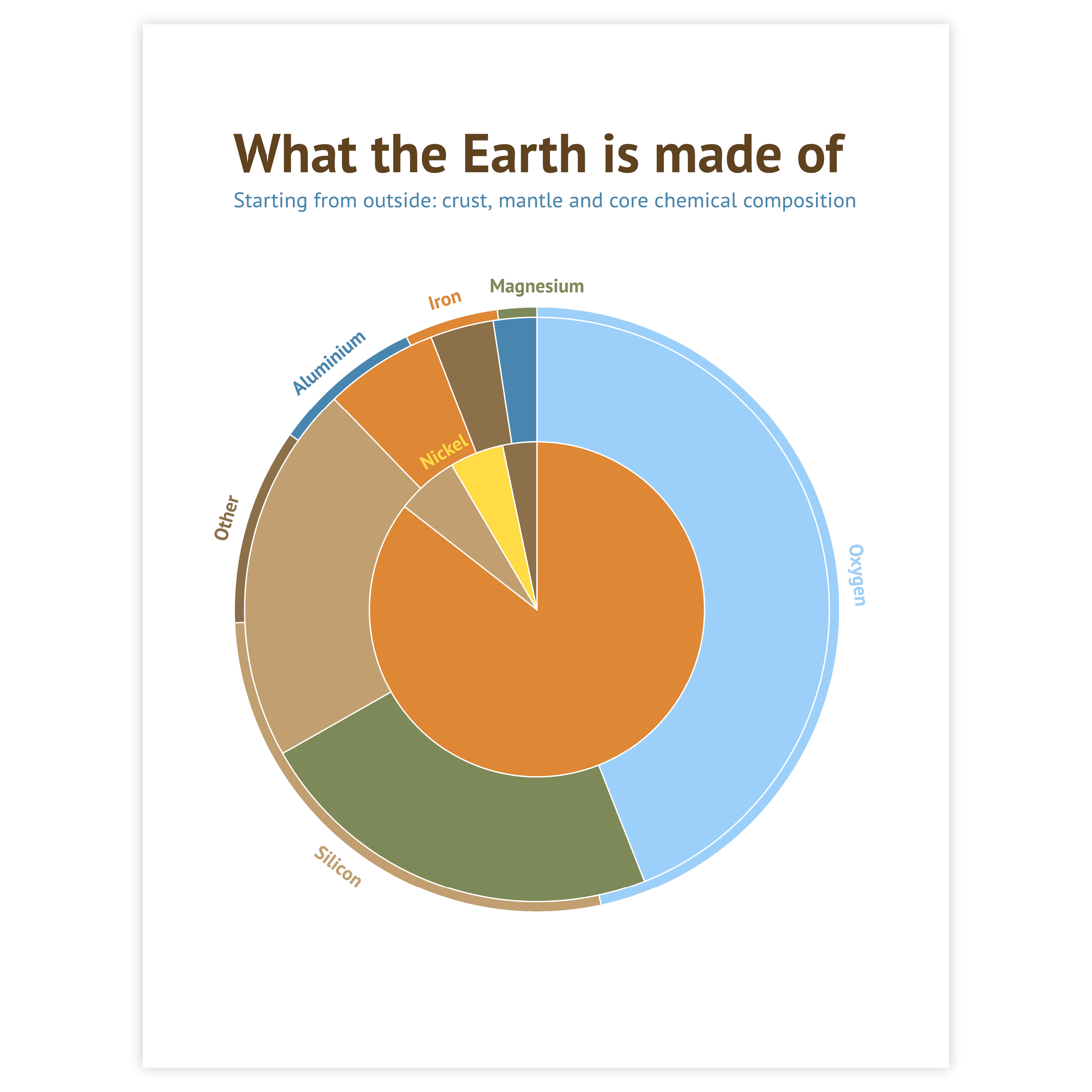


Donut chart
In terms of conceptual representation, the donut chart is essentially equivalent to the pie chart, with its slices communicating the part-to-whole relation in the data. Adding an empty space in the center gives more room to add information such as a description, a title, or a total value.


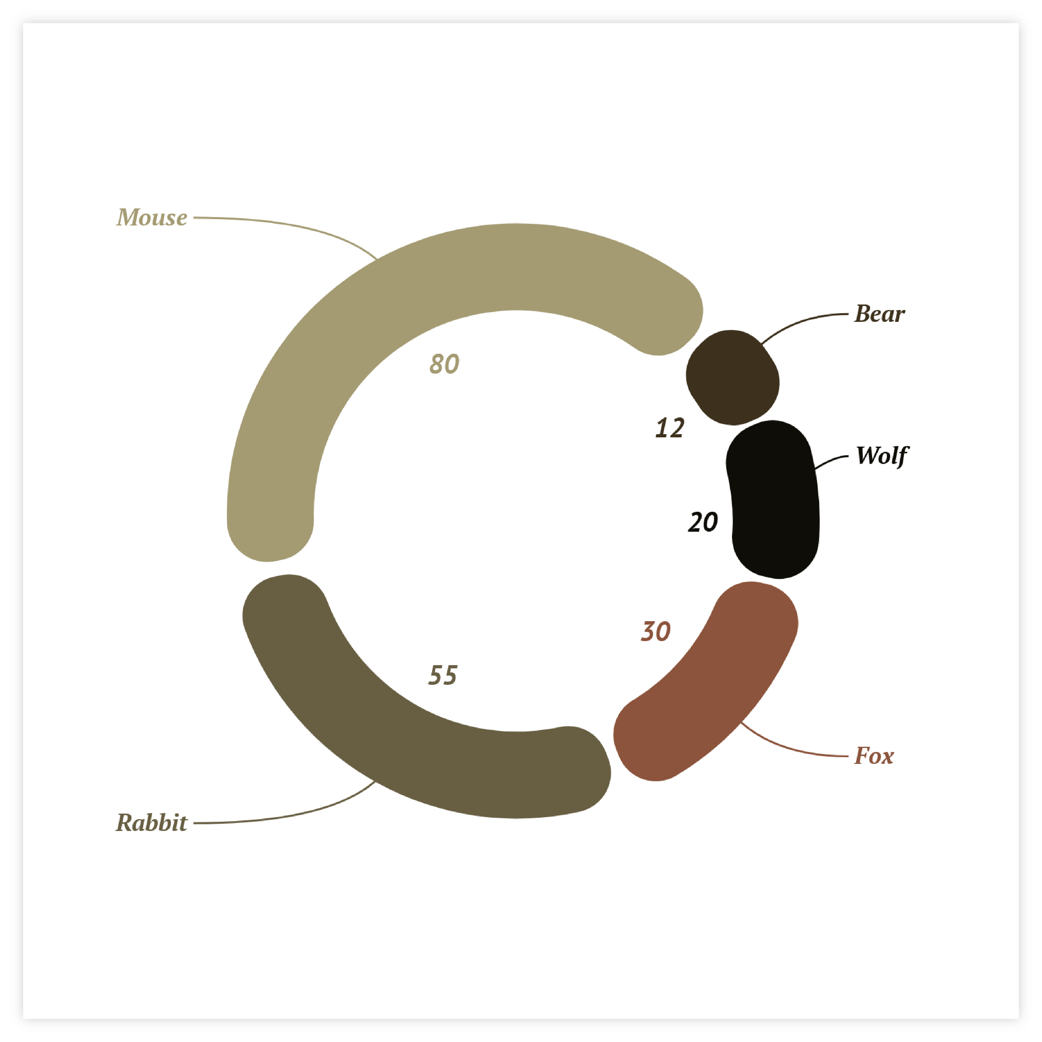
Semicircle pie/donut chart
This chart operates similarly to a standard pie or donut chart, except that the combined values of all categories form a semicircle instead of a complete circle. It can serve as a foundation for creating a gauge chart by using the slices to show progress or by adding a pointer.


Coloring
There are different ways to color a pie chart. When using a legend, you can color categorically: every slice gets a distinct color and equals one category, but the hue of the colors needs to be different enough to easily switch your view from legend to pie chart. You can also give all slices the same color. That way only the size of the slice communicates the data. This results in a calmer and balanced look. Or you can double encode the values by coloring the pie numerically: the value of the slice drives the saturation of the color.
Read more
Sorting
Sorting your slices in ascending or descending order and starting them at 12 o’clock might help the user to read the data. There is no real scientific proof for this but it is the natural way we read a clock and it also results in a calmer design.
Read more
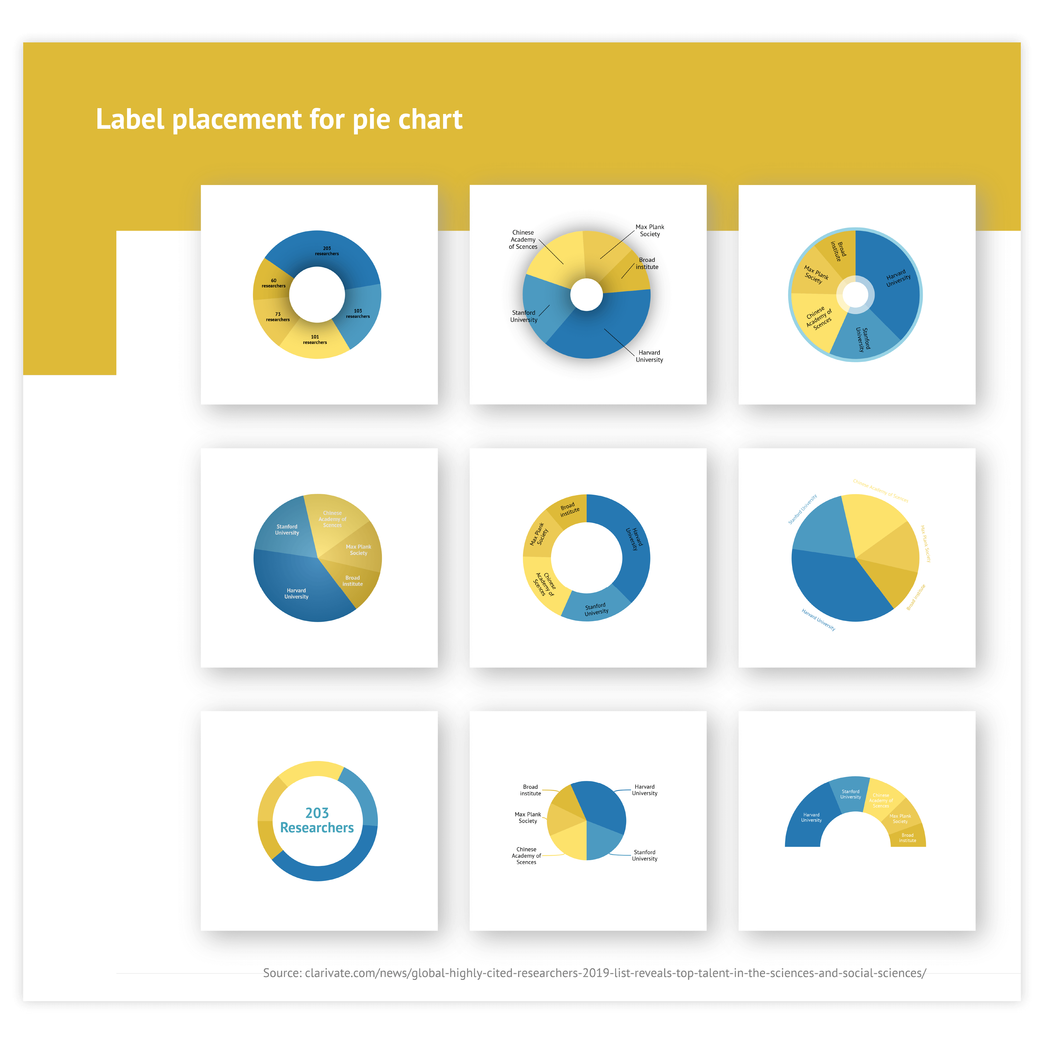
Labeling
You can apply a categorical label directly or via a legend. In general, direct labeling is preferred. That way your eyes don’t have to go back and forth between slice and legend. (Our tool offers a lot of direct label options to optimize the placement of the labels.) However, if your pie chart is colored categorically and the space around the pie is too small, using a legend is a perfect way to make the pie chart design calmer. Value labels are usually applied directly to the slices.
Read more
Data-point styling
You can emphasize a viewpoint or an analysis angle by applying data point styling to a certain slice. Differentiating the color, the label styling, and the size of a slice attracts the attention of the viewer to the point you want to highlight. Attention: be aware that some data point styling options, like increasing the radius of a slice or pulling the slice out of the pie can distort the translation of the data.
Read more
Rest category
If your data contains a ton of categories, there is still a way you can use a pie chart. If the data allows it, and if it suits the message you are trying to convey, you can combine all small categories into one ‘other’ category and label it as such. This does not work for all datasets. Ideally, the ‘rest’ category is not bigger than the next to last category and the total number of categories is not much bigger than 5.
Read more
