

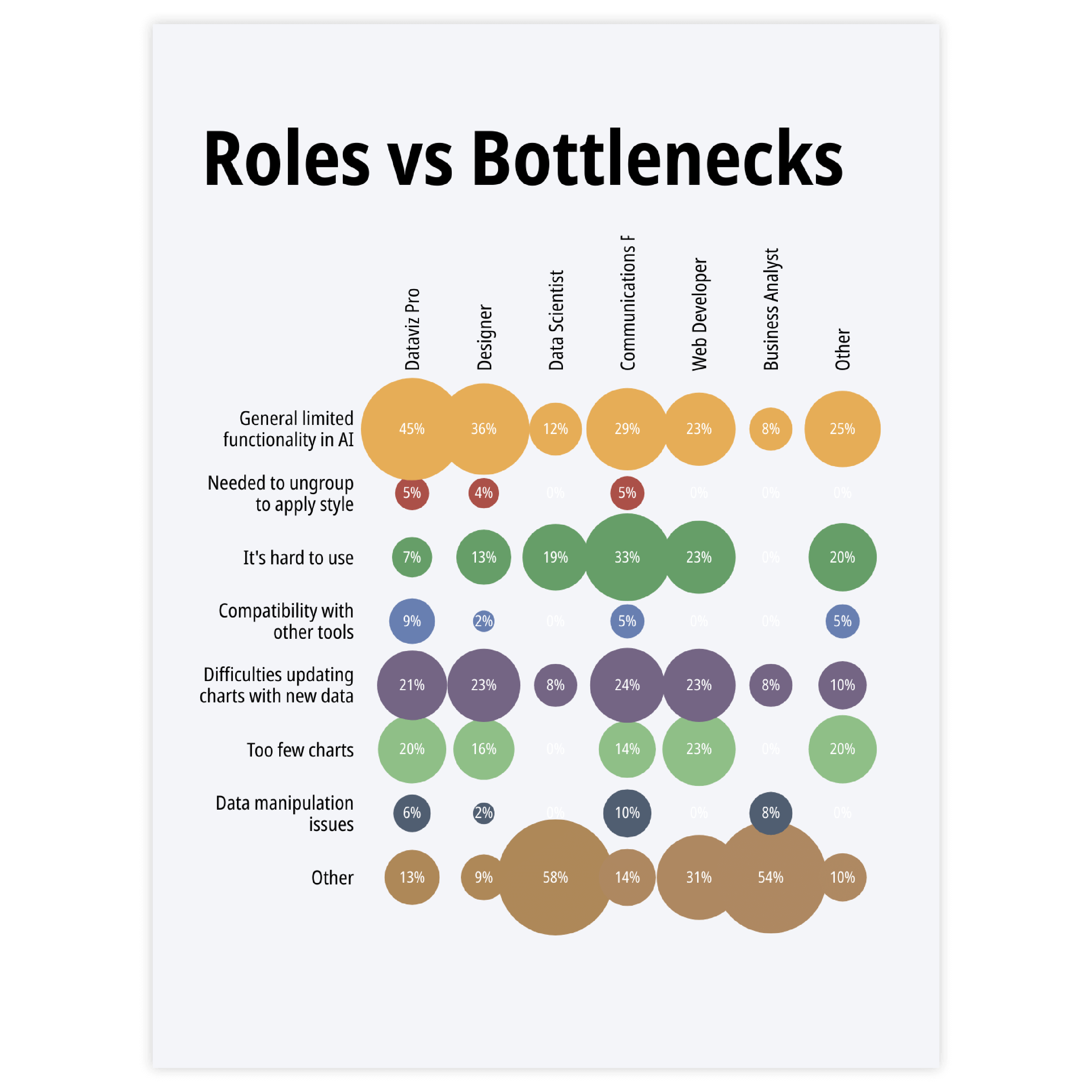


Heatmap
This is the closest alternative. The colored categorical scatter plot (with one-size circles) and a heatmap could be considered to be the same chart (when the only difference is that in heatmaps a grid of rectangles is commonly used, while for categorical scatter plots, circles are more typical.


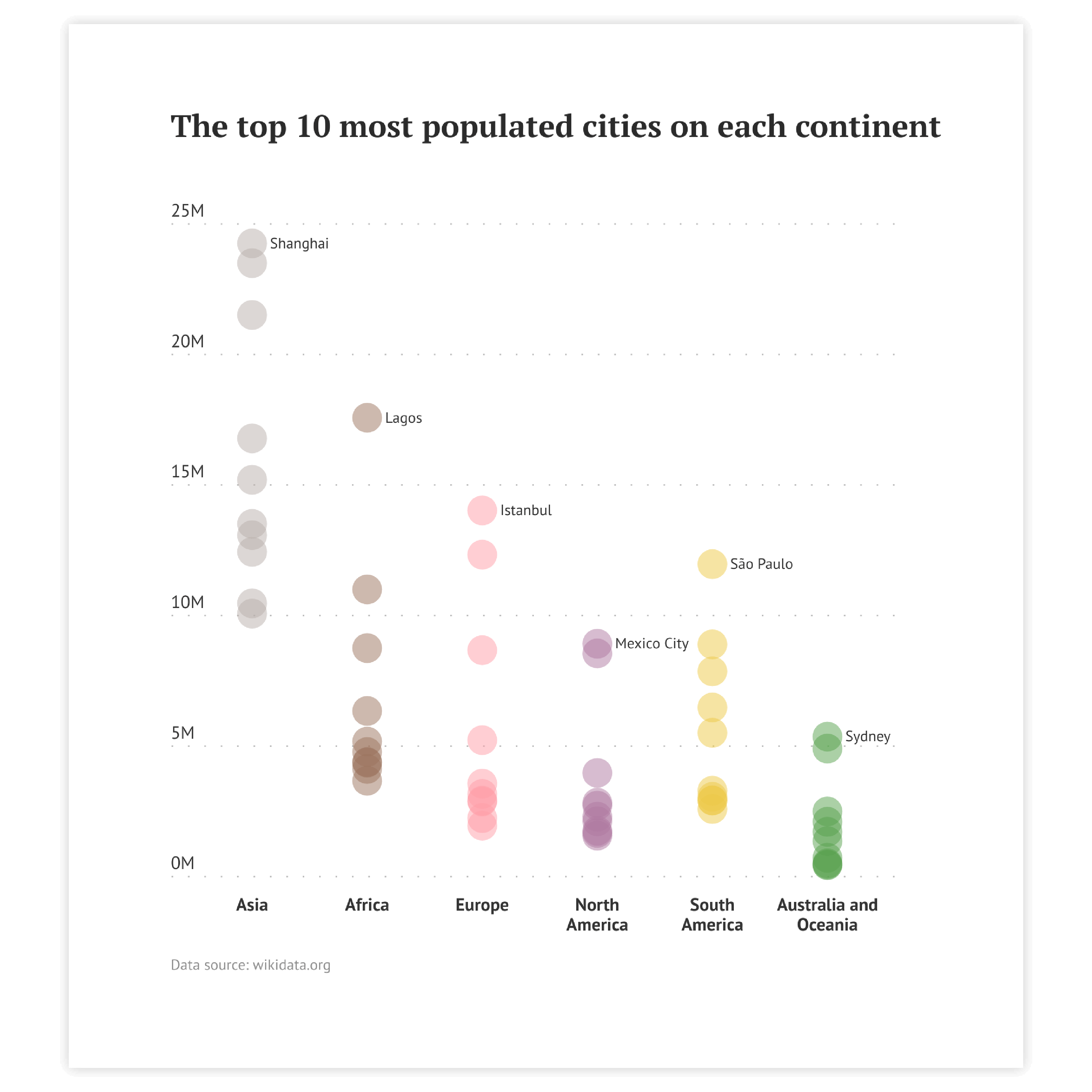
Dot plot
A dot plot might be considered a simplified strip plot. It also has both numerical and categorical axes, but there are fewer values assigned per category. Usually, there are one to five icons assigned to each axis category. Often another category dimension is added via the coloring of the icons.

Sorting
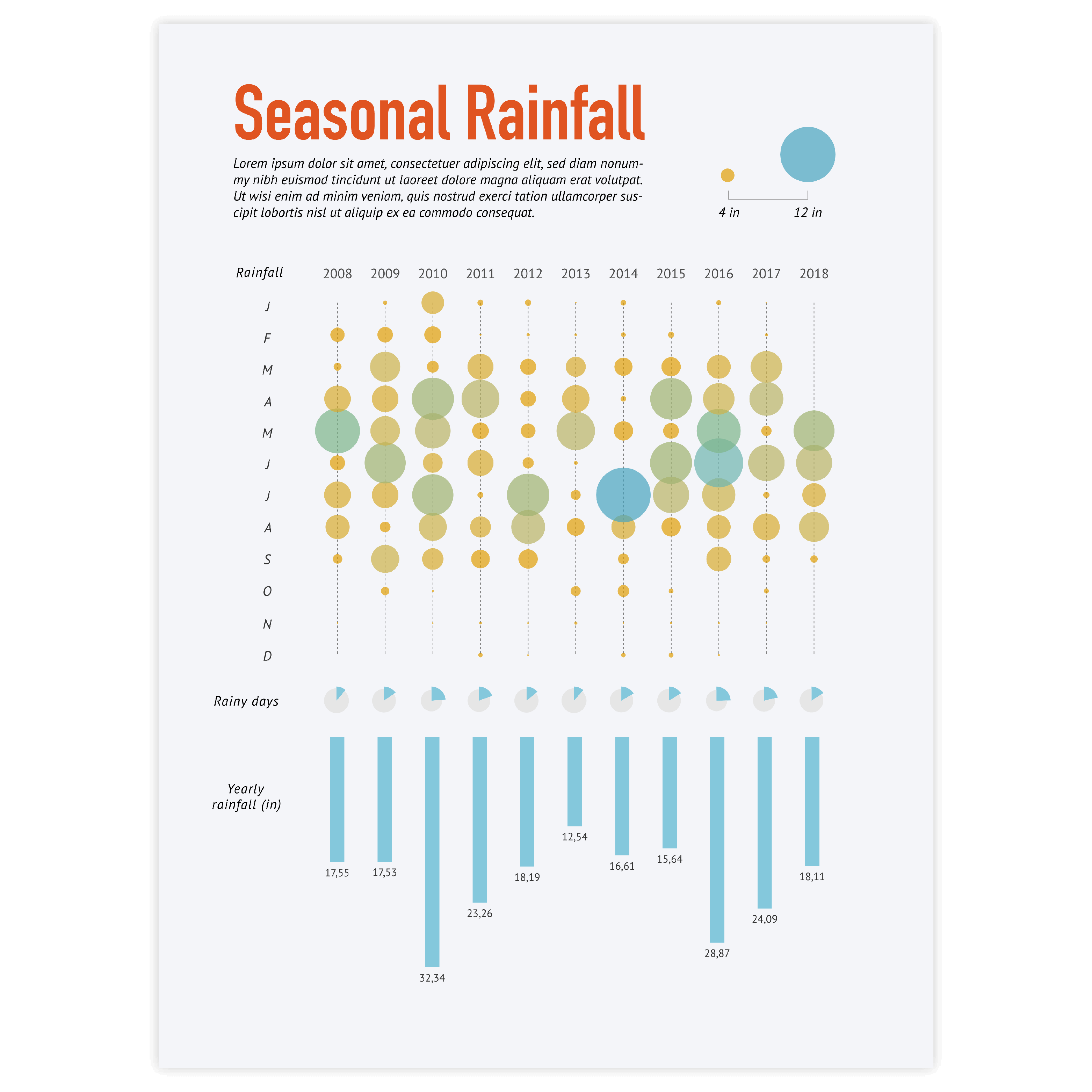
A grid with a big amount of icons might be overwhelming for the reader. To make the reading process natural for the viewer, be sure to follow the left-to-right, top-to-bottom direction of the categories as in most languages it is the natural way to read. If you’re designing a chart for another language, be sure to check their specific reading patterns to sort the categories naturally.
Read more
Accessibility & coloring
For most of the categorical scatter plots, one color is enough. For strip plots, you might need to decrease the opacity to make the circles transparent so that all of them are visible. If an additional dimension is added via color be sure to use one hue continuous palette for numerical variables and an accessible color palette or different icons for categorical variables. The color palettes that should be avoided are based on red and green colors.
Read more
Highlighting
To draw attention to the most important categories of the categorical scatter plot, a good solution is to highlight certain circles by adding an outline or filling the circles in a specific color. Our brain is programmed to notice deviations instantly. This way, highlighting a specific circle will help catch the reader’s eye immediately.
Read more
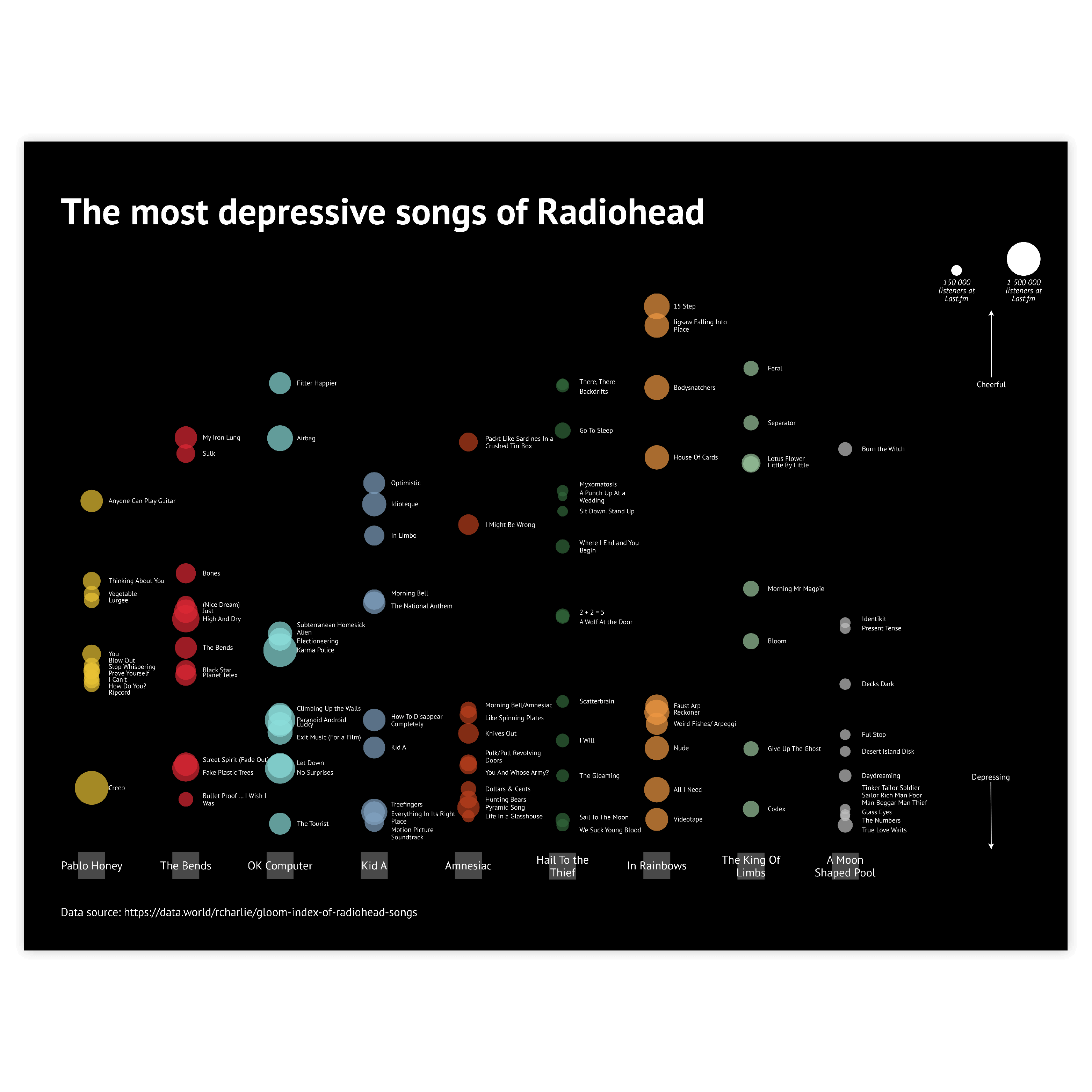
Labeling
The optimal labeling option for categorical scatter plots is category labels along the axes and the data labels for each data point (circle). There might be some cases when the labels are not needed – when only the overview of a vast dataset is needed. In this case, labeling every circle would be redundant.
Read more
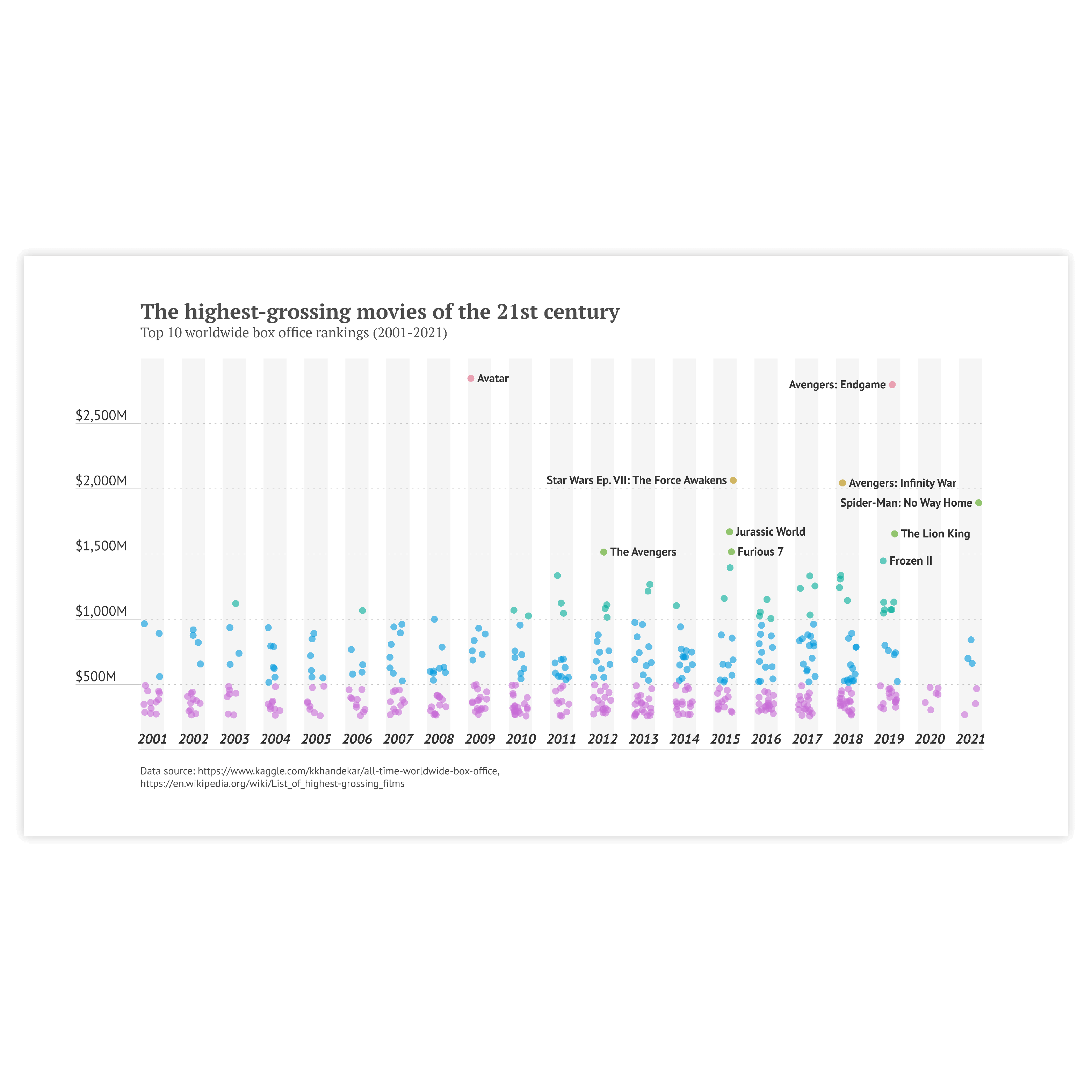
Size of the circles
The area of the circles should represent the corresponding value, so, logically, the minimum size of the circle should be zero. This will prevent the distortion of the data. The other case one might consider is whether the circles should overlap. Generally, it’s better not to have the circles overlap, but in case the dataset range is too large it makes sense to enlarge the scale of the circles so the difference in size can be visible.