To click or not to click: static vs. interactive charts
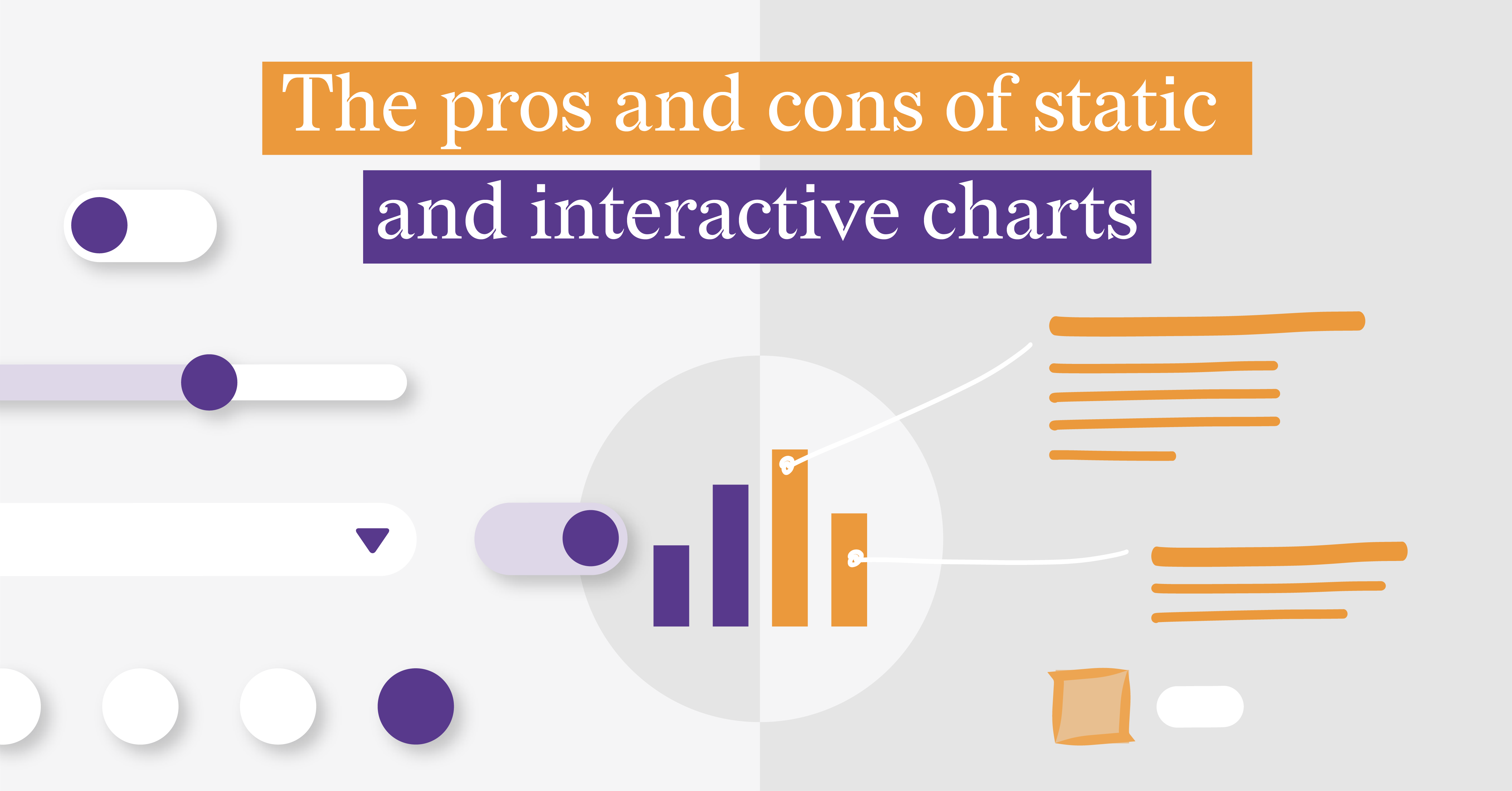
So, you've decided that your presentation, article, or thesis needs some data visualization. And right away you’re at the crossroads in choosing between static and interactive charts. Before we dig deeper into the topic, we need to define what we mean by static and interactive charts. To simplify in this article, we will talk about single charts, not reports or dashboards. By static chart we mean a chart that can’t be changed by the user, it’s presented as it is, and it’s not changed over time. By interactive chart, we mean a chart whose appearance can be changed by the user via different UI controls.
To make an informed decision about whether to use static or interactive charts you need to know what is the suggested purpose of the chart. Should the reader grasp a complex idea? Or maybe dig deeper into the topic? You should also take into consideration the abilities of your design team and the medium in which this chart will be presented. With all that in mind, you can take a look at our list of pros and cons for static and interactive charts and make a wise decision.
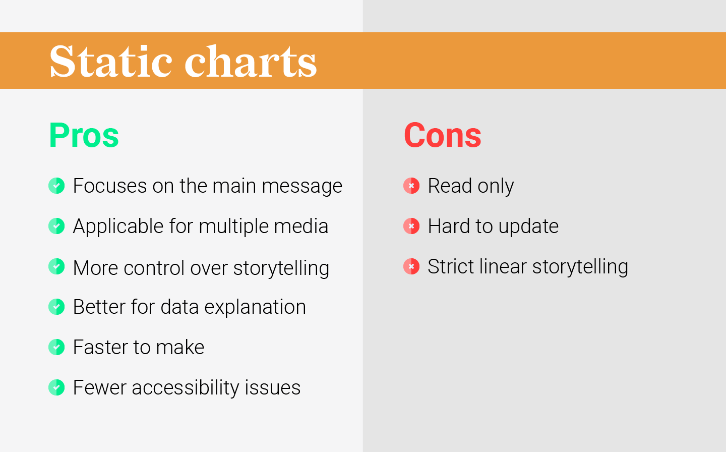
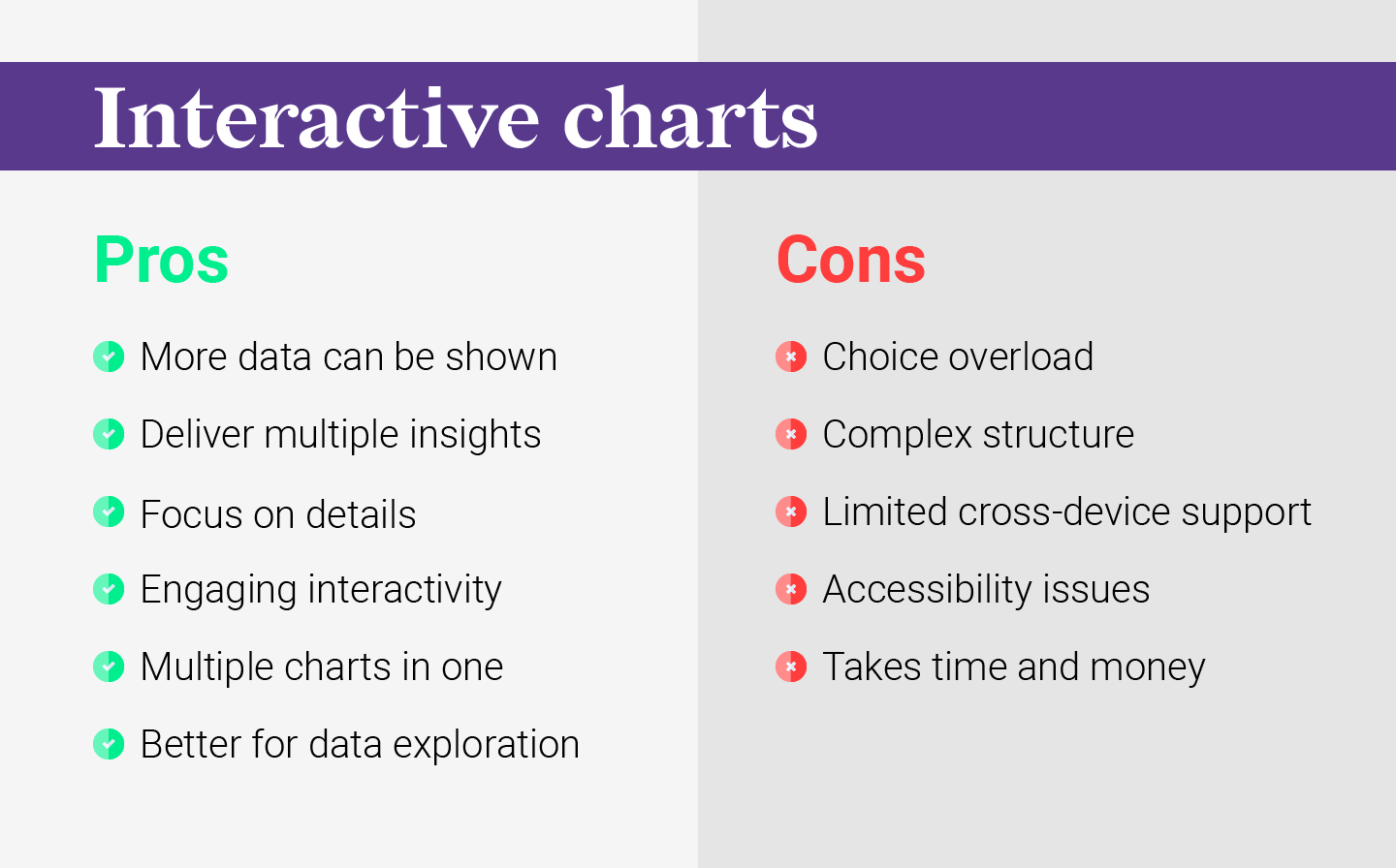
Here is the side-by-side review of static and interactive charts. We will elaborate on them in detail below, so keep reading if you want to learn more.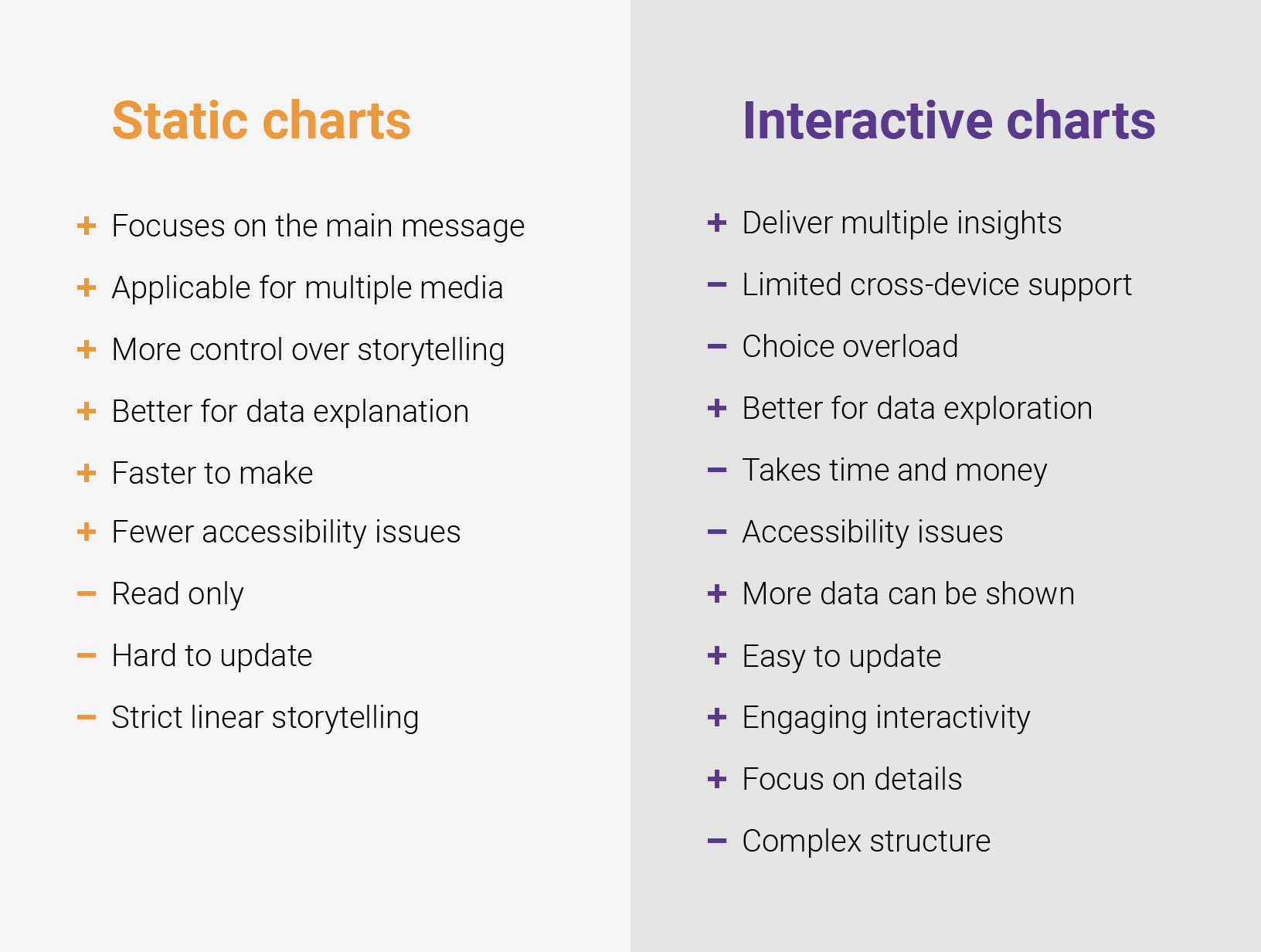
What are static charts?
A static visualization can consist of a single frame with one chart. Usually, static visualizations are accompanied by a title, subtitle, and annotation or notes clarifying the essence of a chart. Static charts usually are part of an article or other text form and are used as an illustration of points or arguments that are postulated in a text. Sometimes they are used as a separate piece, a teaser for a full article, a visual part of a presentation, or one among many other charts in a dashboard or report.
The curses of a static chart are their blessings at the same time. While static charts can’t be changed in time, dataviz designers can utilize all the benefits of guiding the user's attention.
Pros of static charts
Focuses on the main message
As static charts can convey a limited number of facts, they usually emphasize only one or a few key points. First, the attention is drawn to the title/subtitle, then the visualization unwraps the main idea. The highlighted elements and annotations complete the picture. Static charts allow the author to lead you and focus on a certain point of the given piece of information. It can be beneficial both for creators and for the audience.
Applicable for multiple media
Every static chart can be presented as an image, allowing sharing in nearly every possible media. At the same time, you should take into account the size and dimension differences for various devices. This way it can be presented in the best possible way for the audience of every media used.
More control over storytelling
It’s not a secret that our society's main way of learning is by means of storytelling. Most of the information we consume every day is presented in the form of a story. The static chart quite often follows the classical three-act narrative structure. The setup (1) is presented via title, subtitle, and legend, the confrontation (2) is presented via the cryptic first view of the chart, and then guided to a resolution (3) via focusing on certain aspects of the chart using highlights and annotations. Using basic design principles such as form, composition, color, and layout a great story can be told. Just remember how intriguing and engaging comic books can be in terms of storytelling.
Better for data explanation
Ideas, facts, and arguments are always better with illustrations and examples. And static charts are usually used as an illustration of an existing point. But to gain full explanatory power a static chart needs to be well thought through and prepared. This means that after the data is collected and cleaned it needs to be distilled into one main idea that needs to be delivered to a final audience.
Faster to make
The production of static charts is noticeably cheaper than interactive charts. A static chart can easily be made by one data visualization designer. Also, there are a lot of dataviz tools for different needs.
Easy for rare periodical updates
If the chart should be updated once a month/quarter/year, a static chart can be a useful solution. There can be a few hurdles in this case. Many charts might be hard to update in an efficient way preserving the on-brand styling. The other point is that there can be difficulties in delivering data in a format that is convenient both for data engineers and dataviz designers. This is a great challenge we were able to tackle with Datylon Report Studio and Datylon Report Server solutions. Thanks to the easy data connectivity with report templates, it’s possible to update even a large number of charts with new data, all at once, in seconds.
Fewer accessibility issues
Static charts tend to provide a straightforward approach to reporting information. So alternative presentation can be done via a main message (title and subtitle) with some additional text explanations and a simple data table. You can find more information about how to make accessible charts here.
Cons of static charts
Read-only
The other side of the universality of static charts is that they can’t be changed in any way. You get it as a final product and not always there’s a possibility to look “under the hood” and see how the data was manipulated.
Hard to update in real-time
The time aspect of the information you’re trying to convey can also influence the choice of the way of chart presentation. Information that doesn't need updates will work well with static charts, but if it is fluid and changes over time, every data update will trigger the update of the chart also. An example is the charts presenting the course of a sports competition or vote counting after the elections.
Strict linear storytelling
As we already mentioned, static charts follow the classical narrative structure, which is linear in its essence. There is only one route that is thought through by the author and there can be no detours for the reader. Static charts are presented as it is and rarely allow you to find some additional insights other than what was suggested by the author.
Rare access to initial data in a convenient format
The resulting static chart is usually only the tip of the iceberg. The data gathering and cleaning is taken out of the side and rarely is presented next to the chart itself. Also, the way the data can be presented can be different and not always matches the expectations of the reader.
What are interactive charts?
Interactive charts allow the user to change the view of the chart by using UI controls such as buttons, tabs, and input fields. The main idea of the interactive chart is to give the user the ability to discover the prepared data in multiple ways. Usually, interactive charts are used for exploring data and for cases when the data is updated in a short interval.
Pros of interactive charts
More data can be shown
In interactive charts, there are fewer limits to the data that can be shown. In this case, the visualization itself becomes a new way to explore the data – as an alternative to the table view. The different options for searching and filtering only expand the possible ways of viewing the data. For professionals who use a data-driven approach, interactive charts are usually an essential part of the working toolbox.
Deliver multiple insights
As the dataset for the chart is extended there are multiple dimensions available to analyze. This means a user can explore it and find their own points of interest, questions, and stories. Also, interactive visualizations work very well if you are trying to deliver multiple insights at once.
Focus on details
The interaction with the chart via hovering and clicking certain elements allows one to see details. This means that the reader can decide the level of detail that should be provided. While an interactive chart contains a lot of data, a reader can easily filter out the data that they find irrelevant or aren’t interested in, focusing on just one trend or one change.
Engaging interactivity
Interactive charts are more engaging due to the simple fact that the user gets feedback from their actions. Interactivity stimulates curiosity and draws the user deeper into the chart and as such triggers the reader’s interest in the topic.
Multiple charts in one
The dynamic nature of interactive charts is appealing to us, as we’re used to and trained to follow dynamic changes. Also when a big dataset is used there’s no way it can be shown using one static chart. Interactive charts provide the possibility to show multiple charts using different filtering possibilities.
Better for data exploration
While static charts focus on a few main points that are pre-prepared by the author/designer/journalist/researcher, interactive charts are open for exploration and give all the necessary tools to do that.
Cons of interactive charts
Choice overload
The number of options available in interactive charts might be overwhelming. This phenomenon has multiple names – choice overload, over-choice, the paradox of choice, and choice paralysis. Its essence is that the more choice we have the more cognitive capacity needs to be used to make that choice. Also, the more choices we have – the higher our expectations. The vast number of options might lead to rejection of choice – in the context of interactive charts, this means leaving the page with the visualization.
Complex structure
In most cases, interactive charts have little guidance on how to use them. They require a certain level of dataviz literacy. This can be a serious limitation for users who are used to only reading and watching. In interactive charts, there are few limitations on how much data can be used, so usually, it is tempting to use all the possible data. But the quantity of data in combination with the complexity of the structure and multiple filtering possibilities can be a limiting factor for user interaction with the chart.
Limited cross-device support
Interactive charts usually have a significant UI part which is different for various types of devices. When they are viewed with tablets or mobile they might lose some of their features or become unusable. In this case, a separate mobile version should be created. It doubles the work for creators on one side and limits the experience for mobile and tablet users.
Accessibility issues
Interactive charts are usually complicated in terms of UI, and for users with limited motor skills or visually impaired readers, the complexity of interactive charts can cause a lot of issues: UI elements are too small, the navigation is too tricky, and it’s hard to get to the data. And from the development point of view, the properly accessible version of the interactive chart is a serious challenge.
Takes time and money
To make an interactive chart or visualization one needs an extensive dataviz toolbox and enough time. Some of the chart ideas can be implemented with existing tools, but if it is a custom project a team of at least a few designers and a developer will be needed, which will require some significant expenses.
Choosing between static and interactive charts
To recap, interactive and static charts each offer unique advantages for presenting and understanding data. The choice between static and interactive charts depends largely on the specific goals of your visualization. Static charts are well-suited for conveying a single, focused message and are often more accessible. Interactive charts, on the other hand, offer greater flexibility for data exploration and are ideal for presenting complex information or data that changes frequently.
However, don't dismiss static charts solely based on their perceived limitations for frequent data updates. By automating static charts, you can easily generate charts on-demand or in scheduled intervals. This ensures that your visualizations always reflect the latest data without requiring manual intervention.
The Datylon Report Server is a powerful solution that simplifies the chart generation process. Simply design a chart template with Datylon for Illustrator, establish a connection to your data source, and effortlessly generate charts on demand or according to a schedule.
To learn more about how Datylon can benefit your organization, schedule a demo with one of our experts today or read our comprehensive guide on automated reporting.
👉If you're keen on crafting custom data visualizations, visit our Bespoke Data Visualization Solutions page.


