datylon-funnel-chart-icon

Funnel chart

An example of a range plot designed with Datylon for Illustrator, a chart maker plugin for Adobe Illustrator
DATYLON > CHART LIBRARY > FUNNEL CHART

What is a funnel chart?


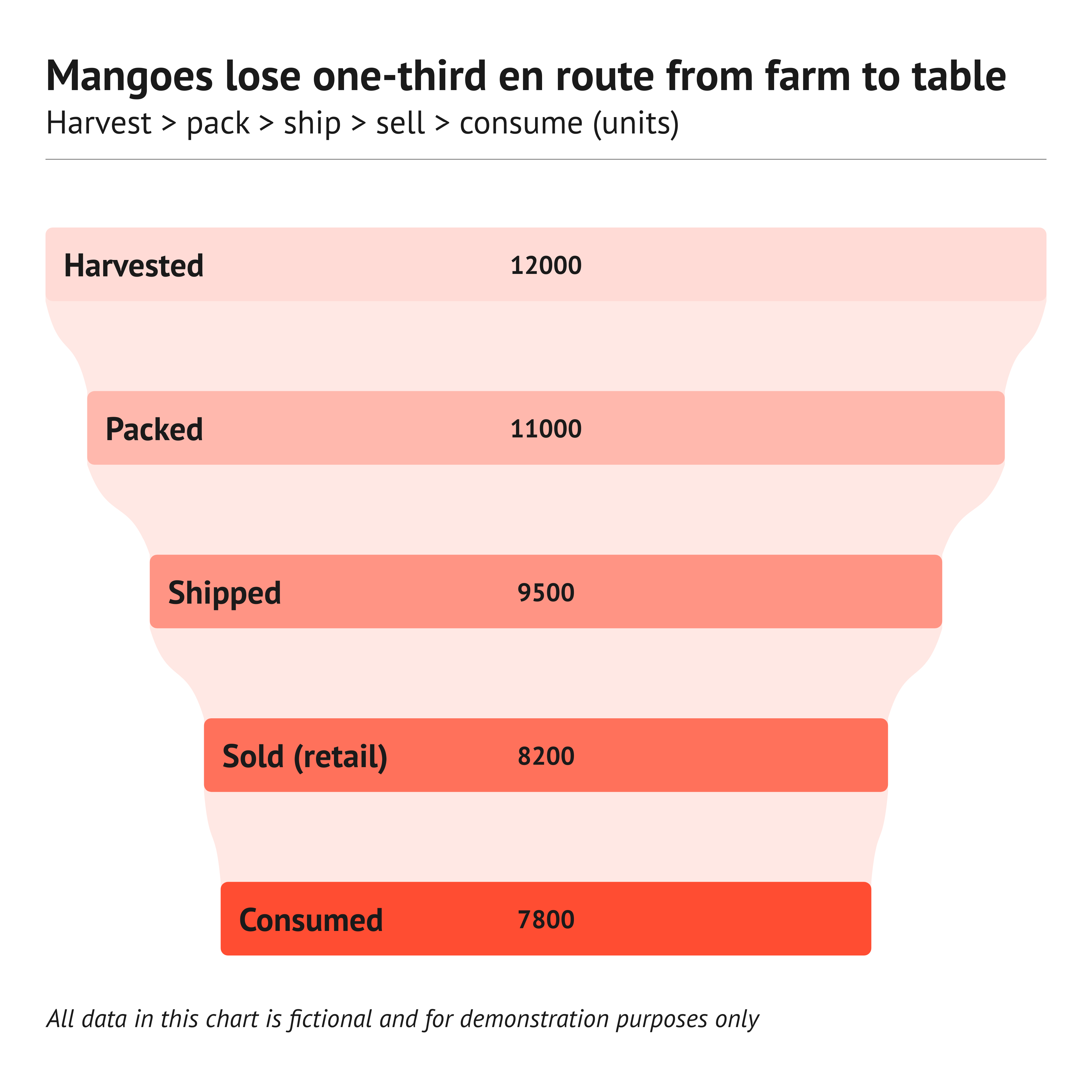
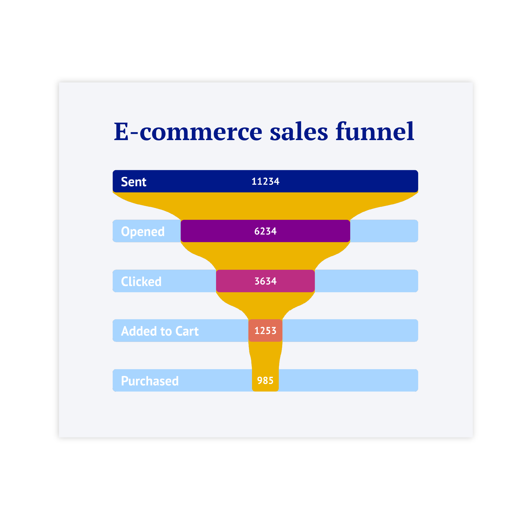
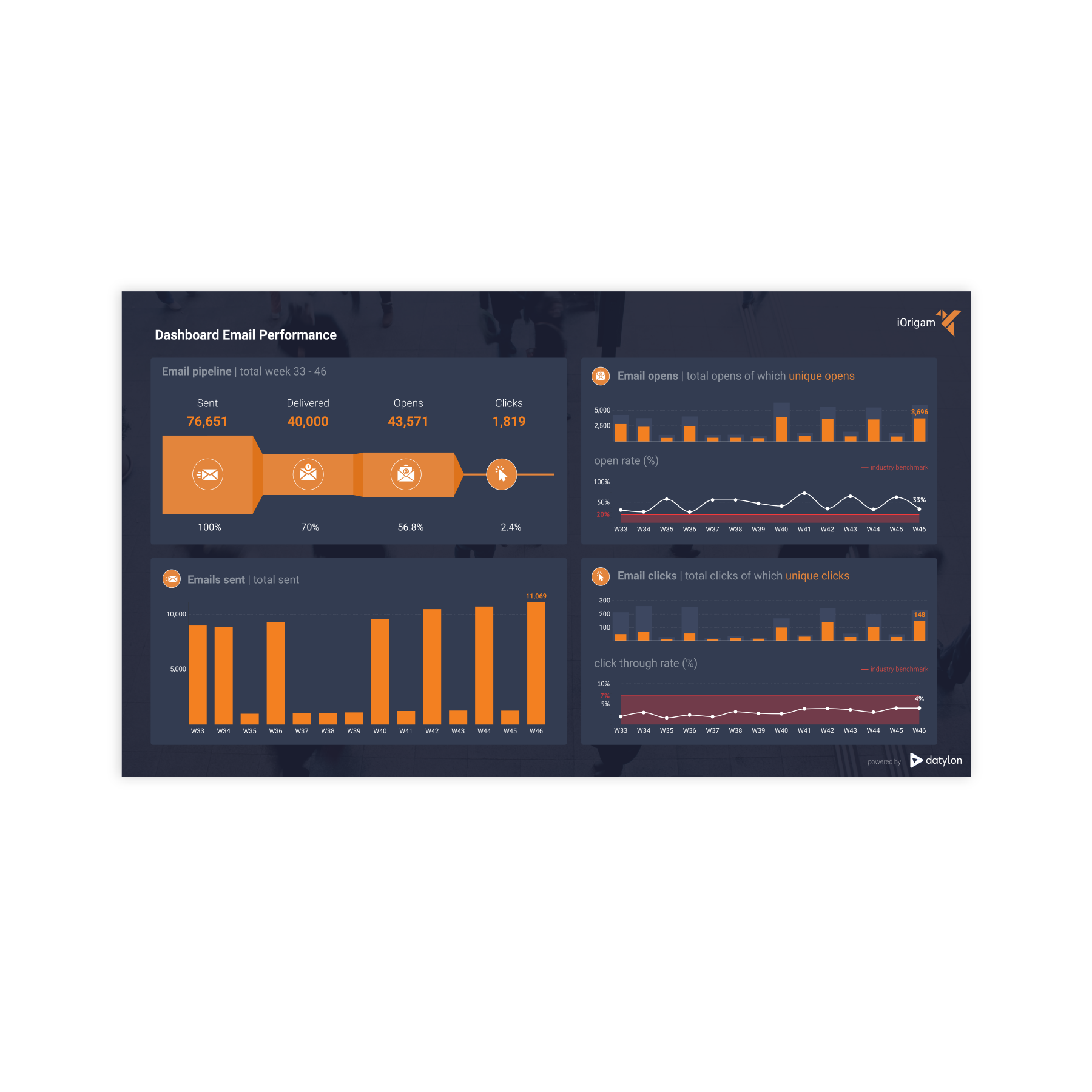
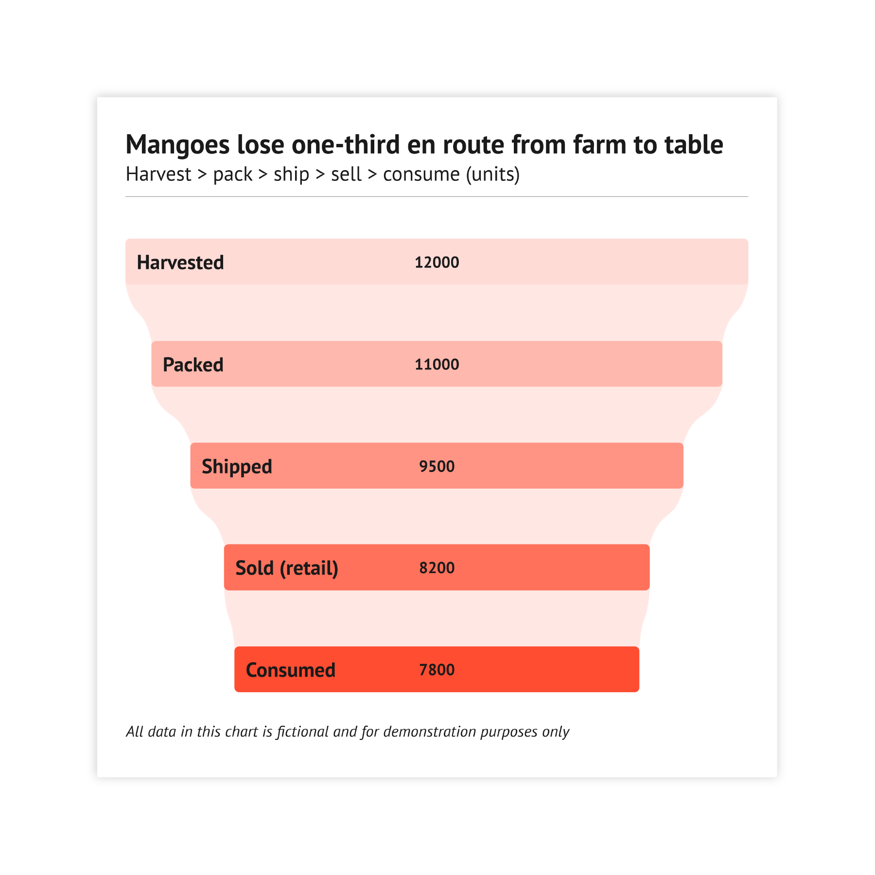
A funnel chart consists of several horizontal bars on top of one another, widest at the top and the narrowest at the bottom.. 

You can use funnel chart when you need a quick visual of how change as they move through stages.

They are common in sales and marketing dashboards to show how many prospects reach each step and what revenue is tied to those steps. They also work anywhere a clear top‑to‑bottom (or entry‑to‑exit) flow helps tell the story. They are widely used in infographics and business presentations and dashboards. 
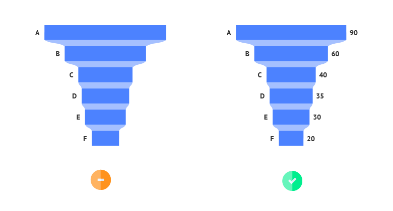
Funnel chart examples & inspiration

Browse the images below to find inspiration samples of funnel charts. With your Datylon account, you can use these designs, customize them and update them with new data. Or start designing your very own funnel chart!

Variations of funnel charts

The charts below are variations of a funnel chart. To learn how to make them with Datylon, check out the bar chart user documentation in the Datylon Help Center.
datylon-chart-library-bar-chart
datylon-chart-library-bar-chart-hover

Bar chart

Bar chart can be considered a simplified variation of a funnel chart. It's possible to create a bar chart with the same data as for funnel chart. In this case all the bars will be aligned and you will be able to compare bars easier. 

Datylon chart library: use a waterfall chart as a variation of a range chart

Waterfall chart

If you need to visualize indicators that can be represented with negative values, a waterfall chart can be an option. It is can be used to visualize accounting data for a single time period and also track changes over time.

datylon-chart-library-line-chart-range
datylon-chart-library-line-chart-range-hover

Range chart

Visually renge plot resembles a funnel chart, but the structure of data and function is slightly different. Range plot allows to see difference between two values. Range chart is more focused on the range itself rather than the individual data points.

Alternatives to a funnel chart

Substitute your funnel chart with the charts below when you want an expanded data view or an alternative representation.
datylon-chart-library-line-chart-area
datylon-chart-library-line-chart-area-hover

Area chart

Area chart uses the same flow as the funnel chart to show steps of the process. The difference is related mostly to different axis structure. Area charts are using coordinate system, while in funnel chart the centered axis of symmetry is used.

datylon-chart-library-streamgraph
datylon-chart-library-streamgraph-hover

Stream graph

Stream graph allows to show changes in a similar way to funnel chart, using the centered axis of symmetry. The dynamic of values are shown in a similar way, which allows to try stream graph as an alternative option if you need some visual variety.

datylon-chart-library-step-line-chart
datylon-chart-library-step-line-chart-hover

Stepped line chart

If you're aiming at simplicity and minimalism, stepped line chart can provide the same amount of information that the funnel chart provide. But with an optimal data-to-ink ratio. Similar to area chart you'll also need a coordinate system.

Pro tips for designing a funnel chart

Learn how to improve the readability and visual appeal of your funnel chart.
datylon-chart-library-funnel-chart-pro-tips-2

Labeling

For the funnel chart it's essential to use value labels, as there are no axes or gridlines that can help to determine the lenght of the bars.
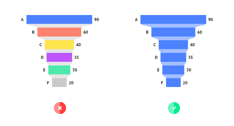
datylon-chart-library-funnel-chart-pro-tips-3

Coloring

The most effective way to color funnel chart is to use a single color. It's not recommended to use multiple colors per each bar. It makes it hard to percept the chart.
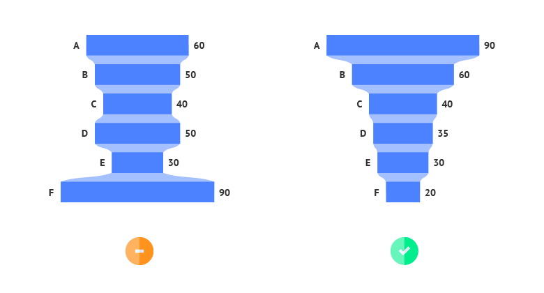
datylon-chart-library-funnel-chart-pro-tips-1

Sorting

Sorting is one of the features that created a funnel chart. The main idea of the funnel chart is showing steps of the process with ascending or descending movement. Sorting makes it happen.
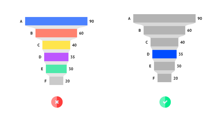
datylon-chart-library-funnel-chart-pro-tips-4

Highlighting

To draw attention to the most important categories of the funnel chart, a good solution is to highlight these bar and color all the other bars the same way in a neutral color. This way, highlighting a specific bar will help catch the reader’s eye immediately.

Read more

Discover more charts in our Chart Library

Learn more about the different types of charts and graphs you can design with Datylon. Discover other resource pages in our Datylon Chart Library.

Learn advanced funnel chart tips
first hand

Join Datylon for free and get started online or download our Datylon for Illustrator plug-in with a 14-day trial. Connect with a Datylon expert for a demo session.