Report Design, Food For Thought, ESG Reporting
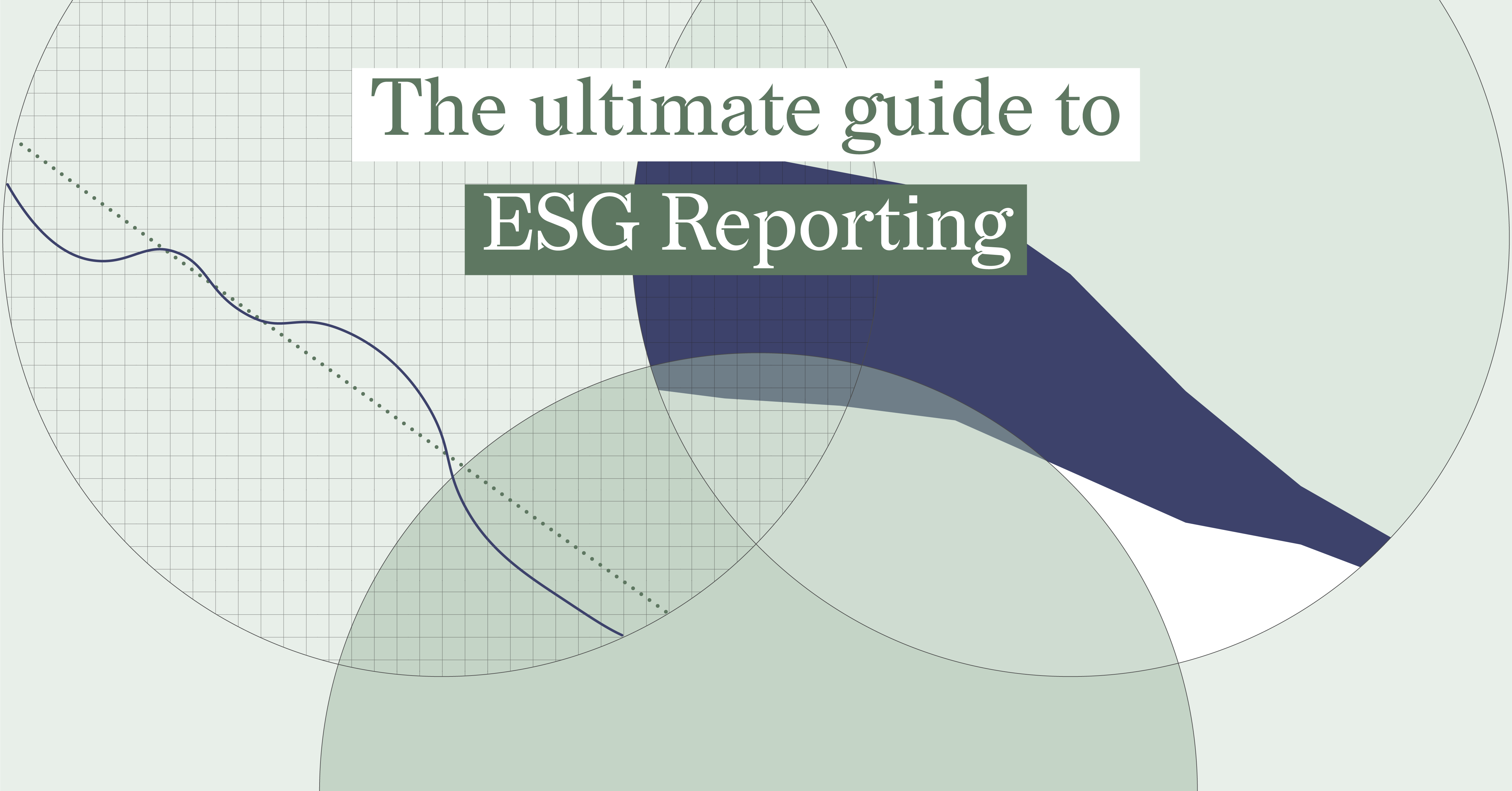
The Ultimate Guide to ESG Reporting
You may agree that environmental, social, and governance (ESG) reporting can feel complicated. You...
DataViz Best Practices, Report Design, Food For Thought, Reporting
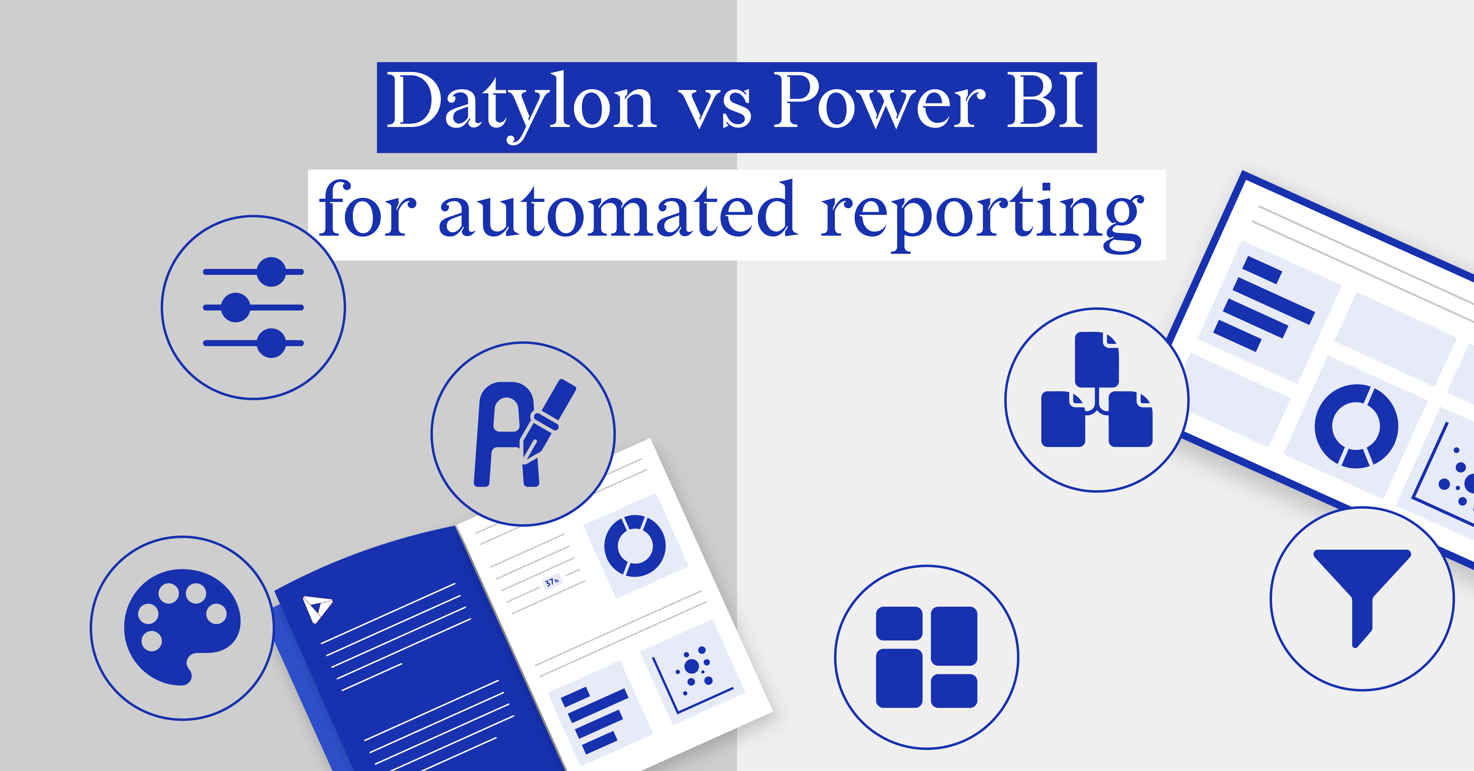
Datylon vs Power BI for automated reporting
In the dynamic landscape of business intelligence, Datylon and Power BI stand out as premier tools...
Subscribe to our newsletter
Receive inspiration, practical advice, customer stories and news right in your mailbox

Report Design, Food For Thought, Report Server, Automated Reporting
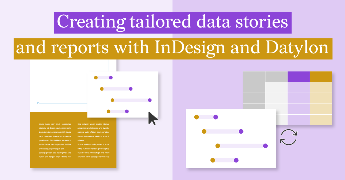
Creating Tailored Data Stories and Reports with InDesign and Datylon
Data-driven reports are essential tools for businesses seeking to make informed decisions and...
DataViz Best Practices, Food For Thought, Dataviz Resources
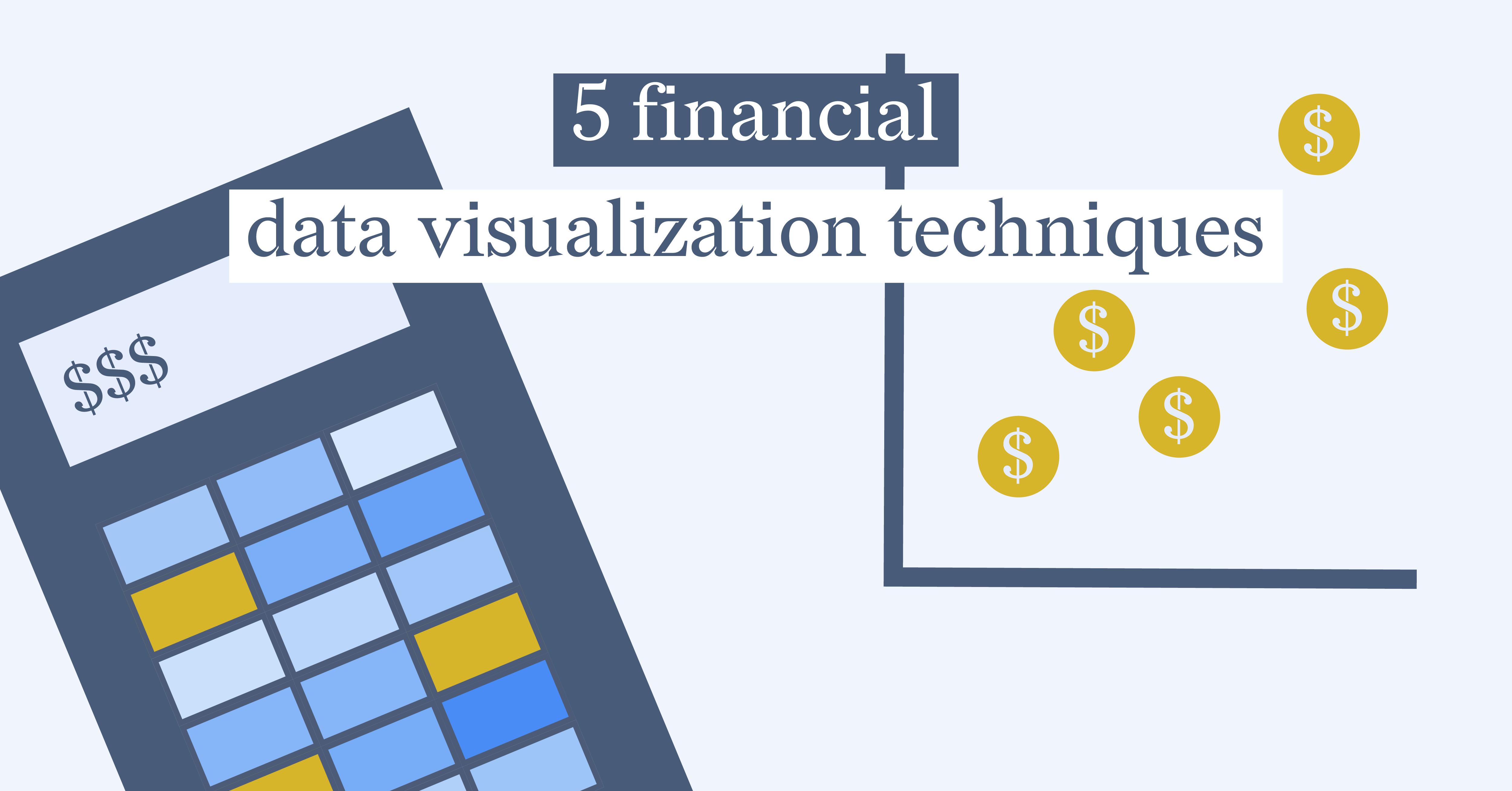
5 Financial Data Visualization Techniques
Gone are the days of creating dry, monotonous reports. Financial data visualization techniques...
DataViz Best Practices, Food For Thought, Dataviz Resources
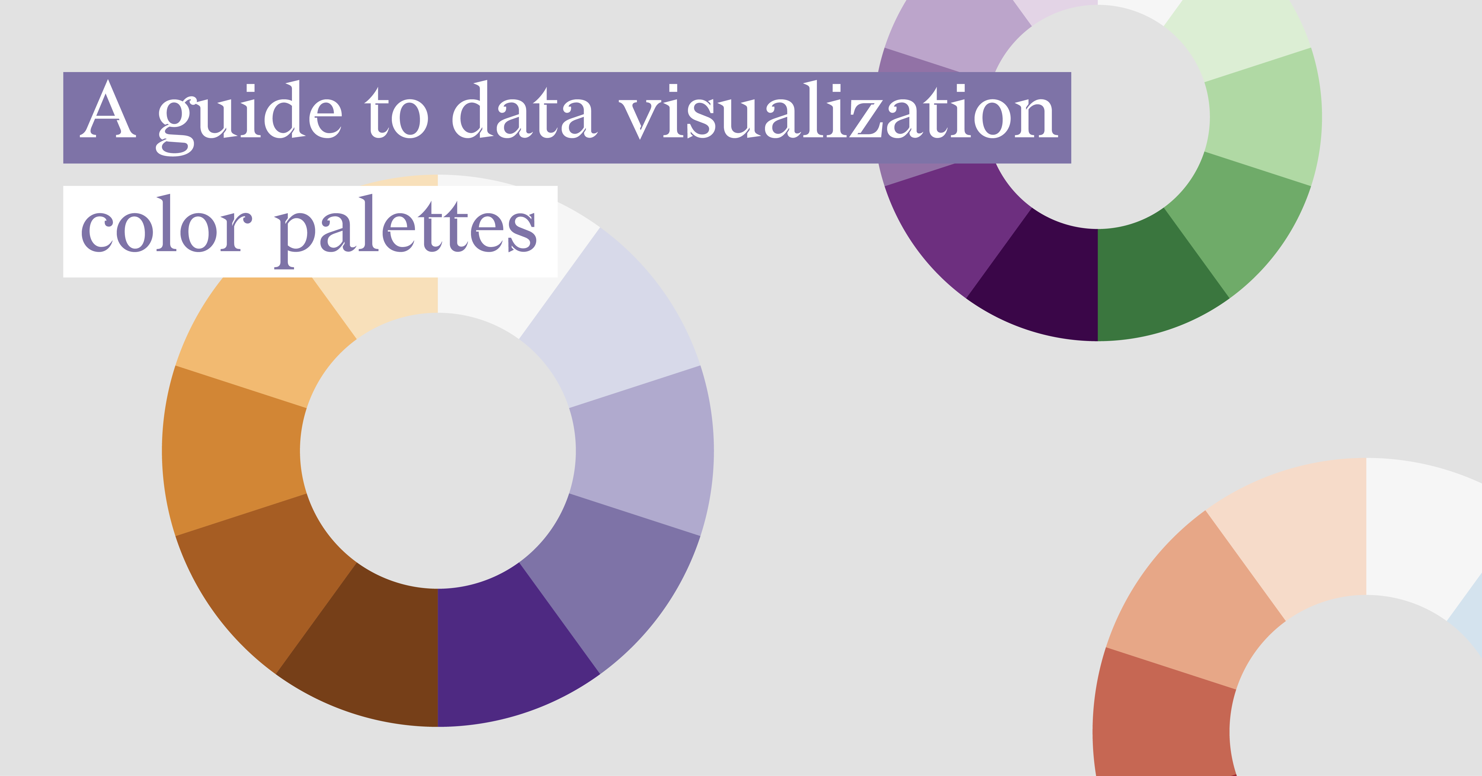
A Guide To Data Visualization Color Palettes
Did you know that your data visualization color palettes play a more crucial role than just...
DataViz Best Practices, Report Design, Food For Thought, Reporting
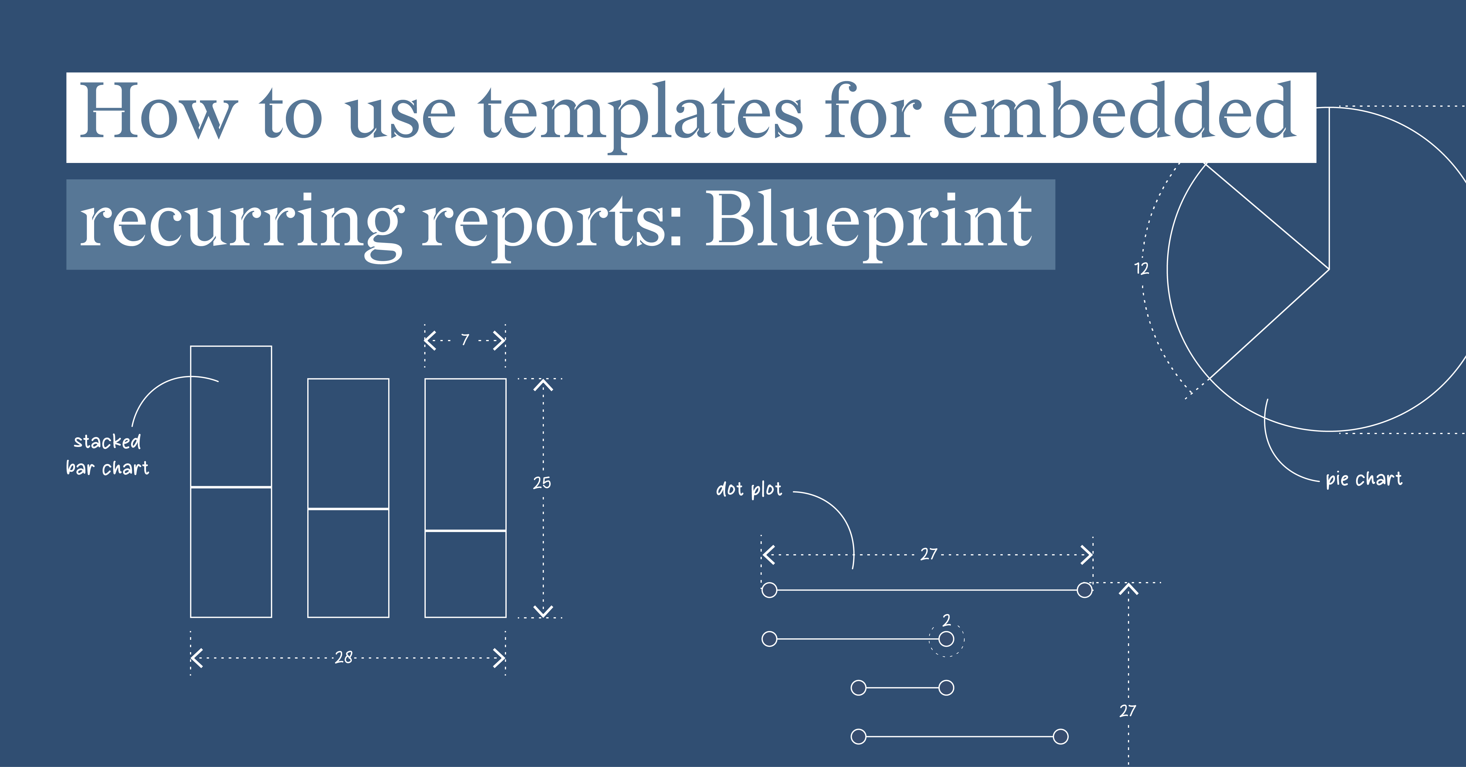
How to use templates for embedded recurring reports: Blueprint
Embedded reports play a crucial role in today's data-driven business landscape. By embedding...
Technical, Food For Thought
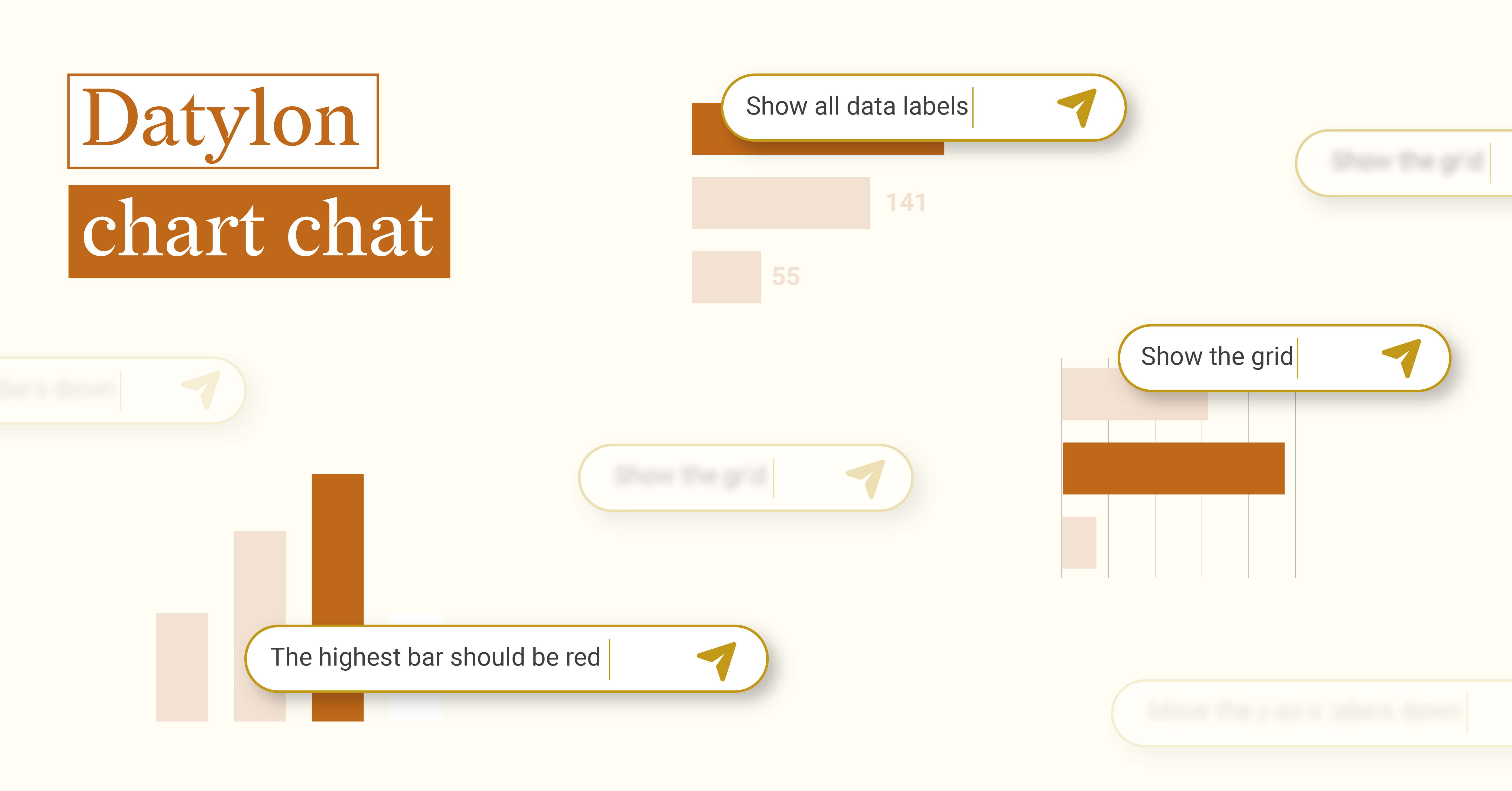
Datylon chart chat
When OpenAI released ChatGPT to the public in November 2022, both the potential and challenges of...
Food For Thought
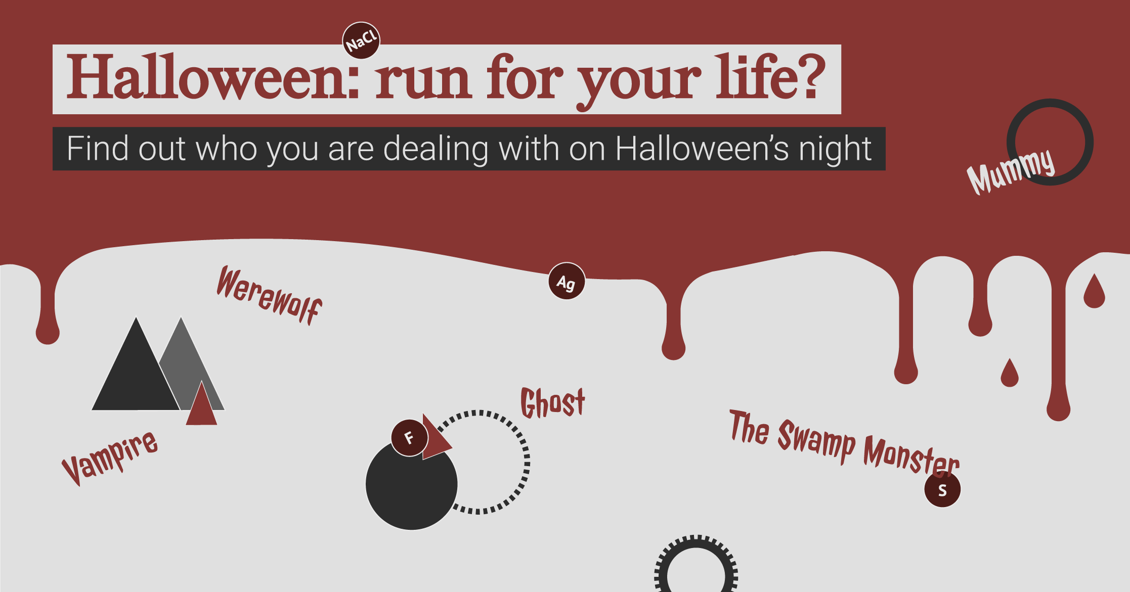
Halloween: run for your life?
It’s that time of the year again when you shouldn’t be surprised if you bump into...
Food For Thought
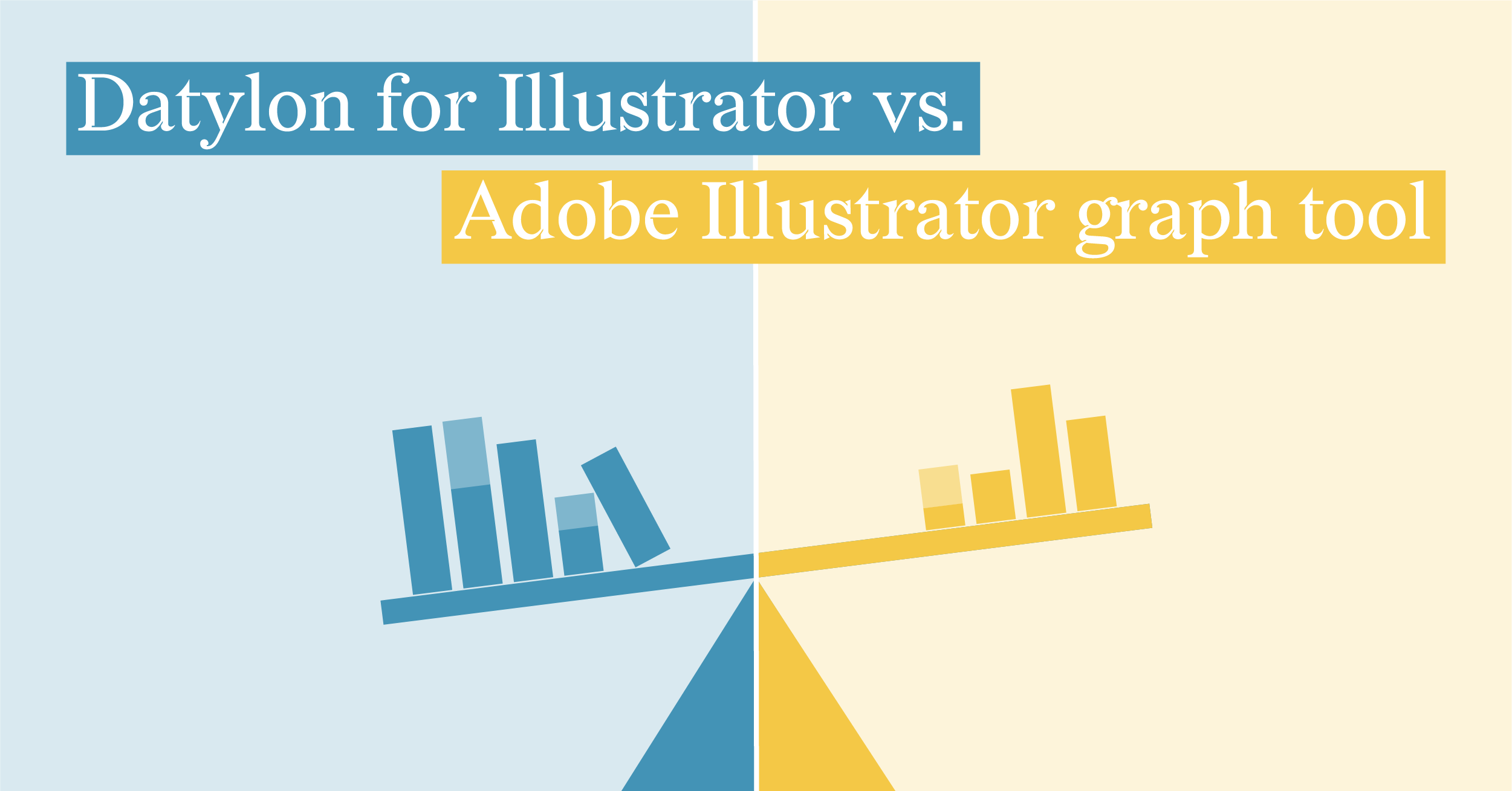
Datylon for Illustrator vs. Adobe Illustrator Graph tool
We enjoy working in Illustrator. This is the industry-standard design tool that can do A LOT in...
Product News, Food For Thought
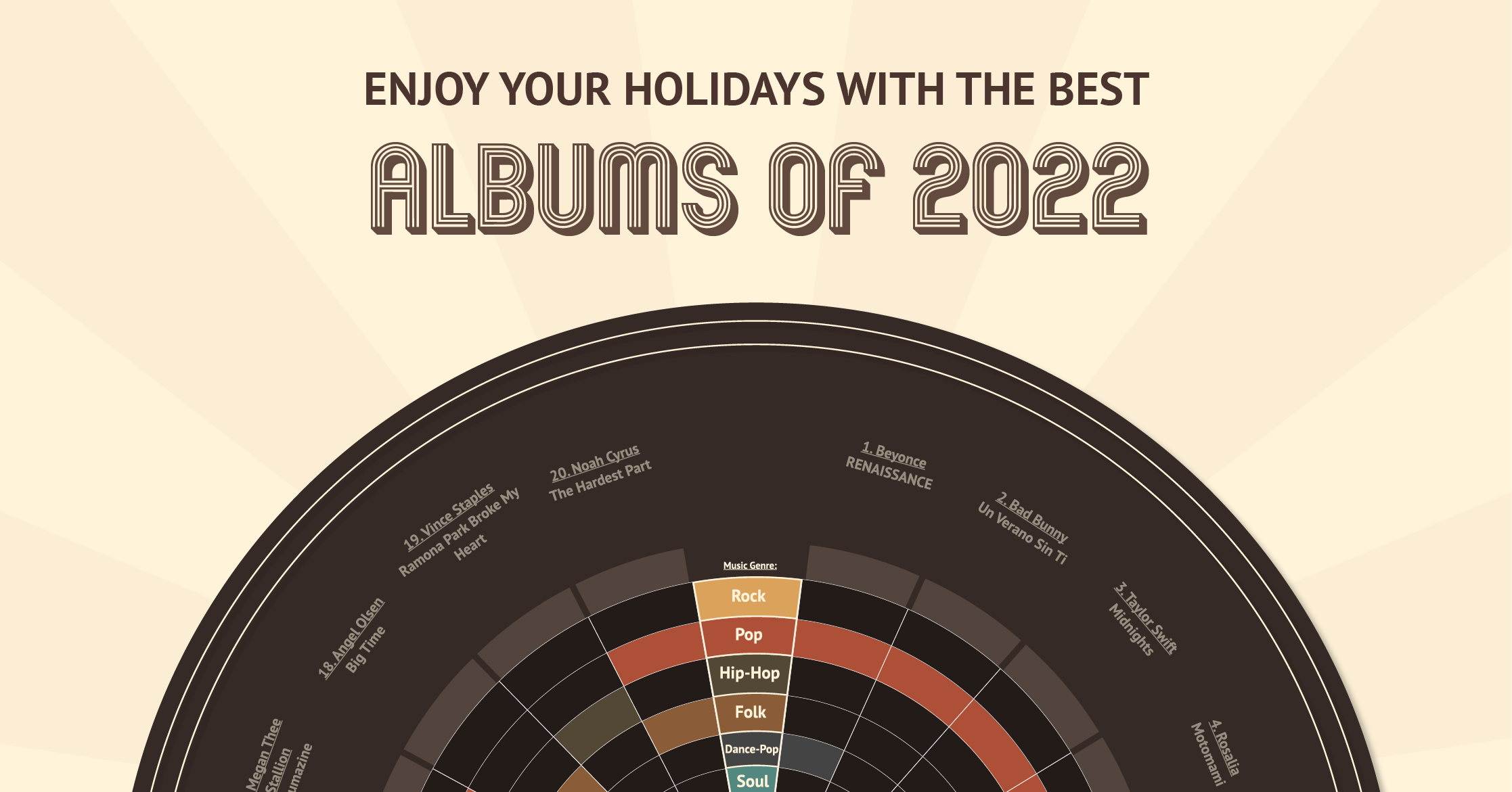
Datylon unwrapped: the best albums of 2022!
And that's a wrap! 2022 is coming to an end, and what a year it was, huh? From large global events...