

Dataviz Resources
To click or not to click: static vs. interactive charts
So, you've decided that your presentation, article, or thesis needs some data visualization. And...
DataViz Best Practices
11 tips for designing accessible charts for visually impaired readers
Recently we’ve published an article about how to choose and refine a chart for colorblind viewers....
Subscribe to our newsletter
Receive inspiration, practical advice, customer stories and news right in your mailbox

Illustrator Chalk Talk
How to make a scatter plot in Illustrator with Datylon
Recently, electric cars are becoming an alternative to cars with internal combustion engines...
Dataviz Resources, Chart Design
80 types of charts & graphs for data visualization (with examples)
In this article we'll talk about different types of charts and graphs. They are sorted into six...
Illustrator Chalk Talk
How to make a bar chart in Illustrator with Datylon
English breakfast is a widely known traditional meal. Its history dates back to the 14-century’s...
DataViz Best Practices
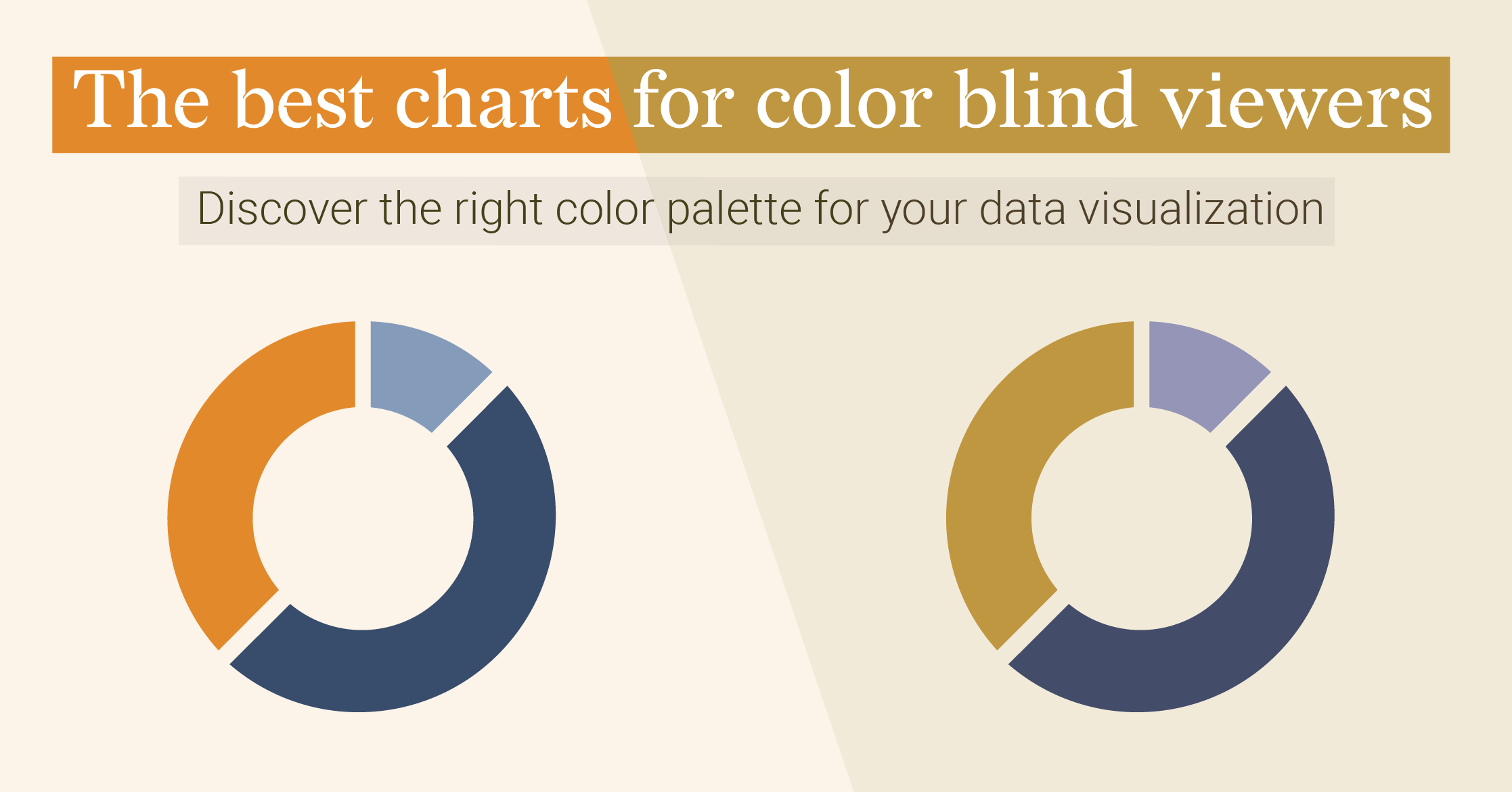
The best charts for color blind viewers

How do we see the world in colors? It all starts with the...
Illustrator Chalk Talk
How to make a pie chart in Illustrator with Datylon
In this tutorial, we will make a multi-level (or multi-layered) pie chart that shows the chemical...
Illustrator Chalk Talk
How to make a treemap chart in Illustrator with Datylon
Climate change is one of the most heated (no pun intended) topic conversations today. This is not...
Illustrator Chalk Talk
How to make a line chart in Illustrator with Datylon
As of the end of the 2021 Men’s tennis season, Novak Djokovic is holding 1st place in the world...
Illustrator Chalk Talk
How to make a bubble chart in Illustrator with Datylon
Would a $10,000 yearly income increase make you happy? And what about $100,000? I guess you’re...