English breakfast is a widely known traditional meal. Its history dates back to the 14-century’s gentry, but over time it became a common meal for all parts of British society. It can be the only meal of the day and provides enough energy. It was used as a welcoming dish or a meal before hunting or long journeys.
In this tutorial, together we will create two bar charts. The first bar chart breaks down the traditional ingredients of the English breakfast, whereas the other one highlights the nutritional value of the meal, compared to the average daily norm.
If you want to follow the steps, you can download the data that we are using here.
Download and install Datylon for Illustrator
For this tutorial, we assume you have already downloaded and installed the Datylon for Illustrator plug-in. If not, you can sign in and download the plug-in here. |
Together, we will make a bar chart, step by step. In the end, our chart will look like this:
Table of contents
Step 1: Preparing the artboard Step 3: Binding the first chart Step 4: Styling the first bar chart Step 5: Drawing and binding the second chart |
Step 1: Preparing the artboard
It’s a good idea to prepare your artboard before creating a visualization. In most cases you need a chart of a certain size and proportions, so taking care of this in advance will make your life easier. You can set the height and width before creating a document or later in the process. For our design, we will set the size of our artboard to 1280 pixels by 900 pixels.
Step 2: Drawing a chart area
First off, we need to draw the chart area. Select the Datylon icon in the AI toolbar and draw a rectangle that more or less fits the desired dimensions of the bar chart. You can later easily resize both charts if needed: chart elements will be redistributed in the same proportions. By releasing the rectangle, the Datylon pane will appear.
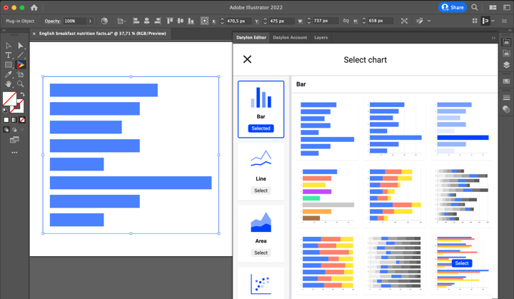
Default charts serve as a starting point to help you design your chart. So if you already know where you want to go with the design, these defaults could help you get there faster. In the case of the bar chart, one can choose from 36 default charts. The first 18 charts are different variations of bar charts, the next 18 charts are variations of column charts.
For our first bar chart, we will go with the ninth default chart.
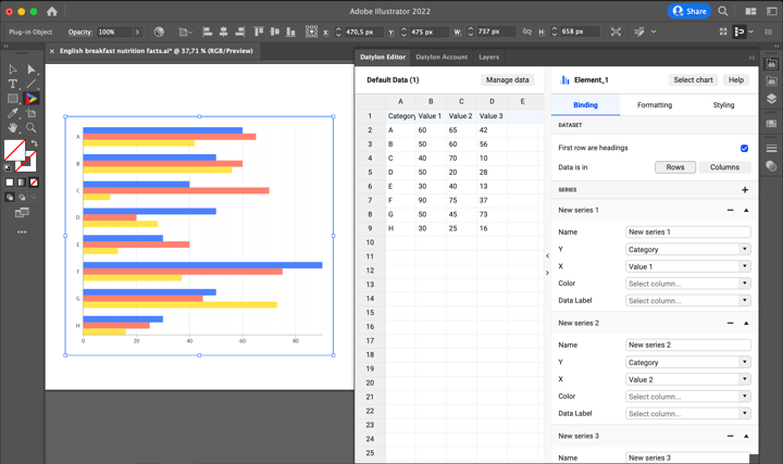
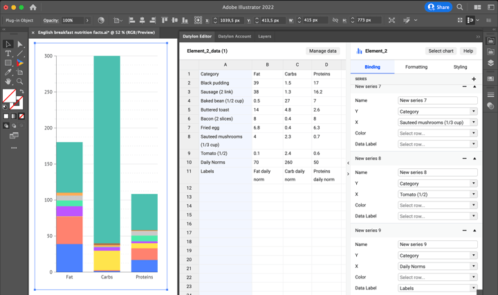
Once you have selected your default chart, the Datylon editor appears. On the left, you can see the data pane, on the right the editor. The editor in itself contains a binding tab, a data formatting tab, and a styling tab.
But let’s take a look at the data pane first. There are three ways of adding data:
- You can start from a dummy sheet/an empty sheet and copy-paste your own data into it.
- You can upload a file from our Insights platform if you have some data stored there.
- You can upload a locally saved file.
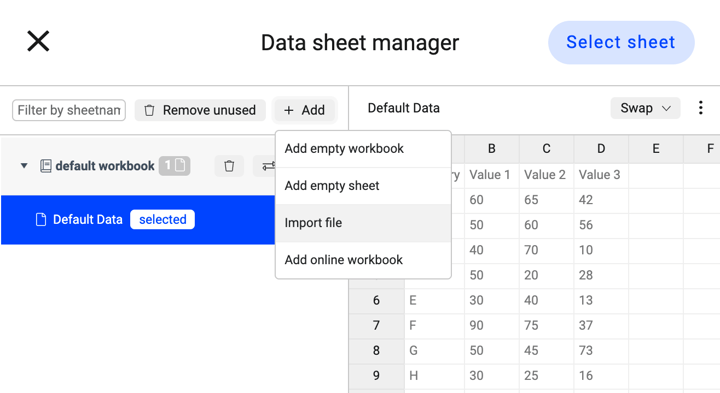
We are going to use a file we have saved locally on our computer. Simply click:
Manage Data > Add > Import File
and browse to find your workbook or datasheet. Click on the wanted datasheet and click the ‘Select Sheet’ button.
Step 3: Binding the first chart
In data visualization, binding the data defines which data drives which visual cue. Some data could drive size, some data could drive position, some data could drive color, etc.
For the given chart the X- and Y values are already bound correctly. Now we need to bind the color also. The idea is to have every group of bars in the same color. To do that first bind Color to Category for every series. When the binding is done we can see that the warning appears.
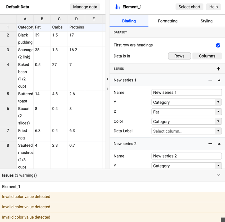
To fix this and to realize our color-per-group idea go to:
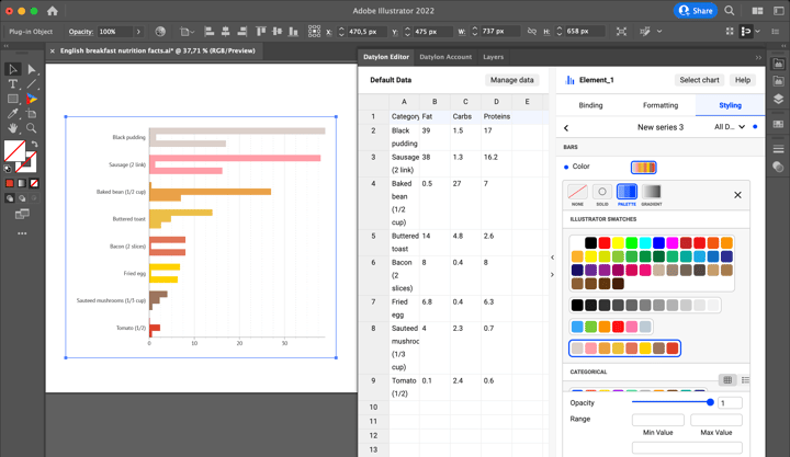
Styling > Series > Series 1> Color > Palette
and choose one of the palettes. In this chart design, we will use a color palette that was already prepared before, with the following color codes: (#dbcfca, #ff9da7, #eaa149, #ebbf48, #e07558, #ffd100, #9c755f, #dd432e). Repeat the same procedure for Series 2 and Series 3.
Step 4: Styling the first bar chart
Now all the bars of the same group are placed tightly to each other. To separate them go to:
Styling > Bars > Multi-Series > Spacing > 20%
Continuing with the styling of the Y-axis, we will remove the axis line, as it’s redundant. To do that, go to:
Styling > Y Axis > Line > Eye icon
To add the additional separator between bar groups use the gridline:
Styling > Y Axis > Ticks and grid > Grid between > On
Also, there’s no need for ticks so they can be turned off:
Styling > Y Axis > Ticks and grid > Ticks > Eye icon off
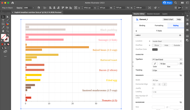
Categorical labels can be also changed here. To save space on the left side of the chart move the labels to the right bottom side of the chart. To do that few adjustments need to be made. First, change the anchor point position:
Styling > Y Axis > Labels > Anchor Point > Positive Side
Then adjust horizontal and vertical offset so the labels are at the far right point of the chart and near the line:
Styling > Y Axis > Labels > Horizontal Offset > 0px
Styling > Y Axis > Labels > Vertical Offset > -20px
Moving on to styling the typeface. Let’s change the typeface from Sans to Serif version:
Styling > Y Axis > Labels > Typeface > PT Serif Bold
Also, change the color to match the color of the bars and make the font bigger:
Styling > Y Axis > Labels > Typeface > Color > Link > Link to > First Series
Styling > Y Axis > Labels > Typeface > Size > 18px
The next step is to style the X-axis. Start with adding an offset so that the labels don’t overlap with the axis line:
Styling > X axis > Offset > 10px
The X-axis line now is thicker than the other lines. To make it similar change its stroke weight:
Styling > X Axis > Line > Stroke > Weight > 0,2px
The data values of the bars will be shown by data marks so there’s no need to have gridlines and ticks. They can be removed:
Styling > X Axis > Major ticks and grid > Eye icon off
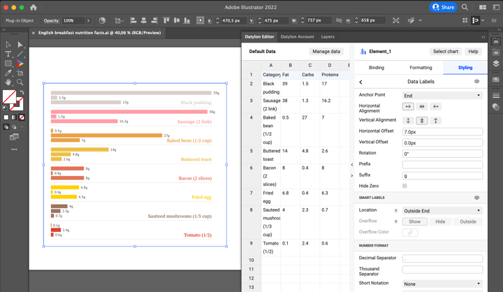
Now add data labels, change the font size and the color and add the suffix:
Styling > Data Labels > Eye icon on
Styling > Data Labels > Character > Typeface > Size > 14px
Styling > Data Labels > Character > Typeface > Color > #808080
Styling > Data Labels > Suffix > g
And we’re done with the first chart.
Step 5: Drawing and binding the second chart
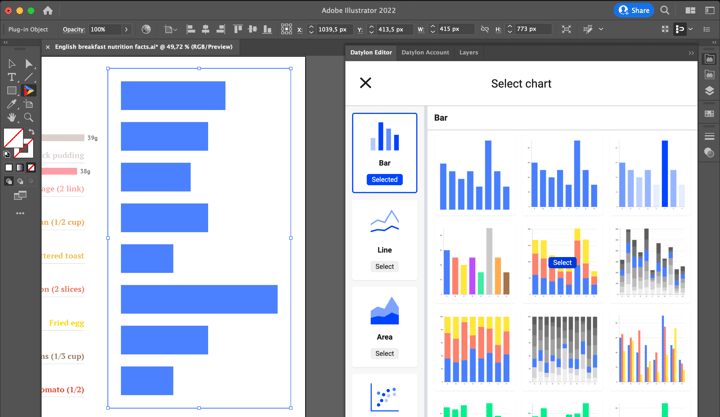
To create a second chart repeat the same steps as for the first chart. The first step is to draw a chart. It will be a vertically oriented chart so try to make it tall and narrow. Then choose a suitable chart from defaults – a stacked column chart – it is the 23rd default chart.
Then import the same data file that was used for the first chart:
Manage Data > Add > Import File
The dataset for the second bar chart is the same but the angle will be slightly different: the focus will be on the total amount of fats, carbs, proteins, and the part that certain ingredients take. To do that a few things need to be adjusted in the Binding tab. First fats, carbs, and proteins should be represented as a stacked bar. To do that go to:
Binding > Data is in > Columns
Then every ingredient should be represented by a separate bar. To do this create a series for every ingredient. Y-Axis should be assigned to Category and X-Axis to the name of the ingredient.
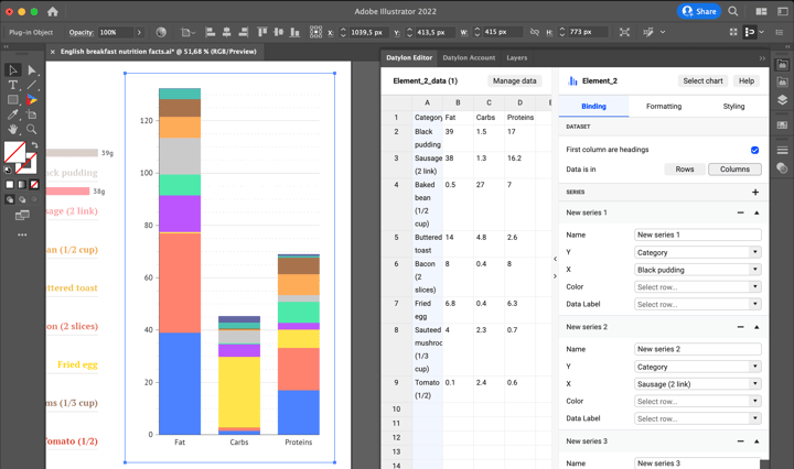
As the daily nutrition norm should be also presented in this chart, two lines of data need to be added. The first of the new rows shows the fat, carbs, and proteins daily norms, the second represents the corresponding labels. Then create a new series and bind Daily norms line to X-Axis, Categories to Y-Axis, and Labels line to Data Labels.
Step 6: Styling the second bar chart
The first step is to make a reference to Daily Norms data. To do that use the overlay options. It will place the selected bar on top of other bars. As there’s only one bar to place the simplest option “On Top” can be selected.
Styling > Bar > Multi-series > Overlay > Overlay Mode > On Top
This property defines how the overlaid bars will behave. The next step is to select a specific series that will be using Overlay mode:
Styling > New Series 9 > Bars > Overlay Series > On
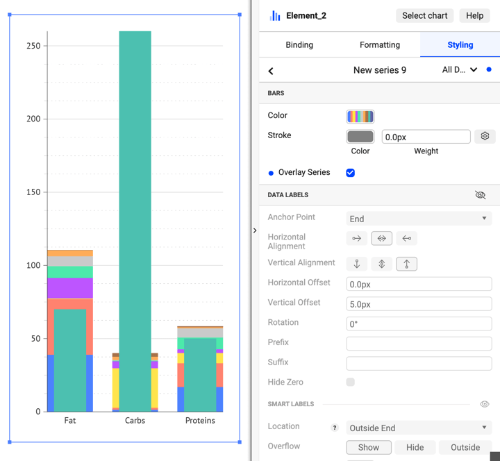
Bars are now placed on top of the stacked bar chart. The aim is to have just a data mark and the data label. The bar can be removed by setting its color to “None”. Then add the data marks and data labels by turning on the eye icon:
Styling > New Series 9 > Bars > Color > None
Styling > New Series 9 > Data Labels > Eye icon > On
Styling > New Series 9 > Data Marks > Eye icon > On
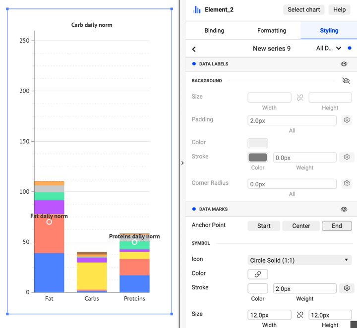
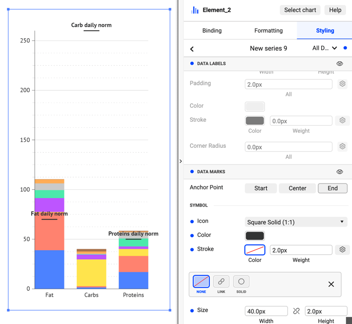
First, let’s style the data marks. They need to look like a line. A line can be made from a solid square by applying high width and low height values. Also, the solid color needs to be applied and the stroke must be turned off:
Styling > New Series 9 > Data Marks > Symbol > Icon > Square Solid
Styling > New Series 9 > Data Marks > Symbol > Color > Solid > #333333
Styling > New Series 9 > Data Marks > Symbol > Stroke > None
Styling > New Series 9 > Data Marks > Symbol > Size > Width > 40px
Styling > New Series 9 > Data Marks > Symbol > Size > Height > 2px
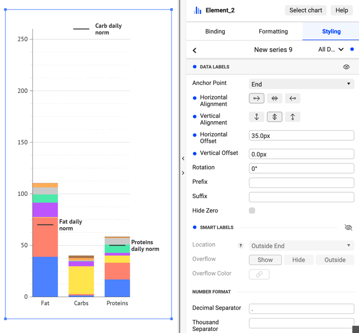
Place the data label on the left side of the data mark so it won’t overlap with the bar.
Styling > New Series 9 > Data Labels > Horizontal Alignment > Left
Styling > New Series 9 > Data Labels > Vertical Alignment > Center
Styling > New Series 9 > Data Labels > Horizontal Offset > 35px
Styling > New Series 9 > Data Labels > Vertical Offset > 0px
Styling > New Series 9 > Data Labels > Smart Labels > Eye icon > Off
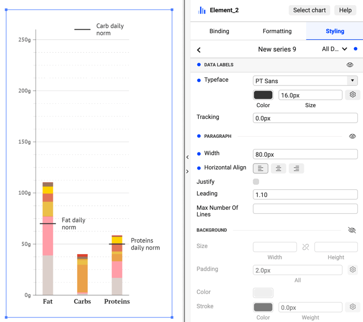
Also, change the paragraph properties so that the labels are more compact:
Styling > New Series 9 > Data Labels > Paragraph > Width > 80px
Styling > New Series 9 > Data Labels > Paragraph > Horizontal Align > Left
Now let’s match the color of the current chart with the chart that was created previously. It will make both charts inter-explainable:
Styling > Bar > Color > Palette
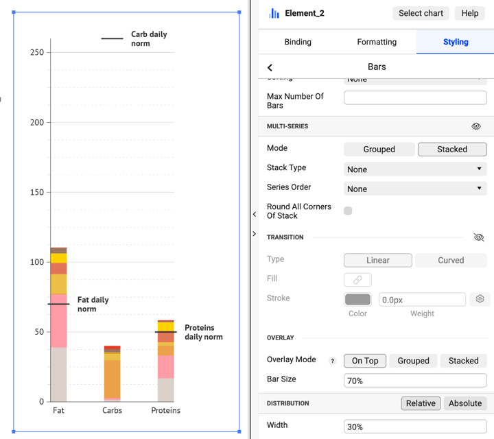
It makes sense to make the bars look thinner to match the overall look of the visualization:
Styling > Bar > Distribution > Width > 30%
Adding some padding will help to see the gridline clearly:
Styling > Y Axis > Outer padding > 20%
Add some font styling for X- and Y-Axis and for reference labels:
Styling > X Axis > Labels > Typeface > PT Sans Bold
Styling > X Axis > Labels > Typeface > Color > #808080
Styling > X Axis > Labels > Typeface > Size > 14px
Styling > X Axis > Labels > Suffix > “g”
Styling > Y Axis > Labels > Typeface > PT Sans Bold
Styling > Y Axis > Labels > Typeface > PT Serif Bold
Styling > New Series 9 > Data Labels > Typeface > PT Sans
Styling > New Series 9 > Data Labels > Typeface > Size > 16px
One small detail left to adjust. Reverse the order of the left bar chart to have the same visual structure of bars in both bar charts:
Styling > Bars > Sorting > Reverse
Now let’s add a title, subtitle, and sources - for this we can use the Illustrator's built-in Type Tool. You can also adjust the placement of all elements. And we’re done!
Datylon Bar Chart Resources
- Blog: Deep dive into... bar charts
- Chart library: Bar chart resource page
- Chart properties: Bar chart properties