Data Visualization Automation Tools for Non-Techies

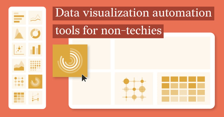
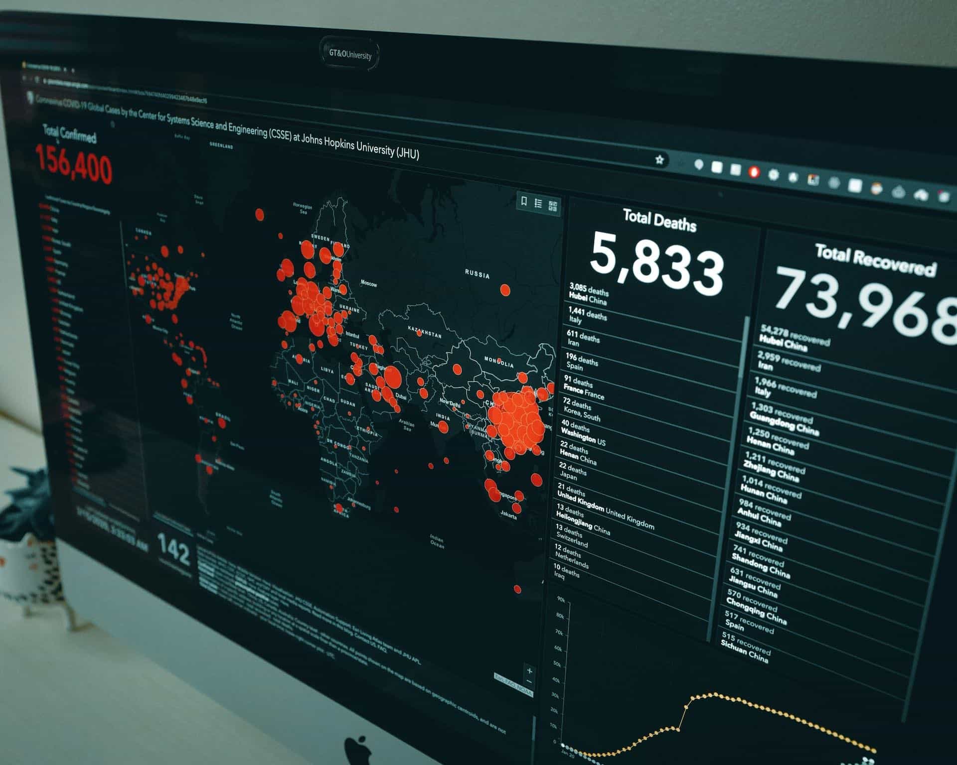
In today’s data-driven world, the ability to turn raw data into visually engaging insights is more critical than ever. Traditionally, creating data visualizations required specialized skills in coding, statistical analysis, and design. However, with the rise of no-code tools, this process has been democratized, making data visualization accessible to anyone—even non-technical professionals.
In this blog, we will explore the landscape of no-code data visualization tools, specifically focusing on the differences between tools designed for single-use visualizations and those that automate recurring reports and dashboards. By understanding these two types of tools, we’ll help you choose the right tool to streamline your reporting workflows and maximize efficiency.
Table of content
1.The need for No-Code Automation Tools 2. Single-Use Visualization Tools Key features of Single-Use Tools 3. Multi-Iteration Automation Tools Key Features of Automation Tools |
The Need for No-Code Automation Tools
In the world of data visualization, there are two primary categories of no-code tools: single-use tools and multi-iteration automation tools. Both offer significant advantages, but they cater to different needs.
Single-Use Tools
These are ideal for creating one-off visualizations, such as charts or infographics, that are typically used for presentations or reports. These tools are quick, easy to use, and often come with pre-designed templates to simplify the creation process.
Automation Tools
These tools are designed to handle recurring tasks like updating charts, generating reports, or creating dashboards based on fresh data. Automation tools are perfect for professionals who need to generate the same type of report or chart on a regular basis.
In this article, we’ll examine popular no-code tools from both categories and provide insights on their key features, strengths, and limitations.

Single-Use Visualization Tools
Single-use tools are excellent for those who need to create visualizations on an ad-hoc basis. These tools are simple to use and allow non-technical professionals to generate charts and infographics quickly without needing any coding knowledge. With pre-built templates and easy-to-understand interfaces, these tools are designed to get users up and running fast.
Key Features of Single-Use Tools
Templates and Pre-Designed Elements: Single-use tools often come with a library of customizable templates and design elements, allowing users to create professional-quality charts and graphs.
Drag-and-Drop Interface: Many of these tools feature drag-and-drop functionality, so users can easily upload their data and adjust the layout of their visualizations.
Ease of Use: These tools are designed to be intuitive, so even those with limited technical skills can create polished, engaging visualizations.
Popular Single-Use Tools
Infogram
Infogram is one of the most popular single-use tools on the market. It provides an extensive library of templates for charts, infographics, and reports, enabling users to create professional visualizations in minutes.
Strengths: Infogram supports a wide range of chart types and integrates with Google Sheets, Excel, and CSV files. It also features a real-time collaboration option, which is beneficial for teams working together on reports.
Limitations: While it’s excellent for creating static visualizations, Infogram lacks automation features, which means users must manually update their reports when new data is available.
Canva
Although primarily known for its graphic design capabilities, Canva also includes a data visualization feature that allows users to create charts and graphs easily.
Strengths: Canva’s user-friendly interface and extensive library of design elements make it an excellent choice for creating visual reports for presentations, social media, or marketing.
Limitations: While Canva is great for simple visualizations, it lacks automation features for recurring reports, making it more suited for one-off tasks.
Datylon for Illustrator
Datylon for Illustrator is a no-code tool designed to create high-quality, customizable reports directly from data sources like Excel or Google Sheets. Datylon for Illustrator offers users the ability to design detailed reports that integrate multiple charts, visualizations, and text in a cohesive layout.
Strengths: Datylon for Illustrator allows users to create static charts and reports from data without coding, providing flexibility and control over layout and design. It supports PDF exports, which is ideal for professional presentations and client reports. Once exported, users can easily annotate PDFs to add comments, highlights, or additional insights before sharing.
Limitations: While powerful for single-use reports, Datylon for Illustrator lacks automation capabilities for recurring report generation, making it more suited for periodic tasks rather than regular updates.
Datawrapper
Datawrapper is a widely-used tool that makes creating charts, maps, and tables straightforward and quick. It’s particularly popular among journalists and researchers who need to create professional-looking data visualizations on a tight timeline.
Strengths: Datawrapper excels in its simplicity and efficiency. Users can create static or interactive visualizations like bar charts, line charts, and geographic maps. The tool doesn’t require any coding and integrates seamlessly with CSV files, Google Sheets, and Excel.
Limitations: While it’s a powerful tool for standalone visualizations, Datawrapper lacks features for automating recurring reports. Users must manually upload updated data to refresh their charts.
Flourish
Flourish is another excellent tool for creating visually stunning, interactive charts and stories. It’s particularly popular in fields like marketing and media, where engaging storytelling is critical.
Strengths: Flourish supports a range of chart types, from basic graphs to interactive visualizations. It also includes templates for data storytelling, making it ideal for creating dynamic presentations. Users can link data directly from Google Sheets for real-time updates.
Limitations: While Flourish offers interactivity, it isn’t designed for large-scale automation. Creating multiple iterations or recurring reports requires manual effort.

Multi-Iteration Automation Tools
While single-use tools are perfect for one-time visualizations, automation-focused tools are essential for professionals who need to generate recurring reports, charts, or dashboards based on updated data. These tools reduce the time spent on manual updates and ensure consistency across reports.
Key Features of Automation Tools
- Data Integration: Automation tools connect to various data sources, such as Excel files, SQL databases, or cloud-based platforms, and automatically update reports when new data is available.
- Pre-built Templates and Workflows: Users can design templates that automatically update with new data, saving time and ensuring that reports are consistent across iterations.
- Automated Distribution: Many automation tools offer automated sharing capabilities, sending reports directly to stakeholders via email or cloud storage services.
Popular Multi-Iteration Automation Tools
Datylon ChartRunner
Datylon ChartRunner is a powerful no-code tool designed to automate the creation of charts and reports directly from Excel data. It allows users to create customizable templates for recurring reports, which can be automatically populated with fresh data whenever required.
Strengths: ChartRunner offers seamless integration with Excel, making it ideal for professionals who already rely on spreadsheets. The tool’s PDF export feature ensures that reports look professional and are easy to share.
Limitations: While excellent for generating static charts, ChartRunner lacks interactive elements like drill-downs or dynamic dashboards.
Luzmo (Cumul.io)
Luzmo, now part of Cumul.io, is an advanced tool for generating dynamic, real-time dashboards and recurring reports. It connects to various data sources and automates the process of updating reports.
Strengths: Luzmo excels in creating real-time dashboards that update automatically as new data is entered. It offers strong customization options for building sophisticated reports and dashboards.
Limitations: Luzmo may require some technical know-how to get the most out of its advanced features, making it less ideal for complete beginners.
ChartBlocks
ChartBlocks is a no-code platform that allows users to create charts based on live data sources. It automatically refreshes visualizations when new data is added to the connected datasets.
Strengths: ChartBlocks supports a wide range of charts and provides real-time data updates, making it an excellent tool for ongoing reporting needs.
Limitations: ChartBlocks is limited to chart-based visualizations, so it may not be suitable for users who need more complex reporting features.
Polymer
Polymer is an AI-driven platform that automates the creation of interactive dashboards. It uses machine learning to uncover insights and trends in the data and presents them in a visually engaging manner.
Strengths: Polymer’s AI capabilities enable users to generate actionable insights directly from their data, making it especially useful for organizations that need to identify patterns quickly.
Limitations: Polymer’s advanced features may come with a steep learning curve, which could be challenging for non-technical users.
FineReport
FineReport is an enterprise-level reporting tool that supports both static and dynamic reporting. It connects to multiple data sources and allows for real-time updates, making it suitable for large-scale reporting tasks.
Strengths: FineReport is ideal for businesses that require sophisticated reporting capabilities, offering powerful automation and customization options.
Limitations: The platform is more suited for large organizations and may be overly complex for smaller businesses or individual users.
Conclusion
No-code data visualization tools have revolutionized how non-technical professionals approach data visualization. Whether you need to create a single chart for a one-time presentation or automate the creation of reports and dashboards, there is a tool to meet your needs.
Single-use tools like Infogram, Canva, and Datylon Report Studio are perfect for quick, ad-hoc reporting. Meanwhile, automation tools such as Datylon ChartRunner, Cumul.io, and Luzmo offer powerful solutions for recurring reports and dashboards, helping businesses save time and reduce the effort required to keep reports up-to-date.
By selecting the right tool for your needs, you can streamline your data visualization process and focus more on analyzing insights rather than spending time creating reports. The rise of no-code tools is making it easier than ever for professionals to harness the power of data, regardless of their technical background.
Book a live demo of Datylon’s ChartRunner today and discover the potential of no-code chart automation.
👉If you're keen on crafting custom data visualizations, visit our Bespoke Data Visualization Solution page, where we showcase numerous examples of our past projects.


