Datylon Chart Library - Scatter Plot Resource Page

Scatter plot

An example of a scatter plot designed with Datylon for Illustrator, a chart maker plugin for Adobe Illustrator
DATYLON > CHART LIBRARY > SCATTER PLOT

What is a scatter plot?


Alternative names: 
ScatterplotScatter chartScattergramScatter diagramScatter graph

A scatter plot is a set of dots plotted on a plane coordinate system representing two variables.

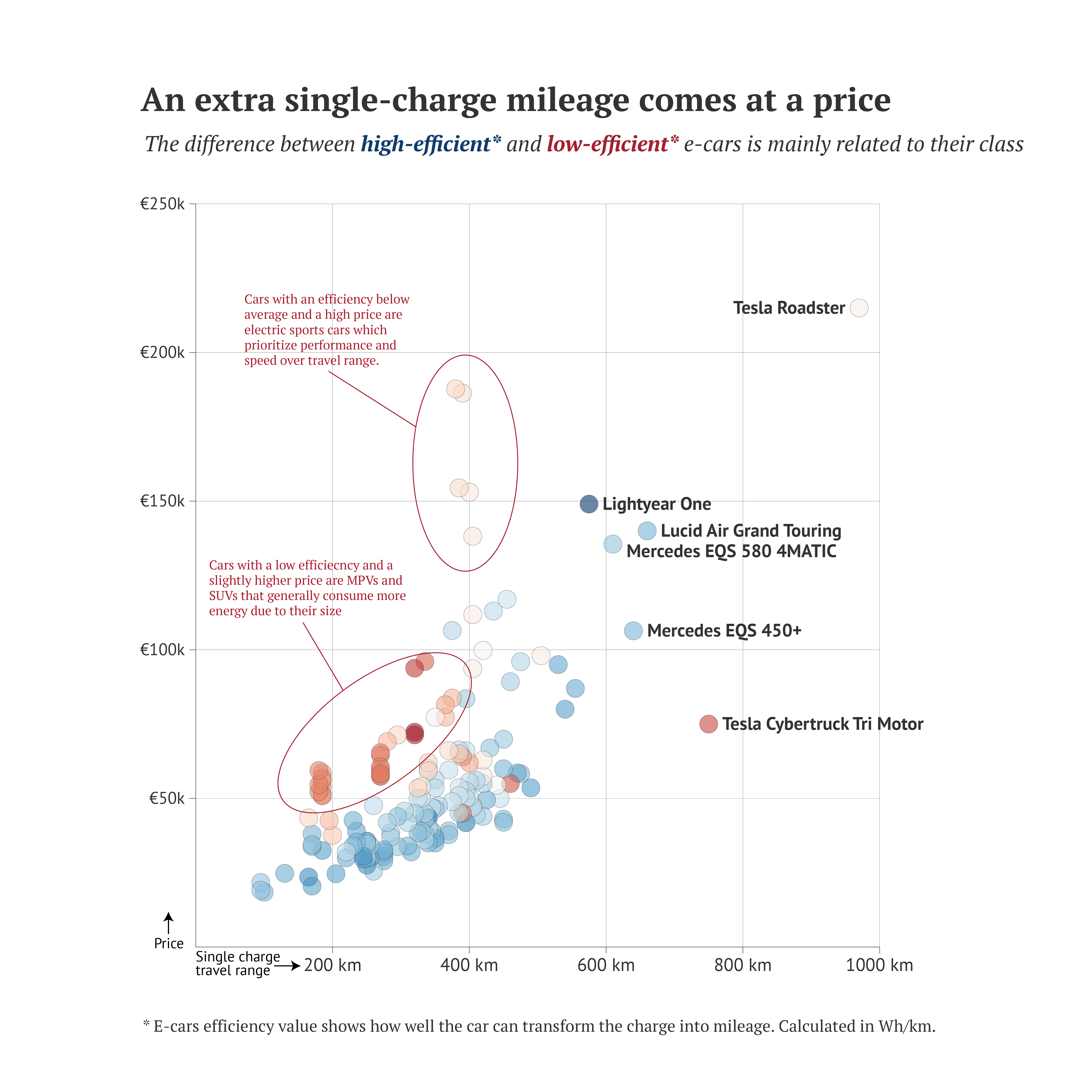
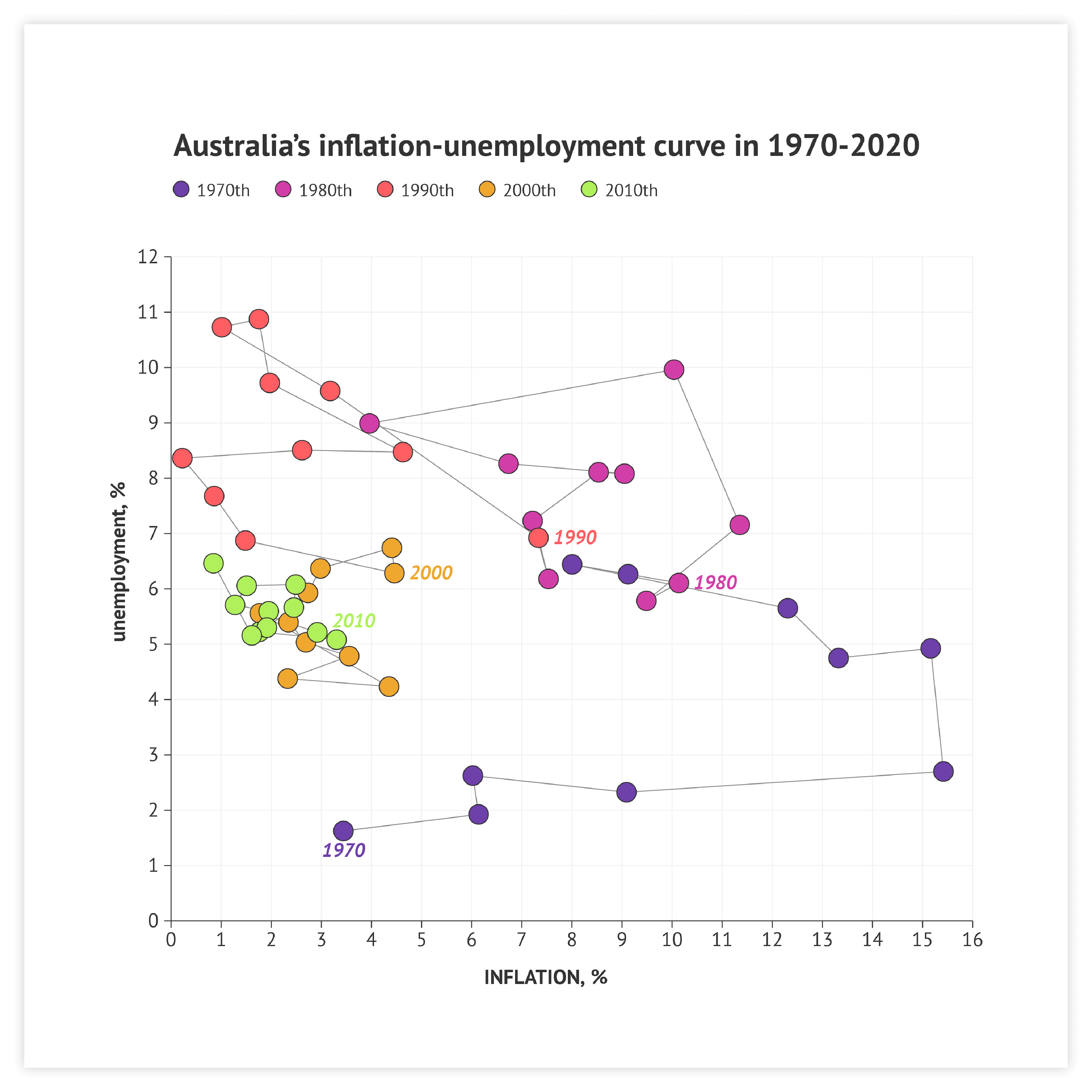
A scatter plot is usually the first choice for data exploration. Simple one-sized data marks give a clear view of every observation’s positioning. A scatter plot is often used to find correlations between two numerical variables and identify patterns. Clusters, as well as outliers, are also easy to spot using scatter plots.

A scatter plot is a chart with one of the best data/space ratios.

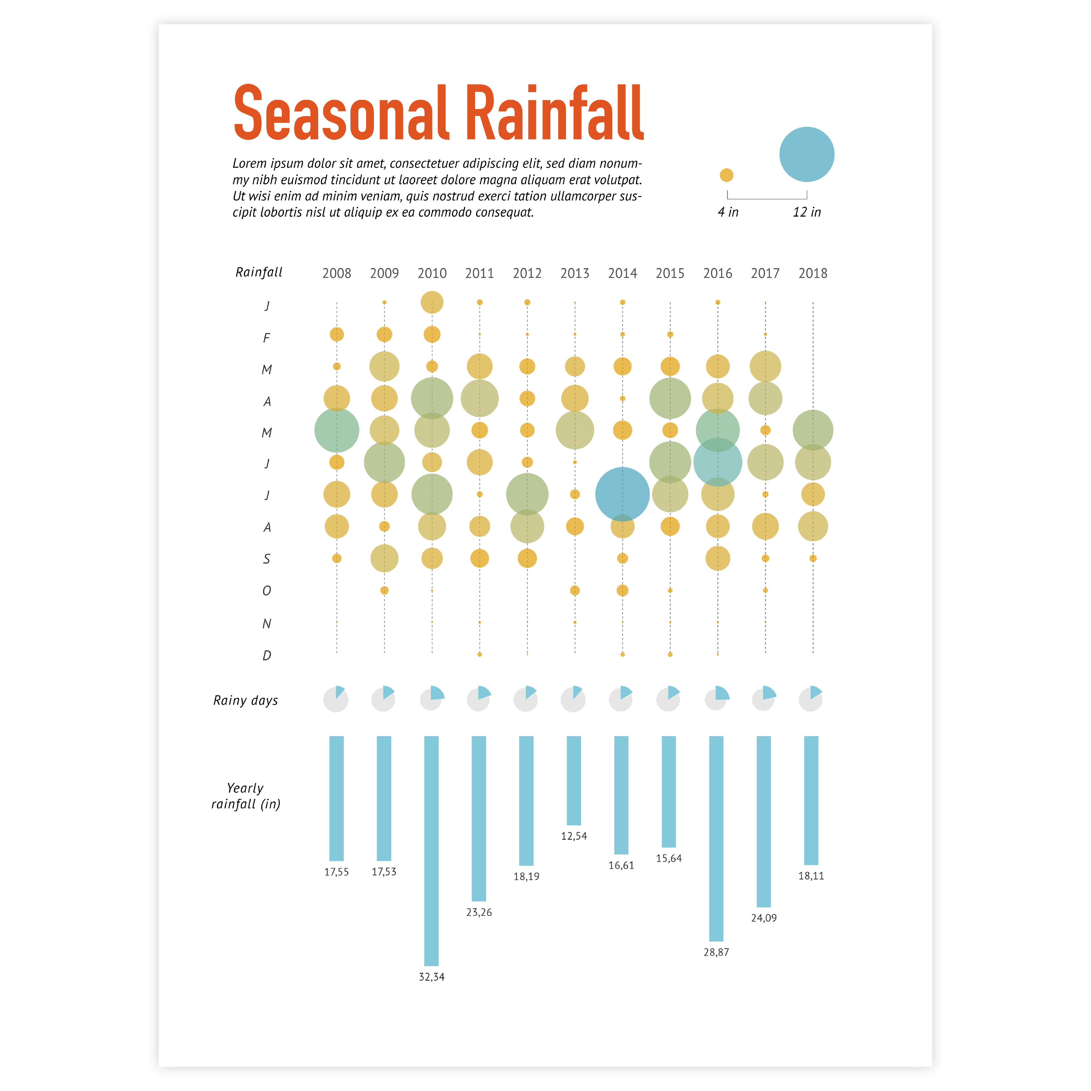
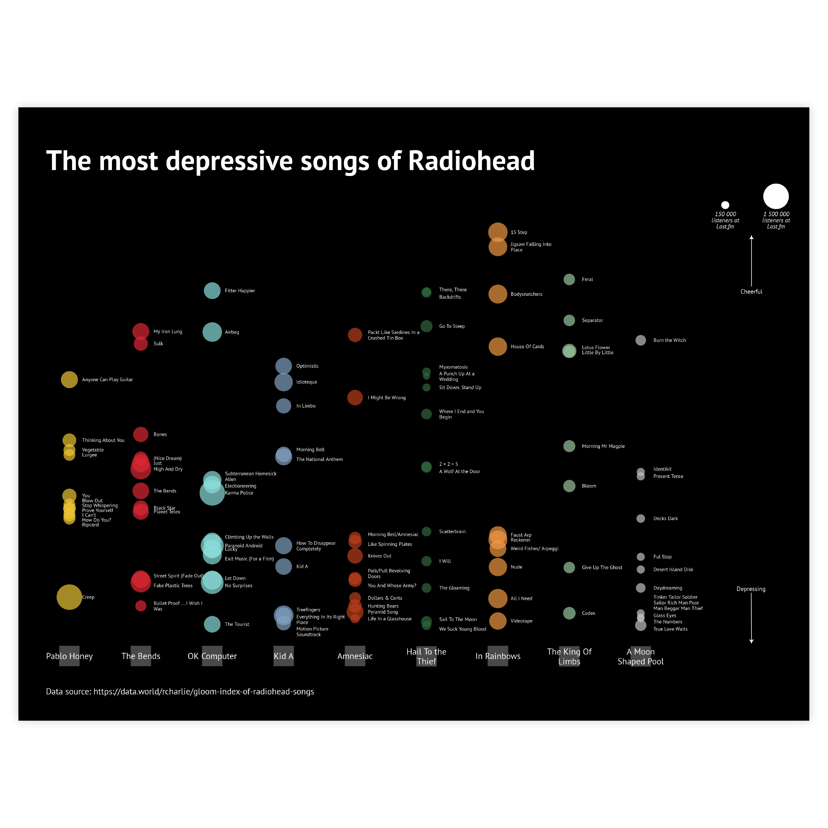
A scatter plot is also known for its versatility. It gives a lot of inspiration to infographic designers and data visualization specialists. It can be turned into almost any chart: heatmap, dot plot, icon chart, tilemap, or some hybrid chart.

Start making your own scatter plot with Datylon

Variations of scatter plots

The charts below are variations of a scatter plot. To learn how to make them with Datylon, check out the scatter plot user documentation in our Help Center.
Datylon chart library: use a bubble chart as a variation of a scatter plot

Bubble chart

It's like a scatter plot but includes bubble size as an additional dimension. Not only that; with some expansions, a bubble chart can even represent up to seven variables at once.

Datylon chart library: use a categorical scatter plot as a variation of a scatter plot

Categorical scatter plot

A categorical scatter plot distinguishes itself from a typical scatter plot through the inclusion of a categorical axis. It can be just one categorical axis or both of them.

Datylon chart library: use a quadrant chart as a variation of a scatter plot

Quadrant chart

It’s very similar to a scatter plot but it’s divided into four equal parts. It is useful if we want to group data marks for some specific type of analysis (for example a SWOT analysis).

Alternatives to a scatter plot

Substitute your scatter plot with any of the charts below when you want a visual alternative that still allows you to use color binding or different icons.
Datylon chart library: use a heatmap as an alternative for a scatter plot

Heatmap

A heatmap is more restricted than a scatter plot as it only uses color and labels to visualize the data. The data itself is structured as a table: both axes are categorical.

Datylon chart library: use a dot plot as an alternative for a scatter plot

Dot plot

It serves as a valuable alternative to a scatter plot when you want to show a range of values associated with each category – connectors will help with that.

Datylon chart library: use a icon chart as an alternative for a scatter plot

Icon chart

An icon chart will be a perfect substitute if the position of the marks is not driven by data. Values can be bound to the color and size of the icons.

Pro tips for designing a scatter plot

Learn how to improve the readability and visual appeal of your scatter plot.
Up to seven variables can be bound in the scatter plot - a record among Datylon charts

Binding

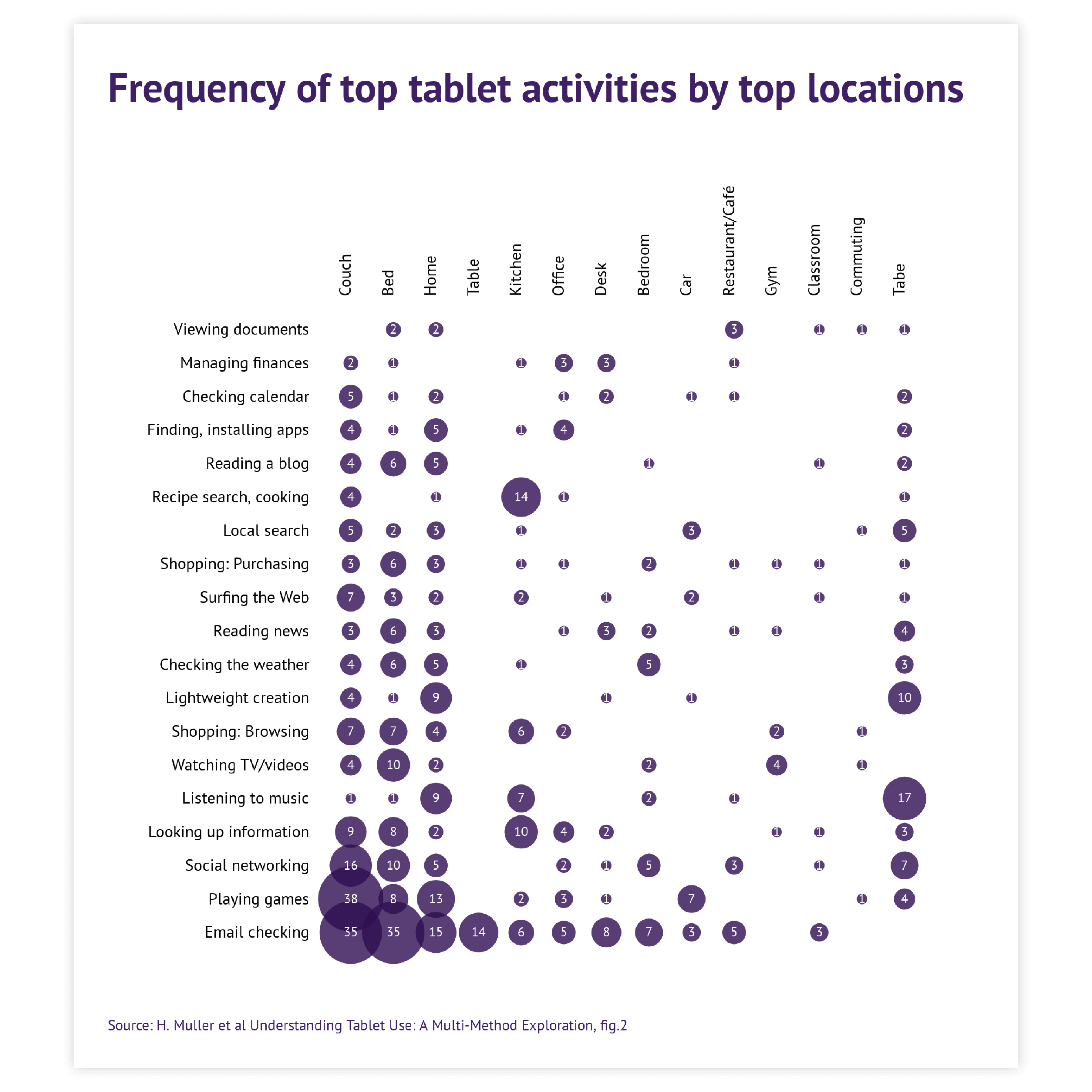
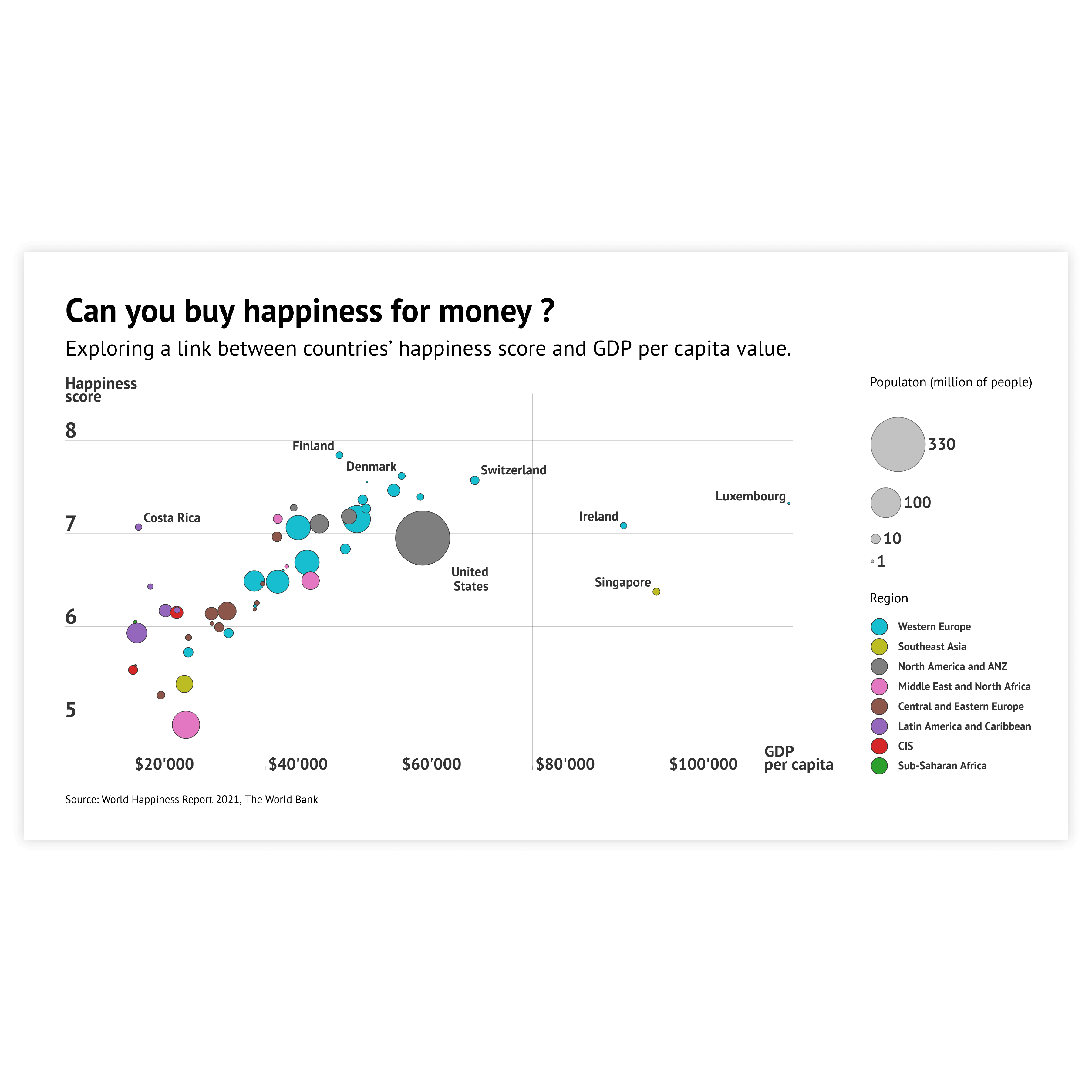
Up to seven variables can be bound in the scatter plot: X and Y axes, size, color, stroke color, icon, and label. It’s a record among Datylon charts. But be careful. Too many bound variables can easily confuse the reader. It’s better to limit the number of bound variables to 3 or 4.

Read more
Ascending, descending, and reverse order of sorting can be applied in the Datylon scatter plot

Sorting

If an axis type is set to categorical, sorting can be applied: in ascending, descending, and reverse order. This can be a huge timesaver if the sorting of categories hasn’t been prepared in the spreadsheet beforehand.

Read more
All the possibilities of coloring are available in the Scatter plot. Three types of color scales allow detailed communication of both categorical and numerical data.

Coloring

All the possibilities of coloring are available in the Scatter plot. Three types of color scales allow detailed communication of both categorical and numerical data.

Read more
Every bubble can be styled separately to the finest detail. This enables endless options to highlight data marks.

Highlighting

Every bubble can be styled separately to the finest detail. This enables endless options to highlight data marks.

Read more
Sometimes we don’t even need any data marks. A label on its own can be enough for communicating the message in a scatter plot.

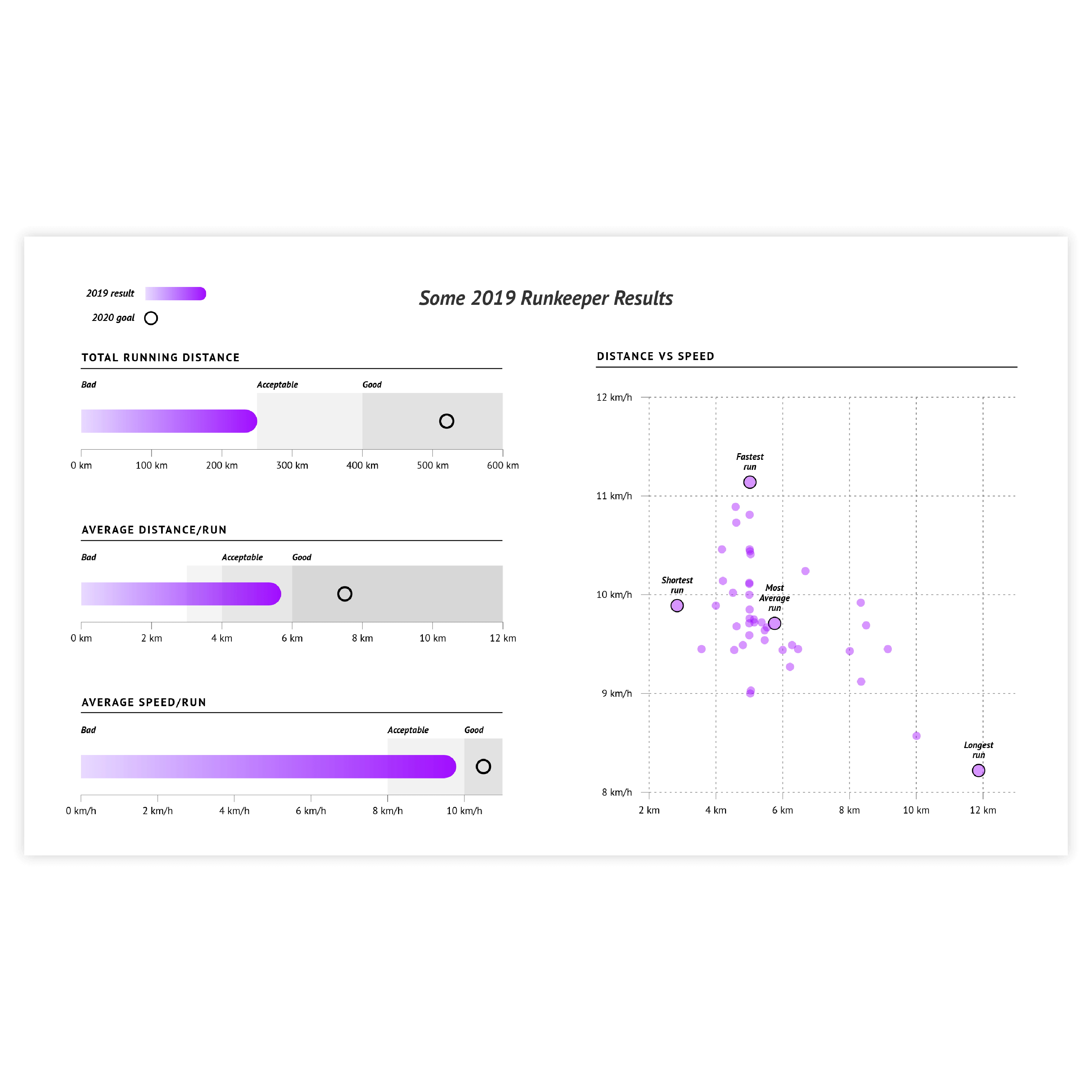
Labels instead of data marks

Sometimes we don’t even need any data marks. A label on its own can be enough for communicating the message. This is done by hiding the data marks and leaving the labels only. The labels can be colored just like the data marks by using the link option for label color.

Read more
If you use a combination of numerical and categorical axes and the plots on the numerical axis are dense, you might run into overlapping data marks. To avoid that you can use the Jitter property along the categorical axis. It allows you to spread data marks near the category line and make the data marks more visible.

Jitter

If you use a combination of numerical and categorical axes and the plots on the numerical axis are dense, you might run into overlapping data marks. To avoid that you can use the Jitter property along the categorical axis. It allows you to spread data marks near the category line and make the data marks more visible.

Read more

Create your own scatter plot

Join Datylon for free and get started online or download our Datylon for Illustrator plug-in with a 14-day trial. Connect with a Datylon expert for a demo session.

Scatter plot examples & inspiration

Scroll and click on the images below to find inspiration samples of scatter plots. With your Datylon account, you can use these designs, customize them and update them with new data. 

Discover more charts in our Chart Library

Learn more about the different types of charts and graphs you can design with Datylon. Discover other resource pages in our Datylon Chart Library.