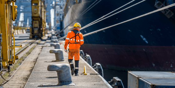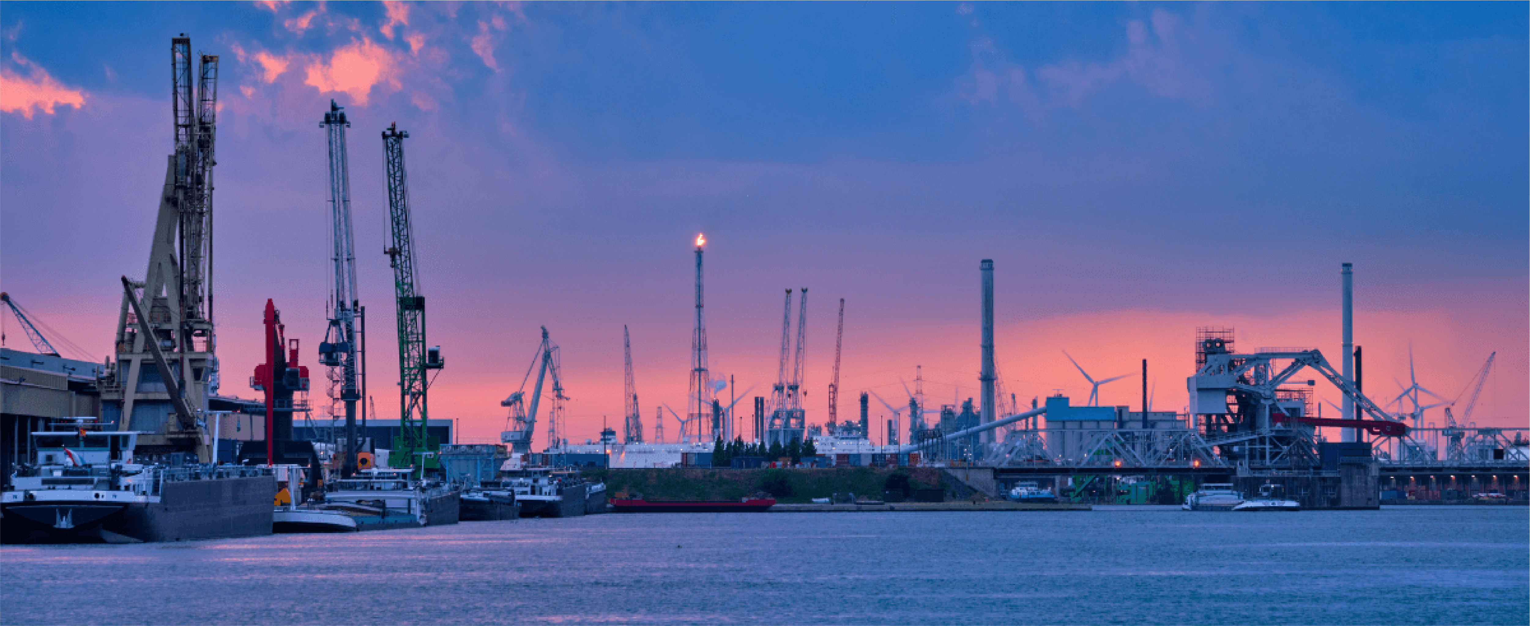

The Port of Antwerp, Europe’s second-largest port, and growing, is a busy landmark located in Belgium. Owned and operated by Antwerp Port Authority, it employs a lot of people within its many departments. This is why the port’s managers pay much attention to the communication that occurs between different divisions and levels of the organization.
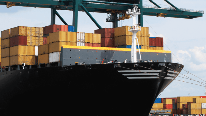
The Port of Antwerp has been Datylon’s happy customer for a while now. We already wrote once about how we were able to help PoA improve its management reporting. This made the communication flow easier, as a high volume of data on shipping, seaborne cargo, and container traffic has to be collected and processed on a monthly basis.
See how Datylon helped the Port of Antwerp improve its management reporting.
Having this superb solution in mind and trusting in the power of Datylon’s digital and dataviz solutions, the Port’s financial department decided to follow suit. That is how they came up with the idea of using Datylon also for this project.
About every month, Port of Antwerp’s board of directors holds a formal board meeting to discuss company-wide policies or issues, the overall business strategy of the Port, and to look closely at the company’s KPIs.
Challenge
These meetings are essential in discussing and defining the trajectory of the company. However, not all members of the board are involved in the day-to-day operation of the port, so everybody needs to be on the same page and be informed in a clear, accurate, and consistent manner. The challenge is to compress the huge amount of data into a comprehensive but yet concise document that helps to align all the board members and reduce preparation time. And data visualizations are a perfect vehicle for that.
Solution
This is why the Port of Antwerp decided that the most important and the most efficient approach would be creating a recurring monthly KPI report that could be sent out to all board members prior to their monthly meeting. This way, everyone would be able to attend the meeting fully informed. Each month, before the assembly, they receive a brief consisting of one general summary and five detailed overviews of different departments’ KPIs.
To help the Port of Antwerp enhance this process, dataviz experts designed this new KPI report using the Datylon for Illustrator plug-in. To make sure that all the visualizations are consistent and that the report itself is on-brand, our professionals created a fully custom, tailor-made template. The reusable design template was then uploaded to the Datylon Report Studio, where the Port of Antwerp's team is able to upload new data to produce the monthly report.
The report itself consists of six pages, it collects data from different divisions of the company.
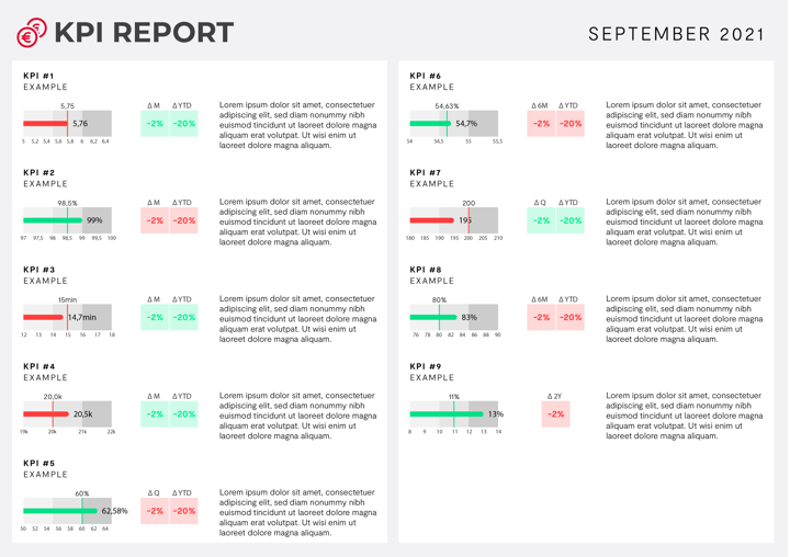 The mockup of the KPI report made for Port of Antwerp.
The report template was designed and created with graphic style guides in mind. The clarity of data visualization and coherence of information conveyed in the report, with in-depth insights into different units helps the team to succeed. The easy-to-interpret reference system of the KPI measurements, together with the additional comments and annotations allowed all board members to easily track the progress and see how far they are on their roadmap.
Continuous support
First launched in January 2021, the KPI report keeps track of monthly growth and is successfully communicated to the Board of Directors every four weeks.
In the meantime, Datylon continuously develops new features and enhancements so that the Port of Antwerp (and other fellow businesses) can benefit from continuous improvement of their report design. Moreover, the steady furtherance in our product and service development reduces the need for manual input, with full automation being a key ingredient.
And if you're a business or organization inspired by this solution, you can get in touch with us. We can help you use your data to make a change.