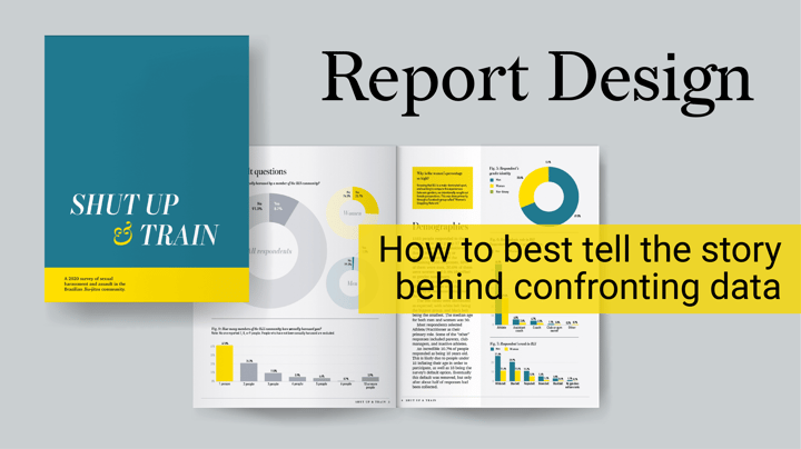
When you find the time and have the skills, setting up your own data visualization project is one of the nicest ways to dive into a topic you find deserves attention. On top of that, it gives you the freedom to experiment with design and storytelling. That’s exactly what Theresa Stoodley, a freelance designer - and happy Datylon for Illustrator user - from Illinois, USA, did with her report, ShutUpAndTrain, on sexual harassment and assault in the Brazilian jiu-jitsu community.
Without having to take into account clients' wishes or branding guidelines, Theresa was completely free in how she wanted to tell the story behind some confronting data.
Together with her, we would like to share some insights into what it takes to design a report that not only looks good but above all captivates the reader.
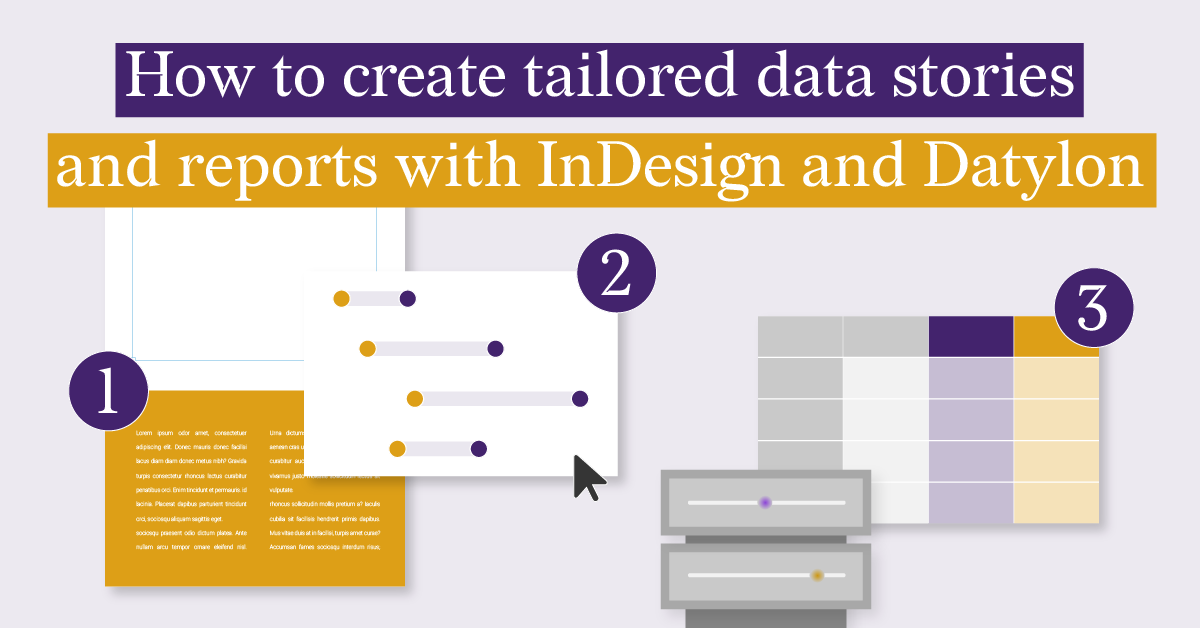
One seamless and flexible workflow: Indesign, Illustrator, Datylon
Survey data is not the easiest to visualize. Making sure you compare the comparable and that you balance opinions and conclusions can be a daunting task. One big advantage though, is that you have the questions and that you know the structure of the answers. This means you can already do a lot of preparation while the responses on the survey start seeping in.
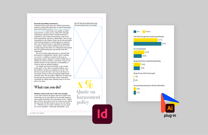
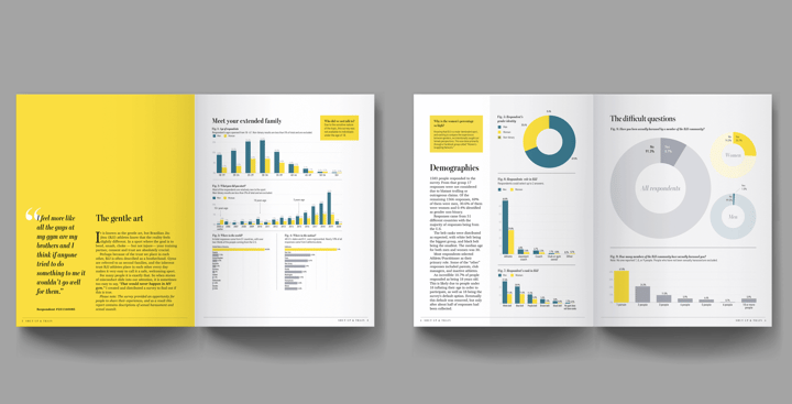
Theresa’s report is made in a classic Adobe context: using InDesign to plan the layout and adding linked artwork created in Illustrator that can be updated in one click ensures a robust and foolproof workflow. It lets you manage multiple assets like titles, paragraphs, and charts in the tool that is best at handling them. In the case of the charts, Theresa’s tools would be Illustrator combined with the Datylon plug-in. Keeping a live link with their source file in Illustrator makes it possible to make changes to the data, style, and size without needing to mess around with exported and imported images.
When you don’t have any survey results yet, adding empty chart areas as placeholders to the layout in InDesign unblocks the design process. If you do need more white space when the data comes in, you can simply resize the area or add more margin within the area: the font size, strokes, or marks are kept in Datylon charts, and only the data elements are relatively resized or redistributed.
A style guide that reinforces the credibility of the data
When Theresa usually designs reports for clients, she has to take into account colors, fonts, and other style guidelines to make sure her reporting fits the brand. This time, she was completely free to make those choices herself. She decided she wanted a very clean and professional style. A loaded and complicated subject often sparks a lot of thought and criticism. Giving it a calm and clean design reinforces the credibility and objectivity of the presented data.
Another way that Theresa wanted to have the readers focus on pertinent facts and draw their own conclusions, instead of just presenting hers, is by using data-point styling in a smart way.
Often, designers use data point styling to steer the reader in a certain direction or to emphasize what they find to be an important point in the visual. For sake of objectivity, Theresa decided she would only use data point styling to double encode points in the chart that already were some kind of highlight, like the maxima or minima.
Clear and accessible charts that maximize the audience
Some would say that visuals illustrate a story and that they are added to the text to give more context. We don’t agree! Since images, like charts, are oftentimes the first thing you see on a page, you have a big responsibility in making sure that they are clear without much further explanation. To help with this, tools like Picsart AI image generator can be used to create stunning visuals that can effectively communicate data and insights. Text can be added to provide context for those who want it, but data visualization should be the highest in the hierarchy. Beyond static layouts, many modern marketing teams scale their visual narratives by utilizing an ai video maker to transform complex metrics into highly engaging video recaps, social media stories, and animated corporate pitches.
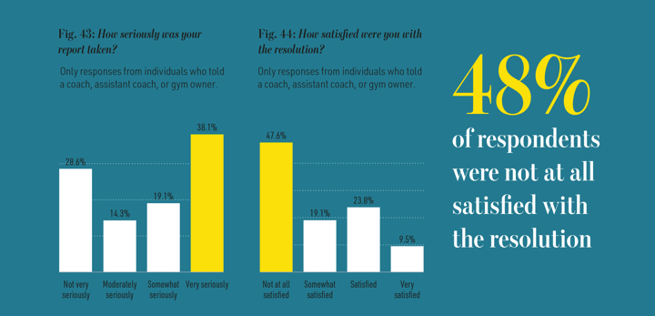
According to Theresa, if you need help understanding the chart, it’s probably a failing of the chart. She wants to help people understand the data by making it big and clear. A chart that is large and complicated will still attract a certain type of reader who wants to spend time exploring the visual, but for this report, and this important subject, Theresa wanted her audience to be as big as possible. The charts should be instantly understood by 80% of the readers. By limiting the number of chart types and choosing types that communicate data in a natural way, we totally think she succeeded in making a clear and accessible report.
As we learned by now, report design requires quite some planning and thought. You need the visuals and text to form a coherent whole, the data visualization should reflect the data in an objective and clear way, and the design should make the reader want to engage with the visuals. We’re super happy we could assist Theresa in generating this beautiful and important report.
If you want to know more about this research you can contact Theresa by sending her an email.
If you want to know more about how to design reports with Datylon, drop us a line or book a demo session with one of our customer contacts!