First things first: let’s start by clearing up some terminology. Chart naming always triggers a lot of confusion and opinions. Cultural and historical differences result in different names and different meanings. Certainly, a chart named after a shape that pops up everywhere - a dot - can be prone to different interpretations.
Based on some google searches, a dot plot could be any of the following charts:
All have dots, but not all are dot plots.
- Icon Bar: visually similar, but a completely different chart concept
- Dot Plot: most classic version of our dot plot with single series
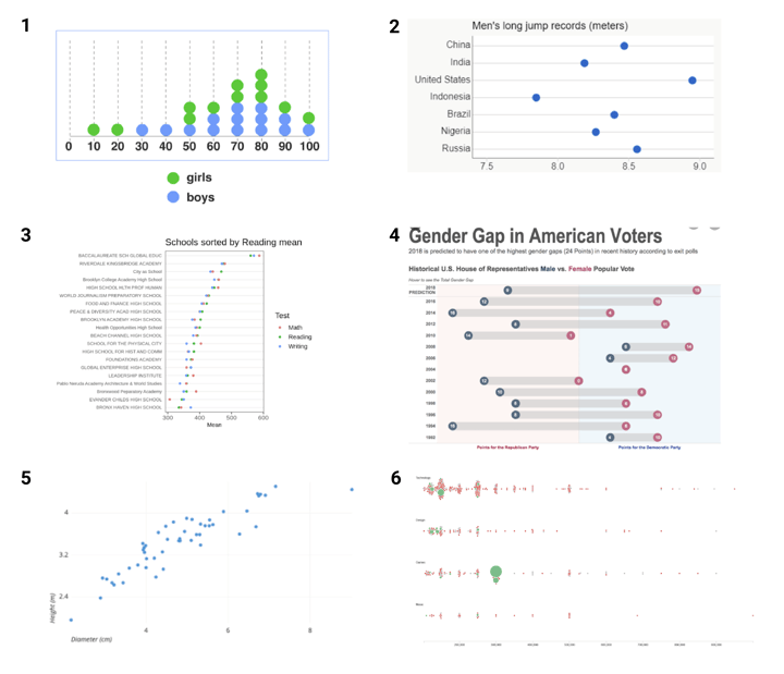
- Cleveland dot plot: our dot plot with multiple series. Cleveland with one dot is by the way a great alternative for a simple bar chart
- Dumbbell chart: a connected dot plot with two series
- Scatter plot: when categorical axis, it is equal to a dot plot, when numerical or date-time axis, it is a separate chart type
- Beeswarm: a dot plot with jitter
Everything except for the first chart could be seen as a dot plot. So why isn’t the first chart one? And there is quite some difference between all other charts, so why are they all dot plots? To know what we could consider a dot plot, we’ll need to dive into how this chart actually works.
➡️ Discover our dot plot resource page with more helpful information, design tips, and tools.
Table of contents
|
How does a dot plot work
A classic dot plot
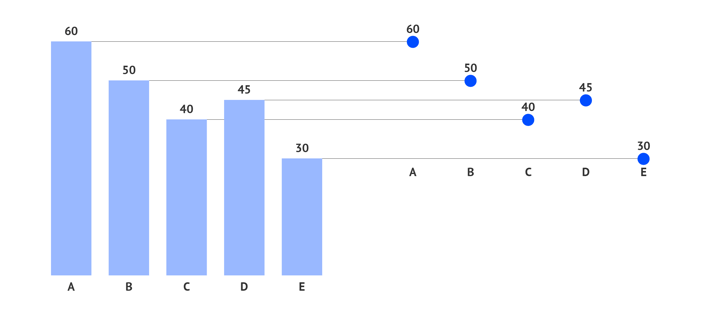
A dot plot shows one or more quantitative values per category by plotting one or more dots per category on a numerical (or datetime) axis. The data-ink ratio is as tight as it is going to get in this chart. Speaking of which, if we follow Tufte’s concept, in a strict interpretation of this rule, bar charts shouldn’t even exist, they should all be dot plots.
There’s a big difference when you compare a dot plot with a bar chart. A value in a bar chart is visualized by the length of the bar. In a dot plot, the value is visualized by its position on an axis. This means that to be correct, a bar chart’s numerical axis should always start at zero. The dot plot doesn’t need to follow this rule. Since the dots communicate information via their position on the axis, and via their position relative to each other, we should define the start and the endpoint of the axis based on the minimum and maximum values in the data.
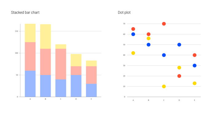
Another difference between a bar chart and a dot plot is that, since a dot plot uses a simple dot on a numerical axis, it is far easier to add more series (more values per category) without needing to stack these series on top of each other and make them rather unreadable, like in a stacked bar chart. This results in a chart that packs a lot of information in a small space. A multi-series dot plot lets you compare values within a category as easily as between categories.
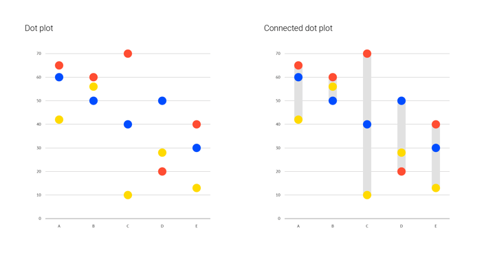
Adding a connector
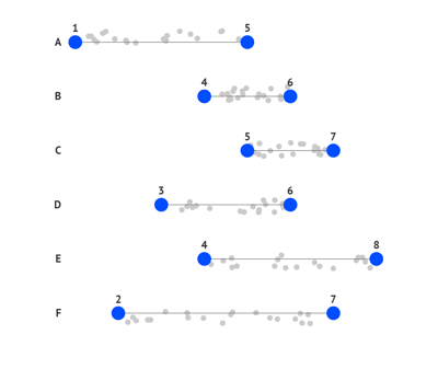
When all your dots are plotted, you can decide to add a connector between the first and the last dot of a category. If a dot plot has two values per category, we speak of a dumbbell chart, if it has more, we speak of a connected dot plot. Adding this connector is not just an embellishment, it actually adds another focal point to the chart. In a dumbbell chart, it emphasizes the delta between the two values: it helps you compare the size of the difference between the two values across all categories. In a connected dot plot, it adds a focus on the range between the minimum and the maximum value of the category.
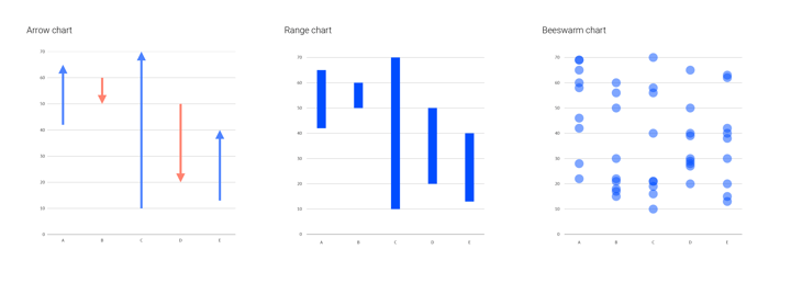
Variations on dot plots: range charts and beeswarms
But you don’t necessarily need to have these dots to focus on a delta or on the range. Technically, they aren’t dot plots, but range or arrow charts are very closely related to the dot plot, and especially to the dumbbell chart.
A range chart can be seen as a dumbbell chart, but without the dots and an arrow chart is actually a dumbbell chart of which the dots are replaced by arrowheads that point in a conditional direction.
Another closely related chart is the beeswarm. A beeswarm chart is a dot plot with "a lot" of values per category. These values are each represented by one dot, and the swarm of dots represents the distribution found in the data. Instead of packing them in bins, the dots are scattered around each other.
What makes a good dot plot
Coloring dot plots
A dot plot can be a pretty simple chart. Its minimum pack is categorical and numerical dimensions and a fixed size mark. Color is the thing that adds the edge to this chart particularly when designing data-driven slides in a pitch deck presentation. It might be used to place simple accents, but it can also add a new dimension: numerical, categorical, or even time.
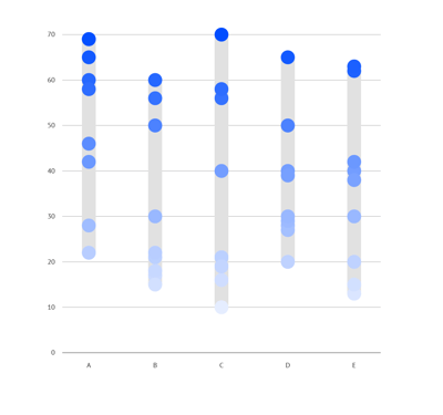
1. Numerical: coloring the dots of a dot plot numerically emphasizes their position on the numerical axis. It’s a way of double encoding the value.
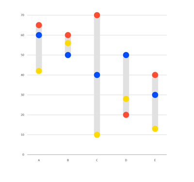
 2. Categorical: coloring the dots categorically adds an extra information layer, it's necessary when you need the ‘score’ of multiple groups on multiple categories.
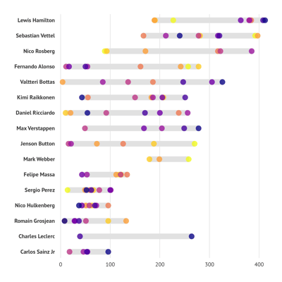
3. Coloring based on time: say, we have chronological values of points gained by a driver in 9 years. We can use a lighter color for the “early” years and a darker color for recent years. In that way, we can see how results were distributed over the given time period.
Combining dot plots with other charts
A dot plot is most suitable for showing a range of values. Combining a dot plot with another chart is a perfect choice for showing more context which may otherwise not be apparent.
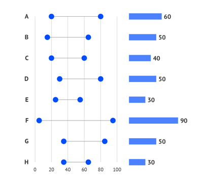
The first example is a bar chart that shows a value of a range. We’ll use a dot plot to show the beginning and end of the range. It’s a perfect combination: a bar chart is the most recognizable and effective chart when it comes to simple values visualization and a dot plot is the best for showing a range.
 The second example is a combination of a line chart and a dot plot. The line chart shows an average value across a certain period of time. The average value could be also a limited indicator, so for some of the timestamps, one might need to see the whole range of values. The dot plot will help us with that.
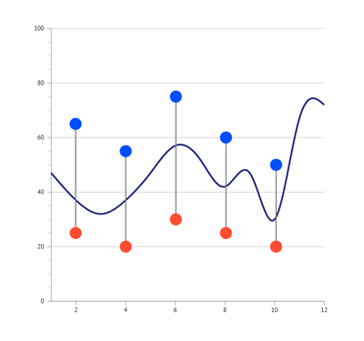 The third example is a combination of a scatter plot and dot plot. In this example the range is the primary information for the viewer, it is used here to have clear boundaries. A scatter plot with transparent marks and some jitter is used to represent the distribution density.
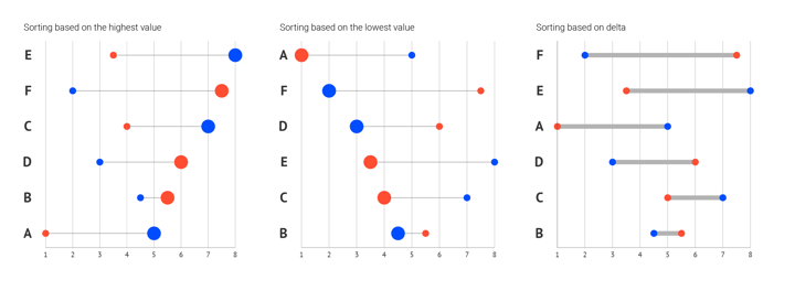
Sorting
Next to styling, you can also use data sorting to emphasize certain categories by putting them first in the list. The most common ways of sorting are based on the highest value, the lowest value, or the delta. If no specific order is required, the categories can as well be sorted alphabetically or even randomly.
Learn more about dot plot variations and alternatives available in Datylon on our dedicated dot plot resource page and check out our dot plot user documentation in the Datylon Help Center.
When you’re ready to create your own dot plot, dive in with the Datylon for Illustrator plug-in. You can choose the perfect dot plot and customize it extensively.
If you have reports including dot plots that need to be generated on a recurring basis, use Datylon Report Server to eliminate manual work. If you need a lot of versions of the same dot plot with different data, Datylon ChartRunner is the perfect solution.
Not sure which tool fits? Book a demo with one of our experts.

Further reading
- Storytelling with data: What is a dot plot
- Data Viz Project: Dumbbell plot
- InfoVis:Wiki: Data-Ink Ratio
Datylon Dot Plot Resources
- Tutorial: How to make a dot plot in Illustrator
- Chart library: Dot plot resource page
- Chart properties: Dot plot properties