The 5 Best Data Visualization Dashboards: Exploring Automated Reporting Solutions
An effective data visualization dashboard helps to promote quick decision-making by telling a captivating story about your data.
Comparing performance and uncovering insights is demanding when you’re handling multiple client projects across various channels. Dashboards simplify this process, helping you avoid errors and hold-ups. Digital marketers, agencies, and their clients regard dashboards as the sole source of certainty. They provide you with the facts through data-driven storytelling and visualization.
Dashboards provide you with a balanced outlook on your business operations, both past and present. Using automated reporting empowers users to generate reports on-demand, delivering the latest information on current activities. Read on as we discuss the best data visualization dashboard designs, their features, and benefits, with helpful examples.
In this article and at Datylon in general, when we discuss dashboards, we'll focus specifically on static dashboards. These dashboards can be automatically generated on-demand or in batches through automated reporting. While interactive dashboards are popular, static dashboards offer a valuable alternative for clear communication and storytelling.
Static dashboards excel at presenting a curated view of your data, guiding viewers through a specific narrative or set of insights. They're particularly useful for reports, presentations, or sharing key findings with stakeholders who may not need to interact with the data directly. Unlike interactive dashboards, static reports offer a focused view, eliminating distractions and ensuring everyone is on the same page.
Additionally, static dashboards can be easily downloaded and accessed offline, making them ideal for sharing via email or including in reports. This portability ensures your insights are readily available whenever and wherever they're needed.
Table of content
1. What is a data visualization dashboard and why is it important? 2. Criteria for evaluating the best data visualization dashboard |
What is a data visualization dashboard and why is it important?
Of all the information sent to your brain, 90% of it is visual. The 70% of businesses finding visualizations crucial in their decision-making process for marketing highlights this fact's significance. A dashboard tracks a variety of data, including key performance indicators (KPIs) and benchmarks for advertising metrics. It presents this information beautifully, using visualizations like graphs and charts.
Dashboards provide you with the tools required to identify and understand patterns, trends, and outliers, and extract insights. They help you to grasp all this data quickly and make informed decisions. Data visualization dashboards help you categorize your insights per client. They make presenting findings easy to follow and digest.
Dashboards using automated reporting provide you with suitable and insightful data, and trends on-demand. They’re a central hub for compiling, and visualizing data from multiple sources, saving you time and effort.
Criteria for evaluating the best data visualization dashboard
An effective dashboard displays useful and actionable information quickly. It eases analyzing, understanding, and presenting important insights by simplifying the representation of complex data.
The best dashboards meet the following criteria:
- Naming standards are logical, distinct, and consistent
- Prioritizes the format and flow of data
- Appropriate margins for readability
- Don’t overload or hide data
- Easy to read and understand
- Essential information is easily accessible
- Displays data clearly on a single page
Key factors of effective dashboard design
There are three key factors you should consider when deciding on the best data visualization dashboards:
- The goals of the project
- The user’s needs
- The data’s nature
Start with clear goals, focusing on the problem you need to solve and the insights you wish to convey. Employ the S.M.A.R.T framework to prioritize objectives that promote effective and efficient execution.
Ask yourself these questions when determining your goals:
- How long will it take for users to achieve a goal?
- Can users reach their goal alone using your dashboard?
- What data do users require to accomplish their goals?
Asking what problem the design will solve is an effective way to define the goal of the dashboard. It helps you gain insights into what characteristics, values, metrics, data, and visuals are important.
An effective dashboard design focuses on solutions to problems. Understand your business objectives and user goals, and communicate important information.
Best data visualization dashboard designs and examples
There are many data visualization dashboard designs, ranging from ESG reports to marketing metrics. You need to know which ones suit your business needs the best.
Here are the top five designs for your business with examples:
SaaS dashboard
Our team takes pride in their experience in building SaaS (software as a service) solutions. That’s why we’ve highlighted this static dashboard.
Datylon’s embedded reporting helps you create a window for workers and team members to view dashboard reports directly in your application.
Datylon also helps you automate your static dashboards so all the relevant data updates on-demand.
A SaaS dashboard is an ideal business tool that allows you to analyze and oversee important data metrics and KPIs. It gives you all the information required to make decisions and optimize your programs based on data.
Features and Benefits
The most important feature of a SaaS dashboard is organizing key metrics. These parameters include sales, development teams, and support, providing executives with an encompassing view of the business.
There are various metrics and KPIs you should always focus on when running a successful SaaS business.
- Monthly recurring revenue (MRR)
- Customer lifetime value (CLTV/LTV)
- Customer acquisition cost (CAC)
- Net revenue retention (NRR)
- Average revenue per user (ARPU)
These dashboards play a pivotal role in the expansion and success of a SaaS business. They function as its core operating system and are convenient for visualization.
Here are the major benefits of SaaS dashboards:
- Elevated decision-making: They provide a comprehensive view of customer behaviors and business operations, allowing you to make data-driven decisions.
- Predictive analysis: SaaS dashboards help you anticipate future outcomes and make driven decisions by analyzing patterns and trends.
- Boosted productivity: They enhance productivity and efficiency by minimizing time spent searching for data, as the dashboard centralizes all the information.
- Enhanced customer experience: A SaaS dashboard helps you recognize patterns in customer activity, allowing for user-based strategies and heightened experiences.
Datylon automates these reports, providing you with up-to-date data on your static dashboards. They can be reproduced regularly, whenever you need them, so you don’t have to keep remaking them. It helps you to improve productivity and make informed decisions faster.
SaaS dashboard example
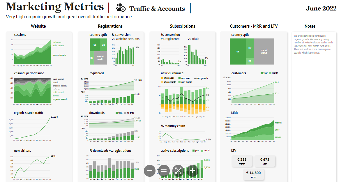
This SaaS dashboard example focuses on traffic and accounts. It highlights several key metrics within various important marketing categories.
Each column showcases certain KPIs, such as channel performance, registrations, monthly churn, and LTV. It also highlights certain countries where customers use their service.
This data visualization dashboard presents the information using a wide variety of charts and graphs. It uses tree maps to display country splits, with colors and sizes highlighting each category.
There are stacked column charts comparing data and line and area charts showing various growths. Each graphic clearly defines the information using accurate labels, axes, and colors.
There’s no overload of data and it’s all accessible. It presents the information clearly with distinct and consistent naming standards for each chart, label, and annotation. The data flows orderly from one graphic to the next.
Marketing dashboard - email performance
Email marketing dashboards are core platforms guided by data. They visualize and merge KPIs for related campaigns, helping you analyze, oversee, and improve advertising efforts.
The primary goal of email marketing dashboards is to help you recognize trends and gauge their effectiveness. The resulting data aids in making informed decisions.
Features and Benefits
An email marketing dashboard offers a holistic view of audience interaction, campaign effectiveness, and return on investment (ROI). It achieves this by gathering data from customer relation management (CRM) systems, web analytics, and email clients.
This data visualization dashboard tracks metrics, like unsubscribe rates, sends, opens, clicks, and conversions. This data helps you determine what content your audience prefers. You’re then able to streamline your targeting and change your strategies.
Email marketing dashboards are vital tools for optimizing the influence and ROI of campaigns. They do this through performance analysis, on-demand insights, and decision-making driven by data.
Email performance dashboard example
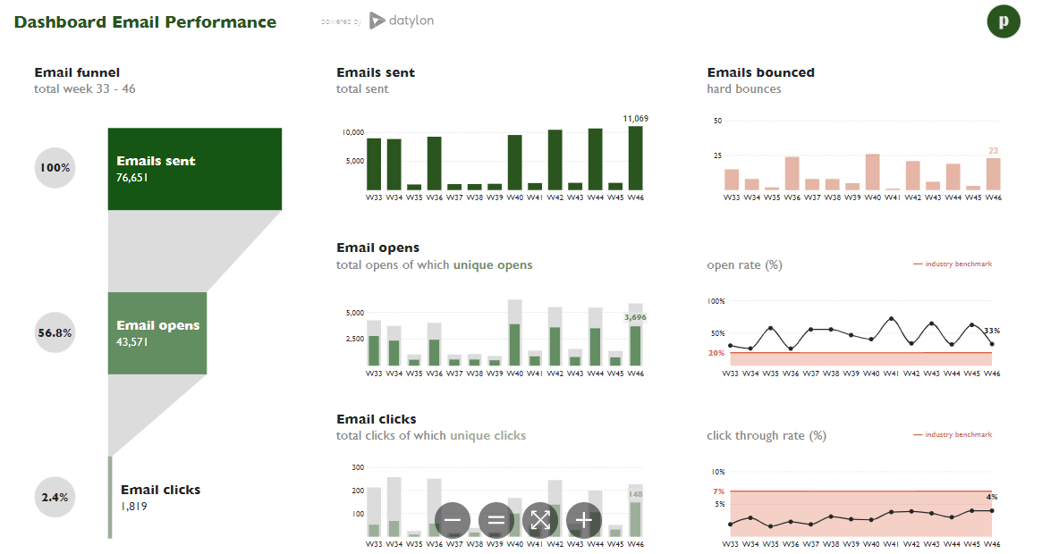
The data visualization dashboard we’re using for this example highlights email performance. It focuses on several metrics, including opens, sends, clicks, and bounces.
It represents each metric clearly in stages. A funnel chart displays email sends, opens, and clicks descending from deep to duller colors.
A series of column charts (overlapping and classic) show data over time and compare between repetitive and unique interactions. The consistency of dulling colors emphasizes the differences.
There’s even a combination of line charts to compare the business’ metrics to the industry standards. All the information is easy to read, understandable, accessible, and uses distinct naming standards.
The flow and naming standards are consistent and it presents data on a single page. All dashboards, charts, and graphs on Datylon’s site are fully customizable. Our automated reporting ensures your static reports stay up-to-date every time you generate them.
 Email performance dashboard example
Social media dashboard
Social media dashboards offer insights into the number of followers, audience demographics, and interactivity. They’re a central hub combining all the KPIs and metrics from your various networks, such as YouTube or Instagram.
Features and Benefits
Social media dashboards display metrics on a single report. It simplifies distribution within your team and eases visualization customization to suit the needs of your audience.
There are several key metrics you can track:
- Followers
- Reach
- Likes
- Content engagement
- Shares
- Post clicks
- Comments
- Average video watch time
- Mentions
- Retweets
- Impressions
Access to insights from these metrics on a single data visualization dashboard helps you make data-driven decisions.
Social media dashboard example
We’re using this dashboard example as it highlights three key metrics over some of the largest social media platforms It focuses on post clicks, impressions, and follower growth over 12 months.
This dashboard displays six social media platforms; Facebook, Instagram, YouTube, Twitter (now X), LinkedIn, and Medium. The charts representing the metrics all use on-brand colors to highlight the data.
It uses two chart types consistently across all social media platforms. This repetition helps to emphasize the significance and relationship of the data.
This data visualization dashboard implements labels with distinct and consistent naming standards. It displays clear, readable, and understandable values and notes. It prioritizes the flow and format of information and presents it all on a single page.
A key piece missing from this presentation is current data. Use Datylon’s Report Server to automate your static social media dashboards and keep information up to date.
 Social media marketing dashboard example
Content marketing dashboard
This dashboard shows you all the critical data relating to the effectiveness of your primary content marketing channels. These platforms range from blogs to YouTube or LinkedIn.
The best data visualization dashboard for this purpose measures virality, reach, impressions, and engagement. It helps you gauge the effectiveness of your content on your audience.
Features and benefits
Here are the most important metrics for measuring the effectiveness of your content:
- Page views
- Impressions
- Post goal conversion
- New subscribers
- Click-through rate
Monitoring your material’s performance and effectively adjusting your strategies requires an extensive content marketing dashboard.
Datylon offers various solutions to ensure you get up-to-date information using automated reporting. We provide you with the tools to generate the best data visualization dashboards for your business needs.
Content marketing dashboard example
This dashboard example emphasizes its most effective content across three platforms and two time periods. It focuses on the best of the month and of all time.
There are only two chart types in this example. It presents the key metrics within a table and displays the publishing timeline using a dot plot. This static dashboard’s execution highlights the customization we offer at Datylon, giving you complete freedom over your designs.
Prioritizing information is an important consideration when exploring the best dashboard designs. This report puts the data first, ensuring everything is clear and accessible.
This dashboard executes flow and format seamlessly. It displays distinct naming standards for the data consistently on a single page. It doesn’t hide anything, nor is it difficult to understand.
 Content marketing dashboard example
ESG reporting dashboard
The best data visualization dashboards are ESG reporting ones. They’re the foundation of every reliable business.
ESG dashboards disclose operations relating to environmental, social, and governance (ESG) areas. They use data to measure a company’s initiatives compared to industry standards and benchmarks.
Features and benefits
Dashboards on ESG provide you with quality insights for informed decision-making. They showcase potential risks and opportunities that may affect the company’s value.
ESG reporting focuses on the outcomes of initiatives, such as corporate social responsibility (CSR) or sustainability. It helps you track how well your business is maintaining its progress toward those goals and make decisions accordingly.
An ESG dashboard has several major benefits:
- It ensures transparency of your company’s progress on sustainability
- Simplifies reporting by presenting all ESG data in a single place
- Improves decision-making and promotes accountability
- Offers schemes for compensation based on ESG performance
ESG dashboard example
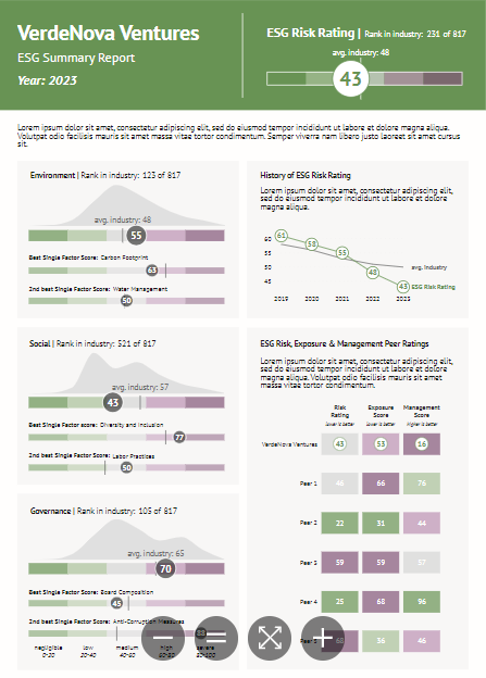
The following dashboard example showcases everything you need in an ESG report. It highlights the overall rank for risk rating as well as the industry average.
This dashboard breaks down each section; environmental, social, and governance. It displays the overall ranking per area and points out categories within them.
The use case makes use of various visualizations to represent the data, including bullet charts, density charts, and line charts. Each graphic uses colors to show the scores on a spectrum from good to bad.
The data in this example is clear and easy to understand. There’s no hidden information and everything flows well. This ESG dashboard highlights the company’s progress compared to its past. It also shows where it stands in contrast to other businesses in the same industry.
Datylon helps you create stunning ESG reports. It also offers the tools to automate static reports as data updates, ensuring transparency and accuracy.
Explore automated dashboard reporting with Datylon
In conclusion, static dashboards play a crucial role in data-driven decision-making by presenting clear, focused insights. They eliminate distractions, provide easy offline access, and offer a streamlined view of your data, making them perfect for reports, presentations, and sharing key findings. Whether for SaaS, marketing, or ESG reporting, a well-designed dashboard enhances the understanding of your data's story, ensuring everyone is aligned on key metrics.
Datylon can help you take this further by automating the creation of static dashboards. With Datylon’s Report Server, you can set up automatic updates for your dashboards, ensuring that the latest data is always reflected without the need for manual intervention. Whether generating reports on-demand or scheduling batch reports, Datylon’s automation capabilities enhance productivity, reduce the chance of errors, and keep your stakeholders informed with up-to-date, accurate insights. This allows you to focus on making informed decisions swiftly and confidently, without being bogged down by repetitive tasks.
Not sure if Datylon is something for you? We offer a 14-day free trial to help you decide for yourself. Or, start by reading our comprehensive guide on automated reporting.
👉If you're keen on crafting custom data visualizations, visit our Bespoke Data Visualization Solutions page.
Julia Vorontsova - Chief Marketing Officer
Julia Vorontsova, a seasoned marketer and the CMO of the company, finds joy in guiding businesses through growth. Based in Belgium, having recently relocated from Canada, she immerses herself in diverse cultures while nurturing her passions for travel and jazz.
