Margaret Bonds was a fascinating and truly talented woman. Born in Chicago in 1913, she was only five years old when she wrote her first musical composition. Her father was a political activist and her mother was a church musician. Bonds eventually rose to fame and gained recognition in the United States as a composer and a performer.
An important moment - for her and for the American orchestras - came on June 15, 1933, when she performed with the Chicago Symphony Orchestra (the very first African American person in history to do so). Throughout her life, she often promoted the music of black musicians and frequently addressed racial issues in her own field of work.
But despite her many career achievements and famous compositions, American orchestras have rarely included Bonds’ compositions in their concerts. In fact, women composers and composers from underrepresented racial and ethnic backgrounds have been frequently absent from the musical repertoire of U.S. orchestras for many years.
On a quest to investigate
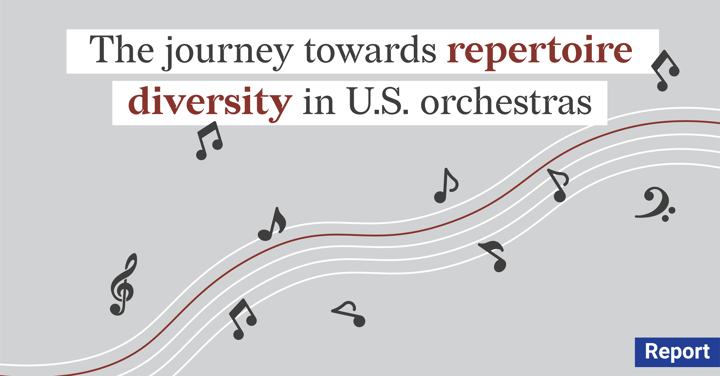
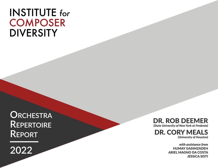
So how much are the historically excluded groups represented in the repertoire programming of professional orchestras today? A good person to ask this question would be professor Rob Deemer, the Head of Composition at the State University of New York at Fredonia. Deemer is also the founder and director of the Institute for Composer Diversity. The institute’s mission is to “encourage the discovery, study, and performance of music written by composers from historically excluded groups.”
Together with his colleague Dr. Cory Meals and with the assistance of his colleagues Humay Gasimzadeh, Ariel Magno Da Costa & Jessica Sisti, they created a very comprehensive, sui generis ‘2022 Orchestra Repertoire Report’ that was launched in June 2022. The report can be accessed here.
The report itself focuses on works by female composers and composers of color as well as living composers from all gender identities and racial/ethnic groups. It is an assemblage of data collected from repertoire programming schedules in the United States between 2015 and 2022.
“Our resource initiatives provide conductors, performers, educators, researchers, media programmers, and music distributors tools with which they can make data-informed and model-based decisions on how best to diversify their programming and connect with their audiences and students.”
A resurgence in diversity
The report is a veracious account of the growing diversity in the orchestral repertory. It tells an interesting (data)story of a positive change in the representation of these historically excluded groups in American professional orchestras, and thankfully, it highlights some really important changes:
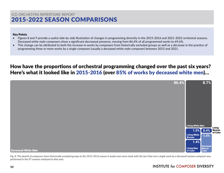
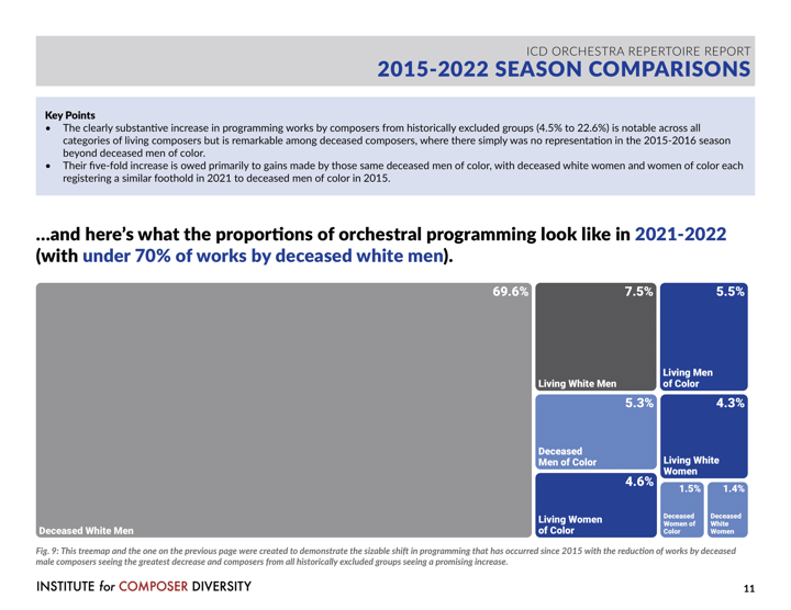
- Programmed works by women composers and composers of color increased overall from 4.5% in 2015 to 22.5% in 2022.
- Programmed works by living composers increased overall from 11.7% to 21.8%.
- Correspondingly, programmed works by deceased white male composers decreased from 86.4% to 69.6% between 2015 and 2022.
The report is also beautifully designed. Consistent with general guidelines for effective data visualization, it adheres to the Institute’s branding color and engages the audience with storytelling. The choice of quite interesting types of charts in the report, such as treemaps, scatter plots, and line charts, is not accidental. Having a musical background, Rob Deemer is not a designer himself. Yet, encouraged by the League of American Orchestras, he was able to lead a project that required him to learn in-depth about data visualization. After that, it was only a matter of finding the right tool to design the charts and graphs for his report.
Telling a powerful story with data
A layout of Rob’s report was prepared with Adobe InDesign. He then used Datylon for Illustrator, a chart maker plug-in for Adobe Illustrator to make his fit so well into the report design. The plug-in allowed him to create an array of reusable charts with full freedom of design to tell his data story.
As already mentioned, orchestral performances are increasingly inclusive. But follow-up research needs to be conducted in the near future to track further changes. This will help understand whether the positive change is only temporary or if it is a long-lasting effect of increasing societal pressure and increased awareness. Rob already announced his plans to continue the project.
Thanks to using the power of Datylon Report Studio, the creation of future editions of the report will be easier and much more efficient. With the report template, Rob and his team can easily update the report with new data, saving time on the redundant re-design process and thus increasing productivity. This allows him to continue telling the story with data in years to come.
This is also a great example of how automated reporting through Datylon Report Server could potentially add even more value. The server enables recurring reports to be generated automatically by connecting the template to a data source, removing manual tasks and making the process far more efficient.
If you would like to understand the full design workflow behind this and similar projects, we invite you to book a free demo session with one of our solution architects. You can easily try Datylon for free and take your data stories project to the next level.
👉If you're keen on crafting custom data visualizations, visit our Bespoke Data Visualization Solutions page.
Further reading & resources
- America’s orchestras get serious about diversity.
- Lack of diversity in top orchestras remains a major challenge for musicians of color.
- U.S. Orchestras playing more works by women and minorities, report says. - The New York Times.
- The survival rates of chess pieces in a divergent visualization. - See why you don’t have to confine yourself to classical charts.