To recap: Sarah Leo, Visual Data Journalist at The Economist, wrote a great article on how even media powerhouses like The Economist sometimes fail to get the data essence across as correctly as possible with their choice of data visualization.
Their faux pas would range from confusing to downright misleading charts, data crimes that weren’t purposefully committed and oftentimes only became evident after the facts. She went on to illustrate a handful of said crimes, discussing the main pain points before presenting the reader with new and improved versions of the charts in question.
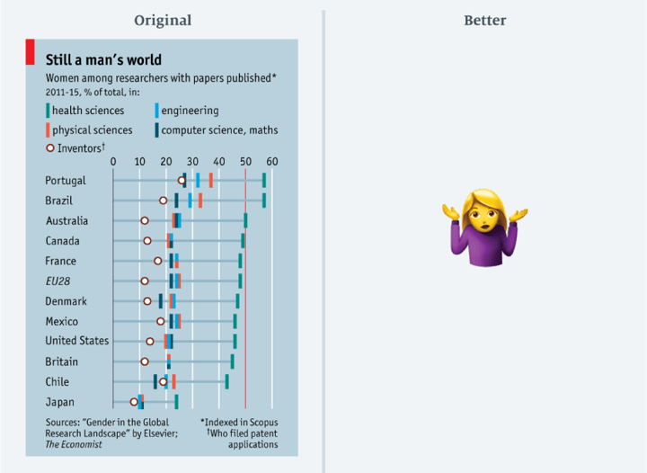
The original version of 'Still a man's world'
There was one chart, however, filed under "Charts that conceal their point - Lots of data, not enough space” that Sarah decided not to correct (we feel your pain, Sarah, and have a similar set of charts filed under “Mo’ data, mo’ problems”). Instead, she sent out a Bat-Signal to all the data viz enthusiasts out there in the interverse.
We might not be Batman but we do have our in-house Superwomen power when it comes to chart design. And when we heard that the story behind the data was about how scientific publishing is dominated by men, there was no amount of kryptonite that could keep us from answering the call. The result of which can be seen in the image below. And you can download it here if you like.
'Still a man's world' - redesigned by Datylon
The new design was made in Datylon for Illustrator. It is also part of our Inspiration & Demo charts, where you can find many interesting chart designs, edit them and download them in your preferred file type.
Our goal here was twofold: we wanted to calm the visuals whilst maintaining the essence of the data points and consequently, get the point across as clearly as its title “Still a man’s world” states. The values might not be as specific as in the original chart, but it still roughly illustrates the gender discrepancy per field and country.
It’s a high-level visual that shows a general overview of the complete data set, with a 50% mark put in place to identify which countries are rocking gender equality at least in some scientific fields and which seem to be suffering from a serious lack of female representation (yay Portugal, not-so-yay Japan). Of course, comparisons between and within countries are more accurate on a numerical scale but it also makes the chart rather unreadable.
If you want the reader to see the big picture, you sometimes have to take a step back and let the details speak through the whole. We invite all readers, and of course, Sarah Leo herself, to share their thoughts on our revision of the chart. Does this more general chart still get the most important data points across? Has it freed up enough space to make the data digestible?
Send out a Superwoman-Signal and let us know. Any dialogue that improves data visualization techniques is a dialogue worth having.
Sources & Contributors
- The Economist
- The Medium blog post "Mistakes, we've drawn a few", by Sarah Leo
- Alternative chart designed by Leenke De Donder
- Creative copy by Gayaneh Oskanian