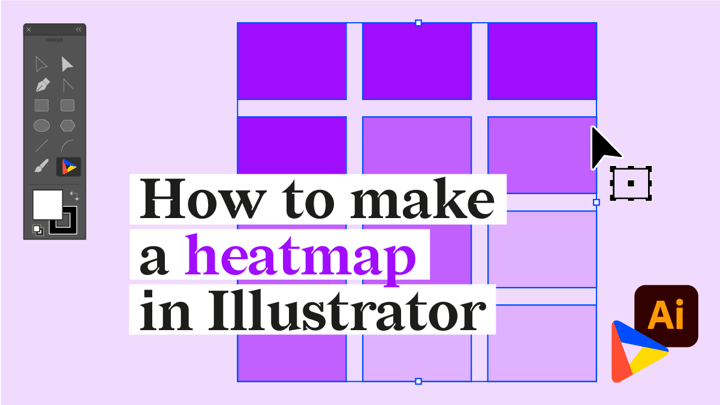
Lately, we’ve been writing a lot on heatmaps: how they work, how you should use them, and what to take into account when designing them. But we haven’t really talked about how you can actually make one in Illustrator with our Datylon chart maker plug-in.
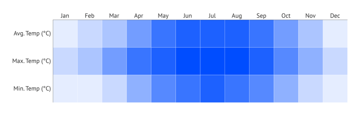
That’s why we’ll design a chart together with you, step by step (you can download the data here!). We’ve chosen to make a heatmap that visualizes the evolution of temperatures at the North Pole and the result will look like this ⤵️.

Download and install the plug-in
For this tutorial, we assume you have already downloaded and installed the Datylon for Illustrator plug-in. If not, you can read how to do so in our setup guide. |
So buckle up and follow these steps to create this heatmap with Datylon for Illustrator. You can continue reading below or you can also watch the tutorial video here:
Table of contents
|
Step 1: Drawing the chart area
First off, we’ll need to draw the chart area by selecting the Datylon icon in the AI toolbar and drawing a rectangle that more or less fits the desired dimensions of the heatmap. Don’t worry if you are not yet sure about the size of the heatmap: resizing charts in Datylon does not resize elements like axes and labels. It only resizes or redistributes the data-driven elements.

By releasing the rectangle, the Datylon pane will appear.
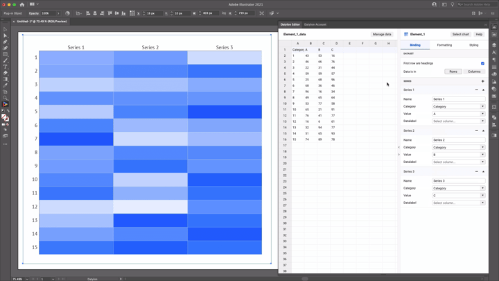
Select the right chart type in the chart library by scrolling down a bit and clicking on the heatmap card. Make sure you click the card and not the select button. Clicking ‘select’ will immediately select the first default chart of that chart type and that might not be what you want.
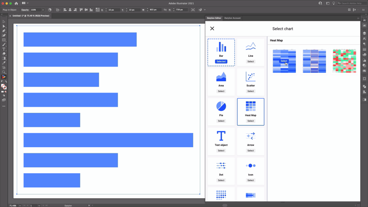
Default charts serve as starting points to help you design your chart. They have different styles, elements, and a number of series applied. So if you already know where you want to go with the design, these defaults could help you get there faster. In the case of the heatmap, we can choose between 3 default charts. The first one is the most generic chart showing a heatmap with some columns and rows. In the second default chart, we see that one column is highlighted. The third default chart has more columns and has a red-green diverging palette applied.
For this tutorial, we’ll go with the first default chart.
Step 2: Adding data
Once you have selected your default chart, the Datylon editor appears. On the left you can see a data pane, on the right you can see the editor. The editor in itself contains a binding tab, a data formatting tab, and a styling tab.
But let’s take a look at the data pane first. There are 3 ways of adding data:
- You can start from a dummy sheet/an empty sheet and copy-paste your own data into it.
- You can upload a file from the Datylon Report Studio if you have some data stored there.
- You can upload a locally saved file.
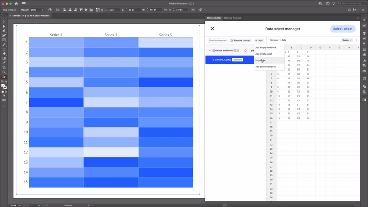
We are going to use a file we have saved locally. Simply click Manage Data > Add > Import File and browse to find your data sheet. Add your sheet and click ‘Select Sheet’.
In our design, we are adding data about temperatures on the North Pole. If your data would contain dates or times, currencies, or other special data formats, the formatting tab helps you handle these data types. Our data is already in the correct format, so we can completely skip this tab.
Once the update is complete, we see that the heatmap is updated with the new data. We currently have 3 rows and 3 columns. In our design we want the rows to communicate minimum, maximum, and average temperatures, and the columns to communicate the months.
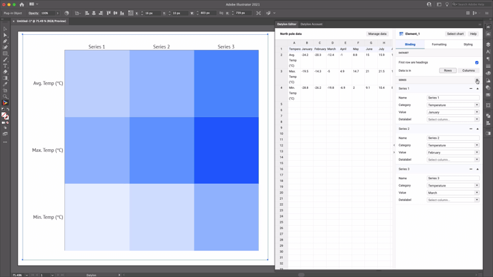
Although we clearly see all months represented in the data, we don’t see those in the heatmap yet. Let’s look at the binding pane to see what is going on.
Step 3: Binding the data
Binding data is a very handy concept in data visualization. It lets you define which data drives which visual cue. Some data could drive size, some data could drive position, some data could drive color, etc.
Our default chart had 3 series which we can see in the binding pane. Category is in each series bound to the ‘Temperatures’-column, but Color is per series bound to another Month column. To end up with a heatmap that has as many columns as there are months, we need to add as many series as there are months.
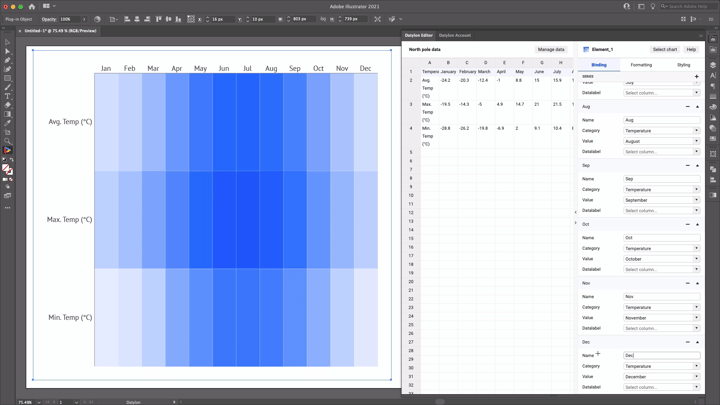
So let's add 9 more series and bind Color to a new month in each series.
Now, to make sure that each column has a month label, we’ll also need to update the series names. To save space and avoid label overlap, we’ll change the series names to the first 3 letters of every month.
The result should look like this:
The basis of our heatmap is done! Let’s see how we can improve the styling.
Step 4: Styling the heatmap
First off, let’s resize the heatmap a bit, so it looks more like the example we have in the beginning. As we said before, resizing the chart, by pulling a corner of the chart box, does not resize the font, but it redistributes and resizes the data-driven properties - in our case: the cells.
You can also now close the data pane to save more space. We don’t really need it anymore from this point on. To do this, click the >-button on the border between the data and the styling pane.
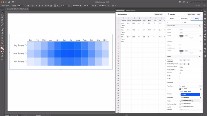
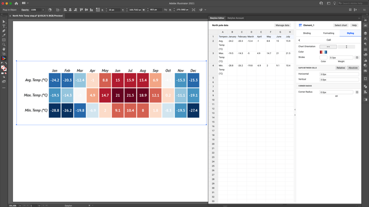
Let’s look at the styling of our labels. We see we already have two types of labels applied: the x-axis labels and the y-axis labels. We’ll leave the y-axis labels as they are, but we want to make the x-axis labels bold and italic to differentiate them a bit more. To do this, go to X-Axis > Labels > Character > Typeface and select PT Sans Bold Italic.
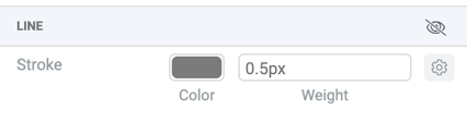
You can also see some kind of black axis line that doesn’t really serve a purpose in our design. Let’s 'unapply' this line by clicking the eye-icon on X-Axis > Line. Let’s do the same on the Y-axis.
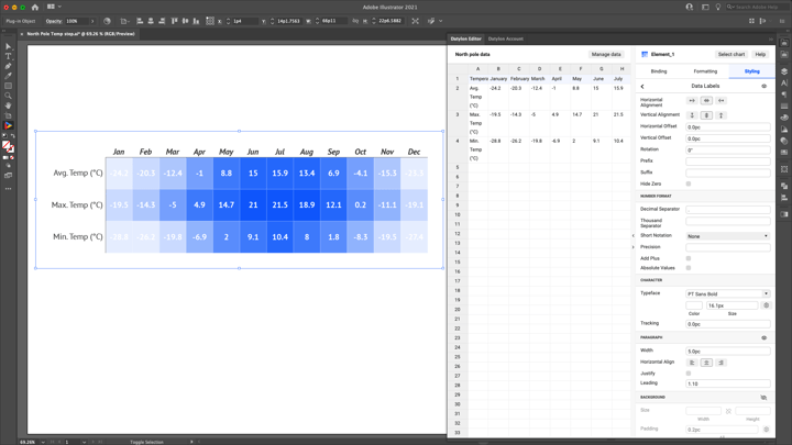
Apart from these two label types, we want to apply a third type: the data labels. These labels will specify the values of the cells more directly. To do this, go back to the menu of the styling tab, go to Data Labels and apply the labels by clicking on the eye-icon. Let’s make them bold and white by selecting PT Sans Bold as a typeface and by opening the typeface color picker and clicking on the white swatch in the Solid Library. We can make the font size bigger to make the labels more readable.
To change the color of the cells, go back to the styling menu and select ‘Cell’. In this property group, when opening the ‘Cell’-Color Picker, we see we can also pick palettes instead of solid colors. Scroll down a bit to the palettes in the ‘DIVERGING D3’ palettes section and select the red-to-blue palette.
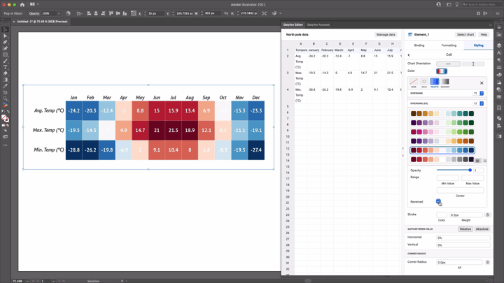
As it makes more sense for low temperatures to be blue and high temperatures to be red, we will also apply ‘reversed’ to reverse the colors of the palette.
Finally, we’ll add some more spacing between the cells by going to Cells > Gaps between cells and clicking on the ‘absolute’ button. Here you can apply a number of pixels that creates a gap between the cells.
Step 5: Using and sharing
And there you have it! We created a completely data-driven heatmap in Illustrator. To annotate this chart, you can add titles, subtitles, and other annotations via the Illustrator type tool. Once you are happy with your design, you can export this chart as an image like you would do with any other Illustrator design and use it in all kinds of tools like Powerpoint, Word, etc. You can also add the AI file to your Indesign documents and when updating the chart in AI, the link will make sure it is also updated in the Indesign document.
Step 6: Datylon Report Studio
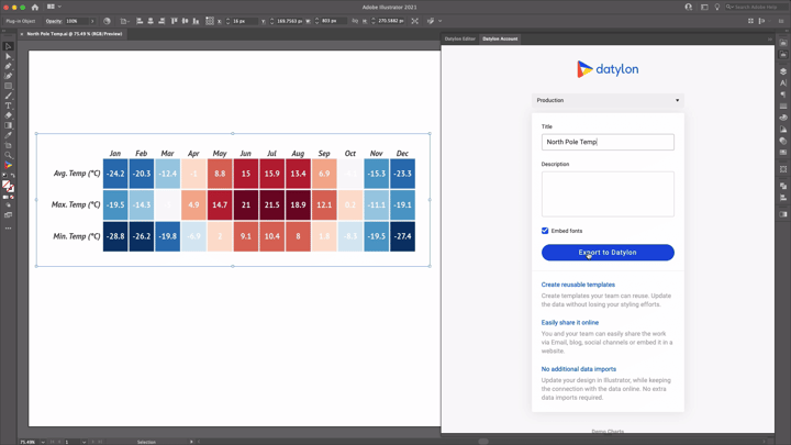
You can also export this chart to our Datylon Report Studio and start collaborating on the template.
To do this, open the Datylon Account pane in Illustrator via Windows > Extensions > Datylon Account. Use your credentials to log in, give the chart a title and description, and export it to the Datylon Report Studio. From here, you can easily receive and manage data, reuse your template by updating it with new data or share the design by publishing it for the world to see!
Datylon Heatmap Resources
- Blog: Deep dive into... heatmaps
- Chart library: Heatmap resource page
- Chart properties: Heatmap properties