
Chart types can sometimes be summarized into one iconic example. Think about the global warming hockey stick chart or the charts by Florence Nightingale, who even had a chart type named after her (#goals).
In the case of heatmaps, this iconic example for me would be this measles vaccination visualization, by The Wall Street Journal. The chart is very straightforward, and its strength lies in its simplicity: it shows the number of reported measle cases per 100k people, for every state in the US, throughout time. At one point on the date axis, we see annotation for when the vaccine was rolled out. The effect it has on the number of reported cases is undeniable.
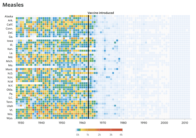
This example uses everything that a heatmap is good at: it gives an initial view of the data and lets you explore information in a wide range. It shows patterns, trends, and correlations that give rise to further opportunities to show more specific data or identify outliers. It does this by letting you quickly skim the visual and by leading to where the action happens: at the highly saturated, bright colors that at one point quickly turn into muted and pale blues.
➡️ Discover our heatmap resource page with more helpful information, design tips, and tools.
Table of contents
|
How does a heatmap work
Putting data into context
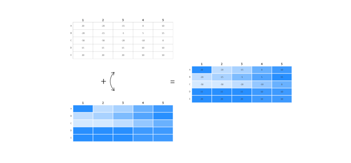
Almost unlike any other chart, a heatmap uses color to convey information. The color serves as a direct representation of the values. Using color is a very natural way of translating information to see patterns, trends, and correlations, but it’s less suited to support detailed analysis of the visualization. But that’s ok. One chart type should not solve all problems.
We can use a heatmap to get an initial view of the data and we can add a time axis to show how the values evolve over time. Although the message of the WSJ heatmap tells a strong story, a heatmap can be seen as an exploratory dataviz technique: it puts the data in context. If you want to compare values with each other and define how big one is compared to the other, it’s best to choose another chart type. A heatmap can serve as a perfect starting point to get the lay of the land and it gives hints on where to look in the data for outliers, other viewpoints, or specific angles. Combining a heatmap with other charts might be a good idea if your goal is to tell a more detailed story.
Shapes of heatmaps
In our iconic measles chart, the heatmap has a tabular shape like a matrix. The Y-axis contains one or more categories that can be combined with either another categorical axis, a numerical axis, or - as said - with a date/time axis. It’s this matrix layout that makes it possible to find correlations in the data.
If you do want to add an extra layer of detail to your heatmap, you can add data labels to every ‘cell’ in the matrix. This also works the other way around: if you have a flat table or data sheet, adding a color layer to the values can instantly help the readability and comprehension of the data.
Apart from being a chart with a tabular/matrix layout, the term ‘heatmap’ is also used in cartography. In this case, the ‘map’ in ‘heatmap’, can be taken quite literally. A layer of color is placed on top of a map, to show the density of a value at a certain place or area.
This type of geographical heatmap is not to be confused with choropleth maps. In choropleth maps, colored regions correlate with geographic or artificial boundaries. The color shows a proportional value, such as an average, for one of those delineated regions.
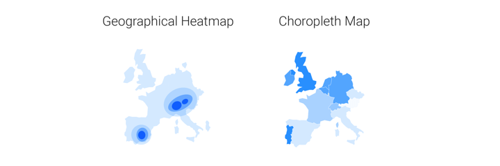
Choropleth maps can be easily translated into other charts. In a bar chart, for example, one bar could equal one region with a certain value. In geographical heatmaps, this spatial aspect is not that replaceable. Here the size or density of the colored area is less strictly defined, making the cartographic approach indispensable.
If all this isn’t already confusing enough, we could also debate which of the two types of maps is actually closest related to a tabular heatmap as far as visualization concepts go. Even if a tabular heatmap has a numerical or date/time axis, the cells in the matrix suggest binned values. The colors might be applied continuously, but the mark that they are applied to are discrete: the colors do not flow from one cell into another, there is a clear boundary. So a geographical heatmap might have the same name as a tabular one, conceptually a choropleth map lies closer to the tabular heatmap.
Color scales in heatmaps
Since color is of such importance in a heatmap, using the right palette is essential. We can distinguish 3 types of palettes: a categorical, a sequential, and a diverging color palette. Both the sequential and the diverging color scale are seen as numerical scales.
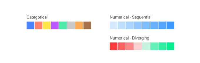
Choosing the type of scale depends on the type of data and on the level of detail you want your reader to have.
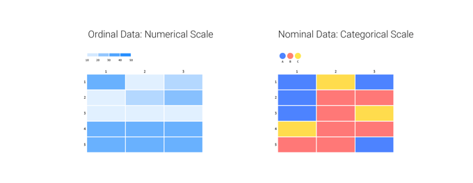
If your data has an order to it, meaning that it is somehow sortable, a numerical scale is the one to go with. If the data is nominal, you should choose a categorical one.
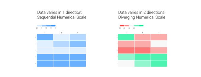
When the data only varies in one direction, a sequential numerical scale is the best choice. When your numerical data has a logical breakpoint and the data varies in two directions, a diverging numerical scale is the way to go.
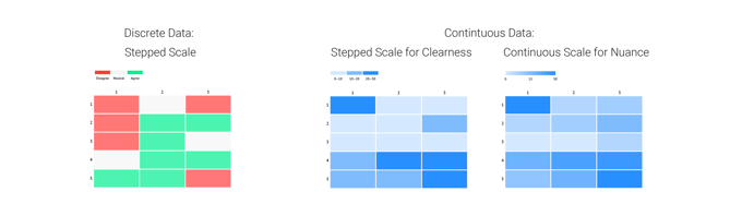
Finally, there is a difference between stepped or continuous scales. With data that is not continuous, but discrete, you should always go for a stepped scale. But with continuous data, we can choose what scale we want. Choosing a stepped scale for continuous data helps you make your point more clear and lets your readers derive values more easily. A continuous scale gives a more nuanced view and allows more interpretation for the reader.
Heatmaps as an ingredient
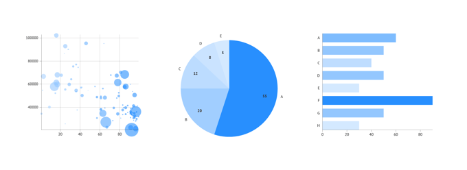
If you like the logic and impact of heatmaps, and you think of dataviz rather as ingredients than as a recipe, we could also take this a bit further and say: a heatmap is not actually a separate chart type, it’s a colored layer, that can be placed over almost any other chart. We already mentioned adding that layer to tables and maps, we could also do this for scatter plots, pie charts, bar charts, treemaps,...: coloring those charts numerically would use the same logic and would have the same impact as a ‘regular heatmap’: it shows you where the density of the data is highest and where to look for outliers and explanatory angles.
In other words, heatmaps are more than just another chart type. You can see them as a visual cue to add to other charts. Understanding these mechanisms that make a chart work, lets you also use those learnings in other chart designs.
With Datylon, you can use the heatmap as an independent chart type, or you can apply numerical coloring to every chart type that supports it.
Learn more about how to design heatmaps on our dedicated heatmap resource page and check out our coloring guide in the Datylon Help Center.

Further reading
- Storytelling with data: A heatmap makeover
- Randal S. Olson: Revisiting the vaccine visualizations
- Well-formed data: On the role of bacon in visualization
Datylon Heatmap Resources
- Tutorial: How to make a heatmap in Illustrator
- Chart library: Heatmap resource page
- Chart properties: Heatmap properties

