Datylon
  • Solutions
    • Chart Design
    • Report Design
    • Automated Reporting
    • ESG Report Publishing
    • Embedded Reporting
    • Bespoke Dataviz Solutions
    • Datylon Foundry - Software Services
  • Products
    • Datylon for Illustrator
    • Datylon Report Studio
    • Datylon for PowerPoint
    • Datylon ChartRunner
    • Datylon Report Server
  • Pricing
  • Resources
    • Help Center
    • Inspiration
    • Chart Library
    • Blog
    • Customer Stories
    • FAQ
  • Contact us
Sign in
Explore free options
Blog> Food For Thought

ReVIZiting the humble supermarket receipt

SHARE

supermarket receipt dataviz data visualization

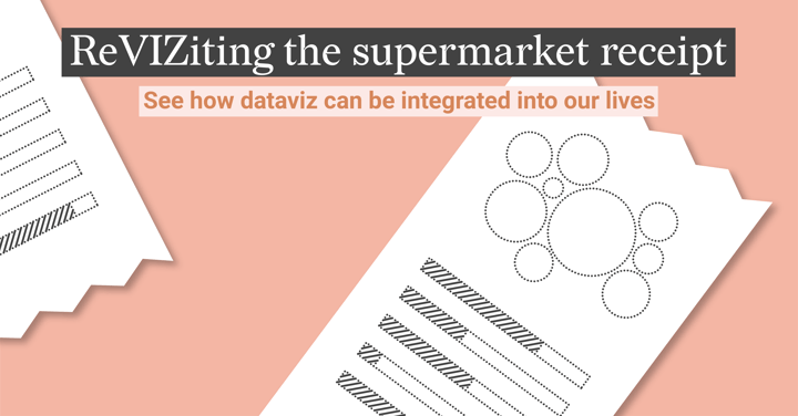
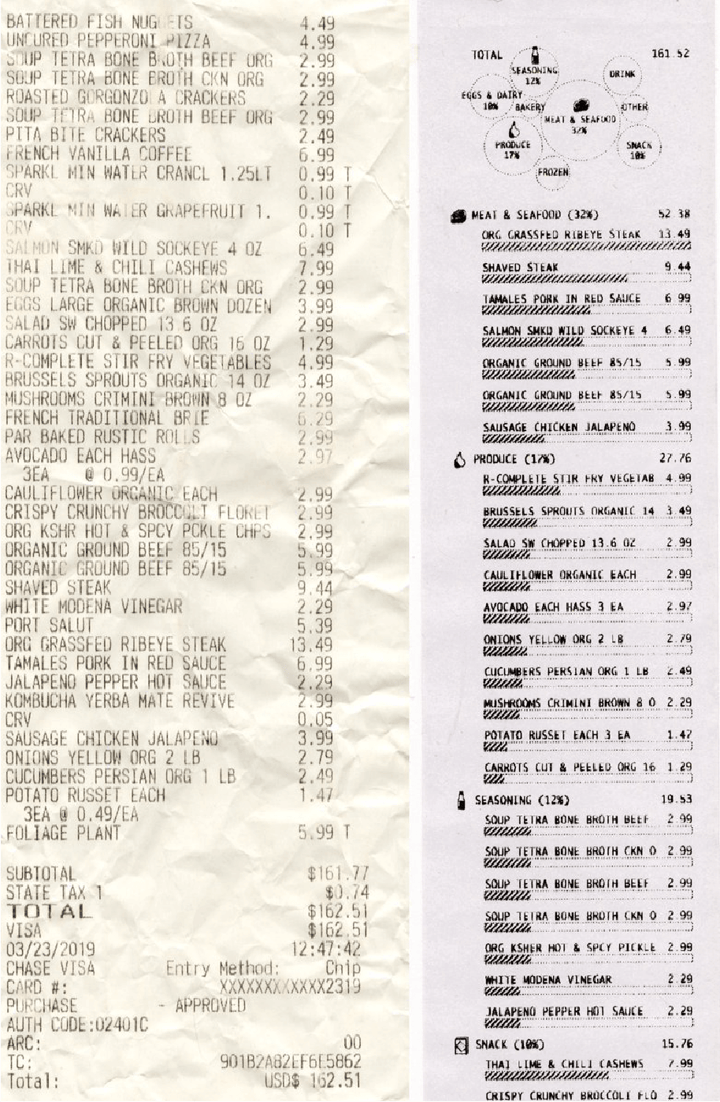
A while ago, Sussie Li (@DataToViz) shared on Twitter a prototype for a reconditioned supermarket receipt. The tweet was met with various reactions, so we wanted to add our perspective to the commentary this generated.

Early prototypes of reviziting the receipt, one piece of a larger question I want explore: how can viz be integrated into everyday experiences? pic.twitter.com/hswtVFp0oc

— Susie Lu (@DataToViz) May 4, 2019


Visualizing your spending habits and financial data has become increasingly popular, look no further than the likes of Monzo, Revolut, and Mint as modern examples. But for a store to provide more visualized information alongside the sales summary is a fresh take, building further to engage consumers with their spending habits.

Comments on the prototype were very broad, ranging from very positive to quite negative.

Negative comments questioned putting time and effort into something printed on non-recyclable paper (thermal paper cannot be recycled) and the receipt not being the right channel from a timing and placement perspective to correctly engage. There were also themes against trying to make a receipt useful beyond its purpose of providing proof of the purchase total.

But there were also strong positives to counter the negatives such as where this approach could lead in the digital space, or the possibility to enrich visuals further on categories such as recyclability of products, local products, or blending financial and nutritional motivations to include detail such as the sugar content of purchased items. 

Comparison between the traditional supermarket receipt and the prototype of a revisited receipt.

From a Datylon point of view, we like that this dataviz experiment interrogates something which has remained unoptimized for many years. It's not about this version being the endpoint but rather starting the conversation (and that it sure did!) to see where it can lead in adding more value to the end-user.

This prototype is challenging an everyday item, making us stop and question if there is a better approach, especially now that the data and tech are more accessible. We are certainly fans of any innovation that personalizes and exposes the human side of data to influence and produce more informed decision-making.

So in this sense we wholeheartedly agree with Susie’s intention, understanding that this is just part of a much larger investigation on how dataviz can be better integrated into improving and enriching our lives.

And when this starts to happen, change will begin to occur.

See how Datylon uses advanced dataviz & digital expertise to help other businesses and organizations to put their data to work, maximizing their opportunity for data-driven change.

Related blog posts

This featured image shows the 3 steps of creating reports with InDesign and Datylon, 1) designing the layout, 2) adding the charts, 3) updating the data
Report Design, Dataviz Resources, Report Server, Automated Reporting

How to Create Tailored Data Stories and Reports with Indesign and Datylon

Are you tired of manually creating multiple versions of your data stories and reports? And what...

Read more
datylon-blog-Render-Server-ObservableHQ-demo-featured-image
Technical, Report Design, Report Server, Reporting

Creating Captivating Paginated Reports: A Guide to Using Datylon in ObservableHQ

In an earlier article (...

Read more

Subscribe to our newsletter

Receive inspiration, practical advice, customer stories and news right in your mailbox.

Newsletter
Company
  • About us
  • Jobs
  • Contact us
  • Data security
  • Datylon reviews
Solutions
  • Embedded Reporting
  • Automated Reporting
  • Chart Design
  • Report Design
  • ESG Reporting
  • Bespoke Solutions
  • Development Services
Product
  • Datylon Report Studio
  • Datylon Report Server
  • Datylon for Illustrator
  • Datylon ChartRunner
  • Datylon for PowerPoint
  • Datylon Enterprise
  • Pricing
  • Free trial
  • Release notes
Resources
  • Chart library
  • Inspiration
  • Blog
  • Customer stories
  • FAQ
  • Help center
  • Video tutorials
Create
  • Area chart
  • Bar chart
  • Bubble chart
  • Bullet chart
  • Density plot
  • Dot plot
  • Heatmap
  • Histogram
  • Icon array
  • Icon chart
  • Line chart
  • Pie chart
  • Range plot
  • Scatter plot
  • Stream graph
  • Treemap
Learn
  • Tips for report design
  • Do you speak data?
  • Do you speak dataviz?
  • Effective dataviz guide
  • 80 types of charts
  • 9 types of dataviz
  • Best dataviz tools
  • Charts for colorblind
  • Accessible charts
  • Break the rules
  • Dataviz in Illustrator
  • Datylon vs. Illustrator
  • Static or interactive?
  • Outside the box charts
  • Mind your dataviz
  • Data storytelling

All rights reserved. © 2025 Datylon BV

  • Legal Terms
  • Privacy Policy

Manage Cookies