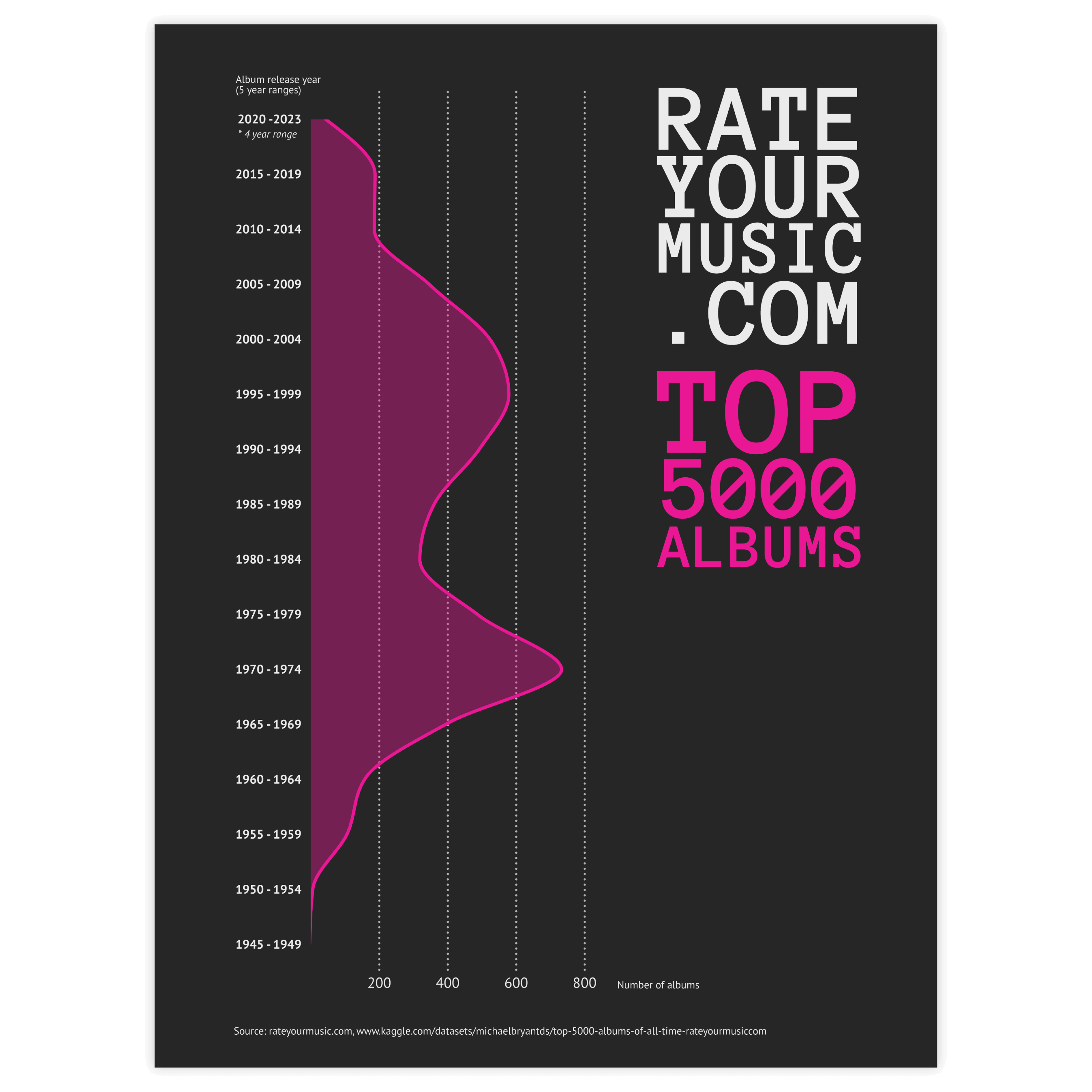
The blue icon represents a density plot

Density Plot

DATYLON > CHART LIBRARY > DENSITY PLOT

What is a density plot?

 
Alternative names: Kernel density plotDensity trace graph
 
A density plot visually resembles an area chart, but its function is quite different. Density plots are used to visualize the distribution of numerical variables over a period of time. Density plots somewhat resemble smooth peaks and valleys plotted between two axes. Every peak represents an accumulated value for the given band. Varying the bandwidth and the degree of smoothing a density plot can look significantly different.
 
Very often, a density plot can be used as an alternative to a histogram. However, because of its smoothness, it’s easier to capture the distribution form of the given data, while in the histogram it is harder to achieve because of the sharpness of bar bins and more issues with bin range choice. Losing the sharp edges in a density plot makes it also visually more appealing.
This visualization shows an example of a density plot. This particular chart shows the height distribution of the top 100 mountains. It also annotates that 21 mountains in the top 100 have a height of 7.4km (4.6miles), and that the highest mountain is Mount Everest with a height of 8.8km (5.5miles).

Variations of a density plot

The charts below are variations of a density plot. To learn how to make them with Datylon, check out the area chart user documentation in the Datylon Help Center.
A yellow icon shows a simplified example of a ridgeline plot with a Datylon icon next to it indicating you can make it with Datylon.
A pale icon (only visible when you hover on the yellow icon) shows a simplified example of a ridgeline plot with a Datylon icon next to it indicating you can make it with Datylon.

Ridgeline plot

A ridgeline plot (also known as a joy plot) shows the distribution of a numeric value for several groups of a category. It is done by illustrating partially overlapping line charts or area charts. This way, the chart resembles a mountain range. The alternative name for a ridgeline plot is a joy plot because this very example above appeared on the first album cover of the British band Joy Division (‘Unknown Pleasures’ from 1979).

A yellow icon shows a simplified example of a horizon chart with a Datylon icon next to it indicating you can make it with Datylon.
A pale icon (only visible when you hover on the yellow icon) shows a simplified example of a horizon chart with a Datylon icon next to it indicating you can make it with Datylon.

Horizon chart

This is essentially a chopped-up ridgeline plot. If overlappings used in a ridgeline are either confusing or take too much space, every chart is sliced into bands of the same height. Then they are colored: the higher the band value the stronger color's intensity. Then they are placed on top of each other – low-value bands – underneath, high-value – above. If placed this way, all the values are visible and take significantly less space.

A yellow icon shows a simplified example of a streamgraph with a Datylon icon next to it indicating you can make it with Datylon.
A pale icon (only visible when you hover on the yellow icon) shows a simplified example of a streamgraph with a Datylon icon next to it indicating you can make it with Datylon.

Streamgraph

While the density plot is placed strictly above the X-axis line, the streamgraph expands symmetrically on both sides of the axis. While it might require a different way of reading, excluding the possibility to see every value precisely, it also allows us to see the form of distribution. Usually, a streamgraph contains several series/categories, but a single-category streamgraph could also effectively be used instead of a density plot.

Alternatives to a density plot

Substitute your density plot with the charts below when you want an alternative representation of the data distribution.
A yellow icon shows a simplified example of a histogram with a Datylon icon next to it indicating you can make it with Datylon.
A pale icon (only visible when you hover on the yellow icon) shows a simplified example of a histogram with a Datylon icon next to it indicating you can make it with Datylon.

Histogram

The first obvious alternative to density plot. It is used for the same purpose – to show the distribution of the data. The bars are used instead of lines. Each bar represents a bin, containing values from a specific range. 

A yellow icon shows a simplified example of a one-dimensional heatmap with a Datylon icon next to it indicating you can make it with Datylon.
A pale icon (only visible when you hover on the yellow icon) shows a simplified example of a one-dimensional heatmap with a Datylon icon next to it indicating you can make it with Datylon.

One-dimensional heatmap

While histogram and density plots use a spatial representation of distribution, the one-dimensional heatmap uses color for the same purpose. These charts are very commonly used to visualize temperatures.

A yellow icon shows a simplified example of a violin plot with a Datylon icon next to it indicating you can make it with Datylon.
A pale icon (only visible when you hover on the yellow icon) shows a simplified example of a violin plot with a Datylon icon next to it indicating you can make it with Datylon.

Violin plot

A violin plot can be perceived as a combination of a density plot (or streamgraph) and a box-plot, showing not only the form of distribution but also the key points of the data: the interquartile range and the median. 

Pro tips for designing a density plot

Learn how to improve the readability and visual appeal of your density plot.
The image shows three types of density plot suggesting the right band sizing. The first two images show the band sizing that is not really recommended and the last one shows the preferred band sizing.

Band sizing

The size of the band works basically the same as bins for histograms: depending on the size of the band the form of the density plot can be changed significantly, so It’s better to follow your data’s logic.

For bins, there’s also a popular way of choosing their size called Sturge’s rule. It can be also used for density plots. The formula is the following:

K=1+3.322 log(n),

where:
K is the number of bands
n is the number of observations in a dataset. 

Two examples of charts of which the first one is really like a stacked area chart, with no overlapping, making it not a good type of chart if you truly want to visualize a density plot. The second chart shows three colored overlappings and it's a perfect example of a density plot.

Overlapping

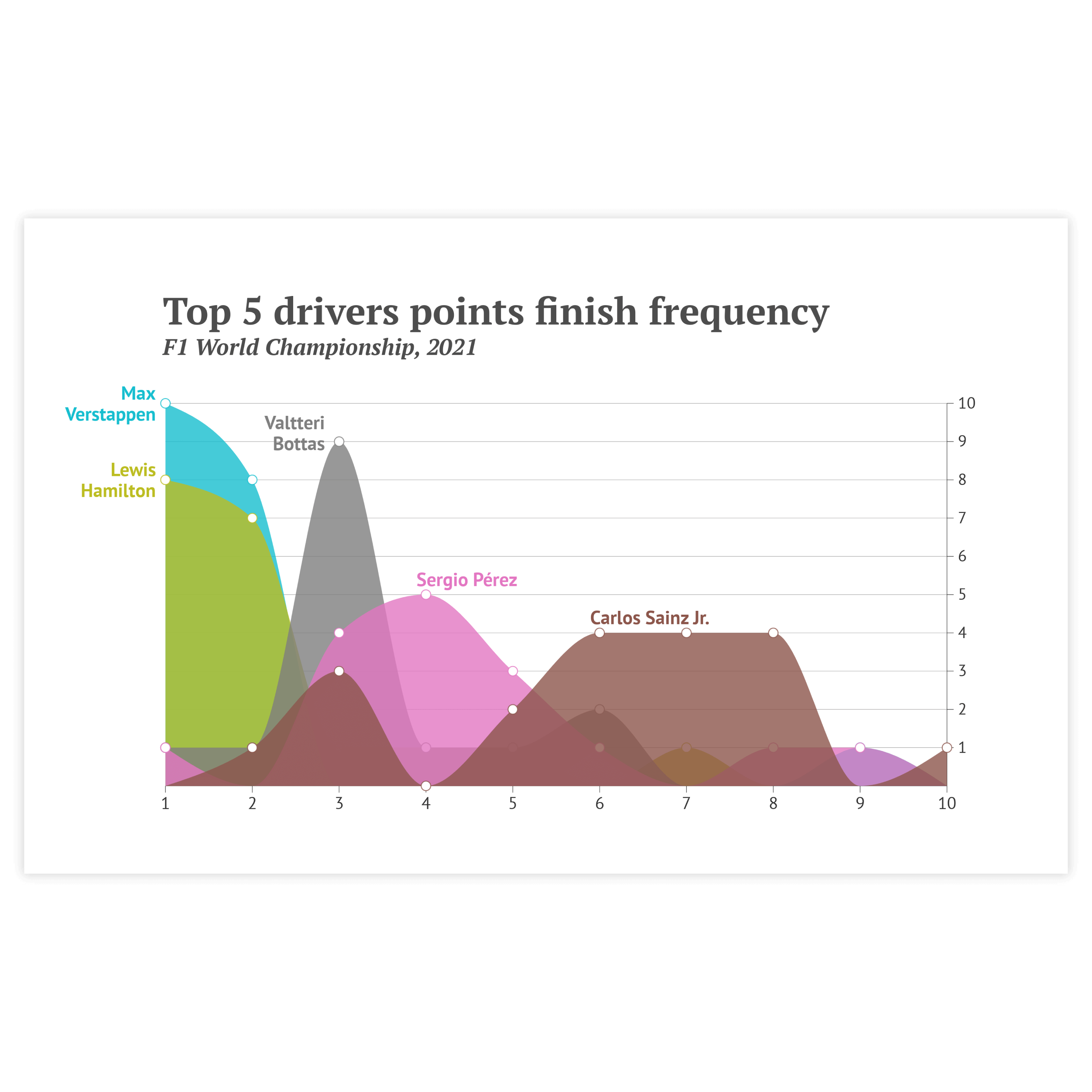
For multiple distributions stacking is not a good solution considering that the form of the 2nd and subsequent distributions can’t be determined. In case of numerous distributions, the best option is to use overlapping areas with reduced opacity. In this case, multiple distributions can be seen at the same time.

Two charts show density plots but the left one has too many colored distributions while the right one has only three, making it a good density plot.

Number of shown distributions

While using overlapping areas for visualizing multiple distributions can be a good solution it’s better not to exceed the number of shown distributions above three as it can introduce visual clutter.

Two charts and both are density plots. But the left one shows overlapping distributions, while the right one shows a mirroring being used as an alternative to overlapping. Both are correct.

Mirroring

As an alternative to overlapping areas for two distributions a mirroring over the X-axis can be a solution. While it can lack a relative comparison of distributions this view is definitely visually cleaner.

Create your own density plot

Join Datylon for free and get started online or download our Datylon for Illustrator plug-in with a 14-day trial. Connect with a Datylon expert for a demo session.

Density plot examples & inspiration

Scroll and click on the images below to find inspiration samples of density plots. With your Datylon account, you can use these designs, customize them and update them with new data. Or start designing your very own density plot!

Discover more charts in our Chart Library

Learn more about the different types of charts and graphs you can design with Datylon. Discover other resource pages in our Datylon Chart Library.