


Bin sizing
The size of the bin is the ultimate customizable option for a histogram, depending on the size of the bin the form of the histogram can be changed drastically. It’s better to follow your data’s logic, but there’s also a popular way for choosing a bin size called Sturge’s rule. It’s used in all major software, but it was criticized for over-smoothing histograms.
The formula is the following: K=1+3.322 log(n),
where:
K is the number of bins
n is the number of observations in a dataset.

Labeling
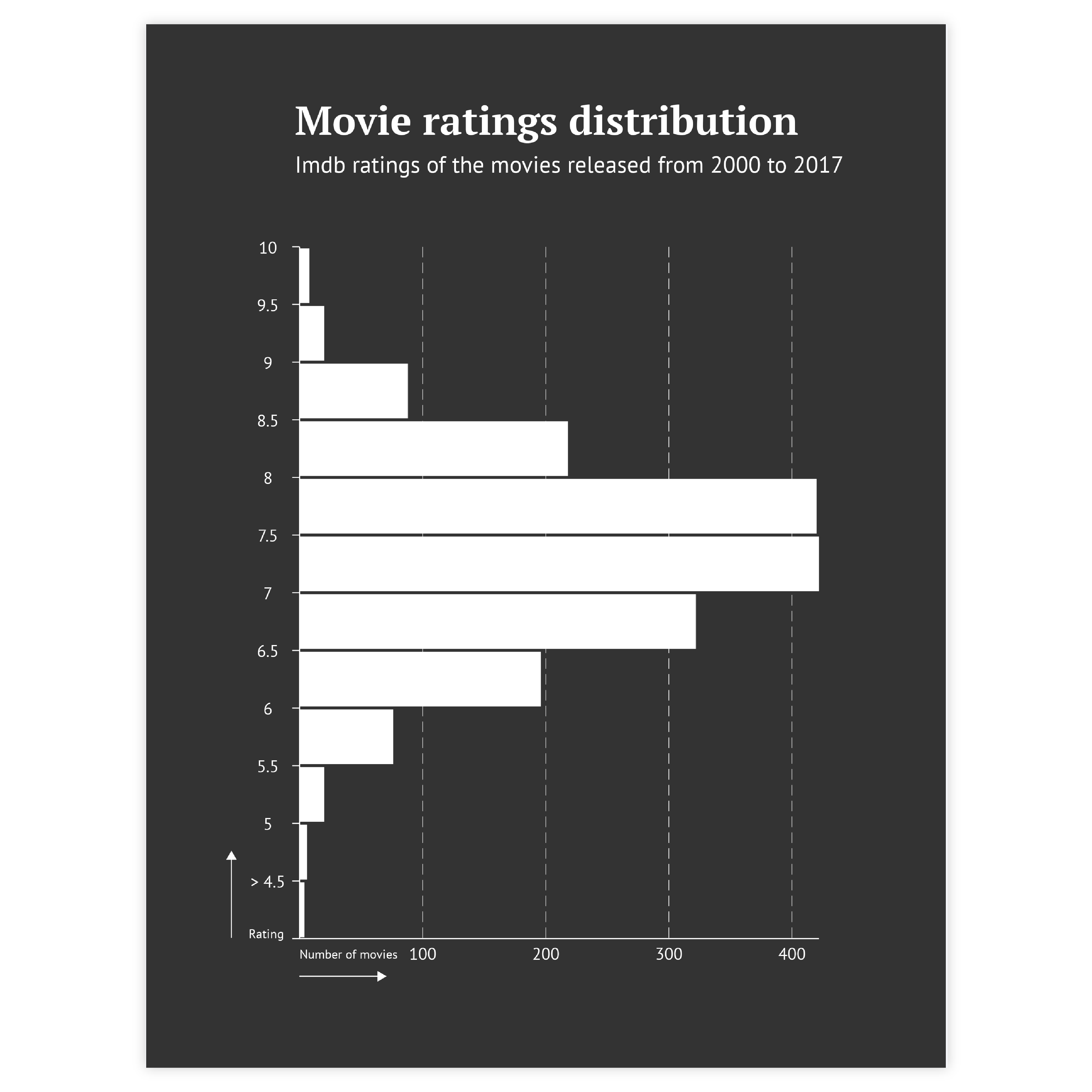
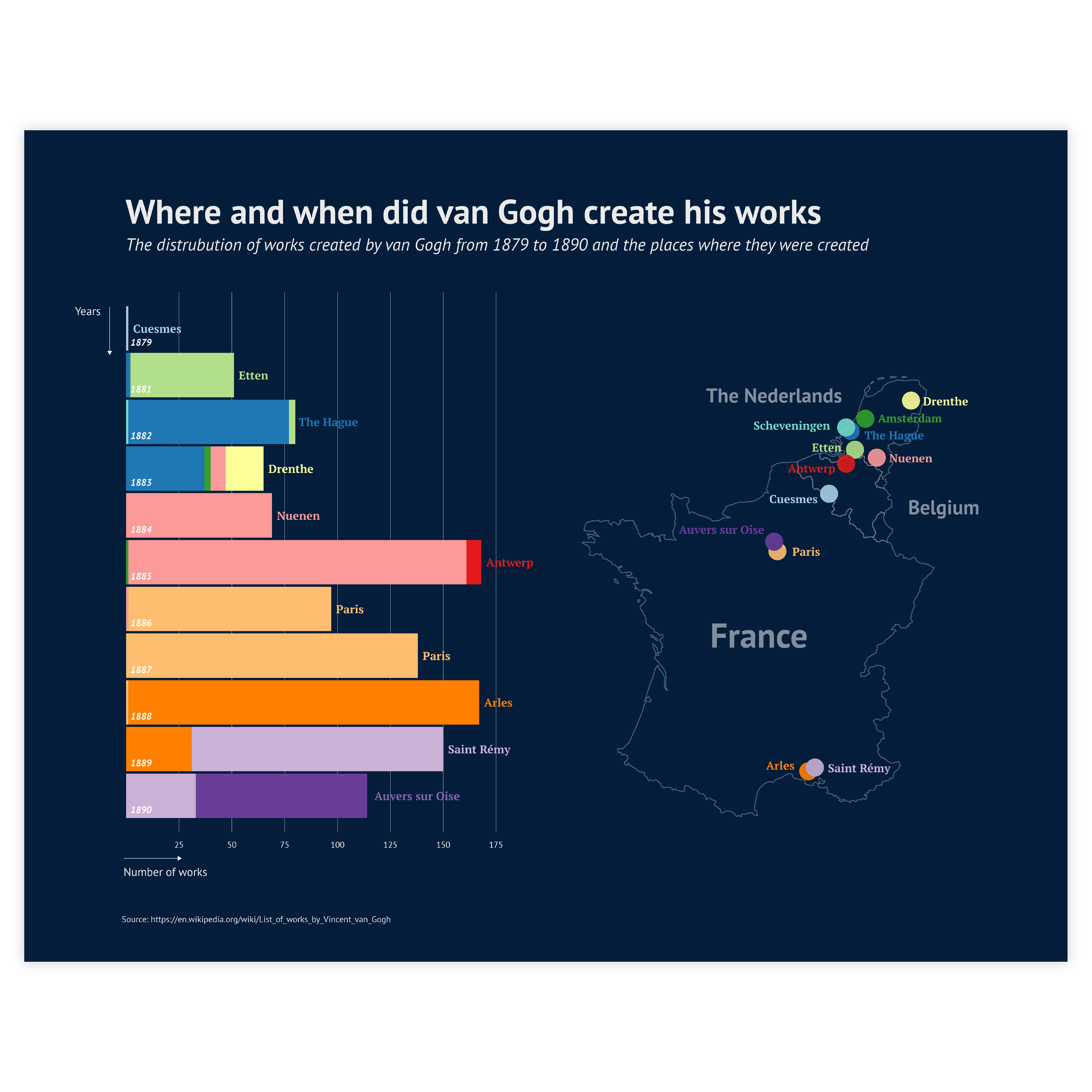
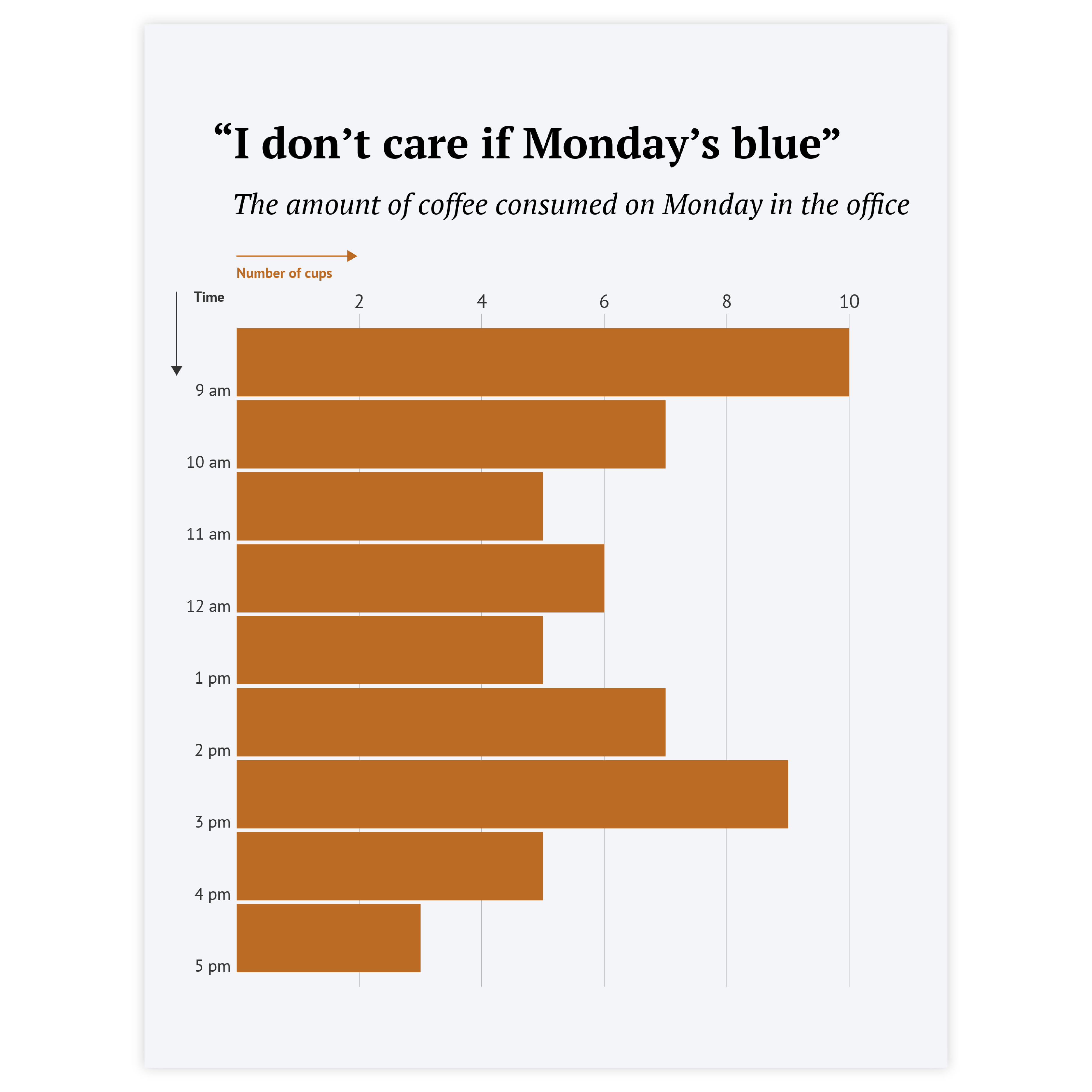
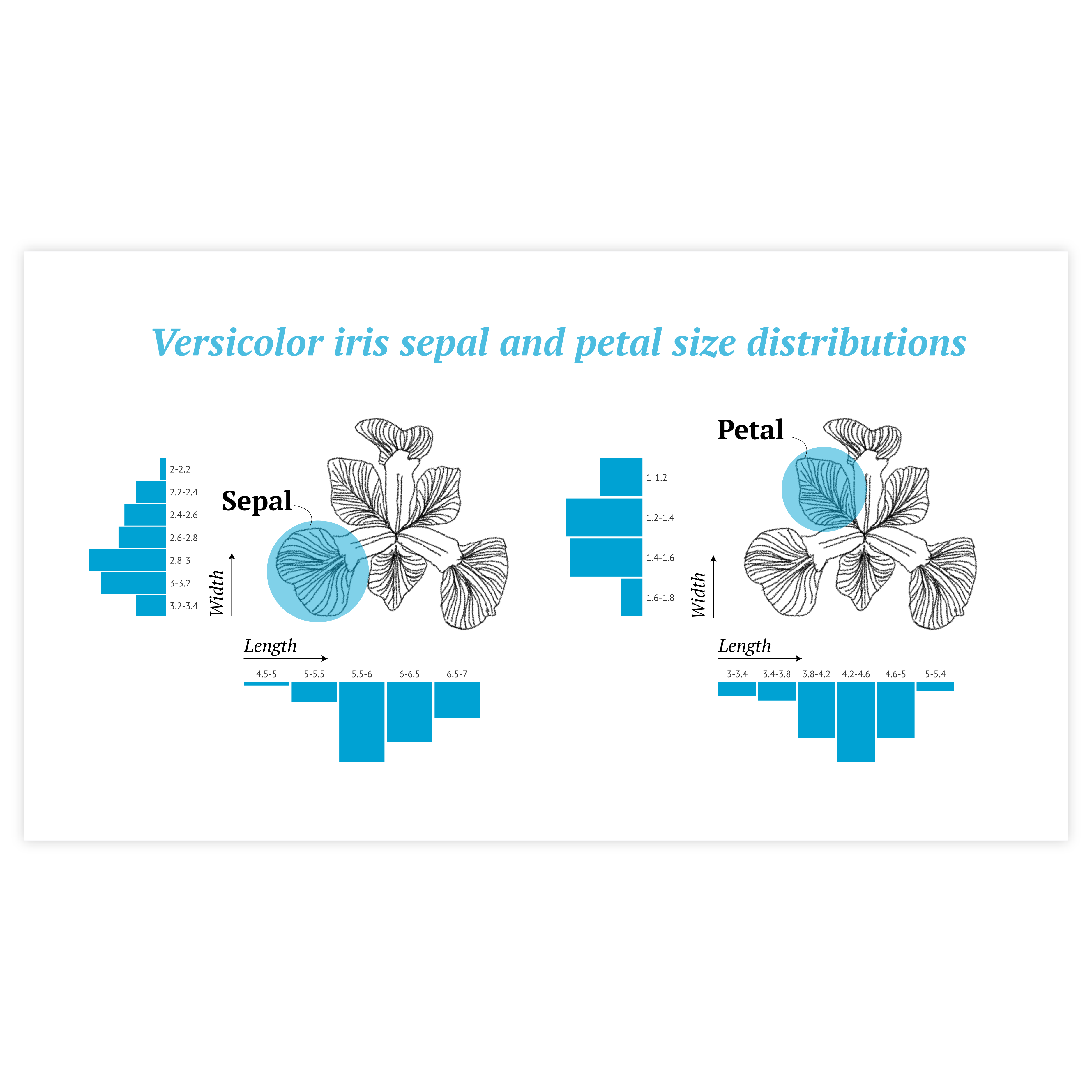
In most cases, the histogram is used to see the form of distribution and overall pattern, so there’s no need for detailed labeling of every bar. A regular axis label for both axes should work.
Read more
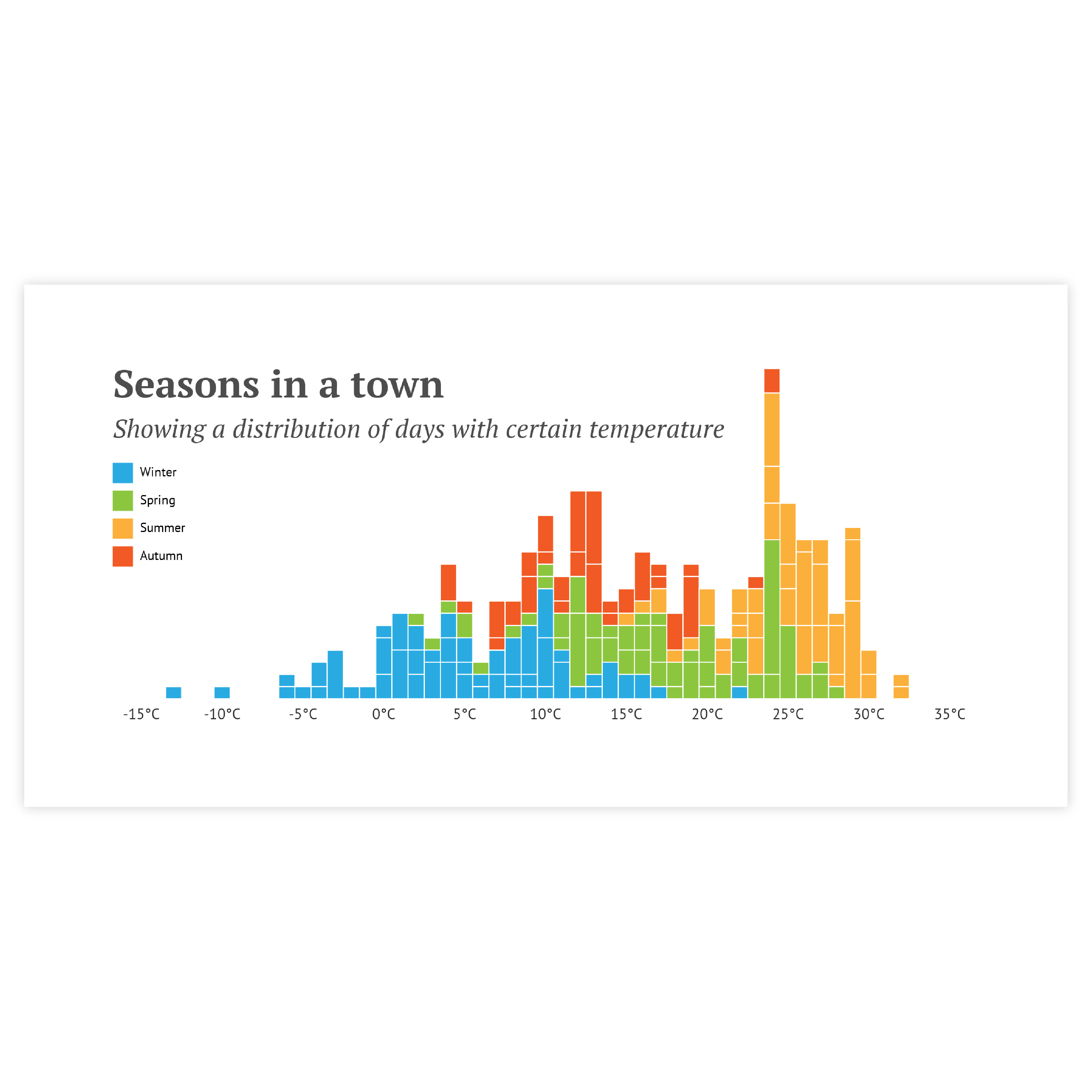
Coloring
Coloring of histograms follows the general rule of using color in data visualization – use color only if it communicates additional information. For any basic histogram, one color should be enough.
Read more
Highlighting
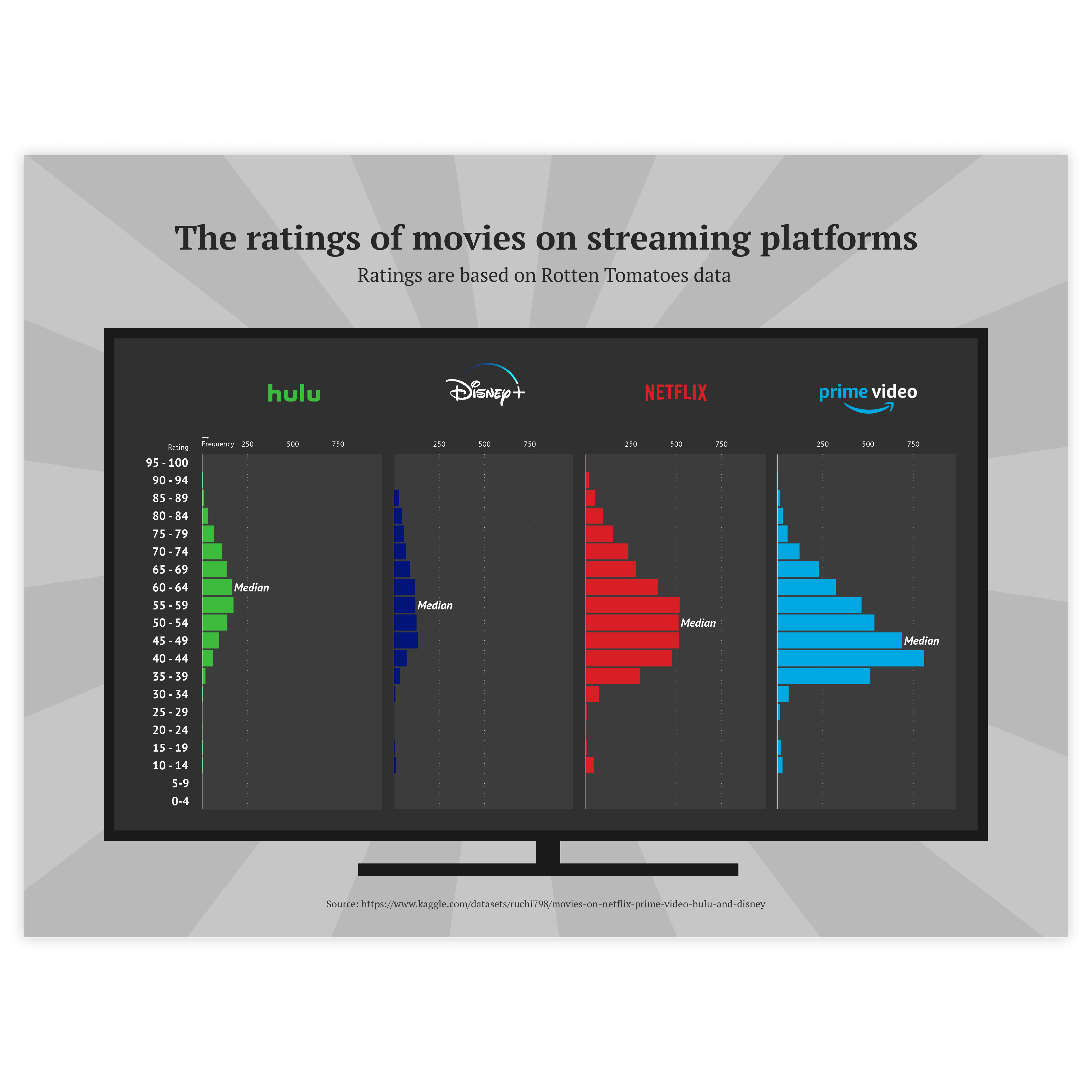
To draw attention to the most important bin(s) of a histogram, a good solution is to highlight these bin bars and color all the others – in a neutral color. Our brain is programmed to notice deviations instantly. This can be done, for example, by applying changes in size, movement, or color. This way, highlighting a specific bin will help catch the reader’s eye immediately.
Read more