Belgium has the worst traffic in Europe. And it's not even an exaggeration. Belgium has been called out, taking the infamous top spot in a ranking from Inrix, which estimates and analyzes traffic data around the world. The number of cars continues to rise, and so does Belgium's congestion rate (which is above the global average). And its capital city, Brussels, was crowded the most car-jammed city in the country.
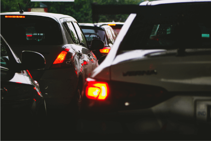
Therefore, it's no secret that the heart of Europe requires some help to tackle these traffic-related challenges. Unfortunately, the current situation negatively affects the climate, overcrowding, and also the mental health of drivers.
But if you think that all hope is lost, just buckle up and keep on reading. We will show you how initiatives like Straatvinken can address the problem and even apply data visualization along the process. All to ameliorate our streets.
A Collective call for change
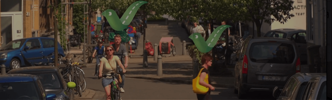
Straatvinken (eng. street finches) is a Belgian "citizen science" project that originated in 2018. It stems from the commitment of citizen movements to acknowledge and respond to increasing concerns regarding all traffic-related problems. The aim is, of course, to improve mobility and quality of life. But the project also raises awareness of the lack of green space, safety issues, and other challenges connected to street liveability.
Each year in May, Straatvinken organizes a large-scale traffic counting "moment". The 2021 edition witnessed an estimated 4,500 citizens participating in the event. During one hour, people took to the streets and counted all traffic movements which amounted to more than 625,000 pedestrians, cyclists, scooters, cars, delivery trucks, buses, etc.
Straativinken's plan is to measure, document, and communicate, on a yearly basis, the "health status" of the Belgian streets. This serves as the starting point in tracking progress being made to improve the congestion and the overall traffic situation.
But this is not where the story ends. Another part of the experience is a follow-up survey, named Straat-O-Sfeer. Participants are asked to write down what would be their recommendation if their best friends sought advice on whether to move to the street they live on. The survey itself consists also of other questions related to street design, social and environmental factors, etc.
To ensure steady improvement, a solid understanding and regular monitoring of the transport modes that make up the roads needs to occur. That is why all results of the counting are carefully analyzed and visualized on a custom-tailored, fully interactive platform designed by Datylon. This can help city officials see exactly what challenges they face, and monitor changes going forward.
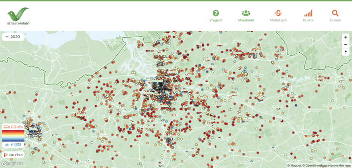
The engaging dashboard is built to deliver the information on areas as granular as street level. By clicking on each "bubble", corresponding to the exact location of counting, one can easily see an overview of all of the collected data. The platform is accessible online at all times and it's available to everyone.
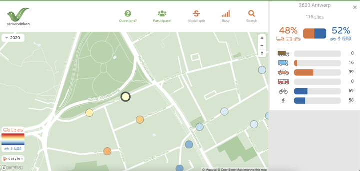
Visualizing the results not only provides the information on certain areas with contextual detail such as road and footpath widths but also allows for the progress to be tracked by each year of the project. With a goal to reduce the current modal split from 25/75 to 50/50 by 2030, there needs to be at least a 2-3% shift each year in order to achieve this. If successful, 50% of all trips should eventually be made by bicycle, train, tram, bus, taxi, water bus, subsystems, etc, and only 50% by car.
An easy-to-use interface was key for Straatvinken’s interactive results platform so that everyone, no matter how technical or data-savvy, could explore the results.
The online platform was built adhering to some of the design principles for dashboards such as being user-centric, showing context, and avoiding being caught up with too much detail.
Communicating data gives context
Publishing and making the results accessible is important, it humanizes the data and means that everyone can explore and interact with the results for themselves rather than remaining in the hands of only a few. Allowing public access means it is something for everyone to own, providing progress, highlighting the good and not-so-good areas, as well as context to the issue so that collective responsibility and shared understanding can occur.
Initial contributors also received a personalized poster with the data visualized for their own street, making this experience even more unique.
Datylon is proud to support this initiative to improve our environment and counter unwanted trends. Here we see that by visualizing data collected by the people we can all better understand transport behaviors and even generate further interest by others when trends are uncovered.
Only by communicating and telling the story of the data, change in the form of transport improvements can take place.
Change starts with you
The number of participants gets bigger year by year. After being busy for a while drawing the conclusion report for the 2021 edition of the project, Straatvinken's scientists managed to publish it in November. You can find the results here.
We strongly encourage all Belgian citizens to register for the next planned counting moment that will take place on May 19, 2022.
And if you're a business or organization inspired by our dataviz solution for this project, you can get in touch with us. We can help you use your data to make a change.