DataViz Best Practices, Dataviz Resources
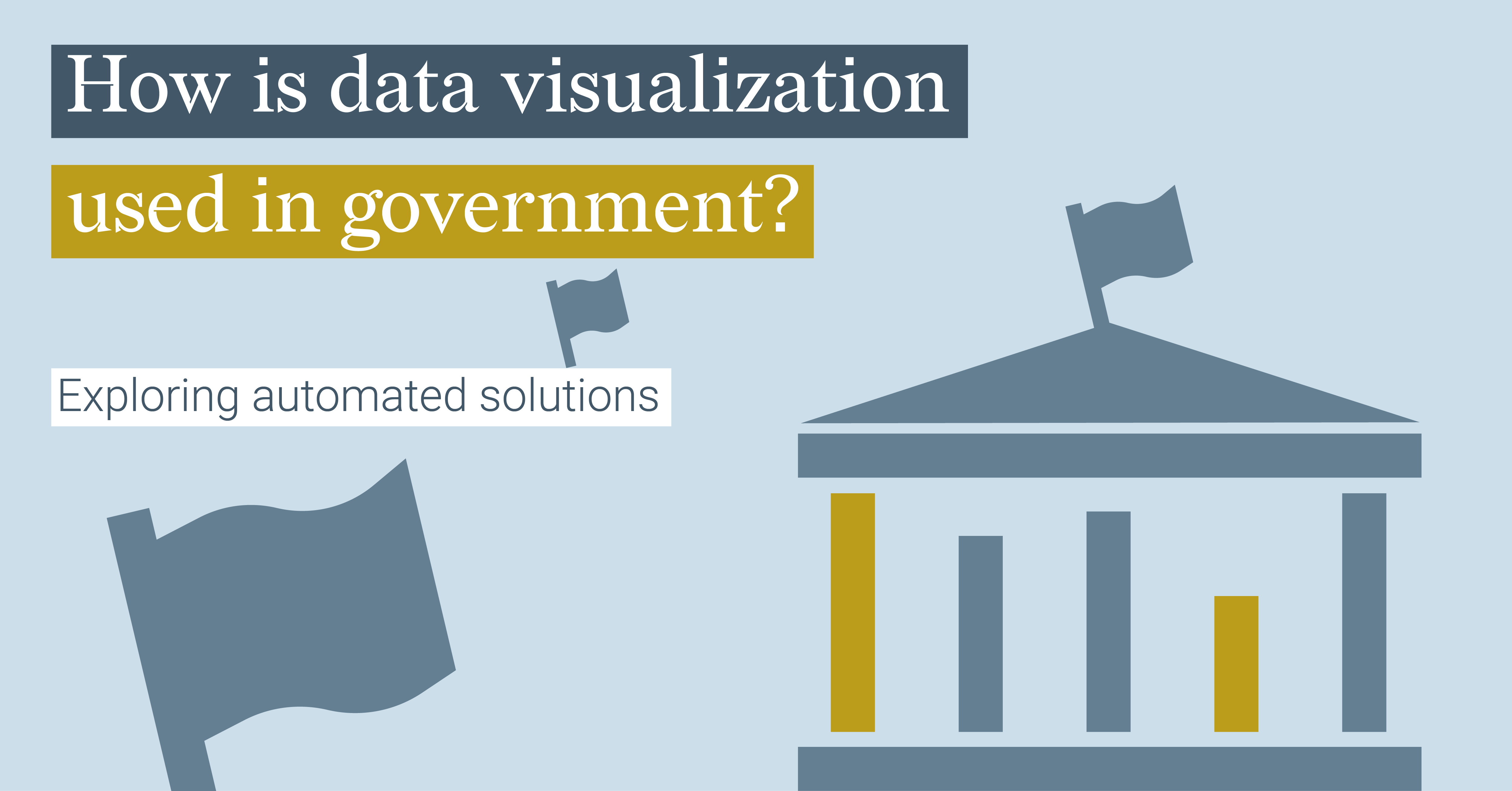
How Is Data Visualization Used In Government? Exploring Automated Solutions
How is data visualization used in government? They gather massive amounts of information on almost...
DataViz Best Practices, Dataviz Resources
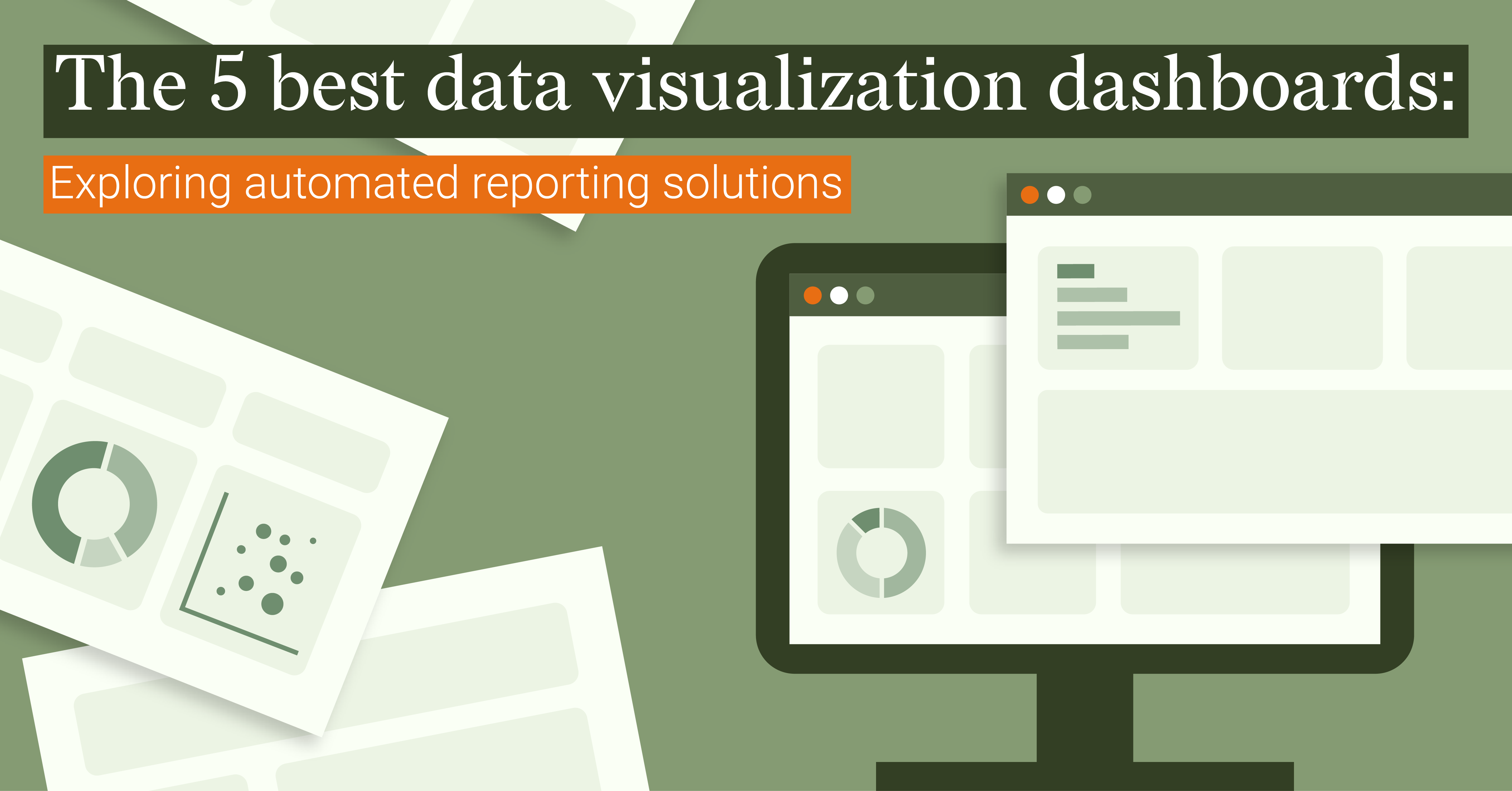
The 5 Best Data Visualization Dashboards: Exploring Automated Reporting Solutions
An effective data visualization dashboard helps to promote quick decision-making by telling a...
Subscribe to our newsletter
Receive inspiration, practical advice, customer stories and news right in your mailbox

DataViz Best Practices, Dataviz Resources
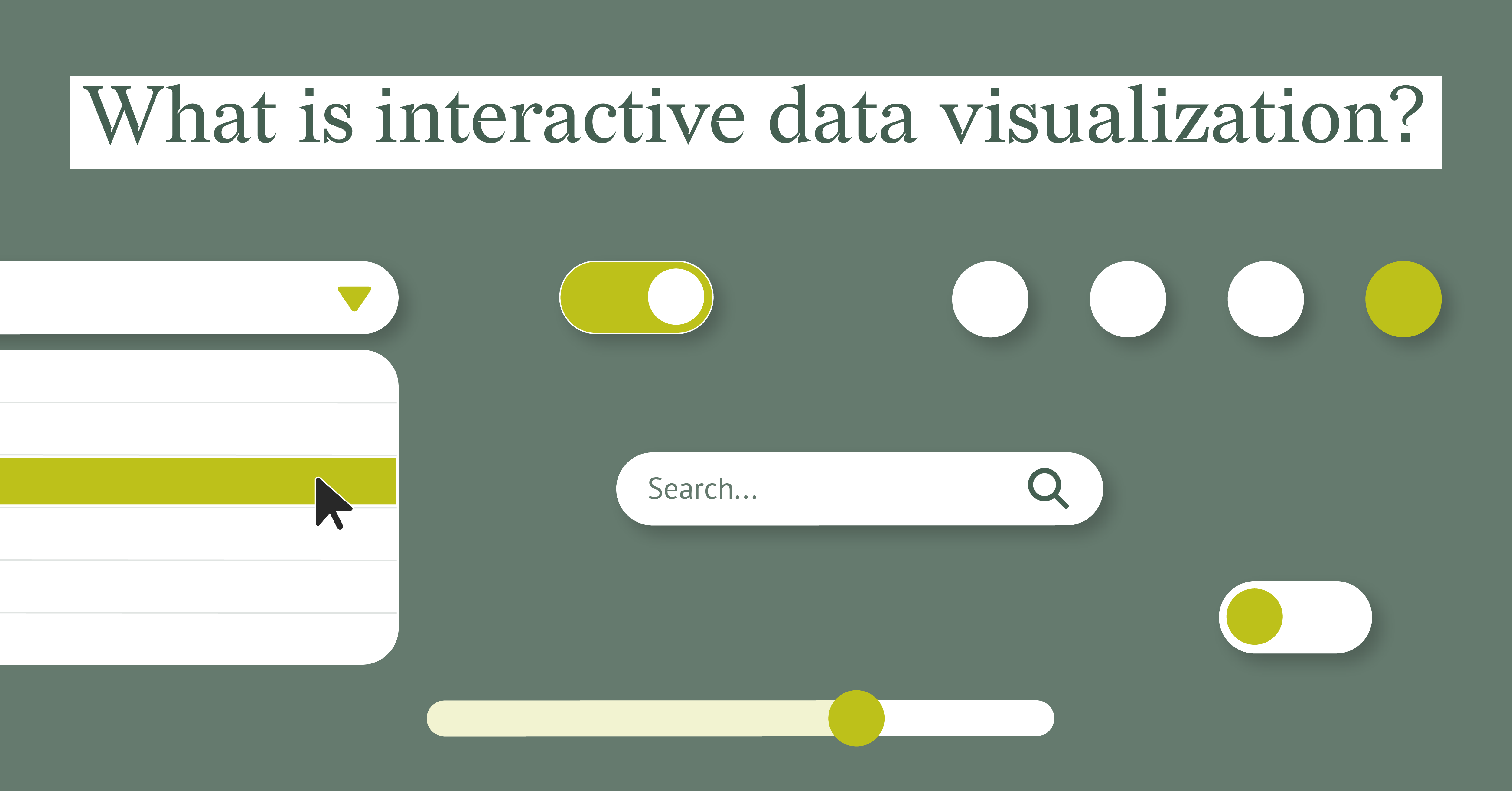
What Is Interactive Data Visualization
Interactive data visualization (IDV) is using software to present and manipulate data visually. It...
DataViz Best Practices, Food For Thought, Dataviz Resources
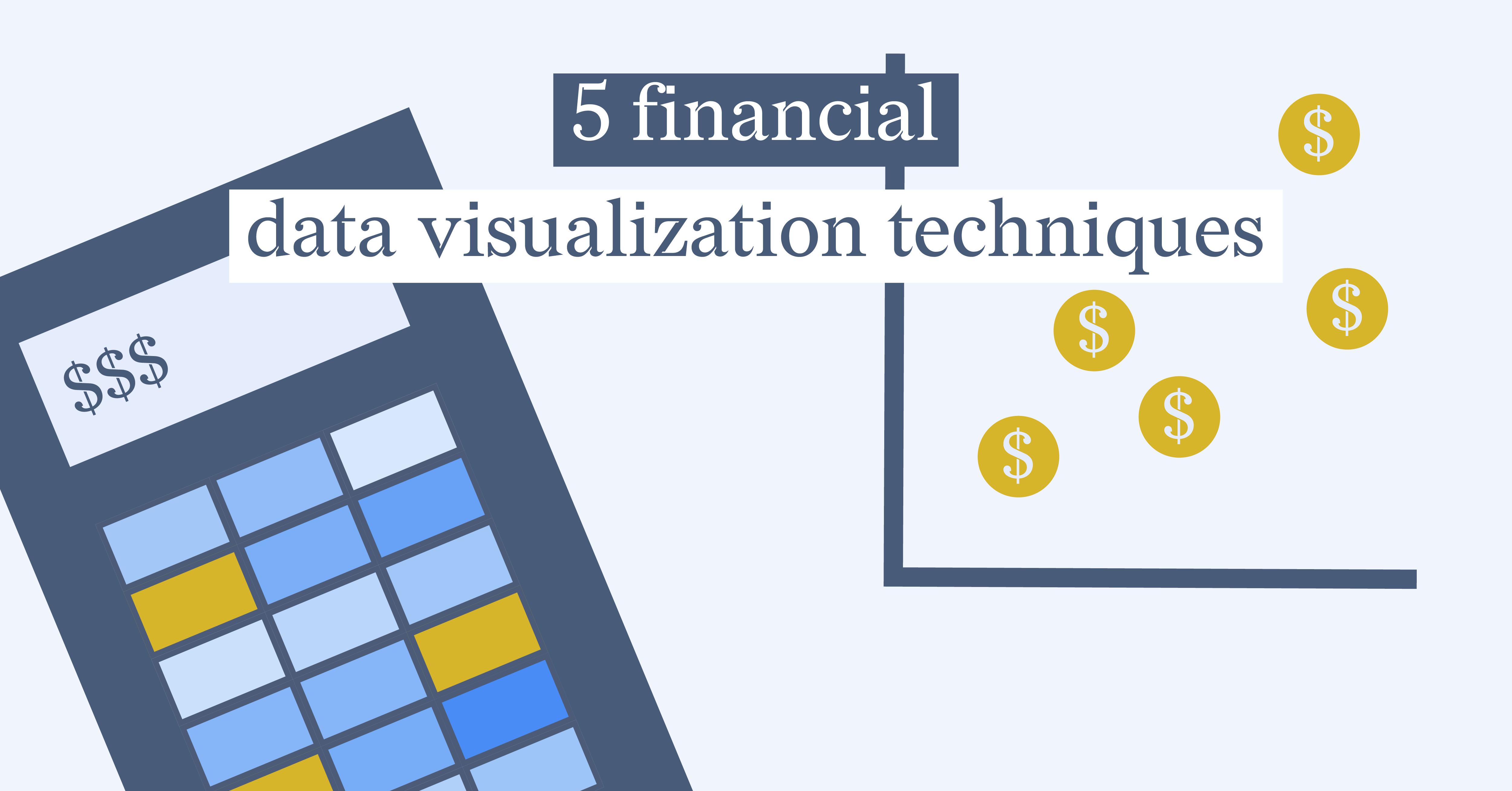
5 Financial Data Visualization Techniques
Gone are the days of creating dry, monotonous reports. Financial data visualization techniques...
DataViz Best Practices, Food For Thought, Dataviz Resources
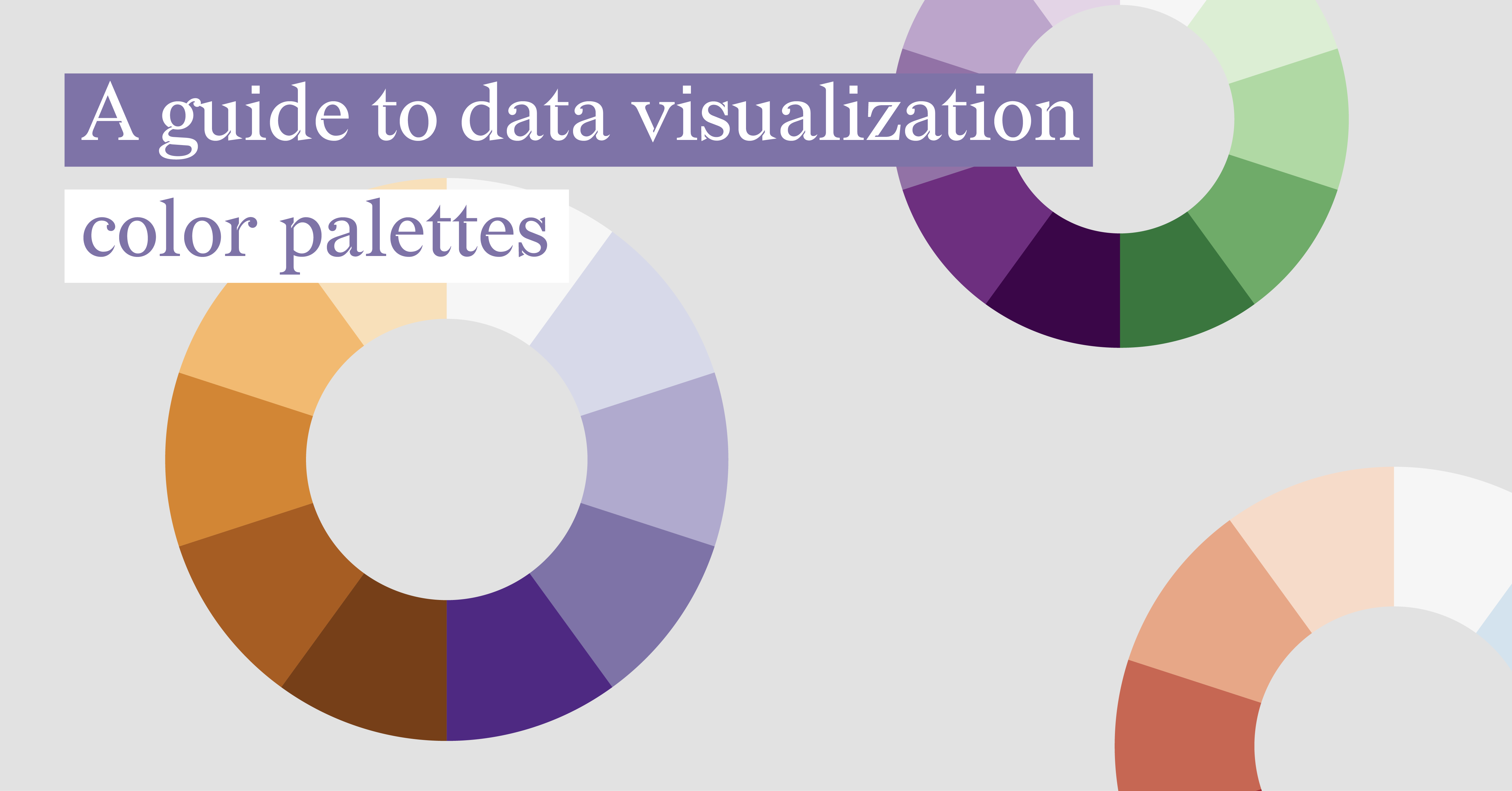
A Guide To Data Visualization Color Palettes
Did you know that your data visualization color palettes play a more crucial role than just...
DataViz Best Practices, Dataviz Resources, Healthcare
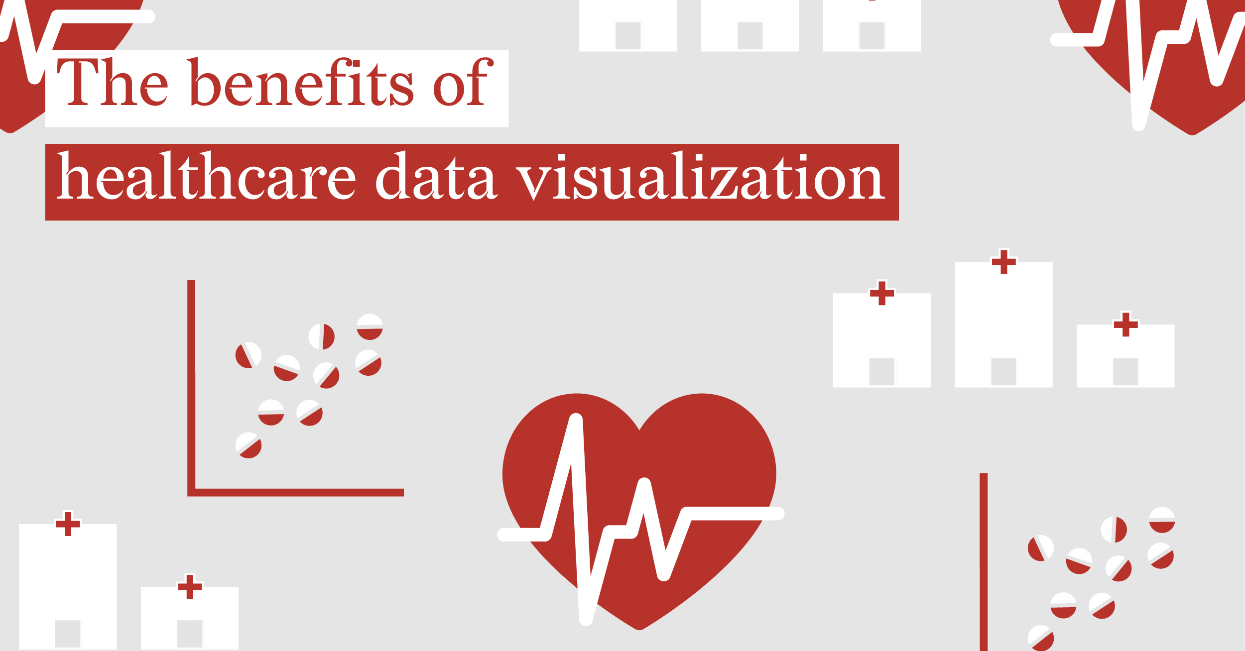
The Benefits Of Healthcare Data Visualization
When questioned about my profession, my response is that I work as a data visualization designer....
DataViz Best Practices
A Guide to Data Visualization Best Practices
You have done the hard work of gathering the data. But let’s be honest: staring at a giant...
DataViz Best Practices
Why Is Data Visualization Important?
We live in a world overflowing with data. From business dashboards to social media metrics,...
DataViz Best Practices
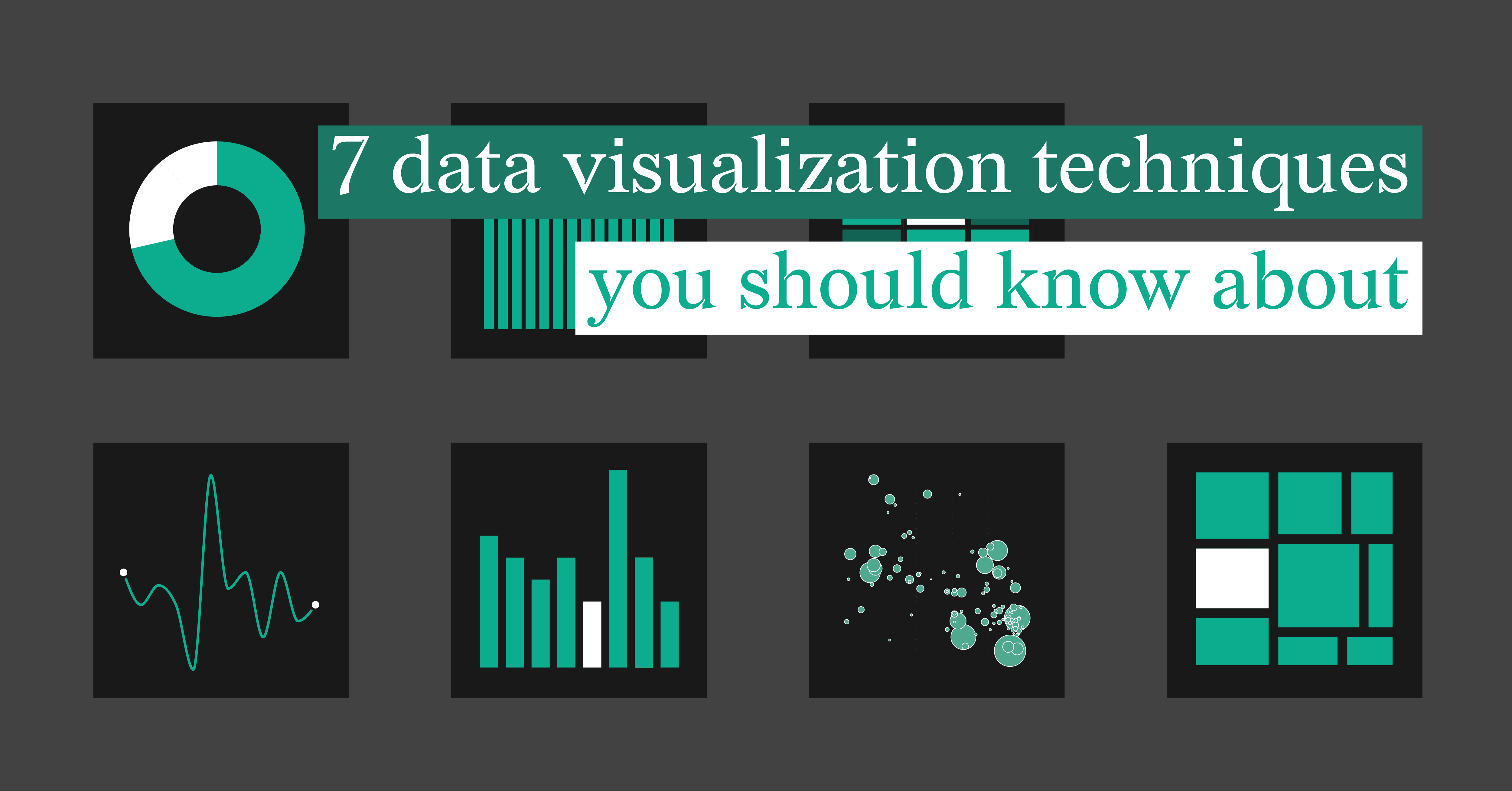
7 Data Visualization Techniques You Should Know About
Have you ever wondered how a simple graph can unravel the intricacies of massive datasets? What if...
DataViz Best Practices
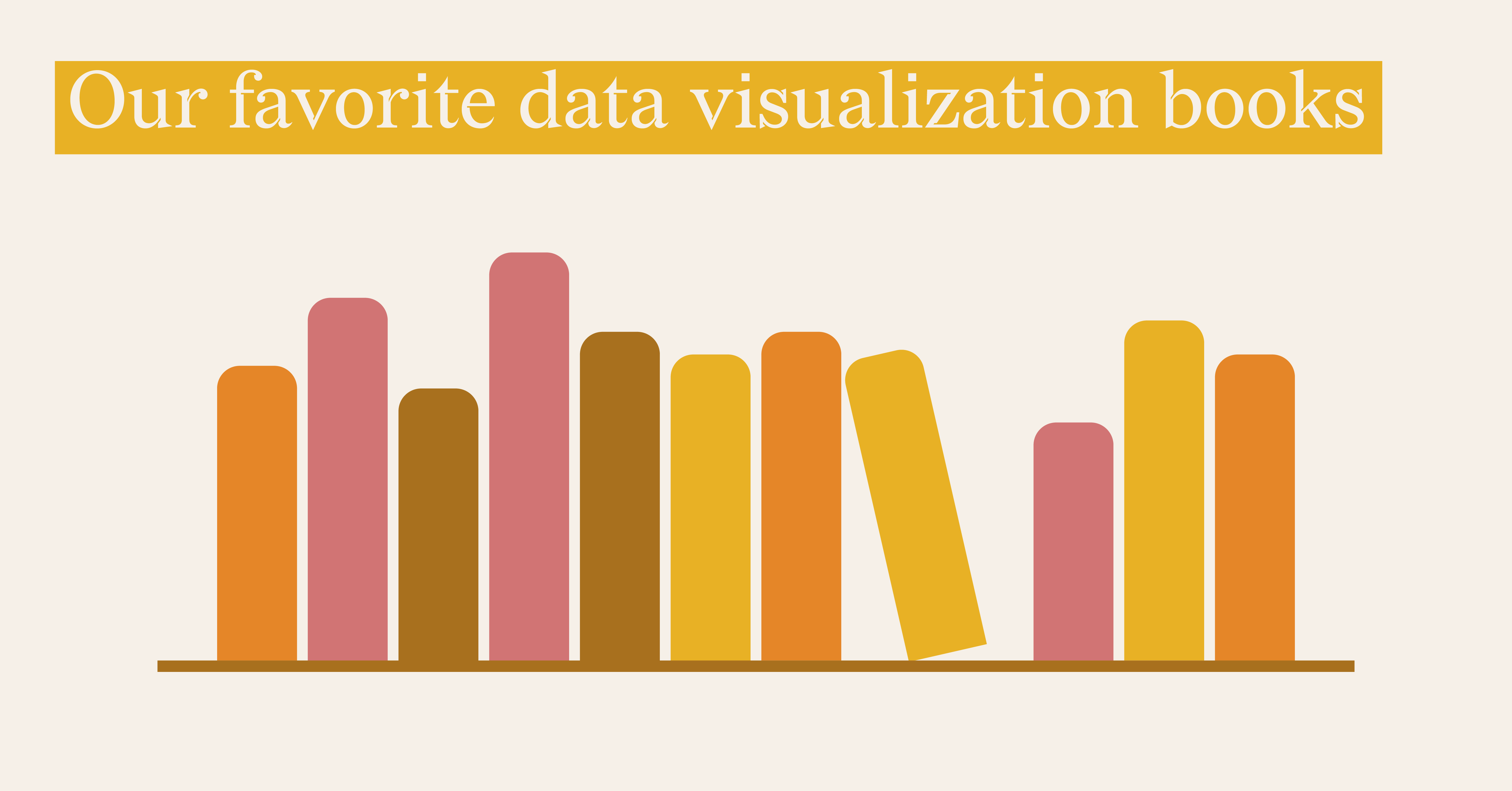
Our Favorite Data Visualization Books
In today’s data-driven world, the ability to create visualizations that effectively deliver...