DATYLON > CHART LIBRARY > COLUMN CHART
What is a column chart?
A column chart is a variation of a bar chart turned by 90 degrees. Indeed, a column chart is a type of chart that resembles a bar graph with bars positioned vertically.
The difference between a column chart and a bar chart is in the usage of labels. Bar charts can handle long categorical labels, while column charts work better with short labels or time series.
Column charts are better than bar charts for cases when categories have a natural order, like income levels or education levels. Column charts are very easy to read and are easily recognised by the general public.


Labeling
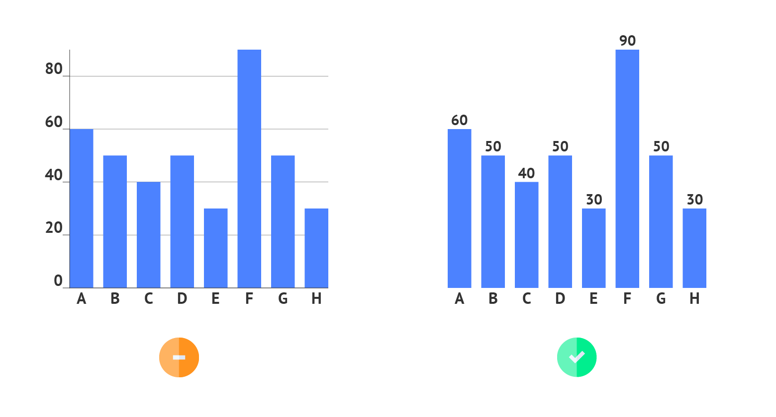
The rule of thumb for using labels in column charts is to use data labels instead of axis labels and axes themselves. By using only data labels the visual clutter is reduced and the essential information is provided.
Read more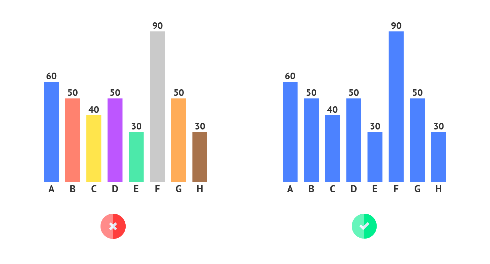
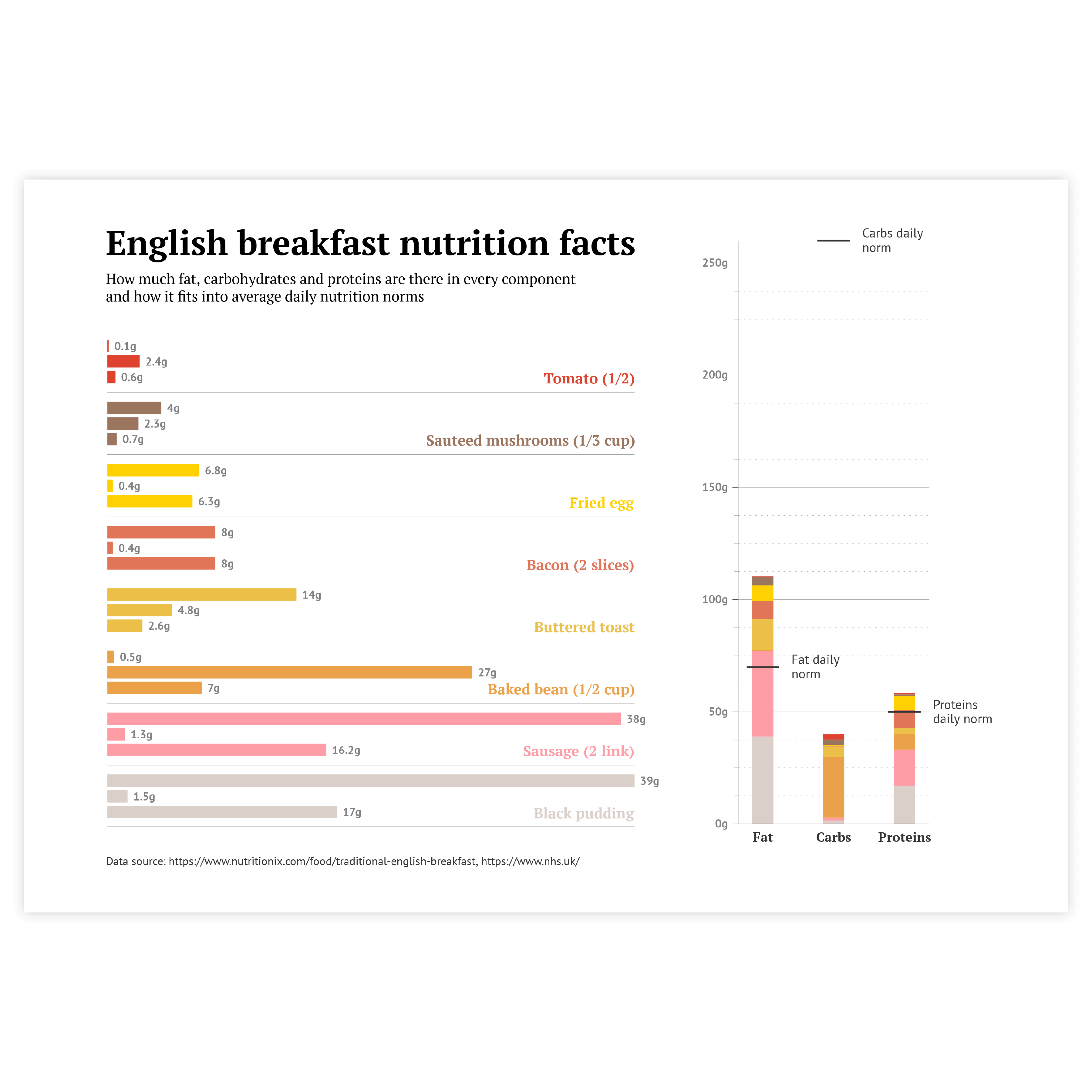
Coloring
Coloring of column charts follows the general rule of using color in data visualization – use color only if it communicates additional information. For any basic column chart, one color should be enough. Don’t use a new color for every column chart just to make it beautiful. It will just make a column chart harder to read.
Read more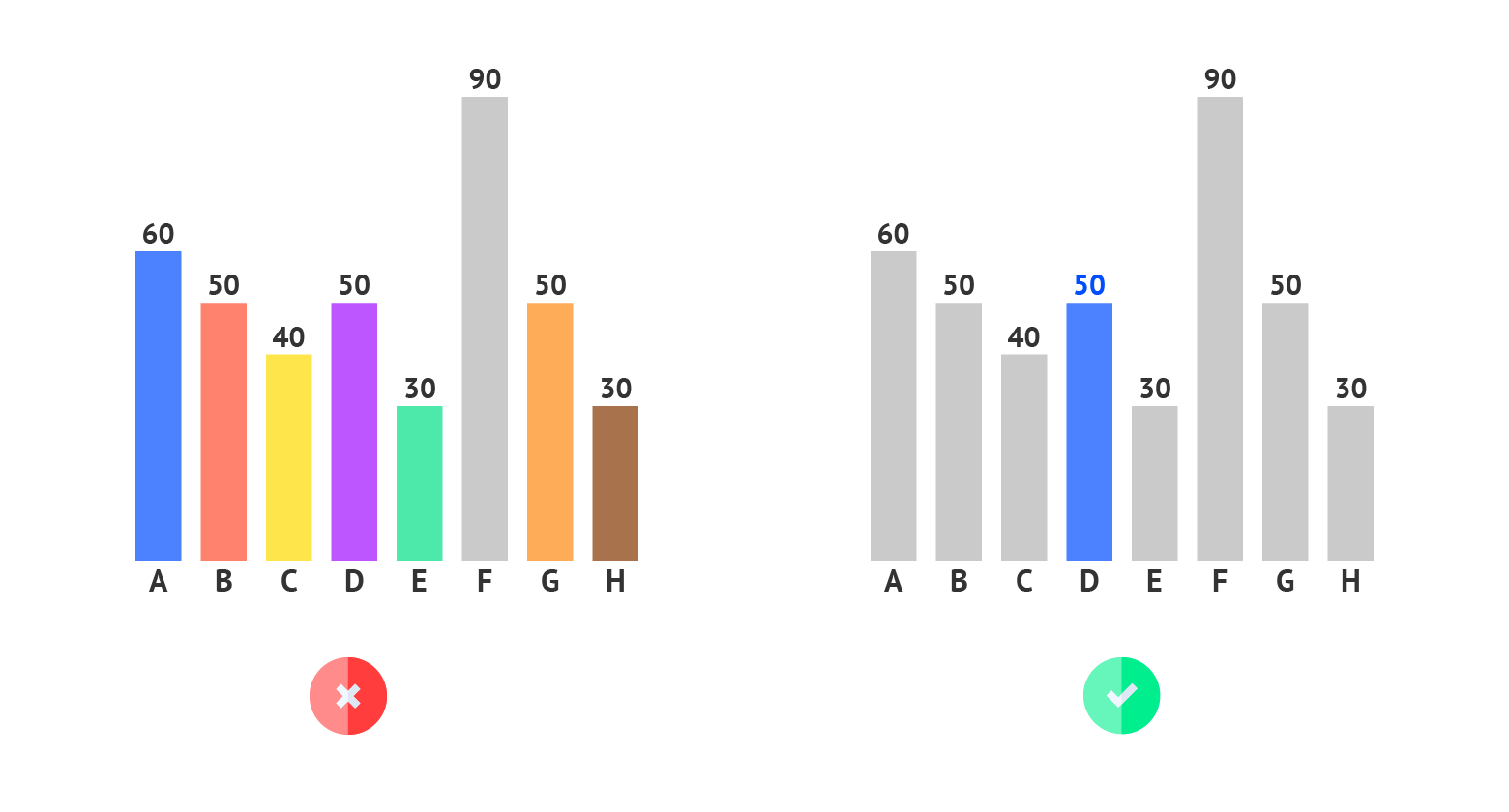
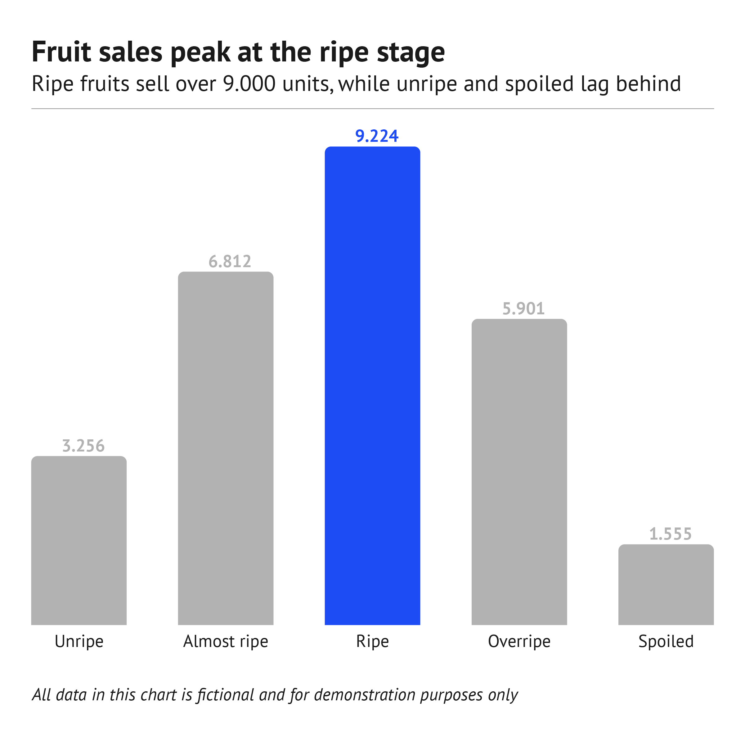
Highlighting
To draw attention to the most important categories of the column chart, a good solution is to highlight these columns and color all the other columns the same way in a neutral color. Our brain is programmed to notice deviations instantly. This can be done, for example, by applying changes in size, movement, or color. This way, highlighting a specific column will help catch the reader’s eye immediately.
Read more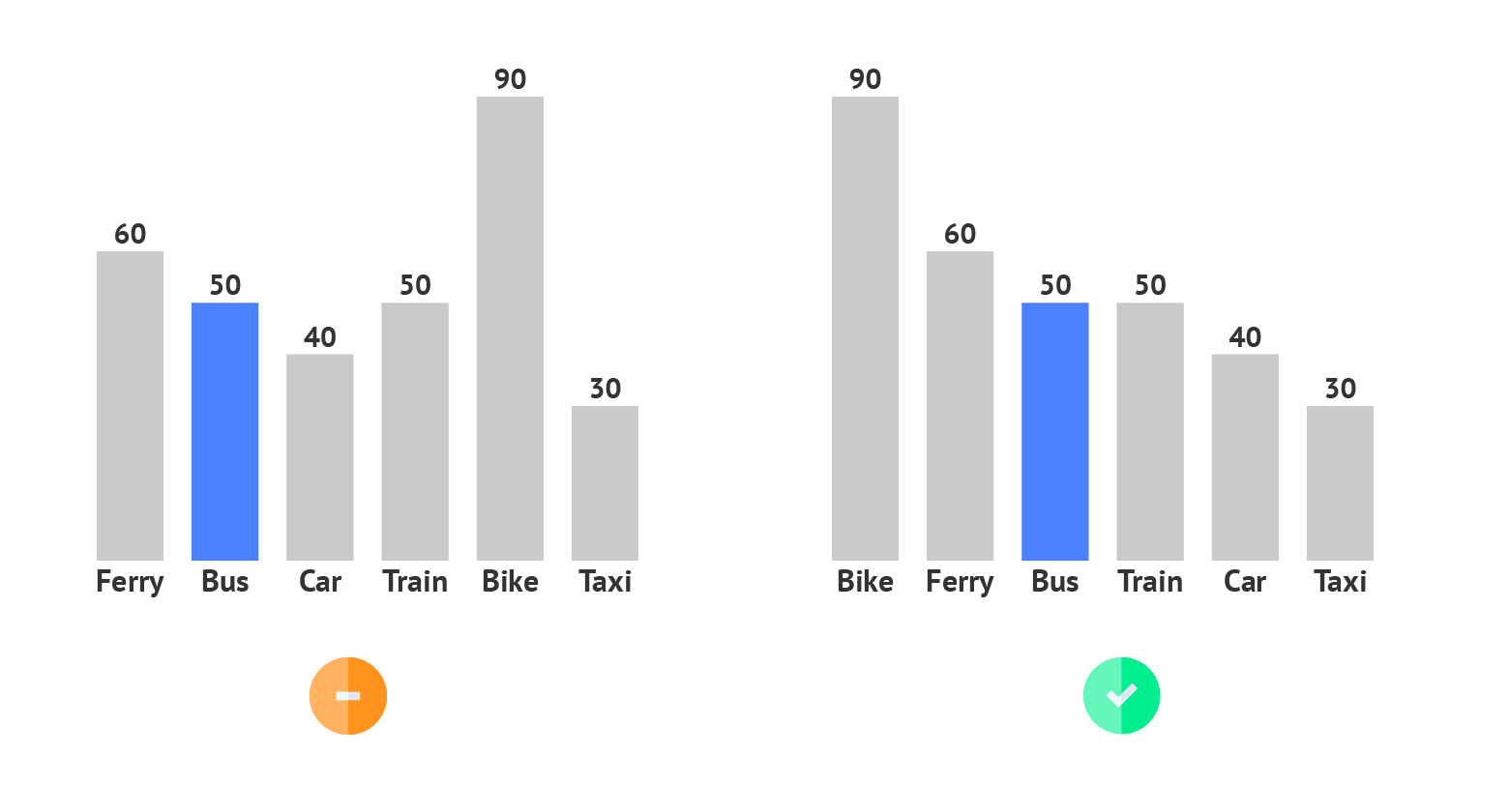
Sorting
Using ascending or descending sorting puts the column in order and helps the user to read the chart. It also reduces the time needed to compare the differences between different columns.
Read more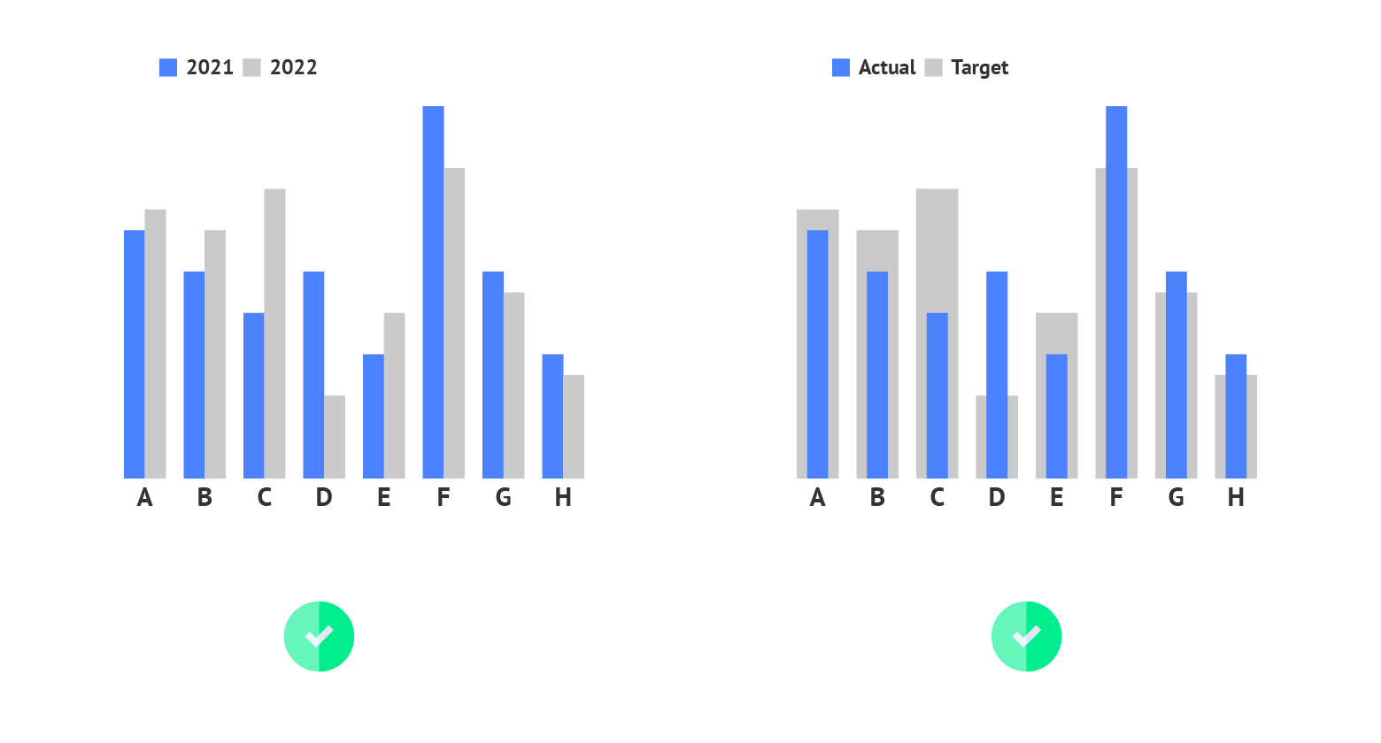
Overlaying columns
While grouped column charts can be useful for comparing two instances of the same order, overlaying columns can spot the slightest difference between two groups of values, for example between the actual and the target value.
Read more