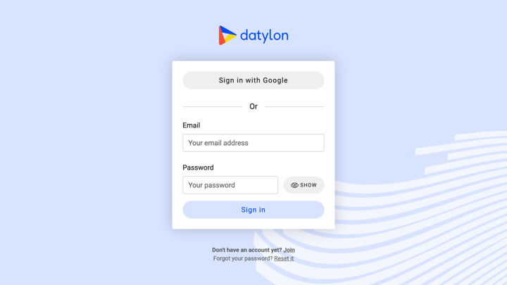
At Datylon, we strive to make it easier for our users to create and share data visualizations. And this means also lowering the hurdle by accessing our tools using Google sign-in.
And next to that we have, of course, a bunch of new features and improvements of which most were inspired by you, our users.
Download Datylon for Illustrator now or sign in to the Datylon web app and enjoy the new version!
ADVANCED STYLING
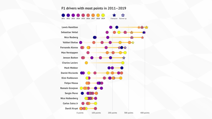
Range chart and dot plot
The beauty is in the details. So we created the option to add a gradient in the Range Chart (formerly known as Arrow Chart) and in the Dot Plot. Additionally, it is now possible to make the icon style in your dot plot design data-driven. These new features were implemented to support your flexibility in design. Read more about binding properties.
ADVANCED STYLING
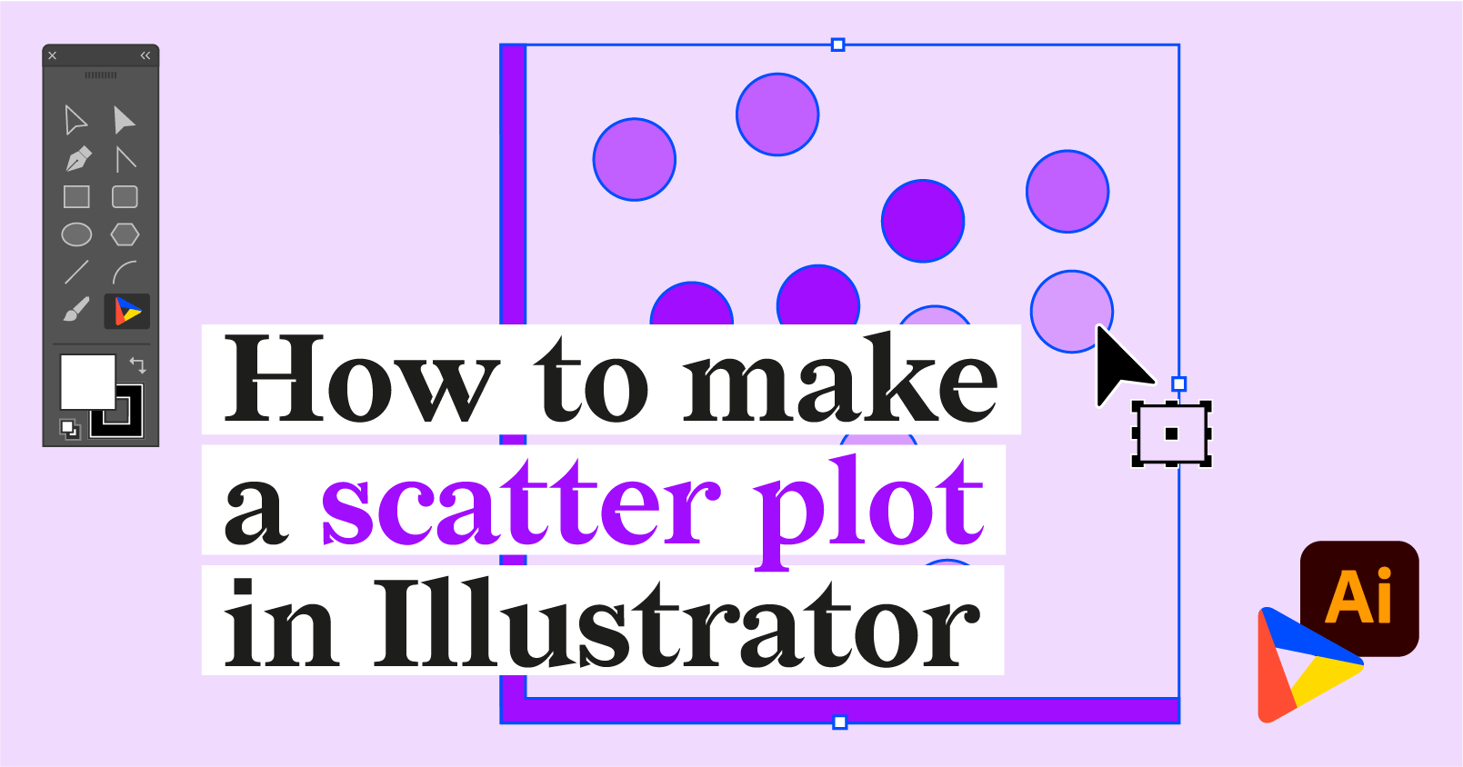
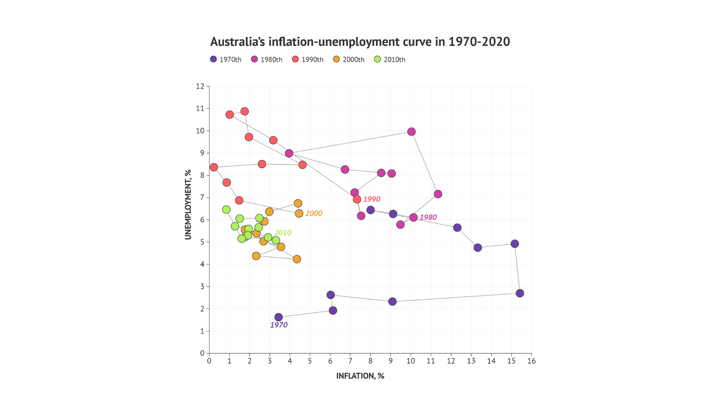
Connect the dots
A connected scatter plot visualizes the evolution of a numerical value. It is used for different kinds of datasets e.g. paired time series. The dots in a standard Datylon Scatter Plot can now be connected using Styling > Data Marks > Connector. Discover all scatter plot properties.
ADVANCED STYLING
Improved Axis Behavior
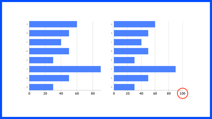
Recently, we engaged in a lot of discussions with our users about the way numerical and datetime axis ticks are placed now. Some of you expressed the need to extend the axis up to an extra axis tick above the highest value in your data. We listened to your feedback and we developed the option to allow for that in our tool. More about ticks and grid properties in Datylon.
ACCOUNT FEATURES
No more passwords
We don't know about you, but we don't have any more passwords left in us. So to make it even easier for you, now you can use your Google account to sign in to the Datylon web app or to Datylon for Illustrator. Feel free to switch to Google anytime, even if you already have a Datylon account with a password login. Sign in to Datylon with Google here.
As always, there's even more. If you'd like to read in detail about all of the improvements and small fixes, make sure to check out the R47 release notes in the Datylon Help Center.
Don't forget to download the latest version of Datylon for Illustrator to benefit from all these enhancements! Alternatively, you can also try them out in our Datylon web app.
Enjoy your design!