Nestled in the Netherlands with its vibrant design scene, Jaaf Information Design stands out as a dynamic and ambitious design agency with a passion for transforming complexity into clarity.
Founded by Esther Rookhuijzen, the agency has carved a niche for itself by creating targeted, data-rich reports and communication tools for organizations ranging from small local entities to large international players. With clients spanning diverse sectors, including data and research agencies, governmental organizations, and sports associations, Jaaf Information Design thrives on unraveling, rearranging, creating, and clarifying information.
Cracking the Code of Clarity
Esther Rookhuijzen, the Founder and CEO of Jaaf Information Design, Concisely captures their mission: "We make complex data, information, and processes visually clear. Put more simply, we translate numbers and text into charts and pictures." Their approach revolves around the idea of providing "clarity as a service," effectively visualizing information so that even non-experts can grasp the intended message. As they call it: “clarity as a service”.

The Jaaf Process: From Chaos to Coherence
Jaaf Information Design follows a proven process to bring order to the chaos of data. They start with clarifying the goal of the project. Why are we creating this, and who needs to know what at the end? They start by gathering details about the data, listing design and technical challenges, and identifying key messages through workshops and interviews. Once the appropriate communication channels are chosen, designers and analysts delve into the content and data, distilling the essence of the message. A clear structure is then crafted, optimizing content, functionalities, and audience interaction. In this phase they work with what they call wireframing. Making rough sketches, seeing if what they have come up with, actually works. Making this phase already visual is no coincidence. They live by the knowledge that almost everything is better to understand and oversee when made visual. Also their own process working their way towards their information solution.
After approval of the wireframe / sketches, the designers weave this understanding into visually appealing and impactful concepts that merge content and form, resonating with the audience while conveying the customer's values. The final stage sees the production of tangible communication tools, where designs leap off the screen into the hands of the audience.
Datylon: A Catalyst for Creativity
Jaaf Information Design has noticed a growing trend where companies increasingly seek to communicate vast amounts of personalized data to specific target audiences. Enter Datylon, a game-changer in the realm of automated on-brand data stories.
Datylon empowers Jaaf to design and produce pixel-perfect charts and infographics in the customer's brand style, all while eliminating creative limitations. With tools like Datylon for Illustrator and Datylon Report Server, the agency seamlessly integrates data visualizations into flexible templates while not having to do any concessions on design or the original designers workflow. Icons, illustrations, and annotations created with Adobe Illustrator enrich these templates, enhancing clarity and appeal for the readers.
A Symphony of Data: From Templates to Tangible Reports
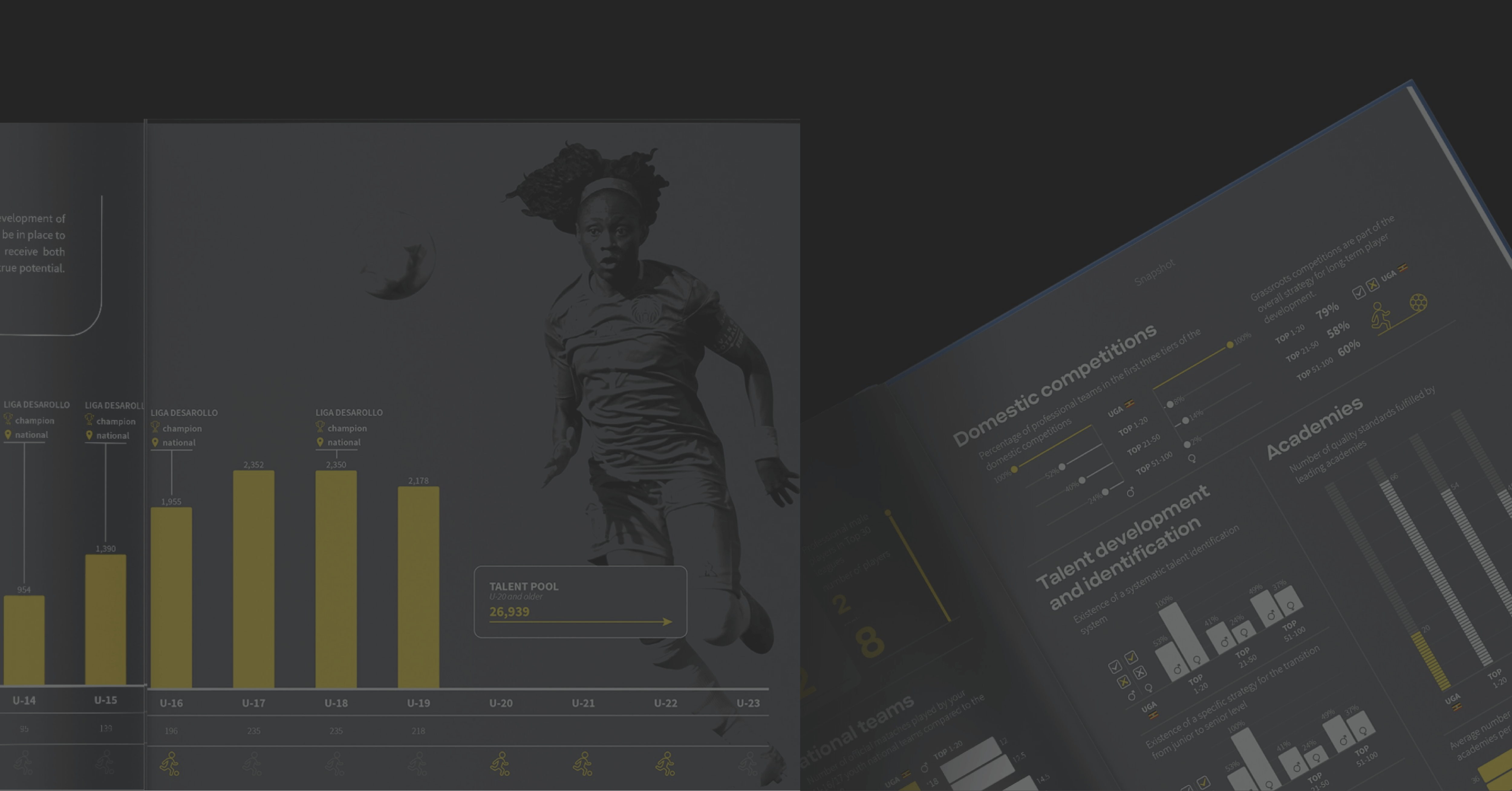
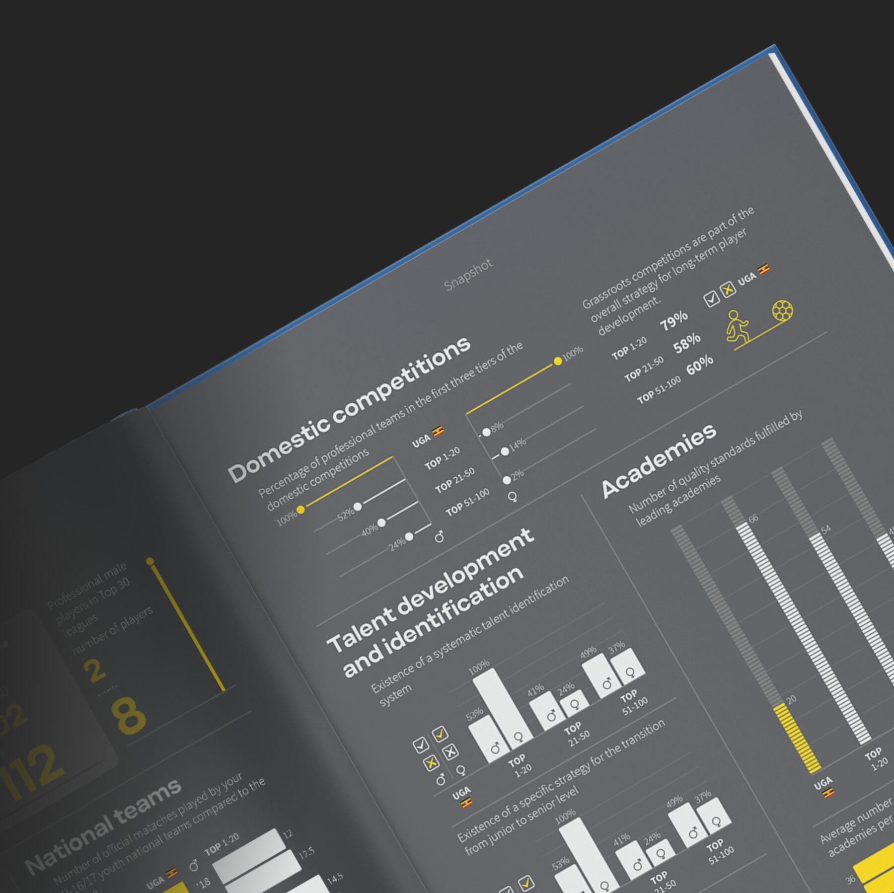
The Datylon templates find their way to the Datylon Report Server, where they come alive with data retrieved from the customer's database. The magic happens through the Datylon Server API, streamlining the report generation process without compromising uniqueness. In a recent mammoth project over a million data points were transformed into 200 clear and beautiful 60-page personalized data stories. This not only simplified the information for the target audience but also facilitated informed decision-making. Also, by using Datylon in this process they have saved themselves the trouble of building thousands of graphs with the Illustrator build-in-graph-tool.
In this remarkable project, Jaaf Information Design went above and beyond by adding an extra CMS application layer to Datylon Report Server for the client. With a project of this scope you simply don’t want to work out all the steps manually. This application allowed the client to invite more than 75 individuals to participate simultaneously in the production of data stories, showcasing the scalability and collaborative potential of their innovative approach. Saving the client and Jaaf the hassle of endlessly going back and forth with feedback rounds for the text, delaying the projects with months.
Automated Elegance: The Datylon Impact
This is just one example of the automated report design prowess fueled by Datylon. Esther Rookhuijzen sums it up: "A growing number of companies have access to a lot of data and now recognize the need to communicate data insights clearly to their customers. They are starting to find the worth in all this harvest data, especially when displayed correctly. This is exactly what Jaaf Information Design delivers with the help of Datylon."
Conclusion: Unleashing Clarity, One Data Story at a Time
Jaaf Information Design's partnership with Datylon epitomizes the marriage of creativity and technology. Together, they unravel the complexities of data, transforming them into compelling narratives that not only inform but inspire action. As businesses navigate the sea of information, Jaaf Information Design stands as a beacon, ensuring that clarity besides being a service is also a transformative experience for all.
Want to automate your own on-brand data stories too? Discover how the Datylon Report Server can help you scale report production without compromising design. Book a demo with one of our experts or read our dedicated guide to learn more.