In today's data-driven world, businesses rely heavily on data visualization and reporting capabilities to gain valuable insights and make informed decisions. Pointerpro, a successful provider of innovative assessment software with automated reports, understands the importance of presenting data in an accurate and visually compelling manner to offer personalized advice reports to their clients.
To elevate their data visualization capabilities and provide their customers with unparalleled features, Pointerpro sought a solution from Datylon, a leading provider of data visualization design tools and services for charts and reports.
Introduction
Pointerpro is a trailblazing all-in-one platform that empowers enterprises to create captivating online assessments and deliver personalized advice reports in PDF format. As a data-driven assessment tool, Pointerpro caters to consultants and diverse organizations from various sectors and industries, enabling them to harness the power of data visualization for their specific needs.
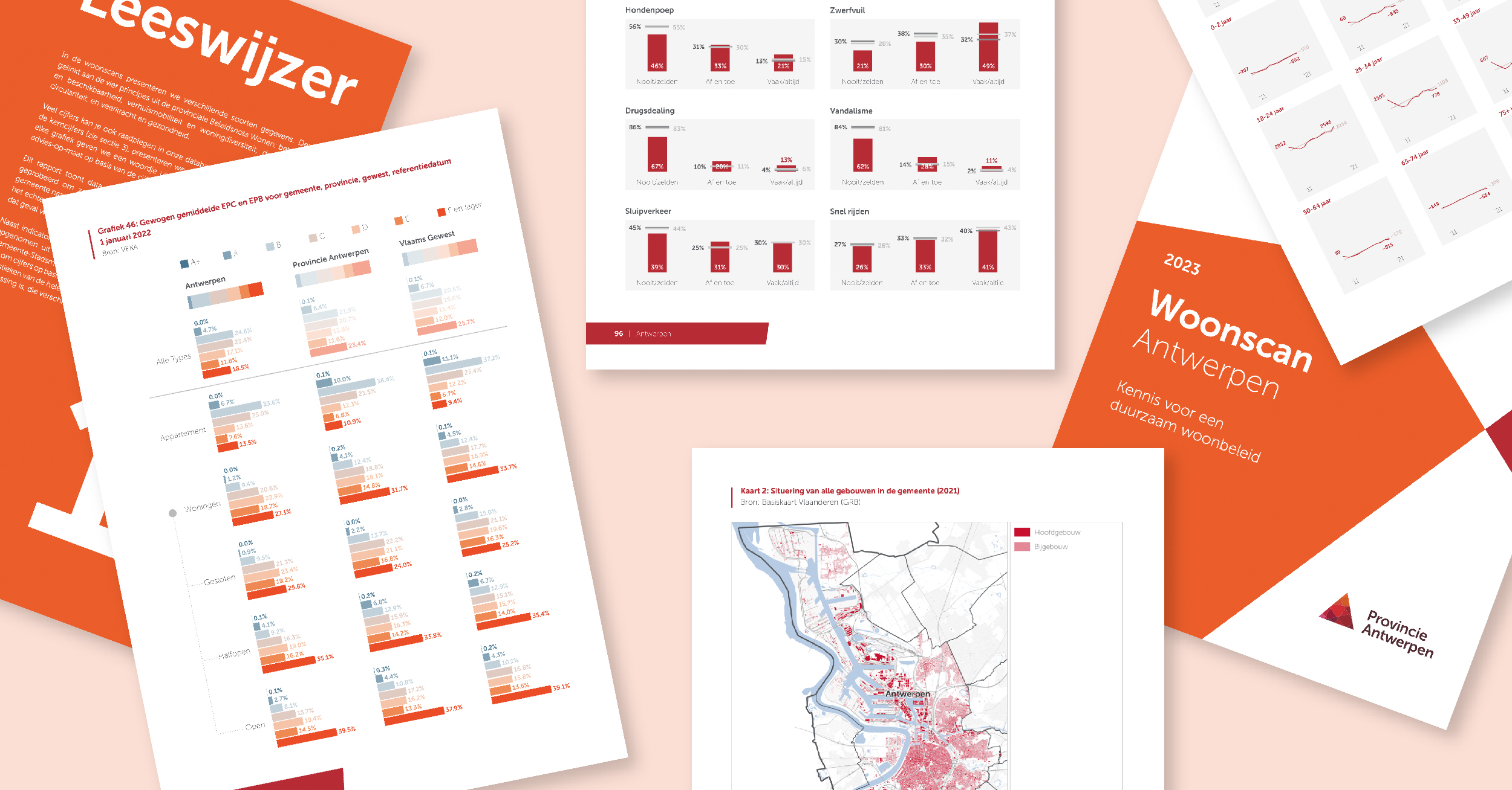
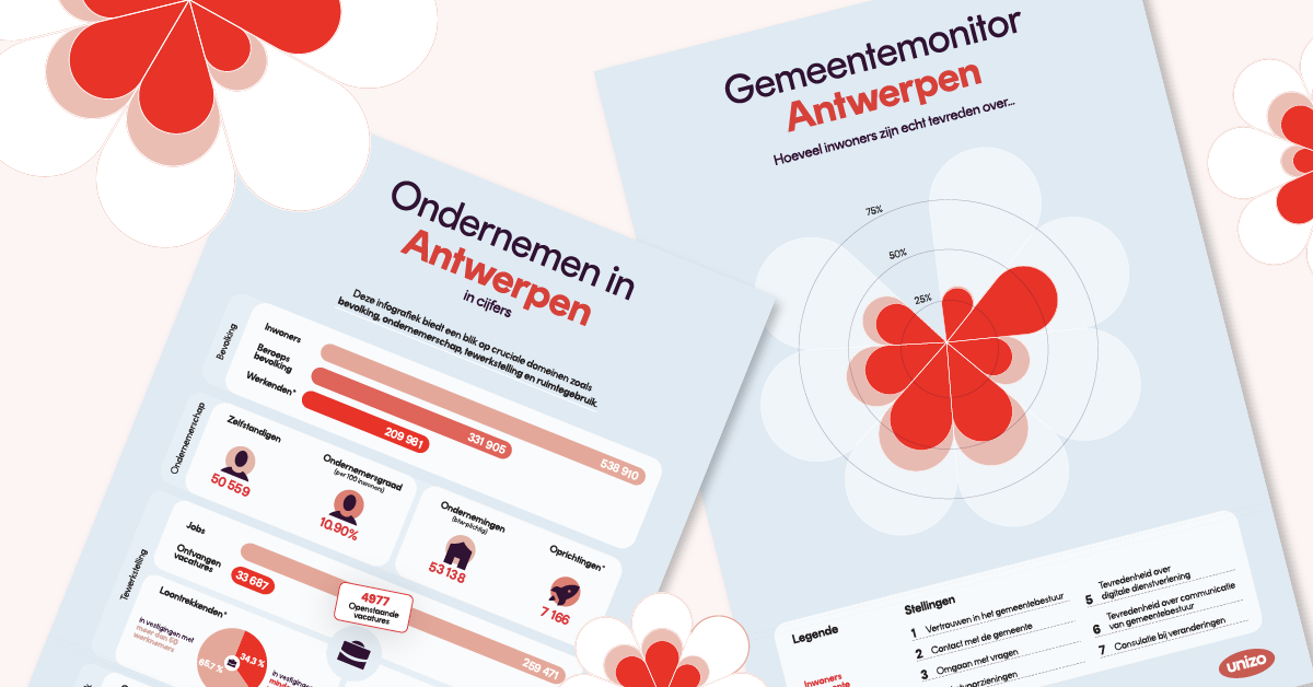
This includes, for example, HR companies seeking to evaluate employee performance and satisfaction, enabling them to gain valuable insights into workforce dynamics and identify areas for improvement. Businesses conducting product surveys can also visualize customer feedback and effortlessly identify product strengths and weaknesses. Furthermore, financial institutions can leverage Pointerpro's capabilities to generate comprehensive financial reports, offering clients a clear and concise overview of their financial health.
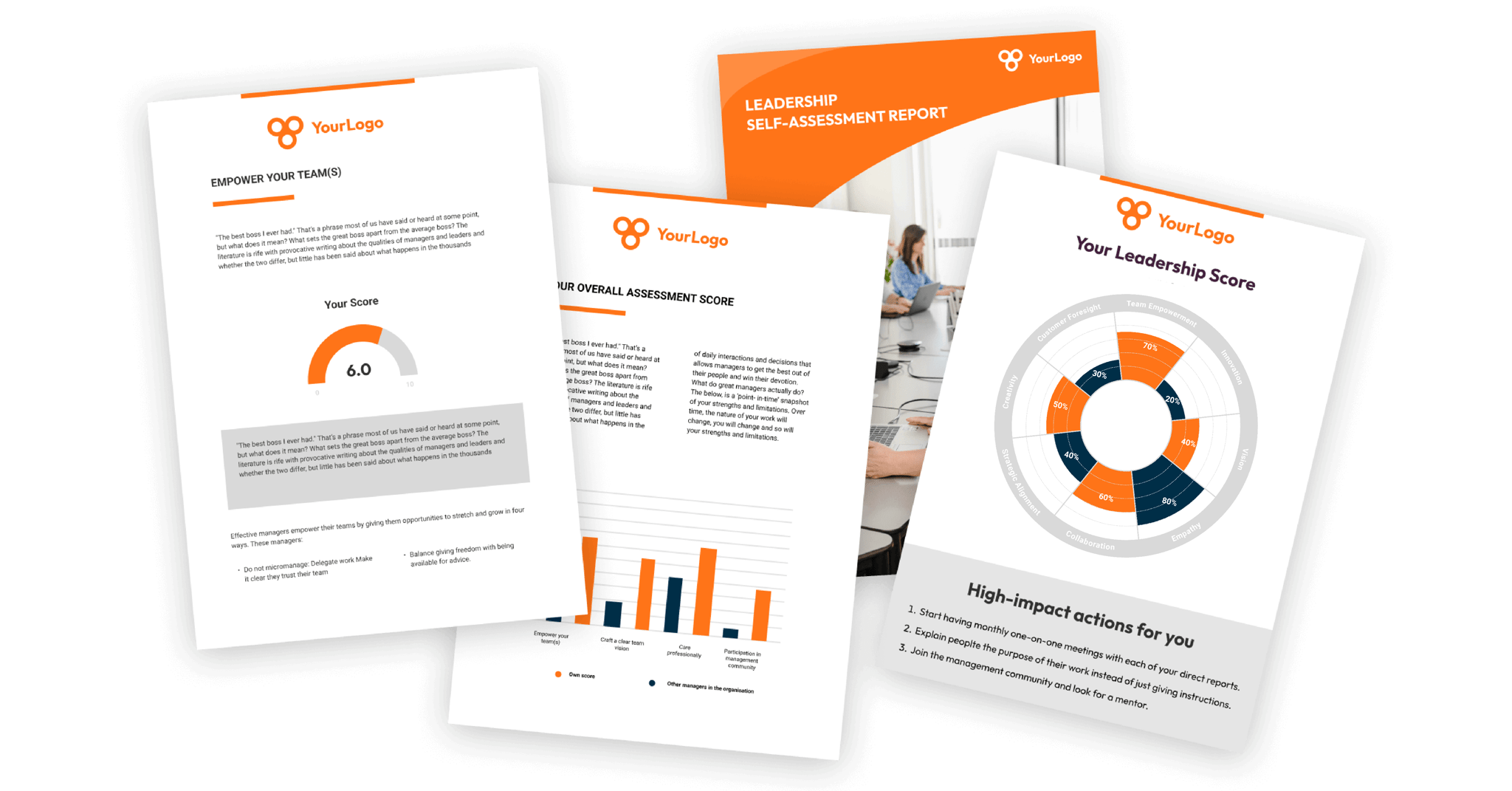
What sets Pointerpro apart from traditional survey or assessment tools is the automatic generation of personalized reports, made tangible and immensely valuable by data visualization.
Challenge
Often, one of the main hurdles for SaaS companies like Pointerpro is the scarcity of data visualization developers and the allocation of valuable resources.
Developing their own in-house solution would require significant time, effort, and budget, which might divert attention away from their core business focus. Therefore, the "make or buy" decision leaned heavily toward finding an external partner like Datylon that could offer a ready-made and cost-effective dataviz solution.
Another challenge was catering to the diverse needs of enterprise customers and consultants who seek custom-designed charts for particular purposes or datasets. Data visualization tools often lack the flexibility to meet these unique requirements, making it crucial for Pointerpro to find a solution that could accommodate tailor-made visualizations.
Solution
Datylon stepped in as the perfect match for Pointerpro's requirements. As experts in data visualization, Datylon offered a comprehensive suite of dataviz capabilities that could be seamlessly embedded into Pointerpro's assessment tool.
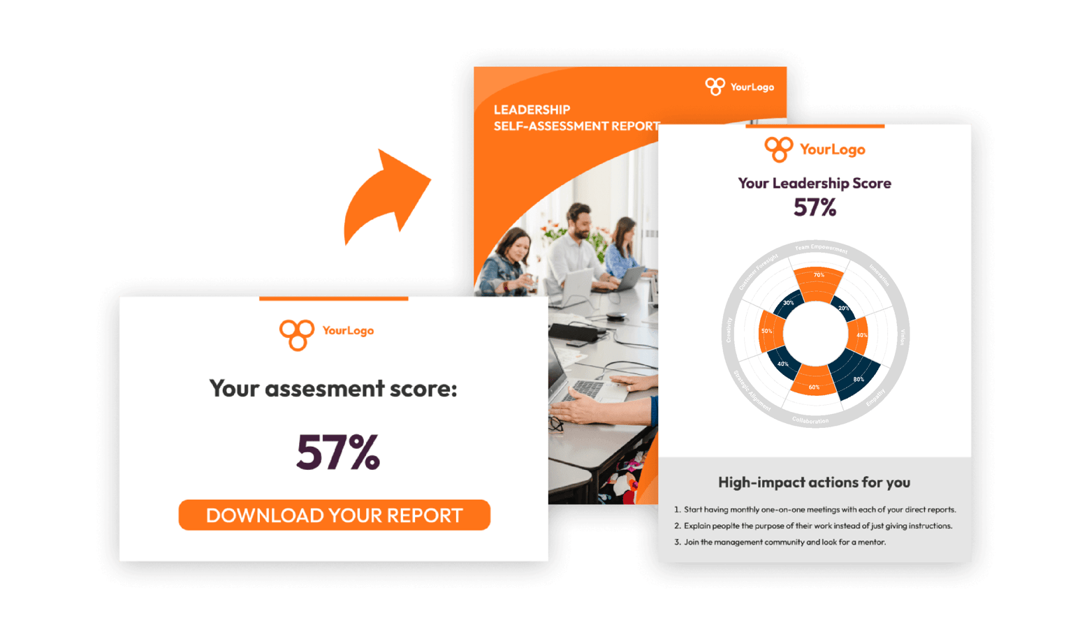
One of the standout features was the integration of specially designed charts to match the customer company’s style guide and specific charting requirements. Datylon charts are dynamically adjusted based on the user's questionnaire inputs, providing an instantaneous and personalized visual representation of their performance in various aspects.
This real-time data sync, facilitated by Datylon's API integration, ensured that each report reflected the respondent's unique journey, making the reports more engaging and relatable.
A game-changer for Pointerpro was Datylon's chart design process, which requires no coding whatsoever. Datylon's tools empower designers, eliminating the need for complex coding and technical skills to create stunning charts.
This no-coding design capability gave Pointerpro a competitive edge. It allowed them to provide tailored data storytelling solution in no time that is not only insightful but visually captivating.
Furthermore, Datylon’s data visualization experts provided support, training, and guidance to the Pointerpro team and designers.
Conclusion
Pointerpro's differentiation lay in offering not just one-pagers but comprehensive reports spanning multiple pages. These reports are tailored precisely to the user's questionnaire responses.
Enhanced with Datylon’s automated chart solution, Pointerpro revolutionized the world of personalized reports and assessments. By seamlessly integrating custom-designed captivating charts and visualizations into their reports, Pointerpro empowered enterprises to gain clearer and more actionable insights from their assessment data.
The integration of Datylon's dataviz component helps Pointerpro's clients visualize and understand their data like never before, leading to enhanced customer engagement and satisfaction. Pointerpro's success story serves as a testament to the power of automated reporting and embedded reporting solutions in the SaaS industry.
If you are a SaaS company or an enterprise looking to revolutionize your data storytelling, add clear and appealing reporting to your product, and enhance customer engagement, Datylon invites you to get in touch for a custom offer or book a demo.
Experience the difference that cutting-edge data visualization and reporting capabilities can bring to your software, empowering you to easily make data-driven decisions.