
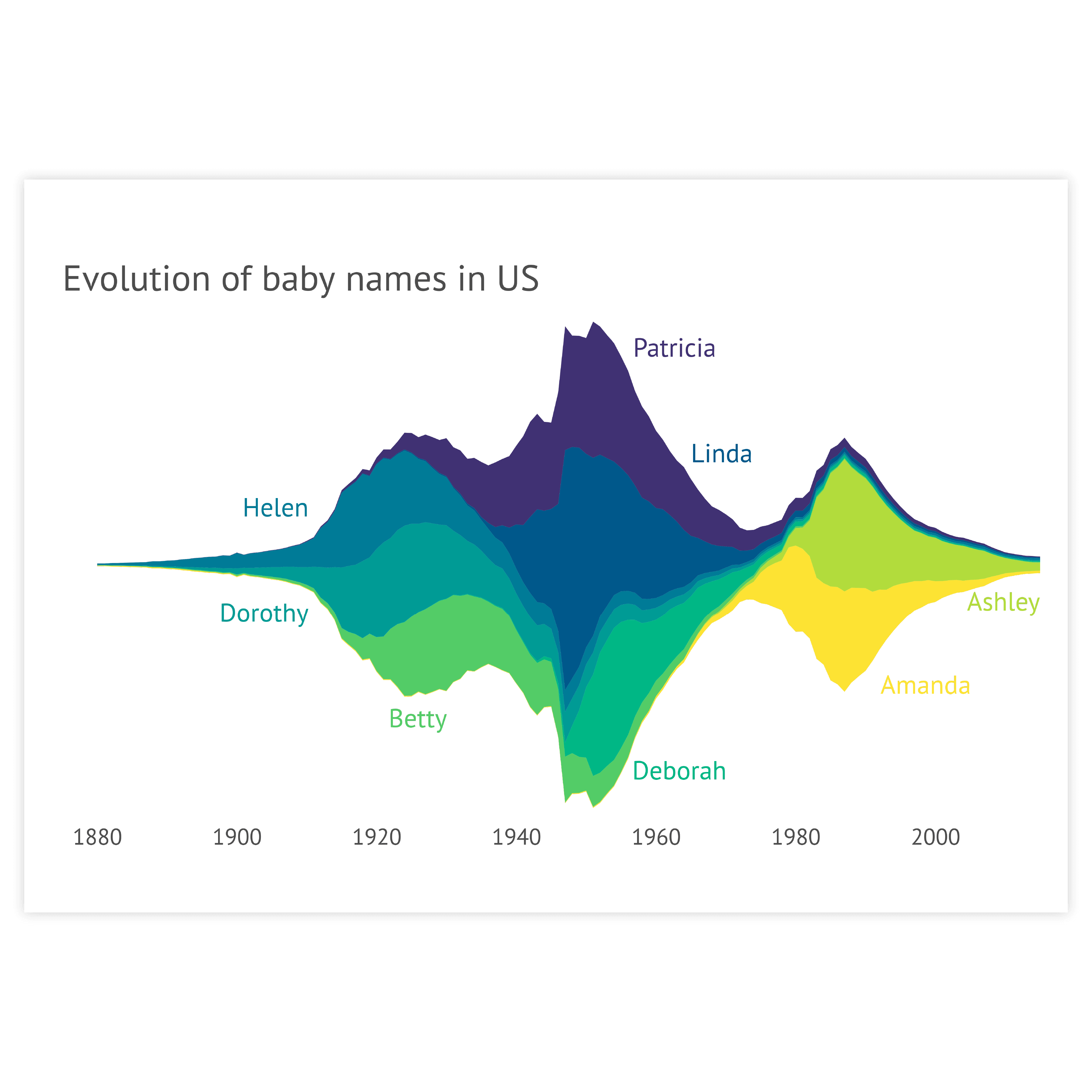

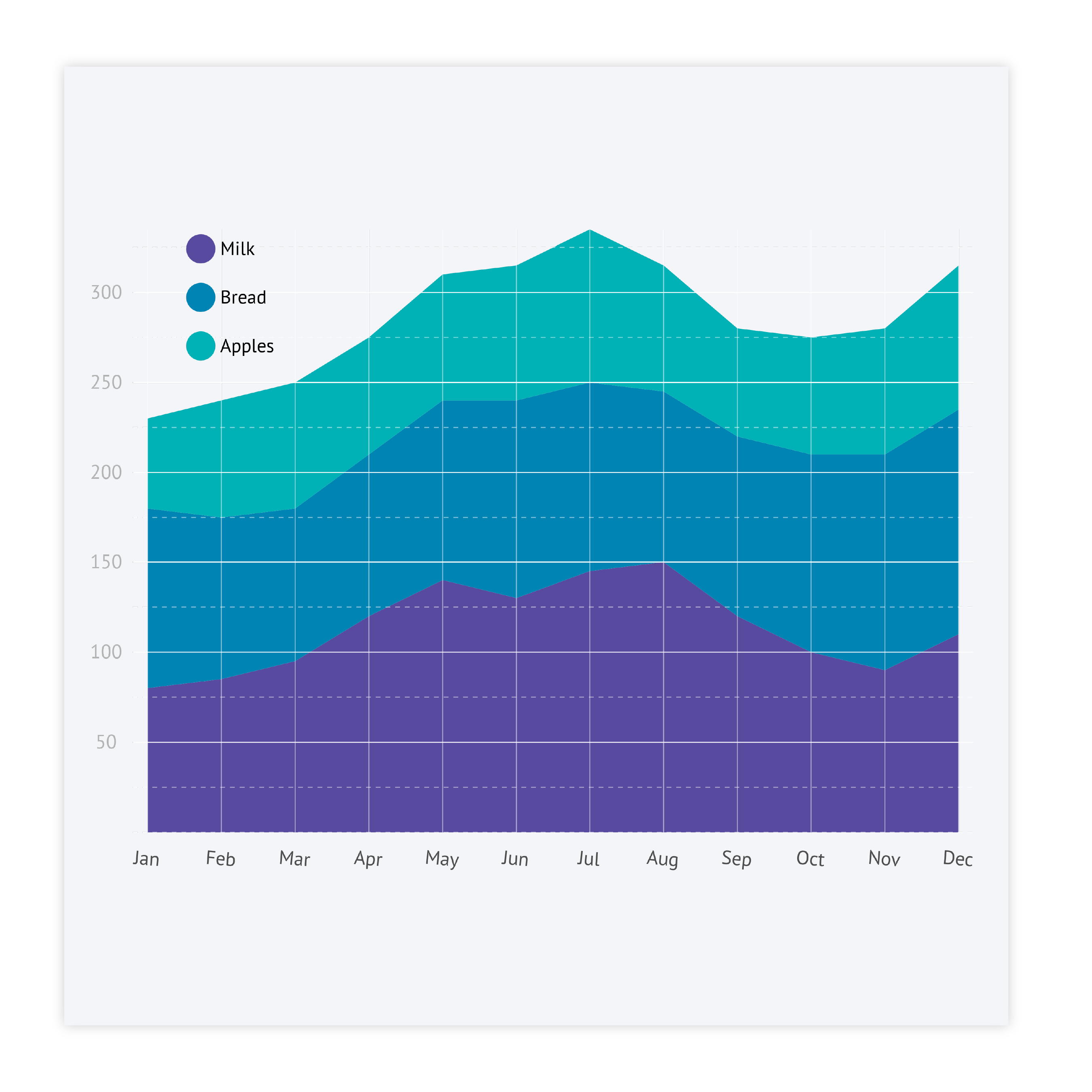


Labeling
You can label every series in your area chart directly or via a legend. In general, direct labeling is preferred. Direct labeling includes placing the names of the categories right next to the corresponding area. This is more beneficial as the viewer does not have to switch its view between the chart and the legend to learn which areas correspond to which category. Moreover, it makes it easier to read the chart by color-blind people or readers of the chart printed in greyscale. To make it even easier for your viewer, color-code the label with the same color as the corresponding area. In Datylon chart maker you can use the color link option to make the colors of the Direct Labels the same as the corresponding areas.
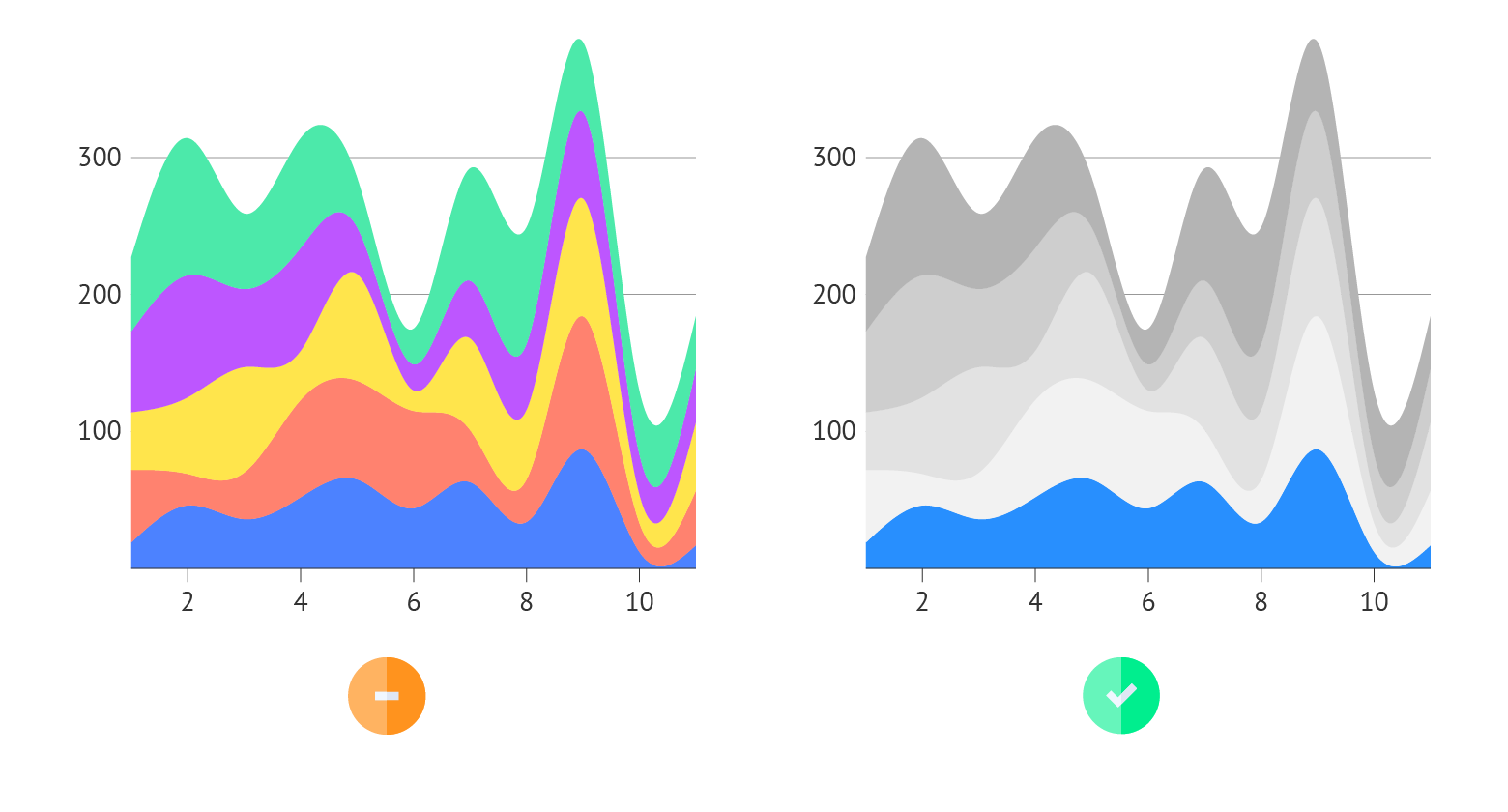
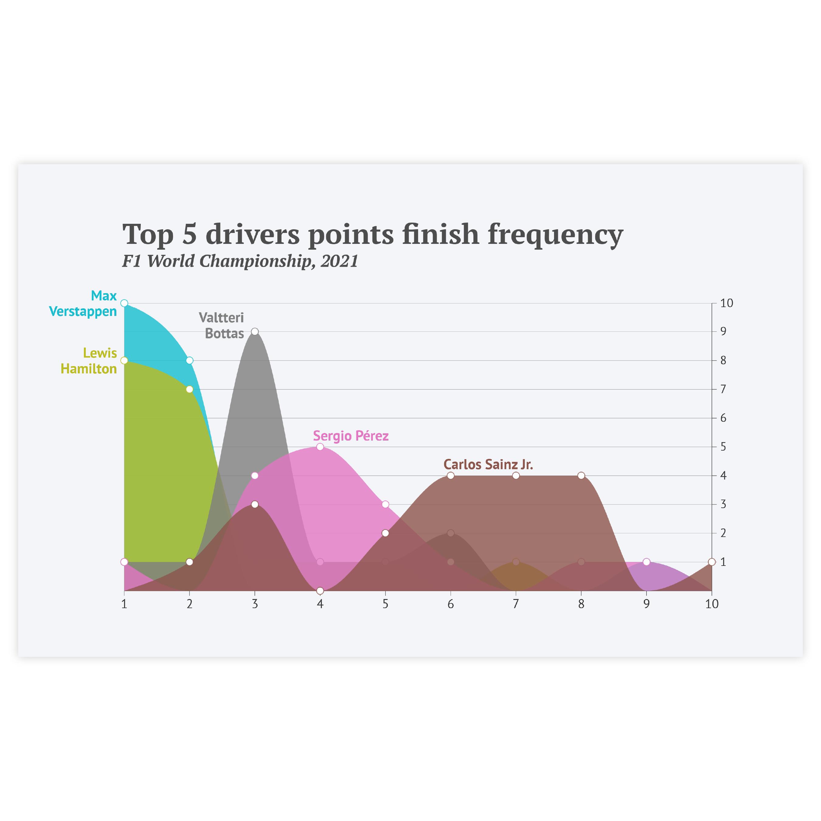
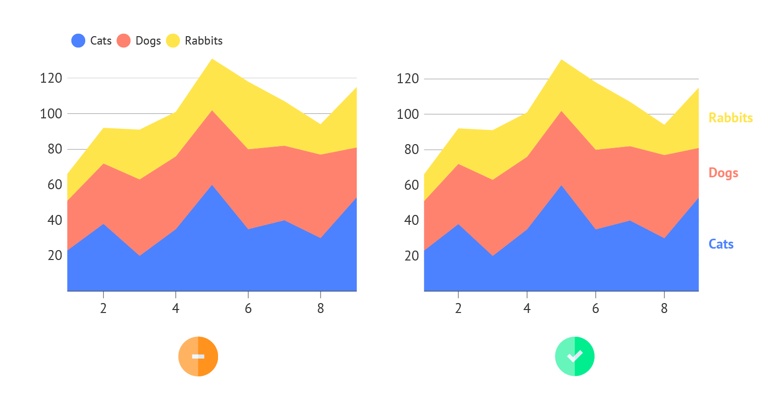
Highlighting
Our brain is programmed to notice deviations instantly. So to draw attention to the most important categories of the area chart, a good solution is to highlight these areas and color all the other areas in a pale grayscale palette. It’s also better to place the highlighted category at the bottom, so it’s easier to interpret it. In general, applying changes in size, movement, or color will make highlighting a specific area easier. And it will catch the reader’s eye immediately.
Read more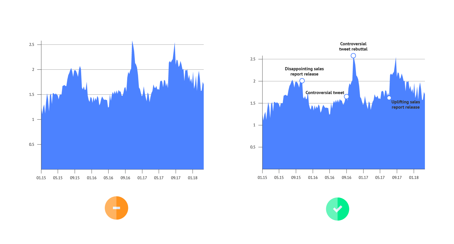
Annotations
As area charts are mostly used for showing trends, there’s no need to add labels for every data point. But at the same time, a reader needs an explanation of what changes the chart is representing. In this case, text annotation for every major direction change is the best solution for highlighting certain events.
Read more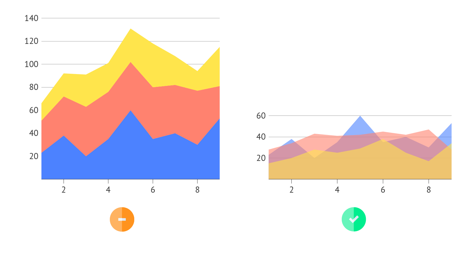
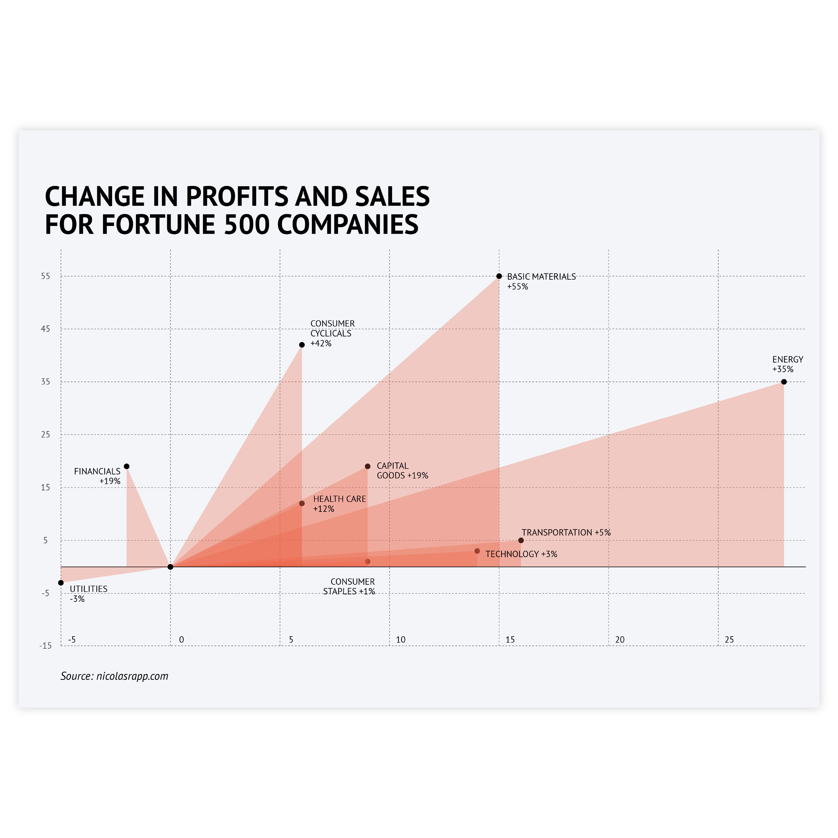
Overlaid series
When multiple series need to be shown but the stacked type isn’t suitable, an overlaid series with decreased opacity might be the right choice. It allows you to show all of the series starting from the same point. The intensity of overlaps of different series might also work as a separate visual clue.

